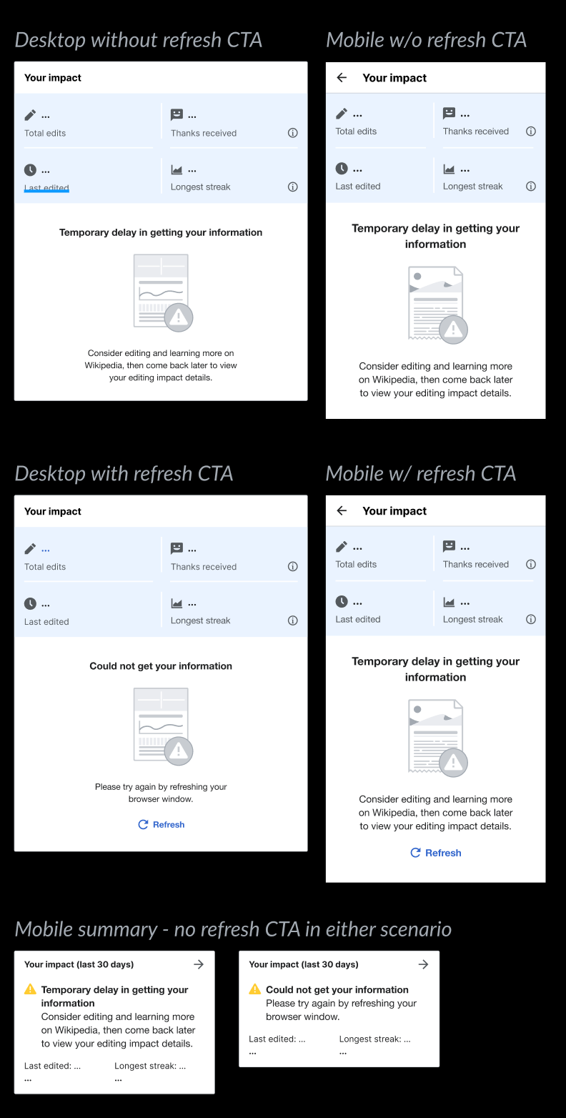
It's possible that requesting impact data will result in "no data" (for all data points) while it is being calculated. We need a simple screen to inform the user that the data is being calculated (or recalculated), and to check back later.
Proposed design
Without "Refresh" CTA Desktop 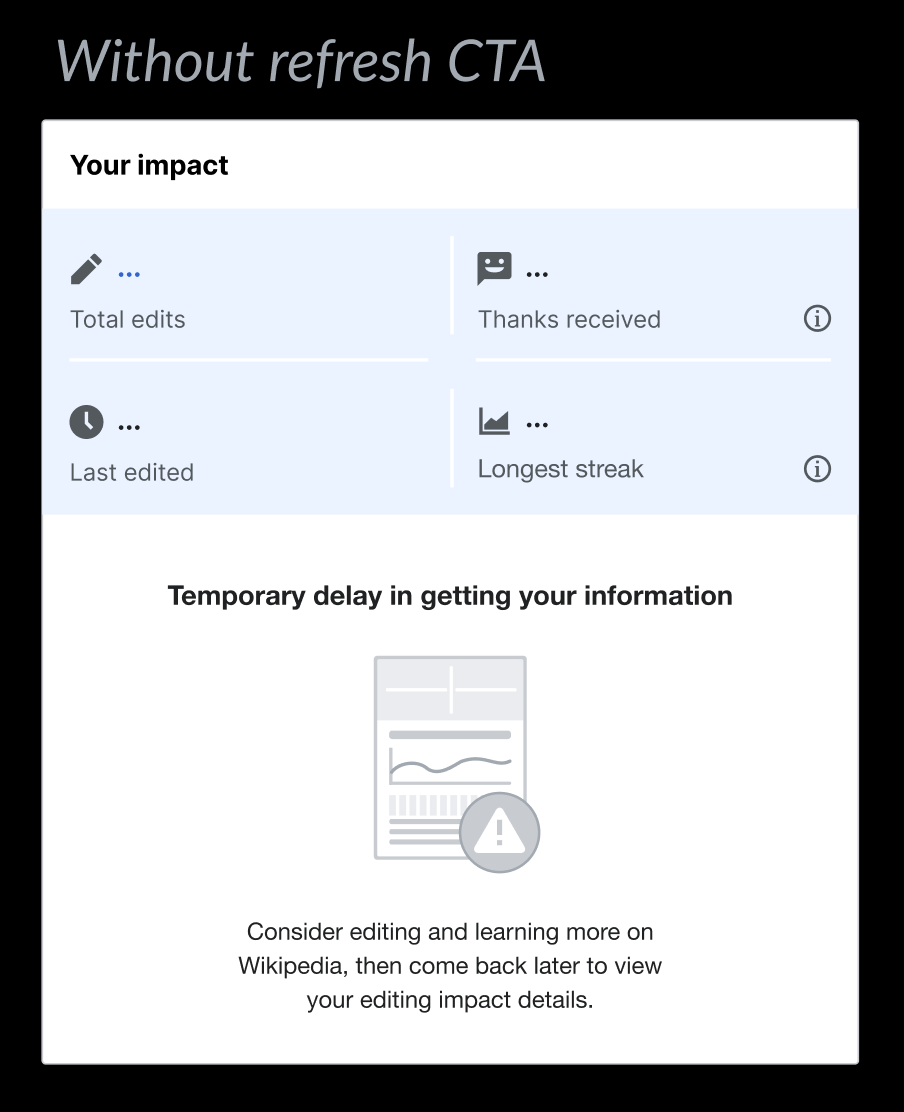 | With "Refresh" Desktop 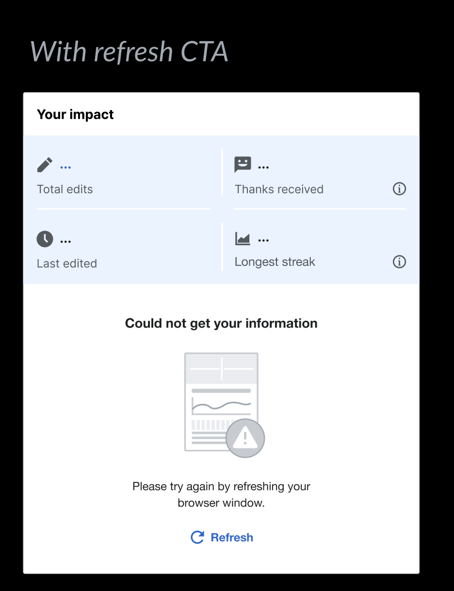 |
Mobile summary (if tapped, opens to Mobile impact without "Refresh CTA") 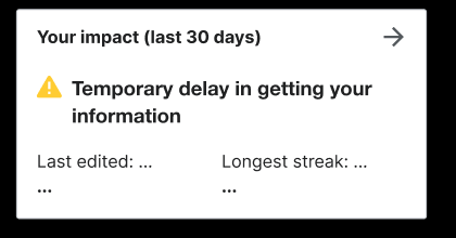 | Mobile summary (if tapped, opens to Mobile impact with "Refresh CTA") 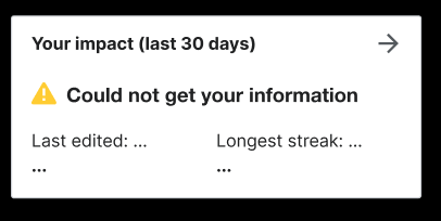 |
Without "Refresh" CTA Mobile 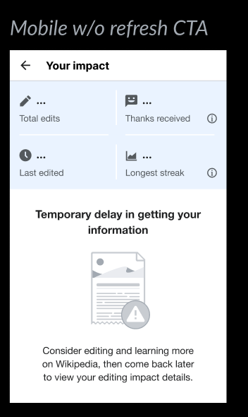 | With "Refresh" Mobile 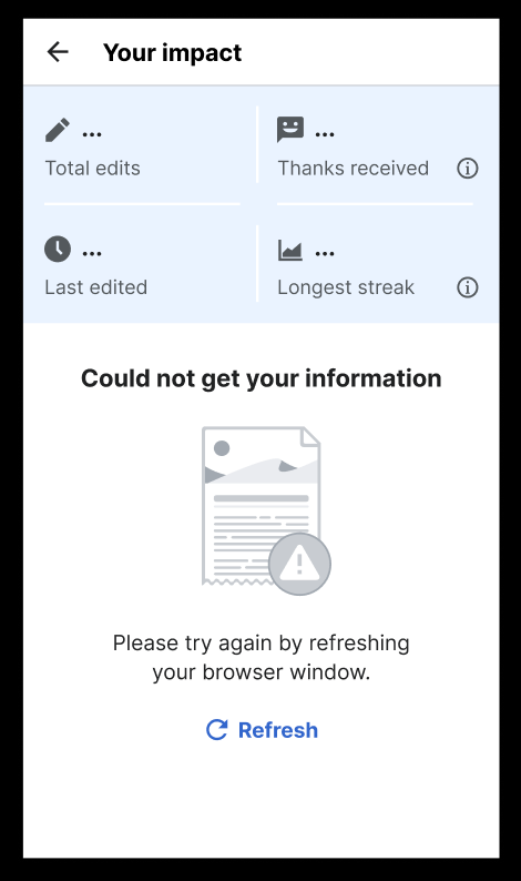 |
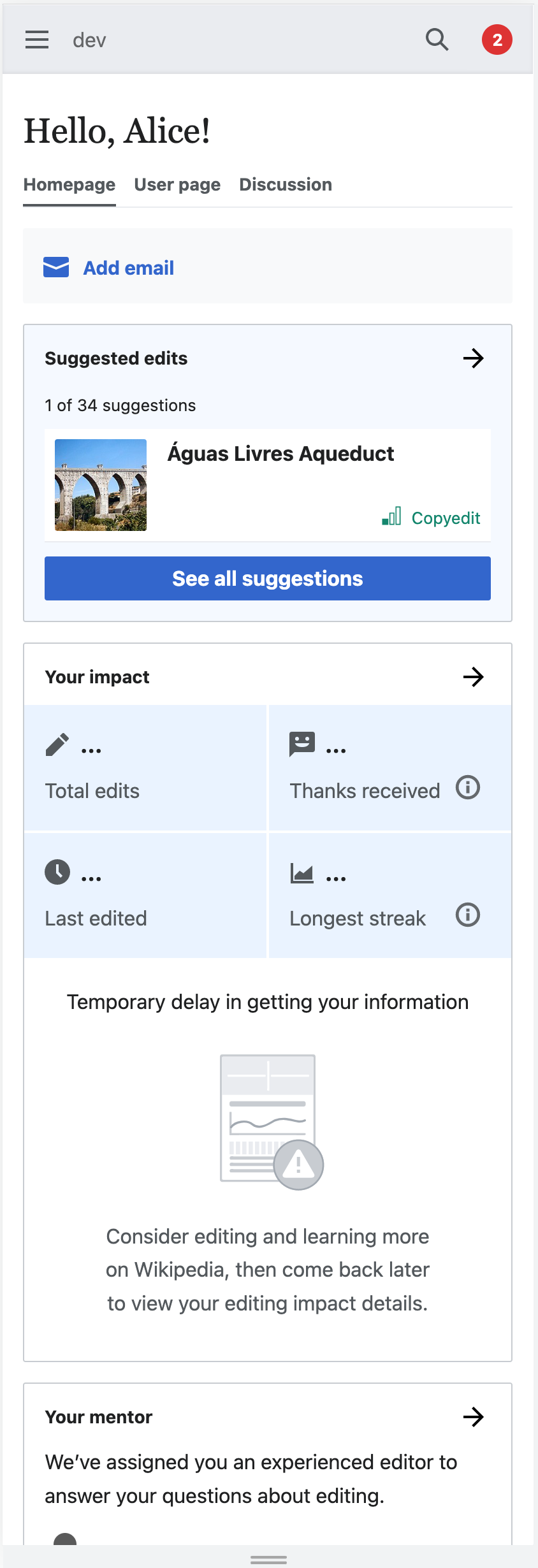
If the person taps on the summary, or navigates to impact module directly on mobile, they will see the mobile version of the error state.
Illustration SVG:
Note: All copy is DRAFT - final text will be updated as part of T322890
Acceptance Criteria
- Should be able to see a "no data" screen on the impact module, when no cached data for the user exists.
Completion checklist
Functionality
- The patches have been code reviewed and merged
- The task passes its acceptance criteria
Engineering
- There are existing and passing unit/integration tests
- Tests for every involved patch should pass
- Coverage for every involved project should have improved or stayed the same
Design & QA
- If the task is UX/Design related: it must be reviewed and approved by the UX/Design team
- Must be reviewed and approved by Quality Assurance.
Documentation
- Related and updated documentation done where necessary
- Internal technical changes: internal repository documentation must be updated (README.md, JSDoc, PHPDoc)
- Infrastructure technical changes: technical changes that reflect on environment, infrastructure, endpoints or any other area of interest for technical contributors should be reflected on Extension:GrowthExperiments or Extension:GrowthExperiments/Technical documentation pages.