This task defines the minimum viable product (MVP) of the InfoChip component.
Scope
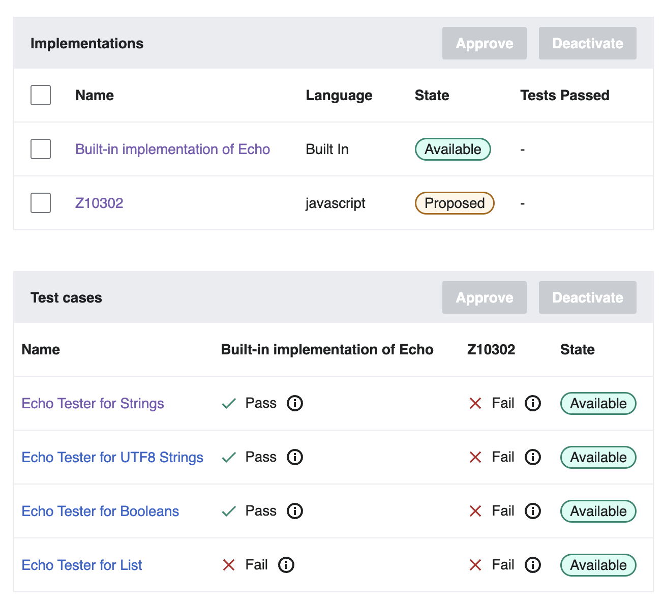
The MVP covers these Abstract Wikipedia use cases:
 |  |
| Info chip | Info chip with feedback status |
Design spec
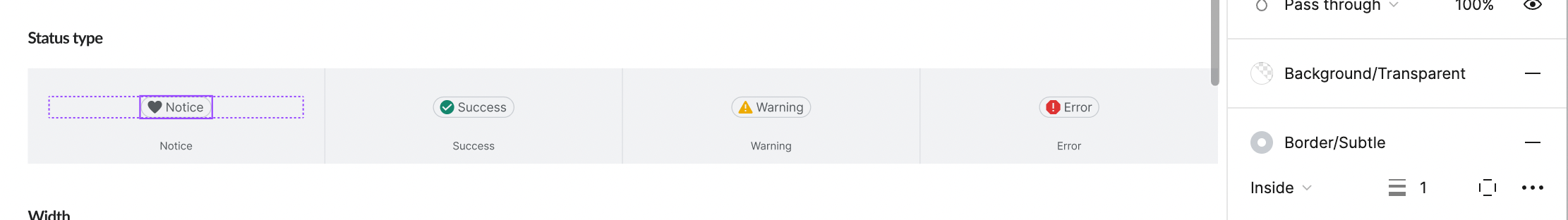
Anatomy
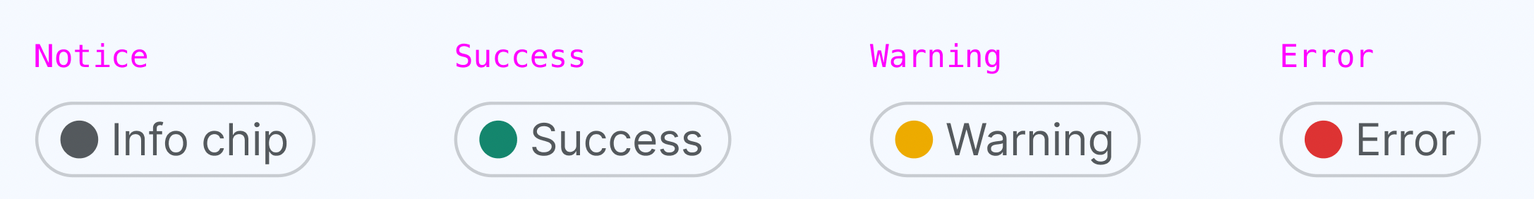
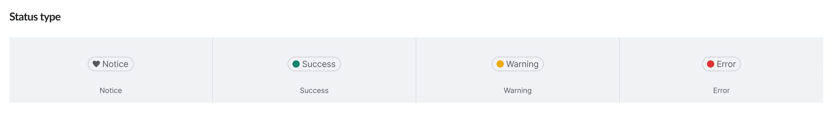
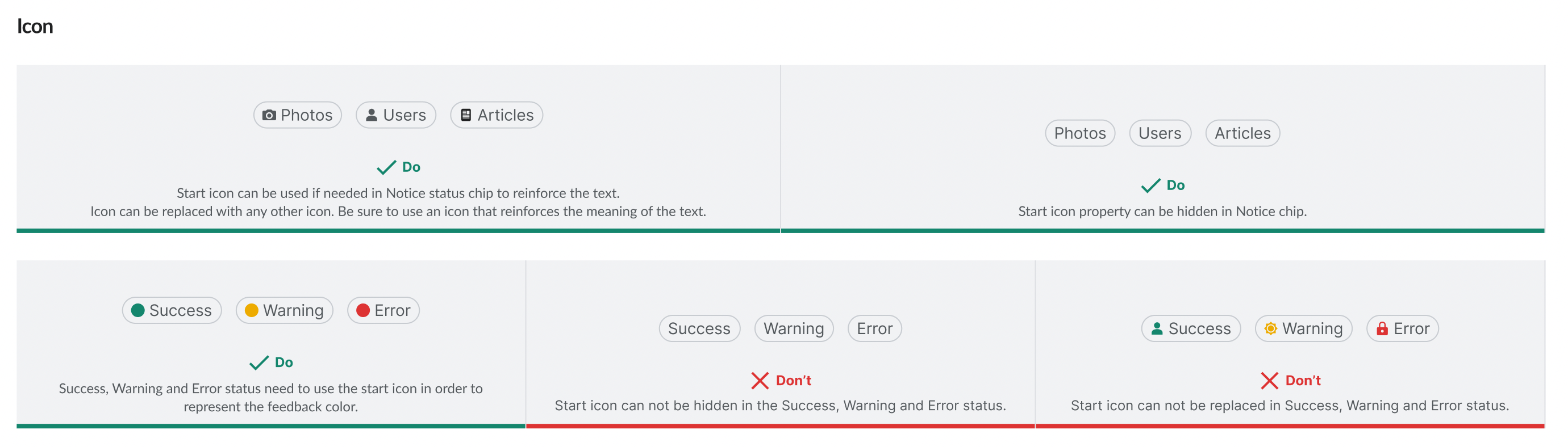
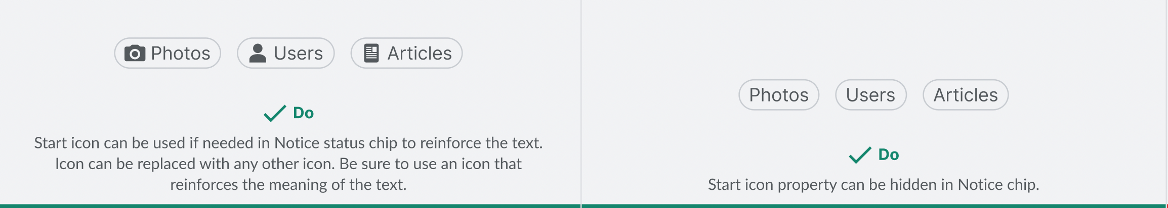
- statusType: Notice, Success, Warning, Error
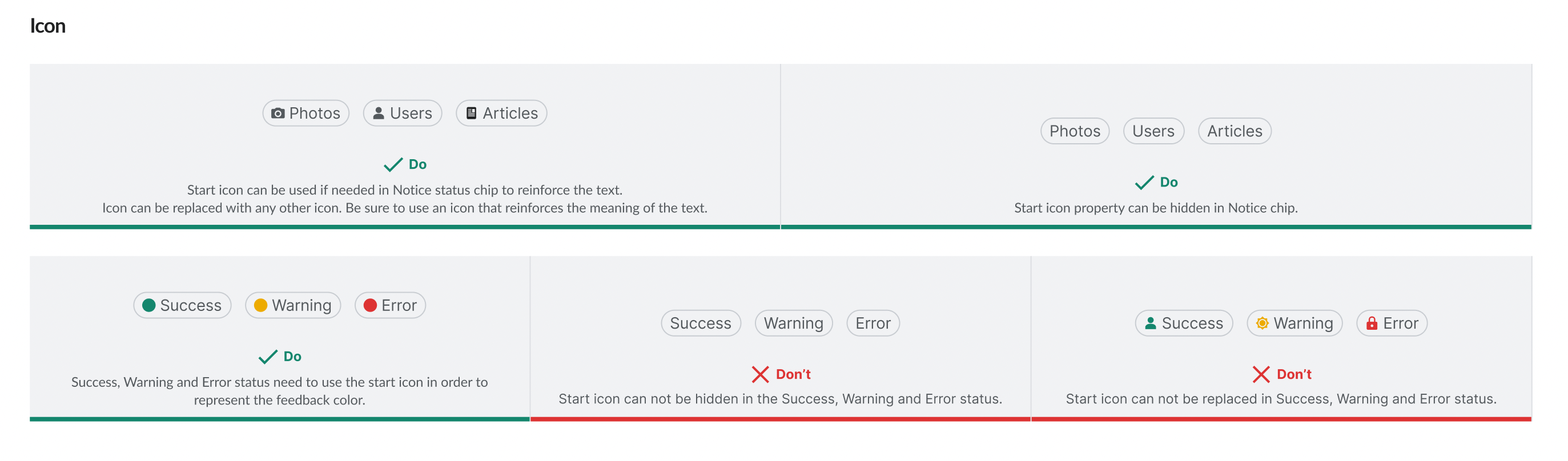
- startIcon: it's customizable in the Notice chip but it should be always displayed in the feedback status (Success, Warning, Error) in order to provide the feedback (dot) to the user
- Width: we need to display 2 props for the width:
- Fixed width: this will be used in the current Abstract Wikipedia use case
- Being adapted to the length of the text
Style
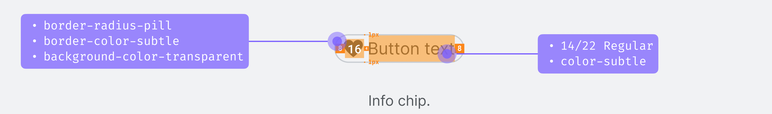
The InfoChip will use the following styles:
- border-radius-pill
- border-color-subtle
- background-color-transparent
- Text: UI text S Regular (14px for both desktop and mobile) and color-subtle
- Icon:
- Notice: content-subtle
- Success: content-success
- Warning: content-warning
- Error: content-error
Interaction
Since this chip is just informative (non-clickable) it will only display the default state
Documentation
To be added.
Considerations
To be added.
Open questions
To be added.
Acceptance criteria
- A Figma spec sheet is created for the component that includes the scope defined here. A link to the Figma spec sheet's MVP version has been added to this task's description.
- The initial component is implemented in Codex.
Design review
- Text color should be color-subtle
- Text size should be 14px for both desktop and mobile chips. 16px is too big for this element.
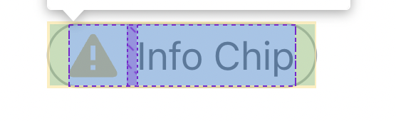
- There is an extra padding between the icon and the text. It should be just 4px.
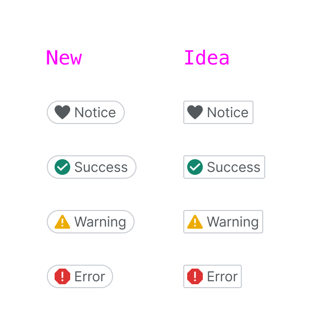
- Success icon should be replaced with the new icon designed in T326557
- Default icon color in notice chip should be color-subtle.
- Represent the startIcon for Notice chip in the Codex demo
- Icon size should be 16px
-
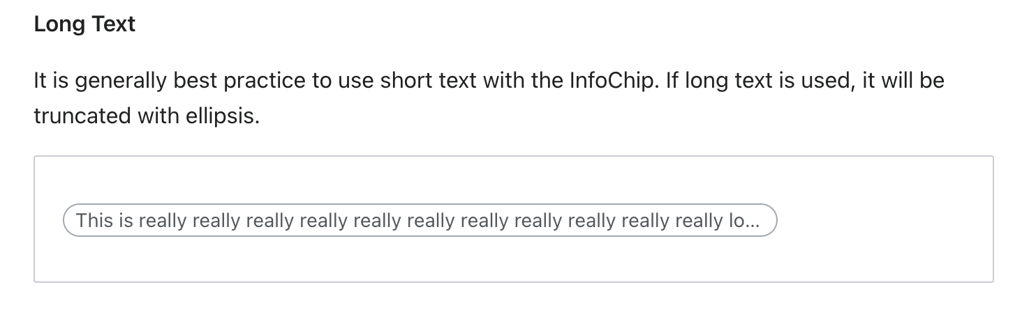
Add fixed width propertyIt won't be a component property since the fixed width will be applied when using the chip inside a content box or component - Use a more representative text in the Long text example