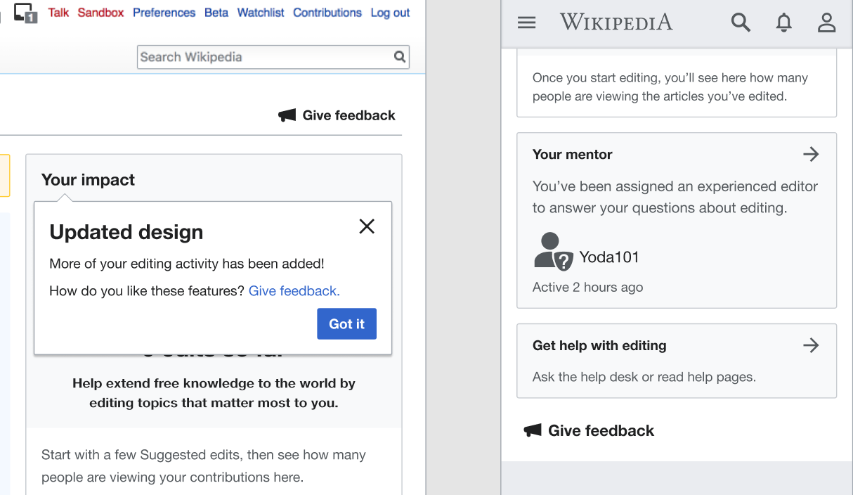
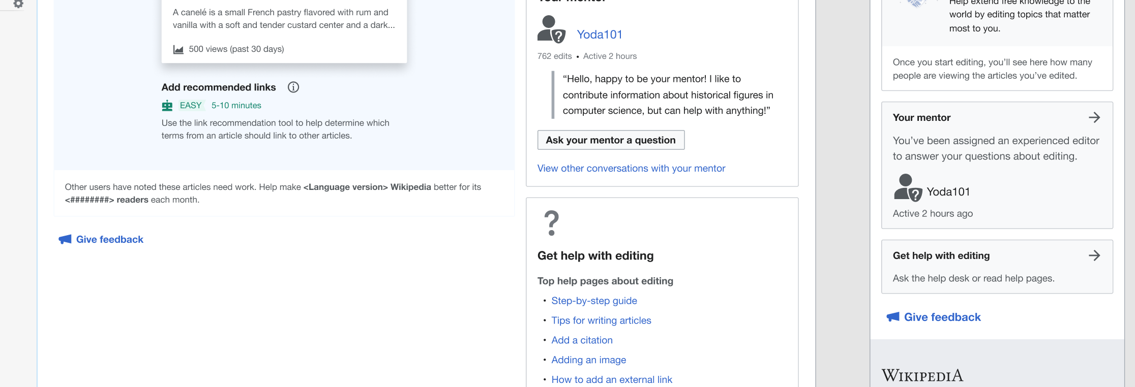
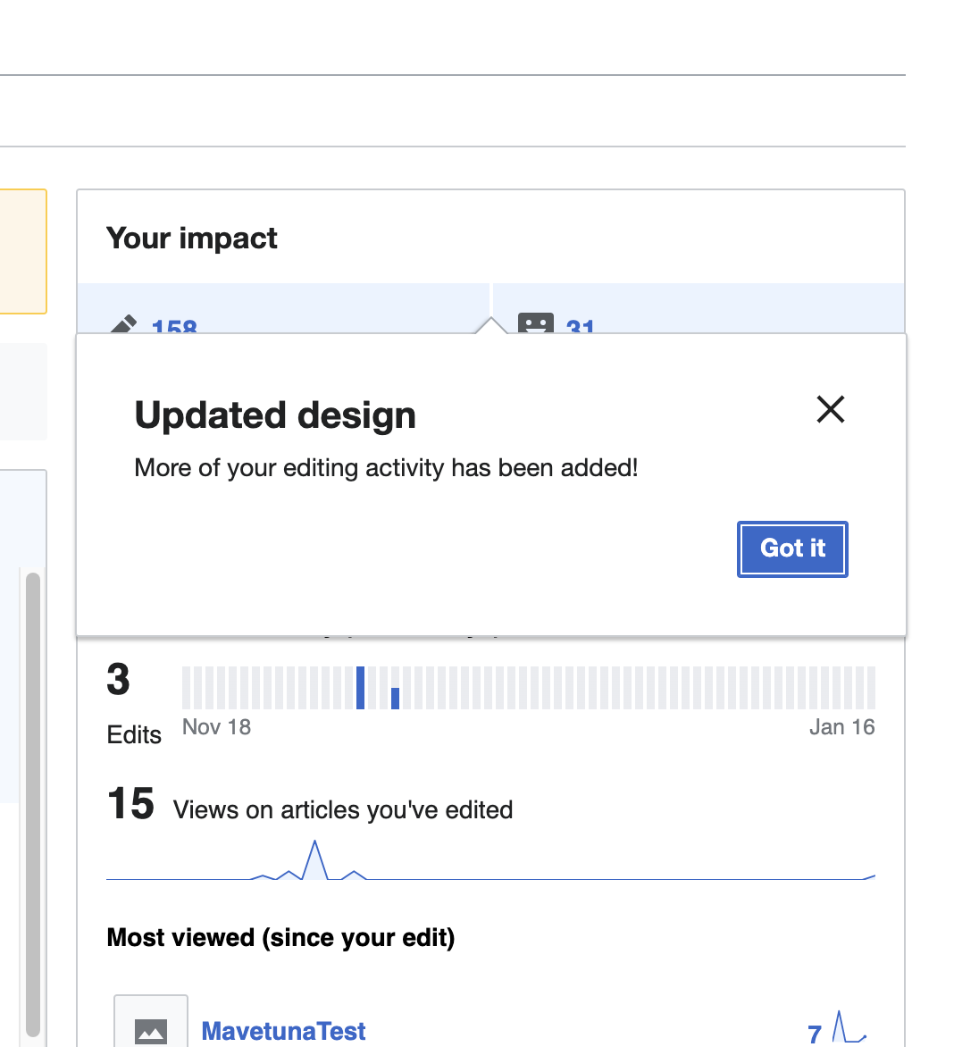
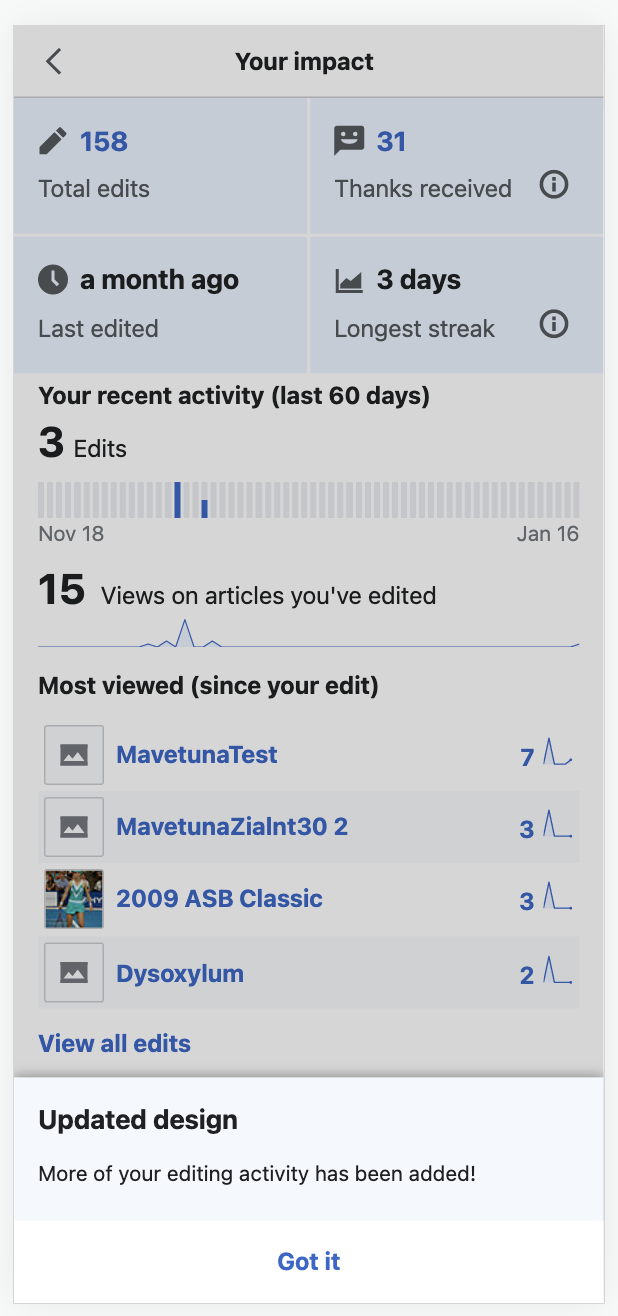
Existing newcomers are shown a pop-up that highlights that there is a new impact module design.
Proposed design
Desktop 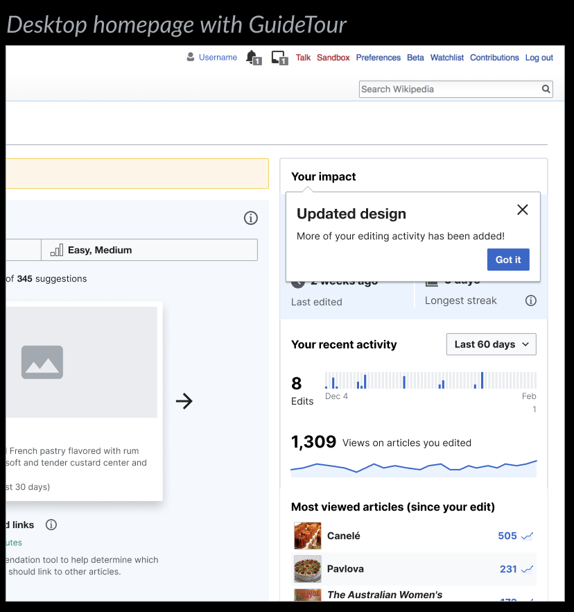 | Mobile 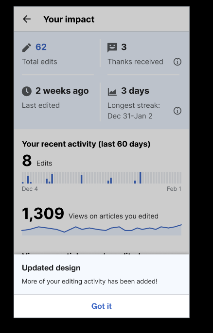 |
- Existing newcomers are shown a pop-up that highlights that there is a new impact module design.
- Same message on both Desktop and mobile, but in different formats:
- On Desktop, the GuideTour extension will be used to show a dialog over the new impact module.
- On Mobile, an info drawer will be shown over the new Impact module (*not* the homepage summary)
- Copy (finalised, QQQ available on copy spreadsheet):
- Heading: Updated design
- Description text: More of your editing activity has been added!
- Close message button label: Got it
Designs on figma: https://www.figma.com/file/fOa1x7hw6EM9VnaMJv7vib/Positive-reinforcement?node-id=3513%3A112805&t=tfloogWjzDCoemsw-
Acceptance Criteria
- Message appears for existing newcomers who had the Impact module and had visited their homepage before.
Completion checklist
Functionality
- The patches have been code reviewed and merged
- The task passes its acceptance criteria
Engineering
- There are existing and passing unit/integration tests
- Tests for every involved patch should pass
- Coverage for every involved project should have improved or stayed the same
Design & QA
- If the task is UX/Design related: it must be reviewed and approved by the UX/Design team
- Must be reviewed and approved by Quality Assurance.
Documentation
- Related and updated documentation done where necessary