Page MenuHomePhabricator

Wikisource download button is too close to "View history", "More" links
Open, LowPublicBUG REPORT

Description

Steps to replicate the issue (include links if applicable):

What happens?:

  • Observe that the "download" button does not have any padding with the top bar (containing the "View history", "More" link/dropdowns)

Screenshot from 2022-11-26 16-19-07.png (172×457 px, 7 KB)

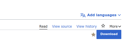
What should have happened instead?:

  • Download button should have some padding from the top bar like other indicators (for example, the featured star icon)

Event Timeline

The Download button is provided by the Wikisource extension and is availiable in Book namespaces defined in the $wgProofreadPageBookNamespaces variable (mostly the Main namespace, and sometimes the Translation namespace) :)

Possibly what we want to do here is something like the following in a Wikisource skinStyles file for Vector-2022:

.mw-indicators {
    padding-top: 12px;
}

Would that be agreeable to everyone? I feel like the whole thing of having a button in the indicator space is a bit strange (but then, there's no obvious other way to do this either, I think).

(I've just noticed that there's no style linting in the Wikisource extension, so I think I'll start by doing that!)

Change 861348 had a related patch set uploaded (by Samwilson; author: Samwilson):

[mediawiki/extensions/Wikisource@master] Add stylelint and fix errors

https://gerrit.wikimedia.org/r/861348

Change 861348 merged by jenkins-bot:

[mediawiki/extensions/Wikisource@master] Add stylelint and fix errors

https://gerrit.wikimedia.org/r/861348

Jdlrobson renamed this task from Download button is too close to "View history", "More" links in Wikisource to Wikisource download button is too close to "View history", "More" links in Wikisource.Nov 28 2022, 5:26 PM
Jdlrobson renamed this task from Wikisource download button is too close to "View history", "More" links in Wikisource to Wikisource download button is too close to "View history", "More" links.

Change 861457 had a related patch set uploaded (by Samwilson; author: Samwilson):

[mediawiki/extensions/Wikisource@master] Add stylelint to existing grunt 'fix' task

https://gerrit.wikimedia.org/r/861457

Change 861457 merged by jenkins-bot:

[mediawiki/extensions/Wikisource@master] Add stylelint to existing grunt 'fix' task

https://gerrit.wikimedia.org/r/861457

Ideally, shouldn't this be the main action item in the main namespace across all Wikisources for all logged-out users, something displayed next to/instead of Edit, but stronger than that?

@Soda seems like there is an unresolved discussion here:
https://gerrit.wikimedia.org/r/c/mediawiki/extensions/Wikisource/+/861348/

Looks resolved to me, but idk. Maybe you just forgot to change status? :)

Maybe, taking advantage of the fact that the fix has not been implemented for two months, it is worth considering whether it would be a better idea to move "<div id="contentSub">" over "<div class="vector-body-before-content" >", as they probably do with javascript on fr ws

image.png (1×1 px, 238 KB)

After such a change, imho it looks better without the extra padding:
image.png (589×1 px, 123 KB)

@Soda seems like there is an unresolved discussion here:
https://gerrit.wikimedia.org/r/c/mediawiki/extensions/Wikisource/+/861348/

Looks resolved to me, but idk. Maybe you just forgot to change status? :)

Yes that conversation was resolved by the followup patch :)

Maybe, taking advantage of the fact that the fix has not been implemented for two months, it is worth considering whether it would be a better idea to move "<div id="contentSub">" over "<div class="vector-body-before-content" >", as they probably do with javascript on fr ws

image.png (1×1 px, 238 KB)

After such a change, imho it looks better without the extra padding:
image.png (589×1 px, 123 KB)

AFAIK this is being added server-side, so there no actual way to change where this is being added atleast from the point of the Wikisource extension. (Also I'm not sure vector-body-before-content is a stable class that is expected to be availiable across all extensions)

Possibly what we want to do here is something like the following in a Wikisource skinStyles file for Vector-2022:

.mw-indicators {
    padding-top: 12px;
}

Would that be agreeable to everyone? I feel like the whole thing of having a button in the indicator space is a bit strange (but then, there's no obvious other way to do this either, I think).

(I've just noticed that there's no style linting in the Wikisource extension, so I think I'll start by doing that!)

I do agree on the weirdness of the button in indicator (which I assume is something not a lot of extensions do). Maybe we can have a different design that preserves the relative call-to-action nature/importance of the button ? Alternatively just adding a padding for now seems like a reasonable fix as well :)

There's a similar problem with the Timeless skin:

ws-download-1.png (150×274 px, 3 KB)

and with .mw-indicators { margin-top: -1em; }:
ws-download-2.png (174×254 px, 4 KB)