Overview
Improve how participants choose whether they want their usernames to appear on the public participant list or to be shown only to organizers.
Design ideas
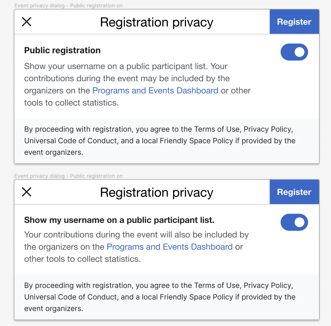
Idea 1:Toggle switch(the ideal version of what we have currently): We have a single object, public registration, which users can switch on and off. The label and explanatory text don't change when you switch it on/off. The explanatory text gives an extra explanation for the label and users understand that switching it on makes whatever is in the explanatory text happen and by switching it off they don't get what is in the explanatory text. This is how toggle switches we come across in everyday life work and what users are used to.
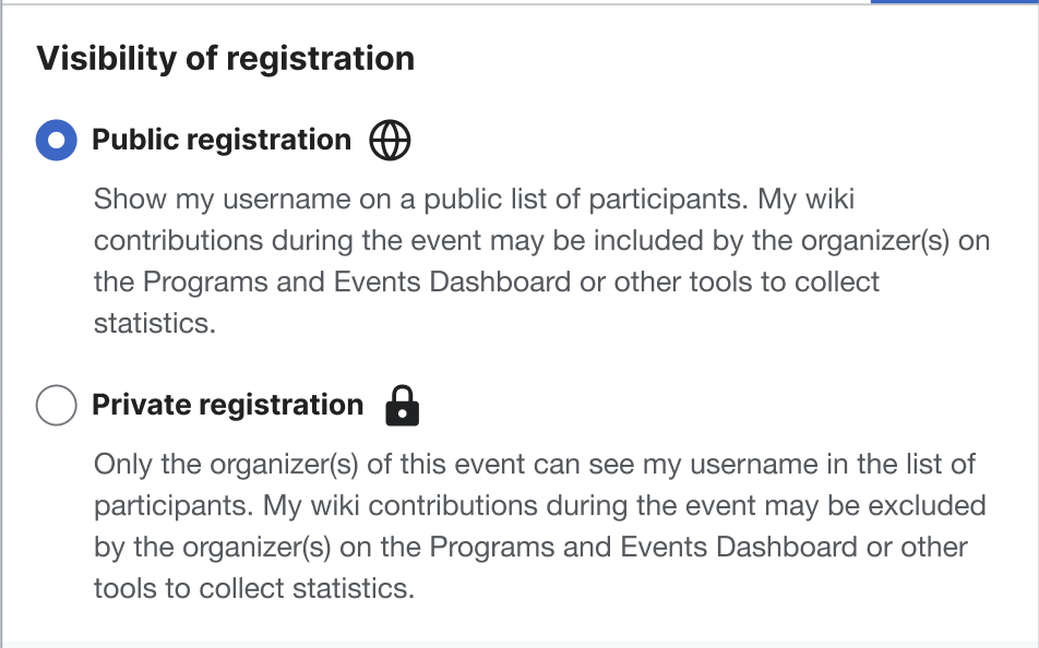
Idea 2:Radio button: This component conveys the concept of switching between public and private registration(or between opposing states). This was one of the ideas proposed earlier. It is pretty simple and straightforward, the only negative feedback given about it was that it gave much prominence to private registration.
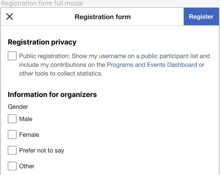
Idea 3: A simple checkbox is also a good solution for this. We don't need explanatory texts/labels for the different states. Whenever we encounter checkboxes, we know checking it will give us whatever is in the explanatory texts/label, and leaving it unchecked will deprive us of them.