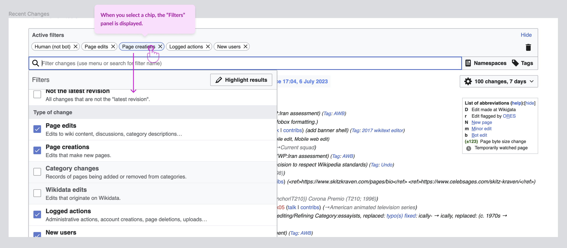
Scope
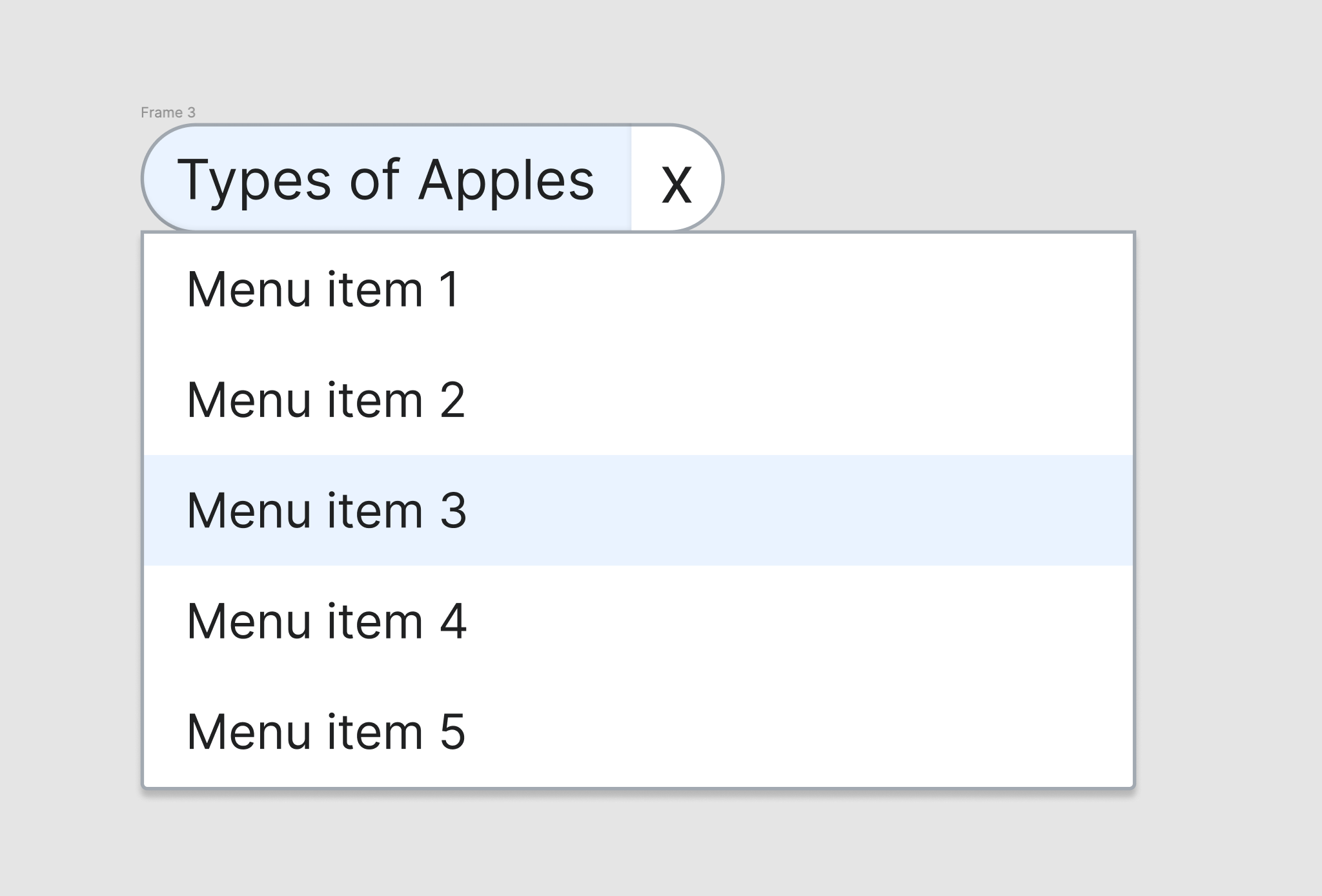
The MVP covers this Abstract Wikipedia use case.
Design spec
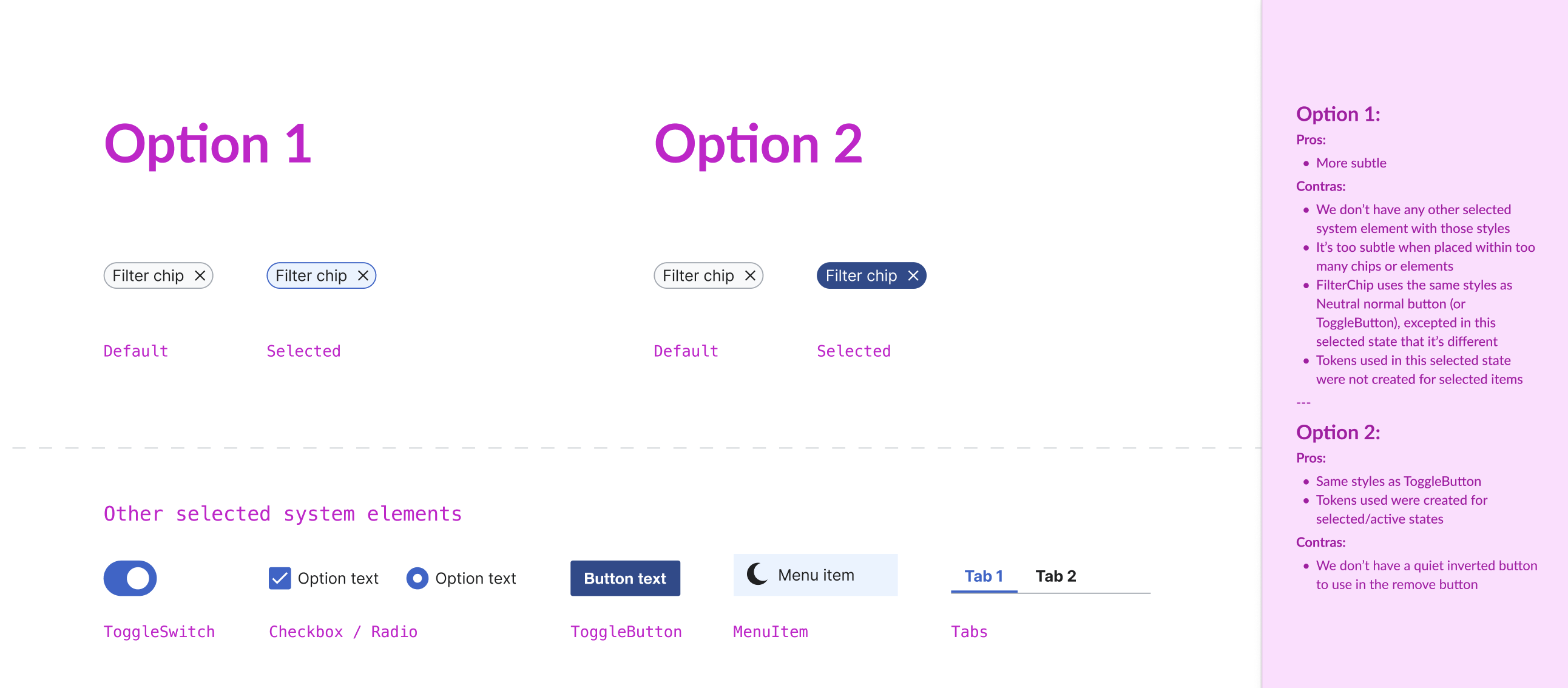
Anatomy
- The chip could have StartIcon although this won't be part of the MVP component
- Removable action will be a circular 20px icon only button created with the same styles and tokens as the quiet buttons
Style
The FilterChip will use the same color styles as the Normal Button component:
- border-radius-pill
- border-color-base
- background-color-interactive-subtle
- Text: UI text S Regular (14px for both desktop and mobile) and color-base
Interaction
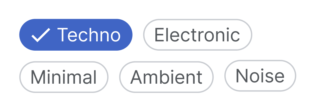
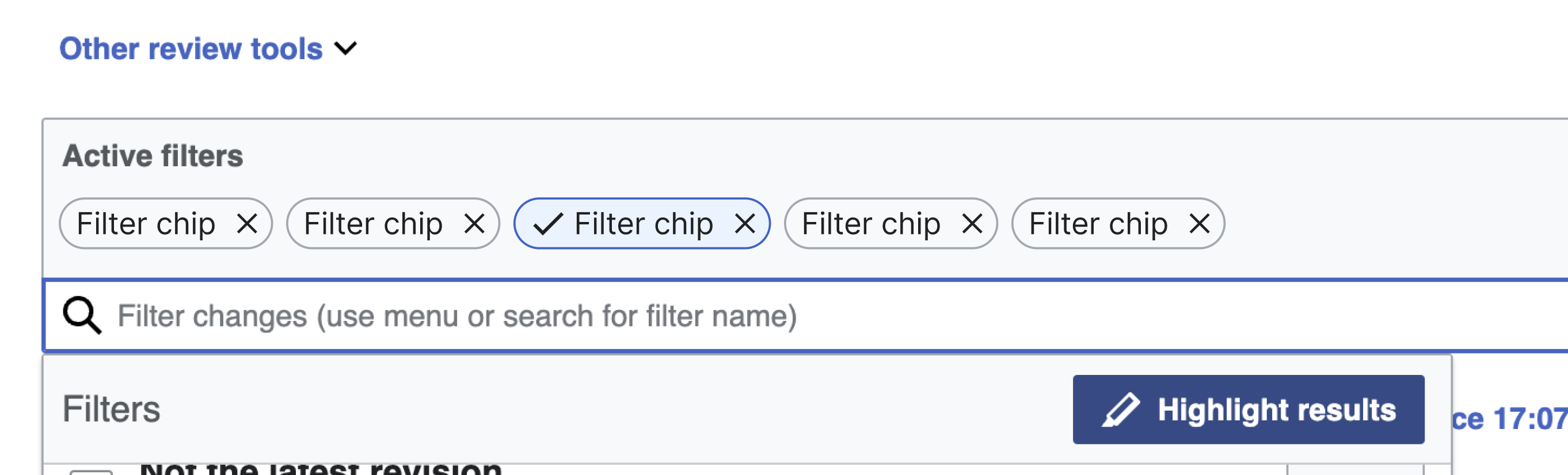
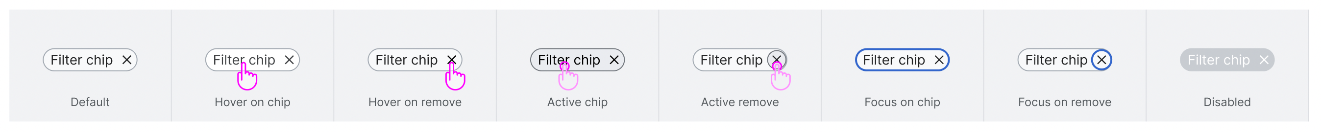
The FilterChip will display the following states:
- Default
- Hoven on chip + Hover on remove
- Active chip + Active remove
- Focus chip + Focus remove
- Disabled
Documentation
To be added.
Considerations
To be added.
Open questions
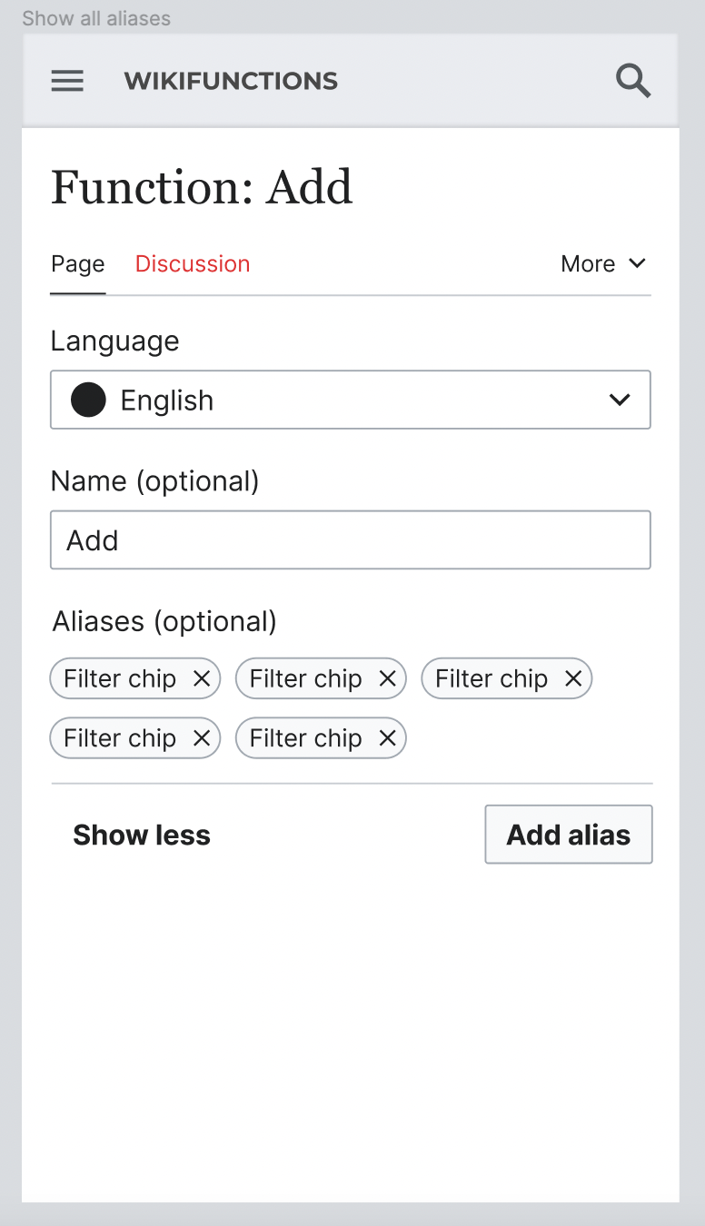
- Should FilterChip be renamed to “InputChip”? We will use it within the input component. Also "SelectionChip" could filter information so maybe we could reevaluate the name of this component.
Acceptance criteria
- A Figma spec sheet is created for the component that includes the scope defined here. A link to the Figma spec sheet's MVP version has been added to this task's description.
- The initial component is implemented in Codex.