Steps to replicate the issue (include links if applicable):
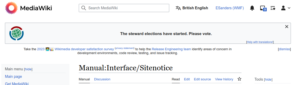
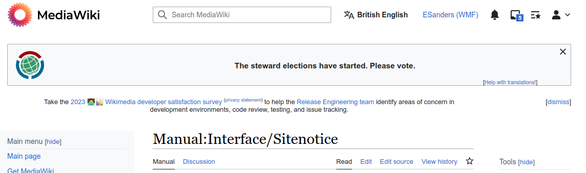
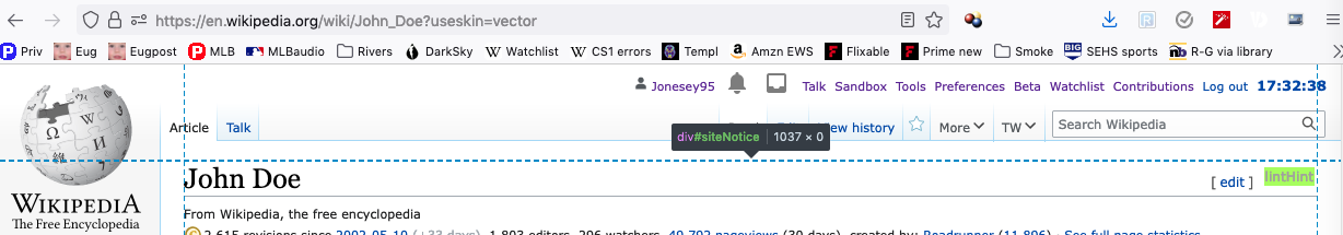
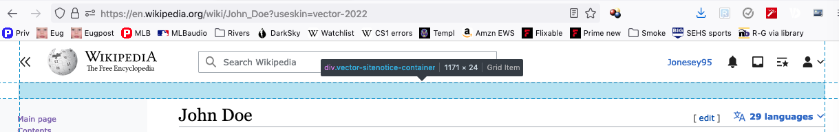
- Go to https://en.wikipedia.org/wiki/John_Doe?useskin=vector-2022
- Observe that there is a noticeable amount of empty white space between the search box and the article title (see screen shot).
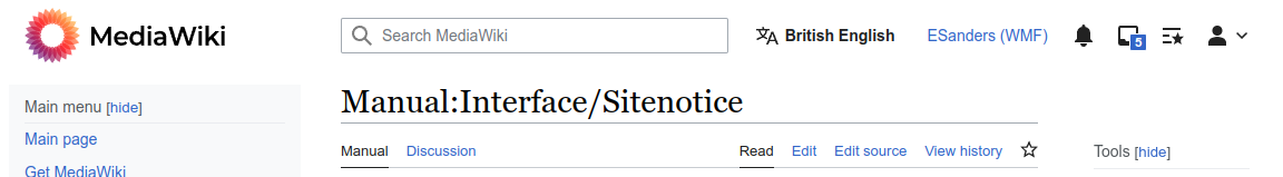
- Go to https://en.wikipedia.org/wiki/John_Doe?useskin=vector
- Observe that there is no such whitespace (see screen shot).
What happens?:
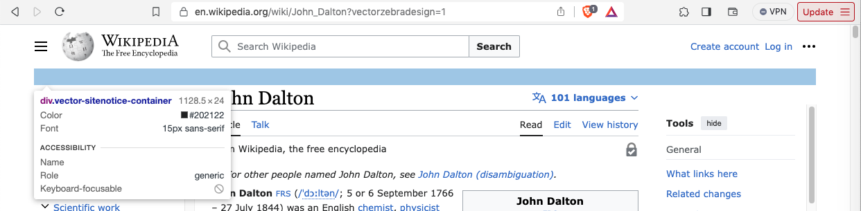
It appears to me that the sitenotice is reserving a 24px vertical space in Vector 2022, even when there is no central notice to display.
What should have happened instead?:
The sitenotice div should be 0px tall in Vector 2022 when it is empty, as happens in Vector legacy.
Software version (skip for WMF-hosted wikis like Wikipedia):
Other information (browser name/version, screenshots, etc.):
Vector legacy:
Vector 2022:
I can imagine a developer saying "It's 24px, what's the big deal?" As you have seen in the long discussions about Vector 2022, wasted white space is extremely bothersome to many editors. I noticed this discrepancy because I had loaded a set of What Links Here pages in which the first clickable link was displayed at the bottom of the page in Vector legacy, but required scrolling in Vector 2022. With these wasted 24px collapsed, the link would have been displayed. A little scrolling may not seem like much, but when you are a wikignome loading 100 of these pages every day to fix errors, that's 100 instances of unnecessary scrolling every day.