Page MenuHomePhabricator

improve responsiveness of contact page
Closed, ResolvedPublic

Description

Problem statement
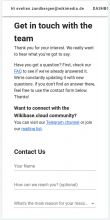
Our supported minimum screen size is 320px wide. Currently the input components don't fit into the view port anymore at that size. The components don't shrink beyond a size of 320px themselves.

image.png (879×320 px, 52 KB)

Suggestion:
Allow for the components to shrink further, until the view port reaches the break point of 320px (should be somewhere around 280px for the components, depending on the exact number of the spacing on the left).

Figma link

image.png (768×211 px, 31 KB)

AC

  • when viewport is at 320px or higher, all input components are entirely visible and usable (not cut off by view port)

Event Timeline

Charlie_WMDE renamed this task from Confirm design layout of contact page with UX to improve responsiveness of contact page.Jan 11 2023, 11:22 AM
Charlie_WMDE updated the task description. (Show Details)
Charlie_WMDE added subscribers: Deniz_WMDE, Evelien_WMDE.

Looks good when it comes to the body, but the top menu when logged in is not properly mobile friendly, see screenshot:

Screenshot from 2023-01-19 10-23-12.png (826×416 px, 71 KB)

So when on mobile and logged in, I can't navigate to anything other than the footer items or to "dashboard" using the top menu.

When not logged in, "sign up" and "log in" appear next to each other just fine, as specified in Figma, so this is as expected.

Since it's not specified in Figma how it should look when logged in, for me it's ok to close the ticket and make a separate new ticket to find a solution.

@Charlie_WMDE FYI

Good find! Note: this even is an issue for the entire site, not only for the contact page

uff, good catch, thanks evelien! will make a separate ticket for this!

Evelien_WMDE claimed this task.