Page MenuHomePhabricator

DefaultView: Create ZBoolean custom component
Closed, ResolvedPublic

Assigned To
Authored By
gengh
Jan 16 2023, 10:26 AM
Referenced Files
F36476754: image.png
Jan 24 2023, 4:11 PM
F36476446: image.png
Jan 24 2023, 4:11 PM
F36319746: image.png
Jan 19 2023, 10:56 AM
F36319728: image.png
Jan 19 2023, 10:56 AM
Restricted File
Jan 17 2023, 4:54 PM

Description

Description

Create ZBoolean custom component following the same patterns as other default/* components created for the DefaultView

Desired behavior/Acceptance criteria

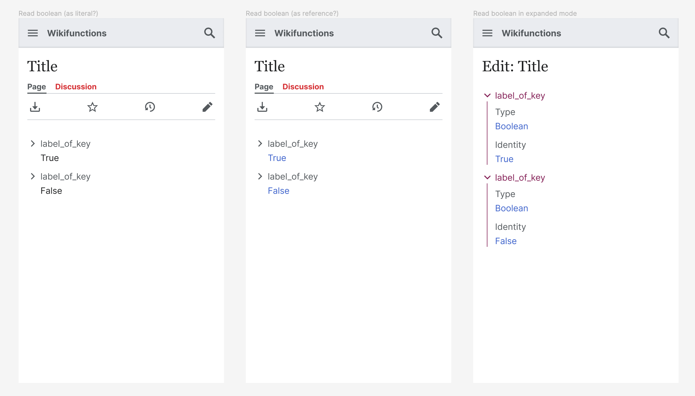
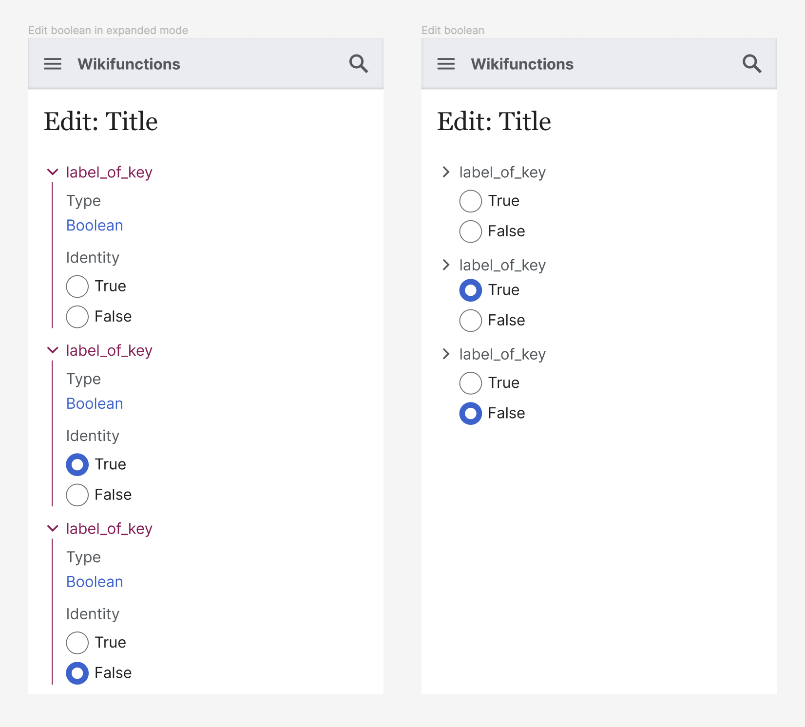
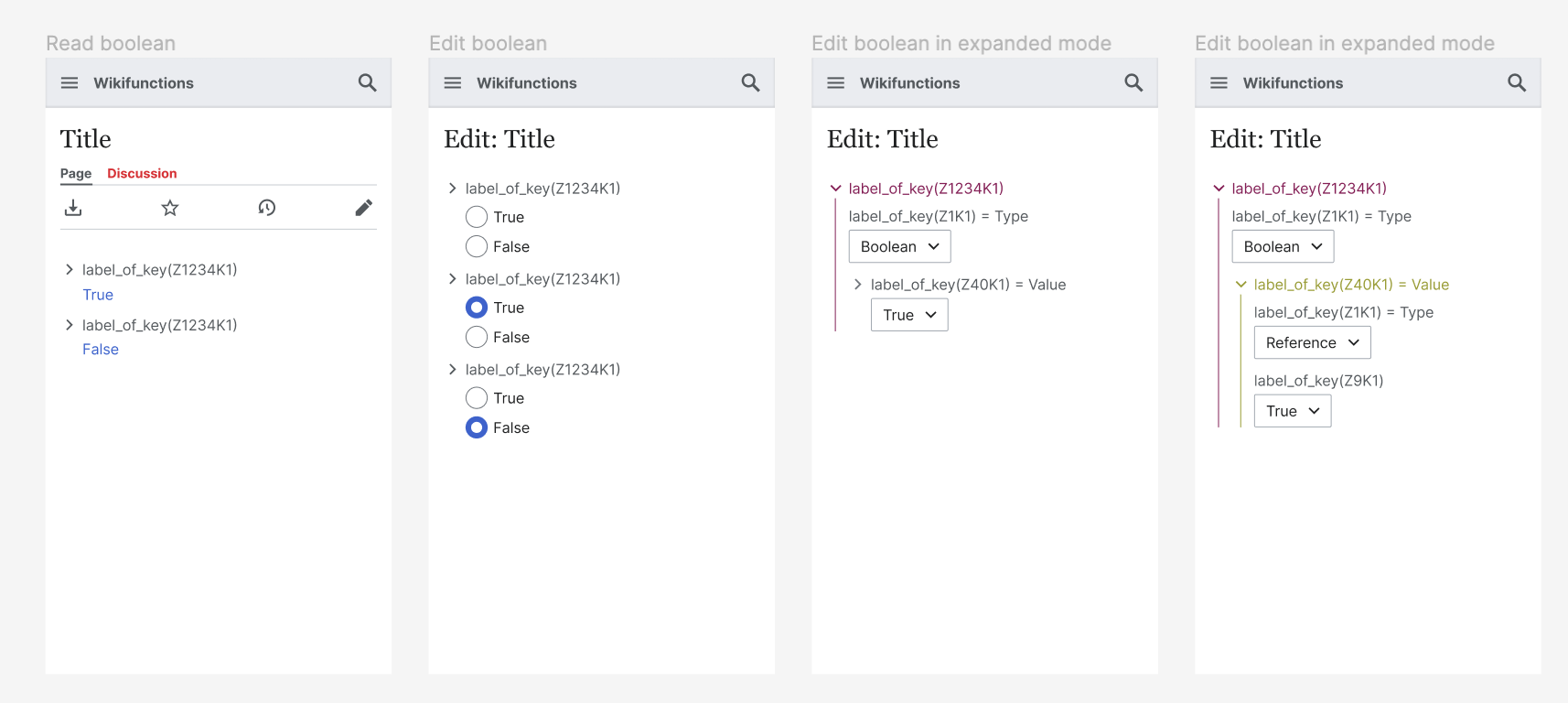
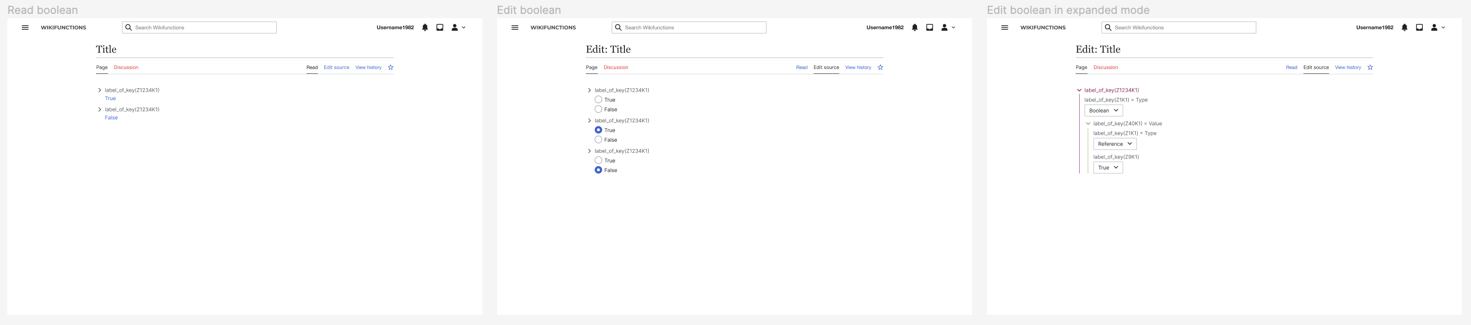
  • Implements a selector with only two choices (true/Z41 and false/Z42)
  • Uses cdx-radio component
  • Styles according to the attached designs*

Devices and Design (URLs or screenshots)

Figma: https://www.figma.com/file/1G8ZCb8Ceyvq8gnp1Vp0ko/T327059?node-id=0%3A1&t=rRKASiMdkhx6tuTE-1


Completion checklist

Event Timeline

Could use https://doc.wikimedia.org/codex/main/components/demos/button-group.html with "True" / "Select" / "False" instead of cdx-select, which is much easier to see for users and more standard for this kind of input? @AAlhazwani-WMF, what do you think?

Could use https://doc.wikimedia.org/codex/main/components/demos/button-group.html with "True" / "Select" / "False" instead of cdx-select, which is much easier to see for users and more standard for this kind of input? @AAlhazwani-WMF, what do you think?

+100! Generally, when we have less than 2/3 options, we should opt for radio/checkboxes buttons. When we have less than 3/4 options we could use button groups (if button labels are short enough), and when we have more that 5 option we could use selects. Radio buttons, checkboxes, and button groups are a great way to surface content just in time, and not hide it behind a component/interaction.

{F36287020}

A clarifying question, what is "Select" option for? The option between "True" and "False".

It's for when the user needs to take action to select which one, but has not yet. I was thinking that clear feedback of the state of the input (as opposed to "neither of the states have been selected") was important. (This mirrors the three options we currently have in the drop-down this will replace.)

I'd like to suggest to remove the "Select" option

I was at first surprised by the idea of radio buttons instead of a drop down for this, but it makes sense: it reduces the necessary interactions and makes it faster to select.

Why was I surprised? I guess because one would read both true and false, even though only one of them is selected. It seems easier to read when only one is shown.

But then I thought, hey, that's only relevant for editing mode, that you see both. When it is already saved, you'd only see a reference anyway (either to true or false) and not an unchangeable button with both options. So yeah, so it sounds good.

These are just recommendations, I am not a designer.

But then I thought, hey, that's only relevant for editing mode, that you see both. When it is already saved, you'd only see a reference anyway (either to true or false) and not an unchangeable button with both options. So yeah, so it sounds good.

Yes, this is exactly the design rationale behind the suggestion. In read mode we could display the identity value when not expanded. Question: should we display the identity as a literal or as a reference? I noticed that we have Z41 for true and Z42 for false.

image.png (1×2 px, 165 KB)

While, when editing, we could display a zero-mode state when you create a new key of type boolean, where none of the identities are selected. Then, once you select one of the two, "there's no going back". It's either true or false, similarly to how radio buttons work by default. As for the monolingual text, when you create a new key you "land" on expanded mode, and it should not be possible to publish if you leave a boolean key unset.

image.png (1×1 px, 167 KB)

Does it make sense? Anything missing or that might be improved?

Question: should we display the identity as a literal or as a reference?

Reference, because

  1. it is a reference
  2. this makes it automatically translated

This design looks good to me!

@JKieserman i updated the task description with a link to a specific figma file! since vector 2022 and minerva do not share the same base font size (14px vs 16px) i created both variants.

besides the font size, there are minor differences in spacings, once you start to work on this feel free to ping me for additional details. while working with @gengh on T323013 we noticed that the implementation was much more spacious compered to the designs, and this is because all designs were (erroneously) set with a base font size of 16px.

let's chat in order to understand if it makes sense to touch the spacings of labels, keys, ... in this patch, or if it should be addressed separately. thank you!

hello hello, after a brief chat with @gengh I updated the figma file for the zboolean to reflect the default view architecture, especially in expanded mode. here's a couple of screenshots for wider visibility.

read and edit boolean on mobile web

image.png (768×1 px, 118 KB)

read and edit boolean on larger screens

image.png (656×2 px, 111 KB)

Change 883229 had a related patch set uploaded (by Jkieserman; author: Jkieserman):

[mediawiki/extensions/WikiLambda@master] Create ZBoolean Component for Default View

https://gerrit.wikimedia.org/r/883229

Change 883229 merged by jenkins-bot:

[mediawiki/extensions/WikiLambda@master] Create ZBoolean Component for Default View

https://gerrit.wikimedia.org/r/883229

The designs put the options on top of each other, in the implementation they are next to each other. I am happy with either, and I have seen that @AAlhazwani-WMF has been aligning them horizontally in the new designs, but I wanted to check before closing.

As discussed, the designs have been updated. Closing!