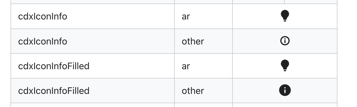
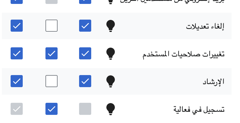
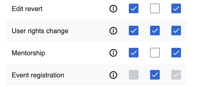
Per discussion in T310665: Impact module: summary panel, specifically brought by @Etonkovidova in T310665#8426469 the information icons shown across GrowthExperiments extension have discrepancies in size and behavior for arwiki and other languages where a light bulb graphic is shown instead of a latin character (i). This problem can be seen in both newcomers homepage and the mentor dashboard.
| Homepage Arabic | Mentor dashboard Arabic |
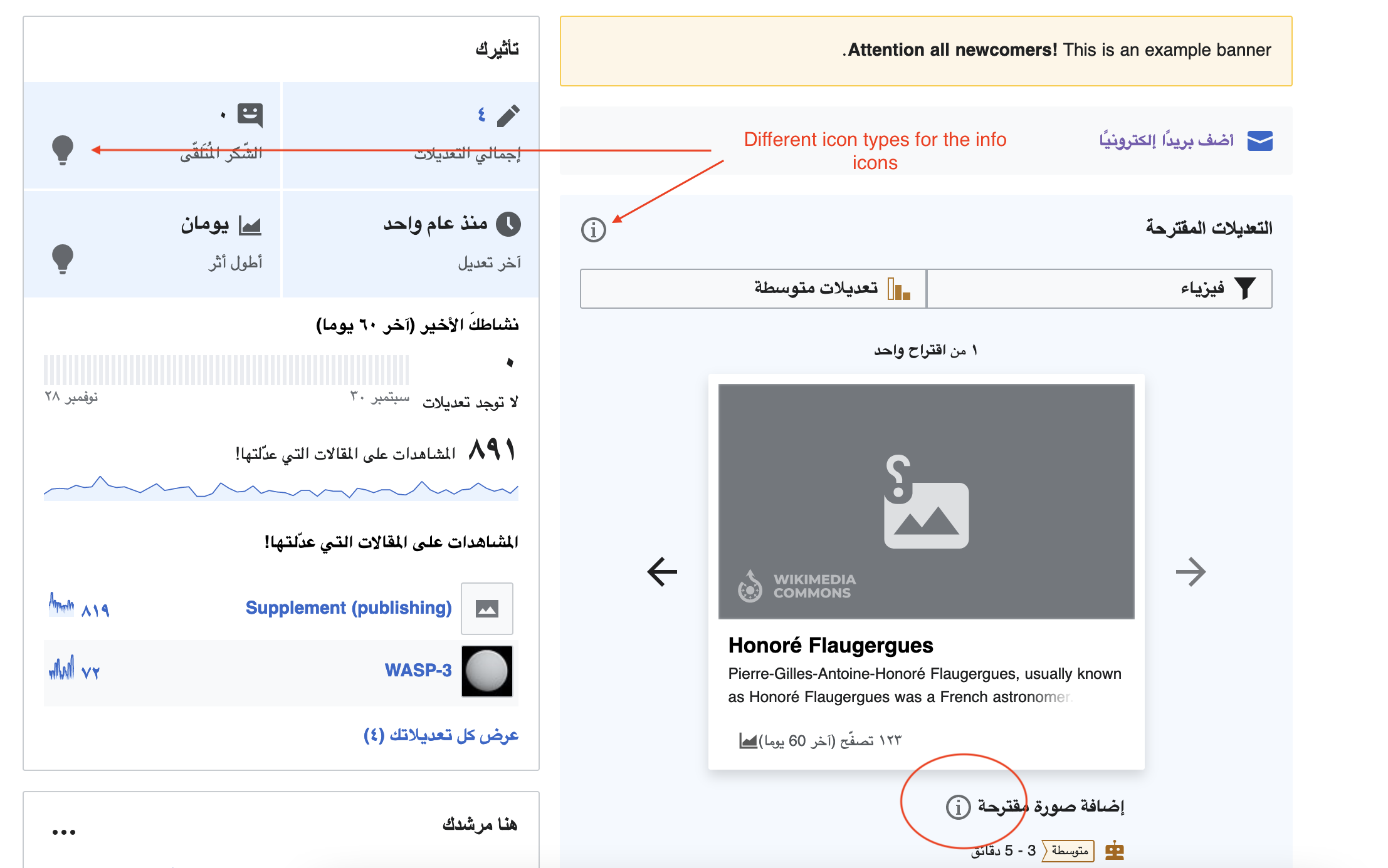 | 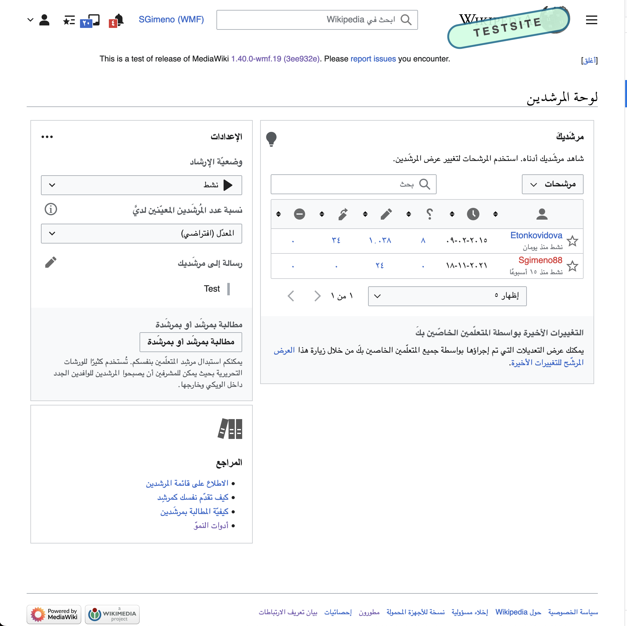 |
This is due to the use of two different source icons, ìnfo-unpadded and CdxInfo.
Proposed solution
Use OOUI's ìnfo and adjust styles if needed
Acceptance criteria
- All information icons use the light bulb graphic in Arabic
- Icons with the same semantics use the same color palette and sizing
- Clickable icons have a defined size for its clickable area (eg: Button type=quiet)
- Enabled icon-only buttons have a defined color
- Disabled icon-only buttons have a defined color
- DRAFT: Icons size adapt to the platform desktop/mobile
- Create a CSS utility or LESS mixin to make it easy to match icons from both libraries on the same page
Notes
Since it seems we mostly use "icon only" buttons as inline help for a particular line or lines of text I wonder if the size should be defined relative to the font-size. That wouldn't solve the size discrepancies still but would align them with the font-size discrepancies we have, eg: T312245: Adjust small font size on the Homepage and Mentor dashboard.
Since we are mixing OOUI and Codex icons it would be convenient to create some styles that help us display both types of icons in a consistent way.