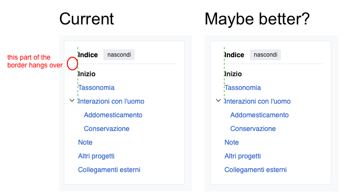
Page MenuHomePhabricator

Increase space between groups in main menu and page tools menu
Closed, ResolvedPublic2 Estimated Story Points

Description

Description

To help people better scan and parse the main menu and page tools menu, we should increase the spacing between the groups by adding 6px of spacing above and below each divider line. For example:

Current menuMenu with increased spacing
image.png (1×418 px, 211 KB)
image.png (1×418 px, 192 KB)

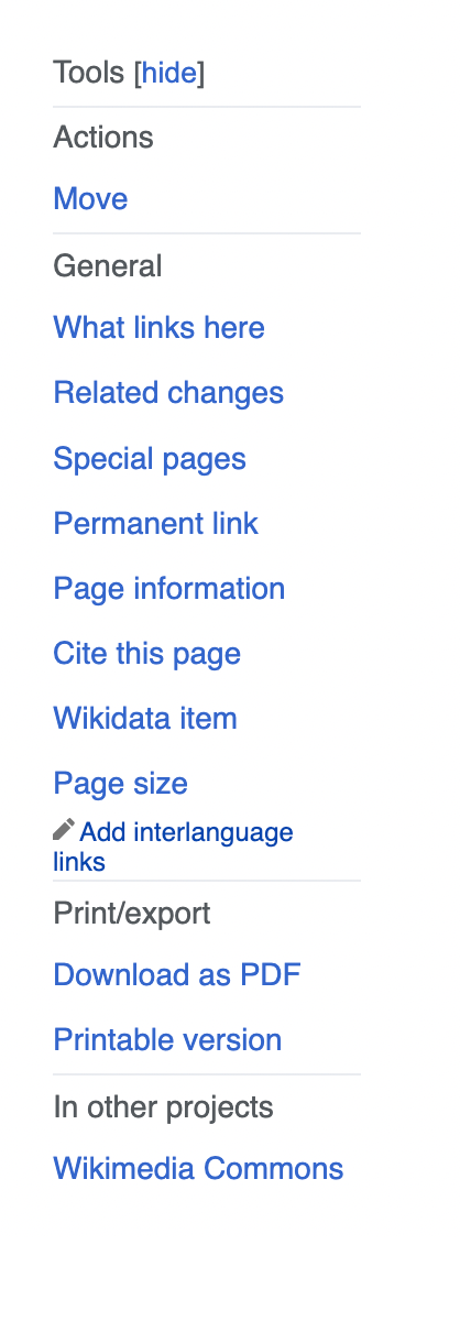
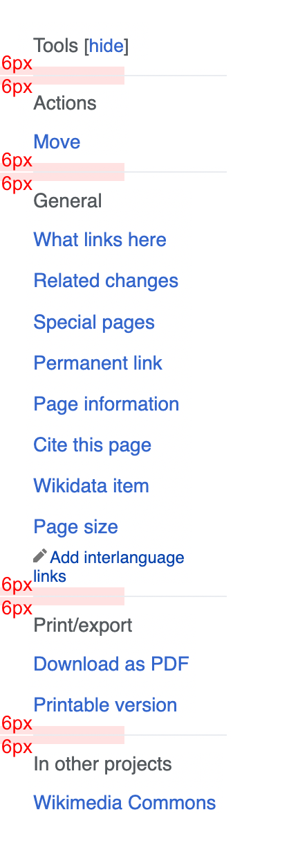
Thanks to @TheDJ for calling this out (T324877#8540834)

Event Timeline

ovasileva triaged this task as Medium priority.Jan 23 2023, 9:55 PM

Please don't add to the already excessive white space in these menus without first decreasing the excessive padding between list items and fixing the font size. See T327732 for some details.

Please don't add to the already excessive white space in these menus without first decreasing the excessive padding between list items and fixing the font size. See T327732 for some details.

Thanks for pointing that out. Just to clarify: part of what's happening here is that to reduce code complexity we're using the same padding for the table of contents items as we are for the other menu items. In the near future we can take a closer look at what differences make sense amongst the different types of lists/menus.

Yes, with a few mysterious exceptions like "Edit interlanguage links", the padding and font size are consistently too large in all of the sidebar groups. If the size and padding assignments are all in one place, fixing them should be straightforward. You have set yourself up for a quick win.

LGoto set the point value for this task to 2.Jan 26 2023, 6:19 PM

Is this task even necessary now with the Zebra design? @Jdrewniak can we just decline this?

I guess we could, but T327732 was closed, and the vertical spacing between items and the font sizing in Zebra is still a mess. Is there a ticket that is still open to address these problems?

@bwang @Jdrewniak where can we check out the latest zebra prototype? I don't think adding the gray backgrounds and white boxes would remove the need to fix the spacing, but perhaps you mean that spacing was already adjusted as part of some other task?

hi @hold_your_horses, the zebra design can be viewed by adding the following param to the url ?VectorZebraDesign=1 to most wikis*, eg:

https://www.mediawiki.org/wiki/MediaWiki?VectorZebraDesign=1

The alignment of the content boxes has changes in the Zebra update and so has the menu spacing, as described in this ticket: T333927#8811199.

@Jonesey95 Do those changes sufficiently address the issues in this ticket?

*We're currently running an AB T335972 test with this design so the param is disabled on the following: hewiki, enwiki, fawiki, frwiki, kowiki, ptwiki, srwiki, thwiki, trwiki, viwiki.

thanks @Jdrewniak : )

That looks great, and in my opinion takes care of the work described in this task. I think T328720 will help make the menus even more readable.

Look at those hide and move to sidebar buttons looking like buttons 😍 One tiny thing I noticed (and I'm very much out of the loop, so forgive & ignore me if this has already been discussed):

image.png (401×705 px, 32 KB)

@hold_your_horses I've filed T340481 to resolve the issue with the TOC border, so I think with the upcoming Zebra update, this task can be resolved.