Page MenuHomePhabricator

Improve the landing page of a shared reading list per design specs
Closed, ResolvedPublic

Description

Problem (Video)
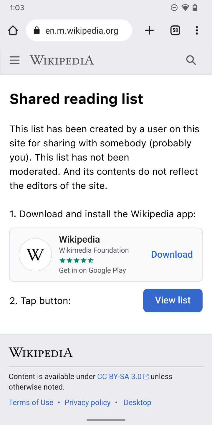
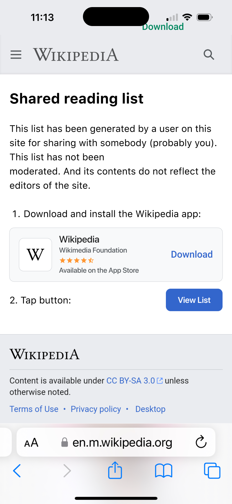
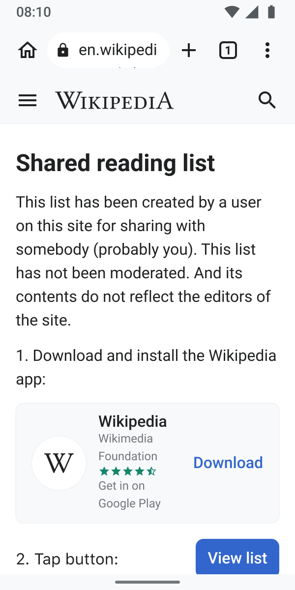
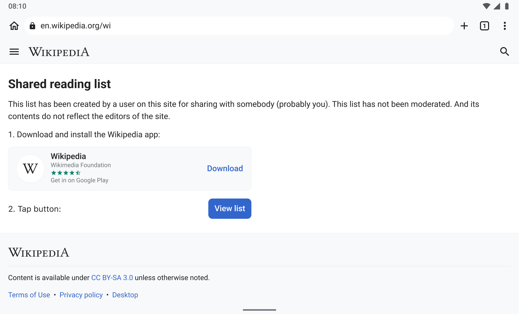
  • The tests revealed that participants had a hard time identifying what the landing page was all about. Participants were looking for a way to view the list on the Wikipedia app before they realized that the yellow box was the actual instruction.
  • The current landing page design led to confusion as it was perceived as an error message by some users.
Solution
  • We need to make sure that the page looks on brand
  • The design and copy of the landing page need to be optimized per design specs on Figma for both Android and iOS, to be perceived as actual Wikipedia content and not an error.
Design

Event Timeline

@scblr @JTannerWMF If we want this updated interface to be fully translated upon release (outside the normal TWN process), we will need translations to be pre-populated in our spreadsheet. I have added a few lines at the bottom that represent the new strings added here, that will need translations.

Thanks @Dbrant – I just submitted the spreadsheet for translations. The same goes for T327903. I will update the tasks once we receive them (CC: @JTannerWMF).

@scblr A few more minor questions about the updated appearance, particularly in different browsers and form factors:

  • If the landing page is loaded in a desktop browser, which app link should be displayed, Android or iOS?
  • If the screen is very narrow, the "Download" button will collide with the "Get it on Google Play" text. What should happen in that case?
  • If the screen is very wide (i.e. desktop browser or landscape on mobile), the "View list" button will be on the opposite side of the screen from the "2. Tap button" text, and appears too disconnected.

Change 895314 had a related patch set uploaded (by Dbrant; author: Dbrant):

[mediawiki/extensions/ReadingLists@master] [WIP] Update design of landing page for sharing reading list.

https://gerrit.wikimedia.org/r/895314

@scblr A few more minor questions about the updated appearance, particularly in different browsers and form factors:

  • If the landing page is loaded in a desktop browser, which app link should be displayed, Android or iOS?

Show both banners. Like this:

reading-list-share-07.png (1×720 px, 107 KB)

  • If the screen is very narrow, the "Download" button will collide with the "Get it on Google Play" text. What should happen in that case?

This (the phone in the example below is 300px wide, which is very narrow):

Let me know if I can assist in optimizing the CSS.

  • If the screen is very wide (i.e. desktop browser or landscape on mobile), the "View list" button will be on the opposite side of the screen from the "2. Tap button" text, and appears too disconnected.

Set a max width for wrapper of the banner and second step, like this:

@Dbrant and I quickly synced on this:

  • Some changes will take a bit longer, and we continue to work with Jon Robson to achieve the desired outcome (see designs in the task).
  • We will go ahead with a lightweight version of the original designs (@Dbrant can you add a screenshot, please)
  • In addition to the "download" badges, we will also provide a link to the "Download" text in order to make sure it’s accessible

Change 895314 merged by jenkins-bot:

[mediawiki/extensions/ReadingLists@master] Update design of landing page for sharing reading list.

https://gerrit.wikimedia.org/r/895314