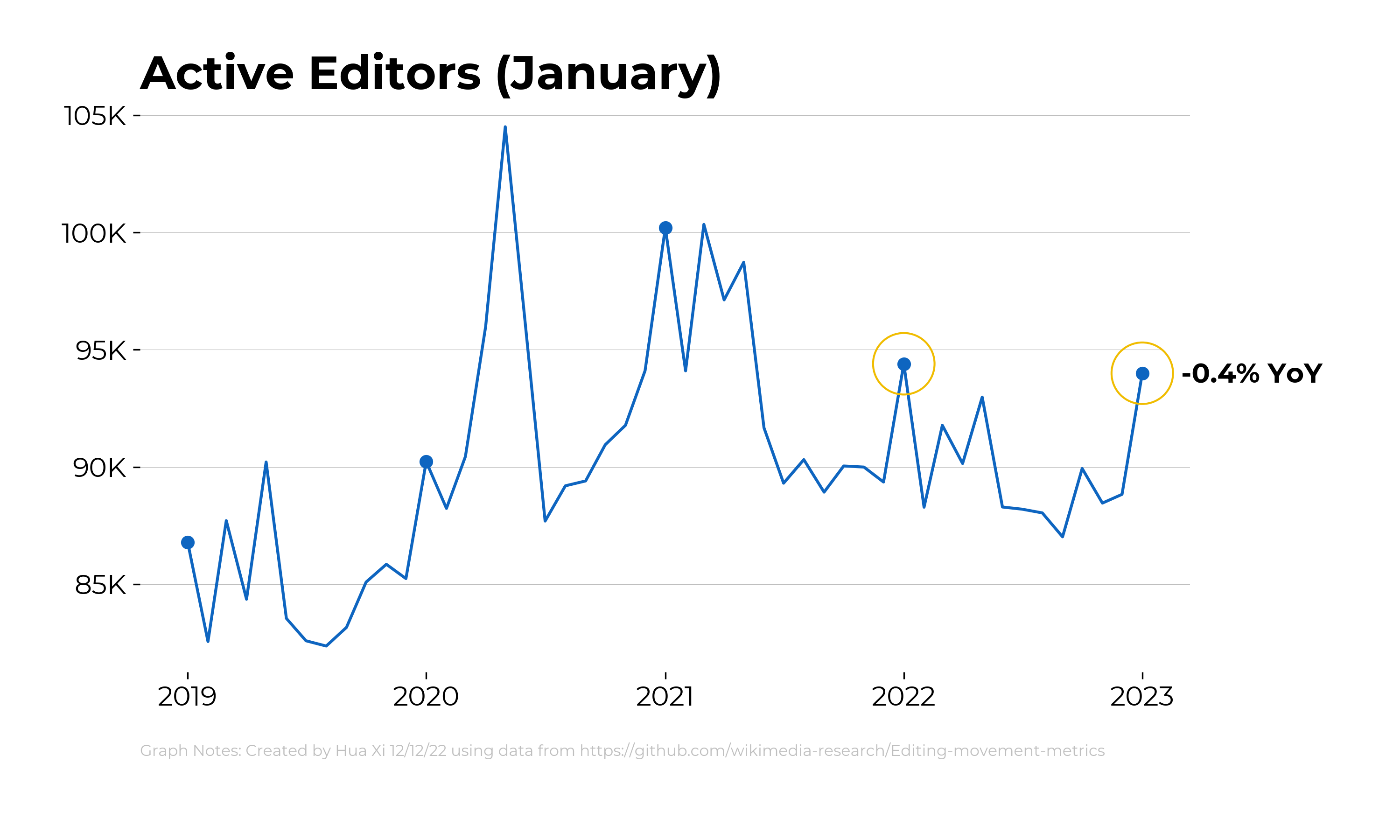
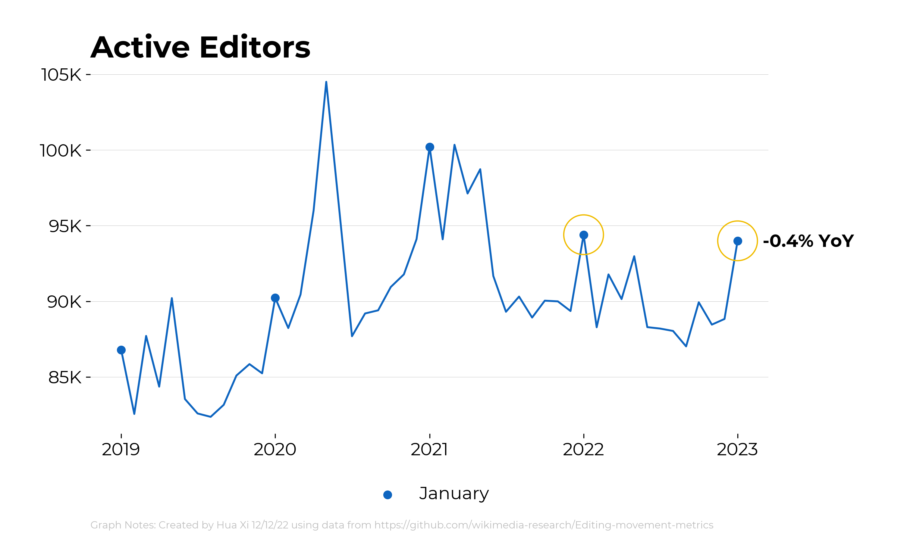
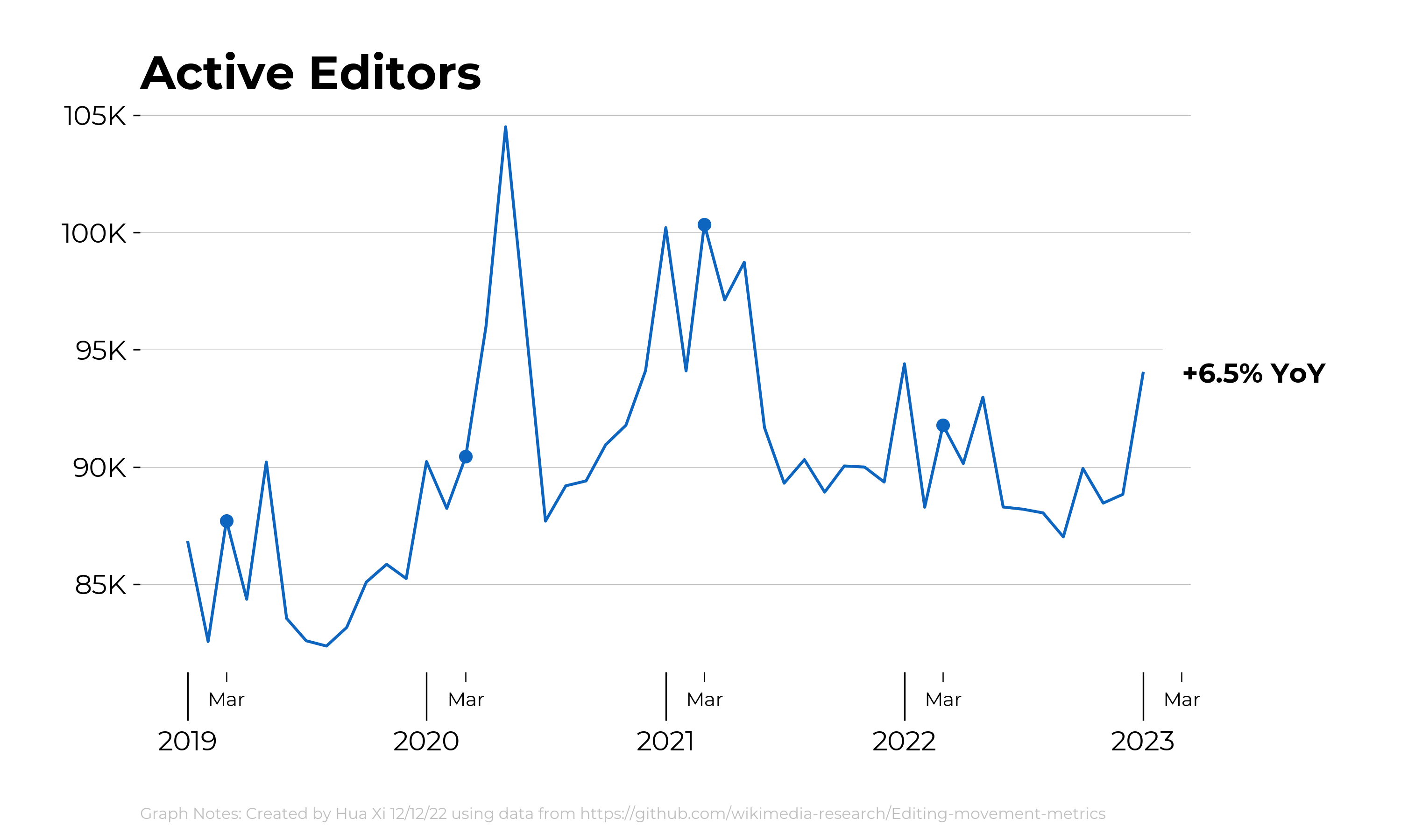
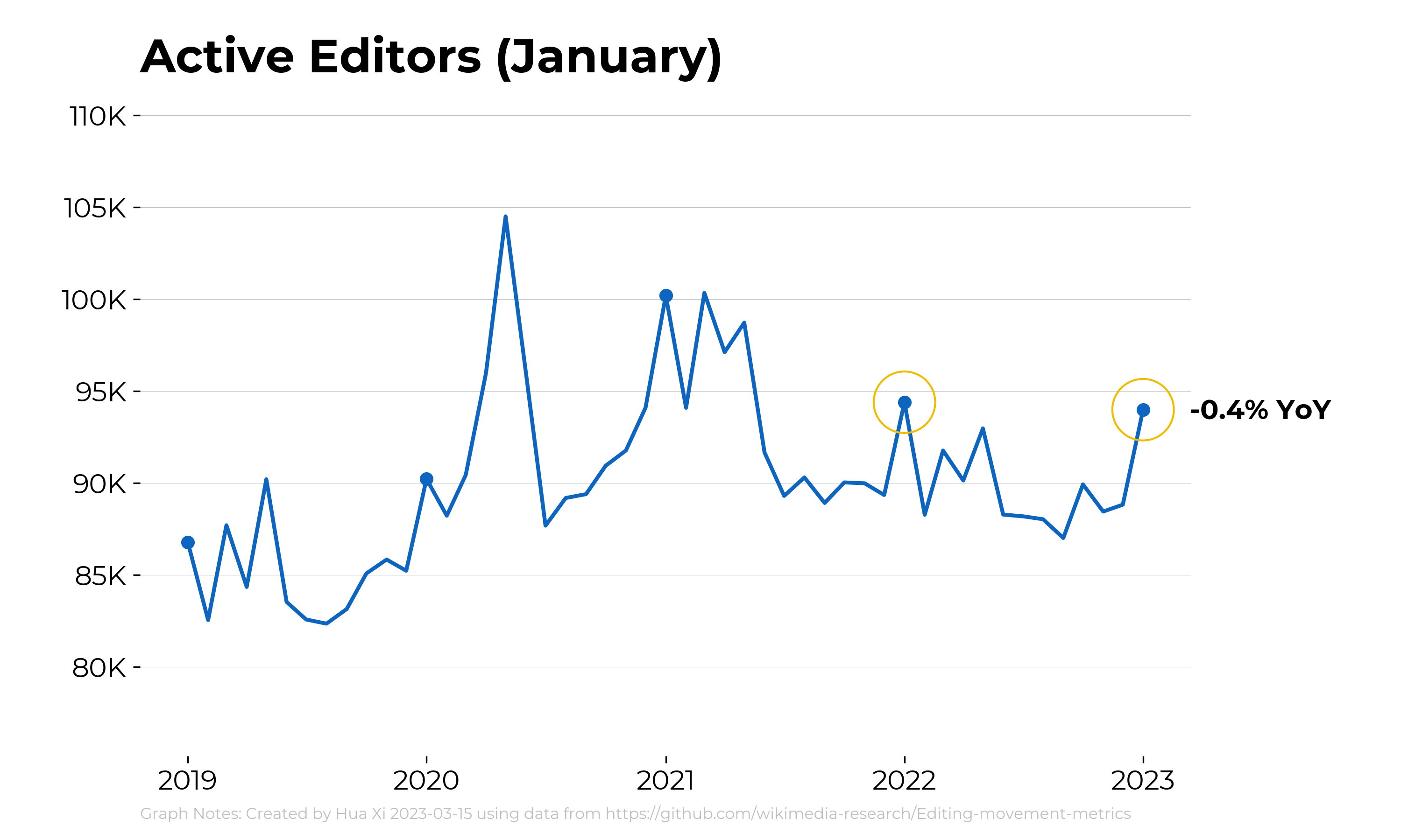
We discussed adjusting the x-axis used in the timeline visuals to make the year more prominent.
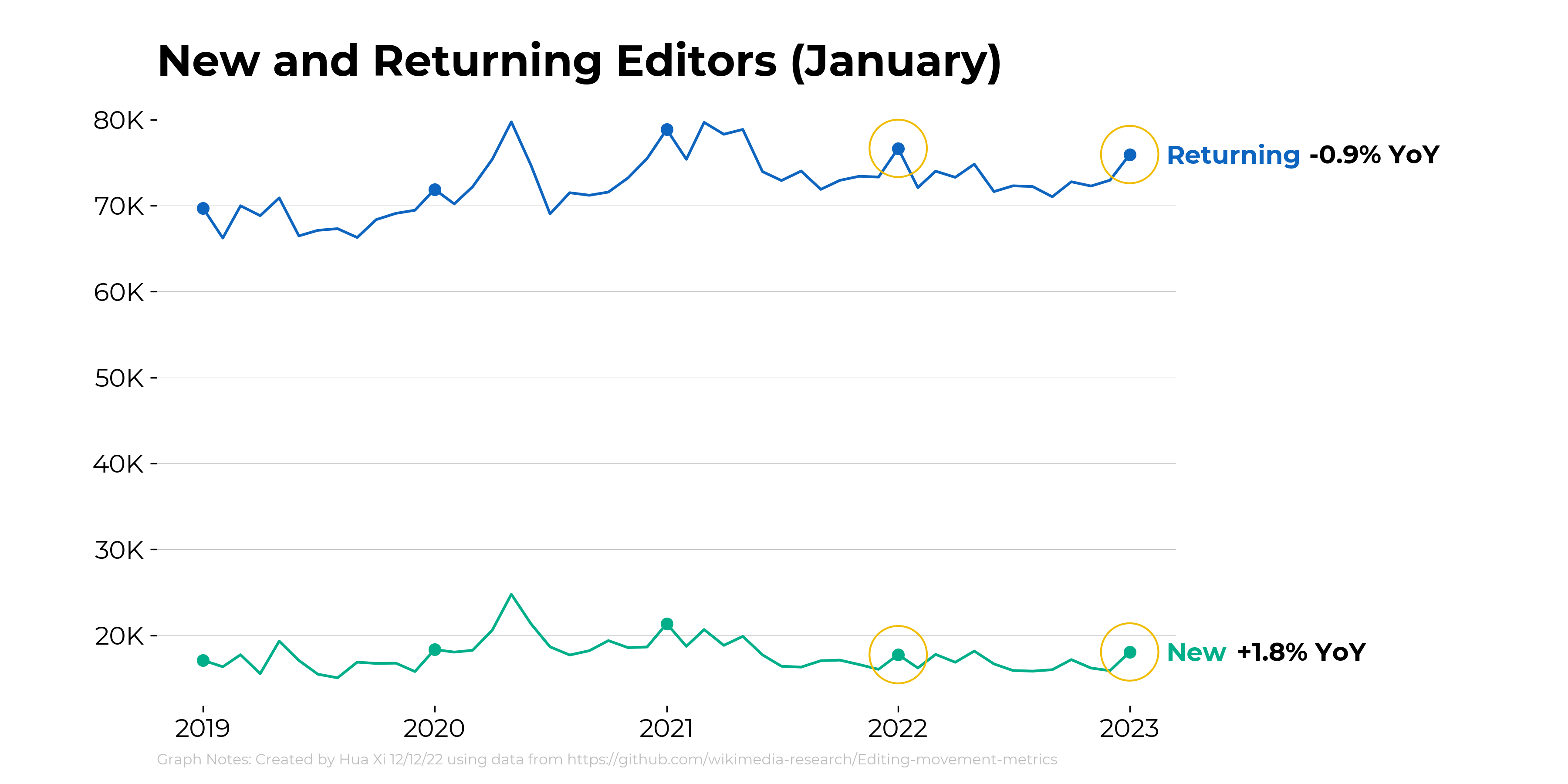
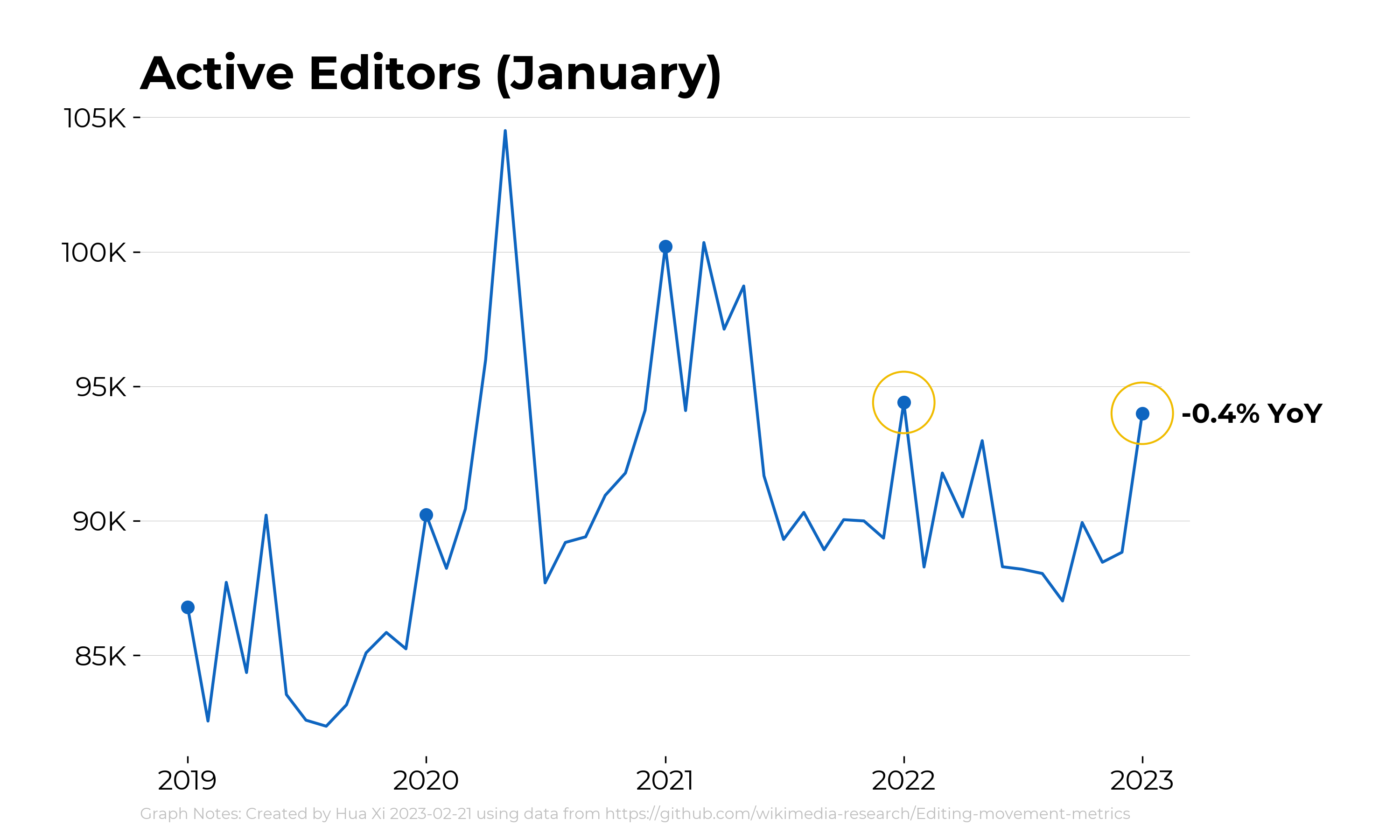
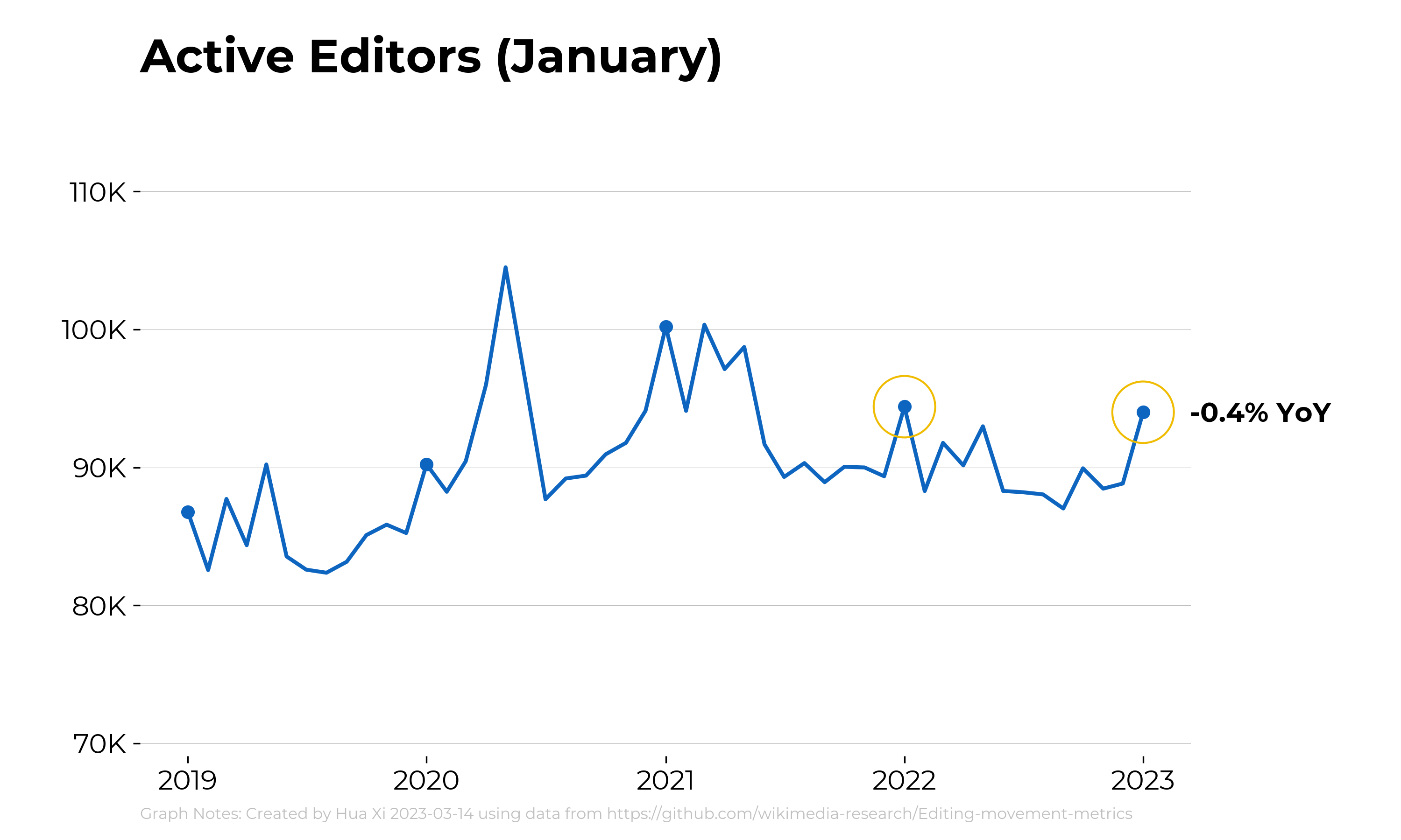
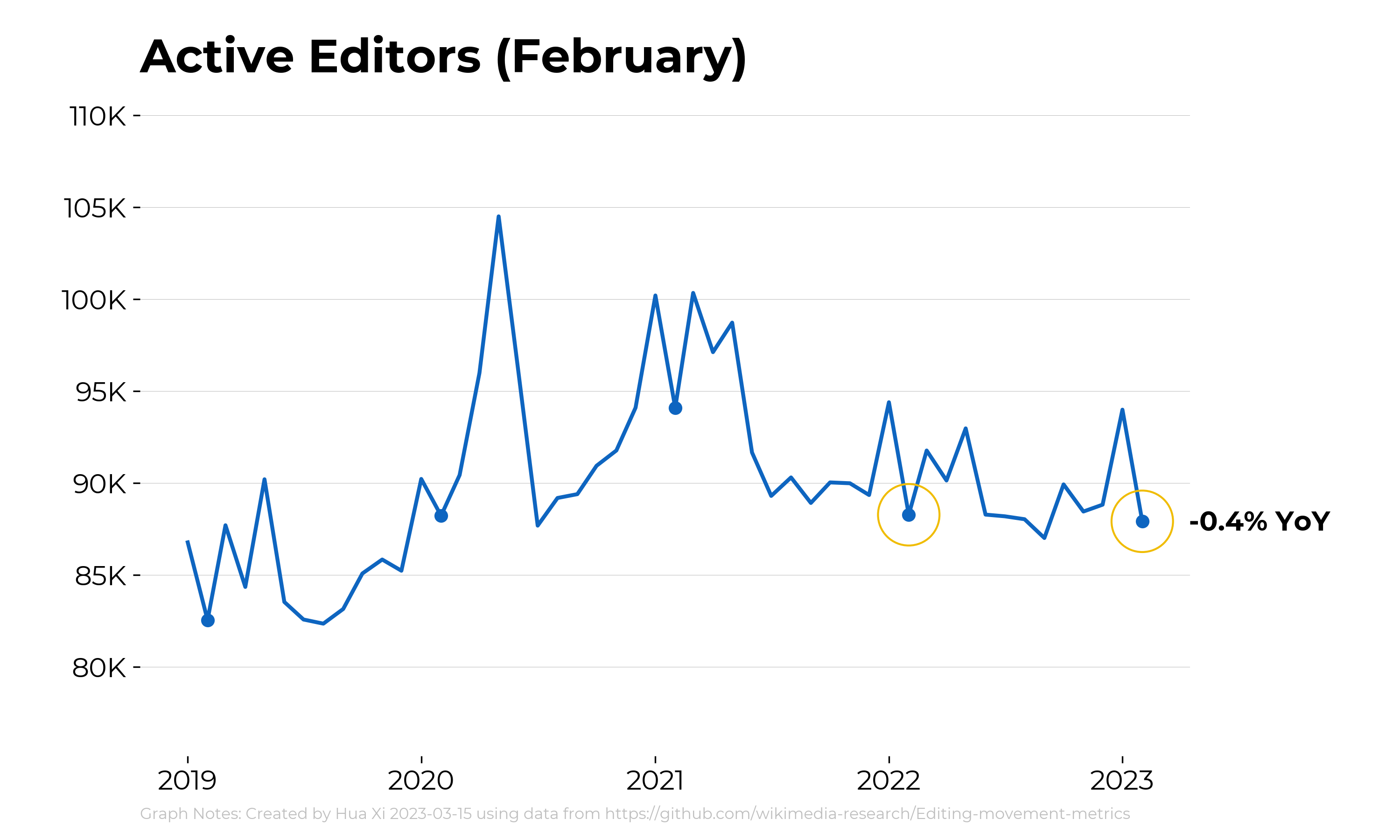
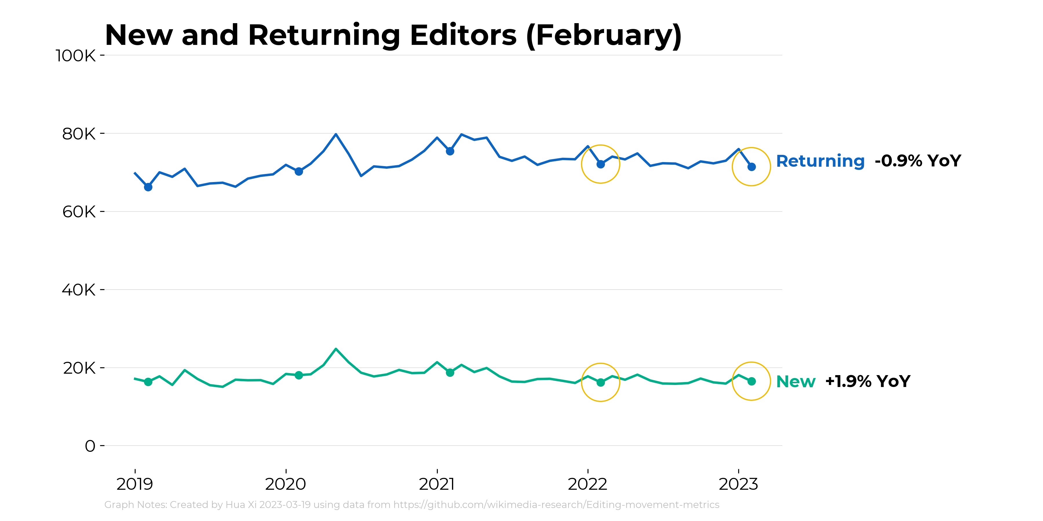
- Provide an example using the active editors data from T324372
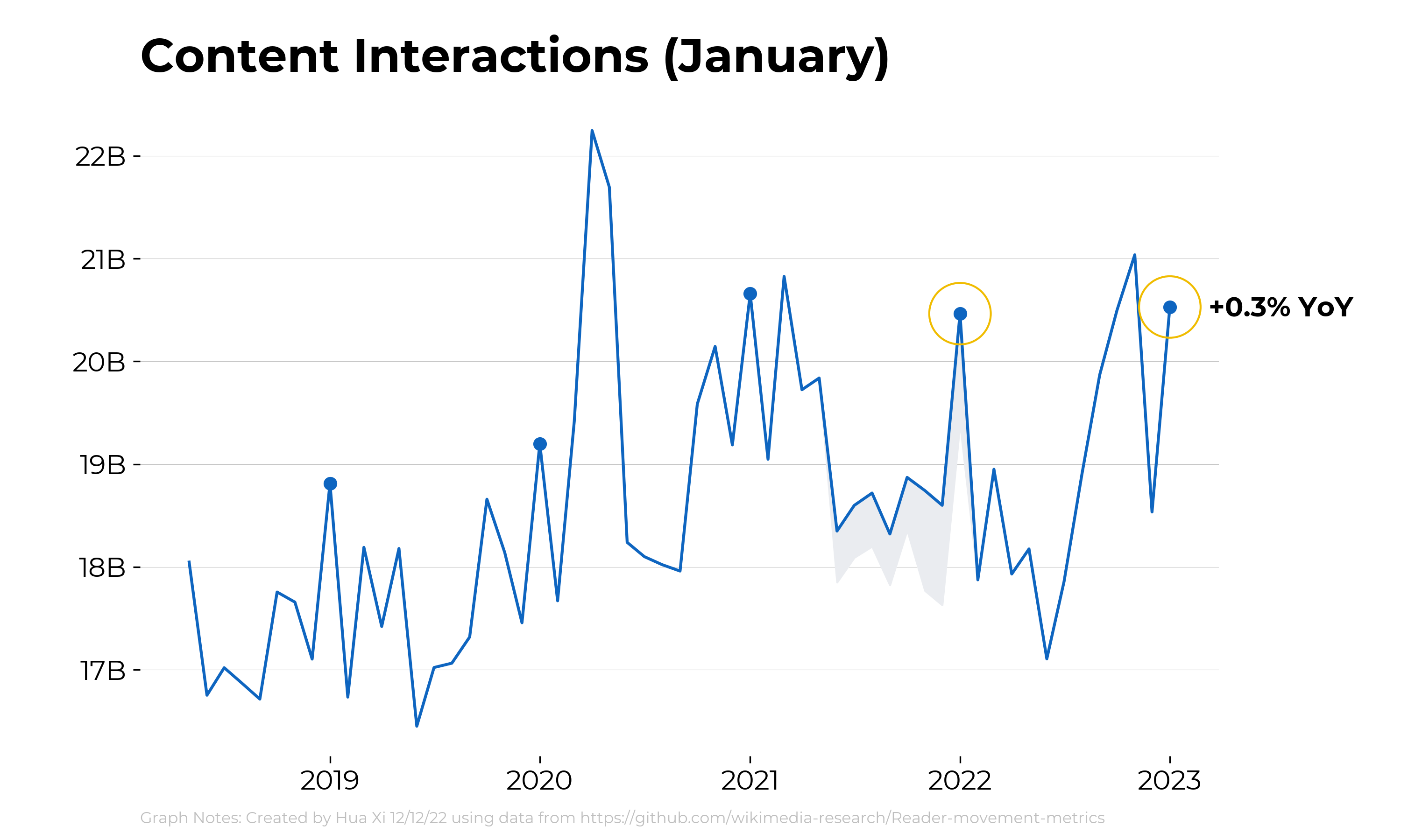
After we agree on a format, please also provide updated visuals for & ensure consistency across:
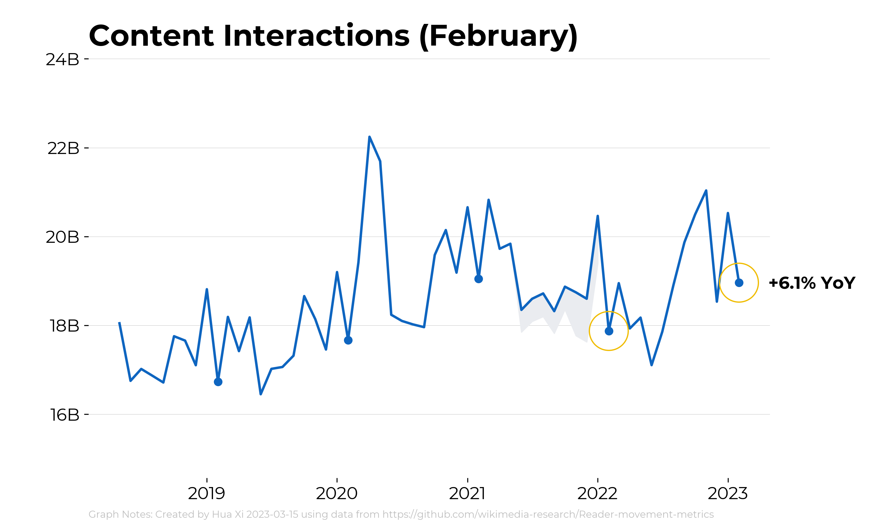
- content interactions T324372
- active editors - returning vs new T326279
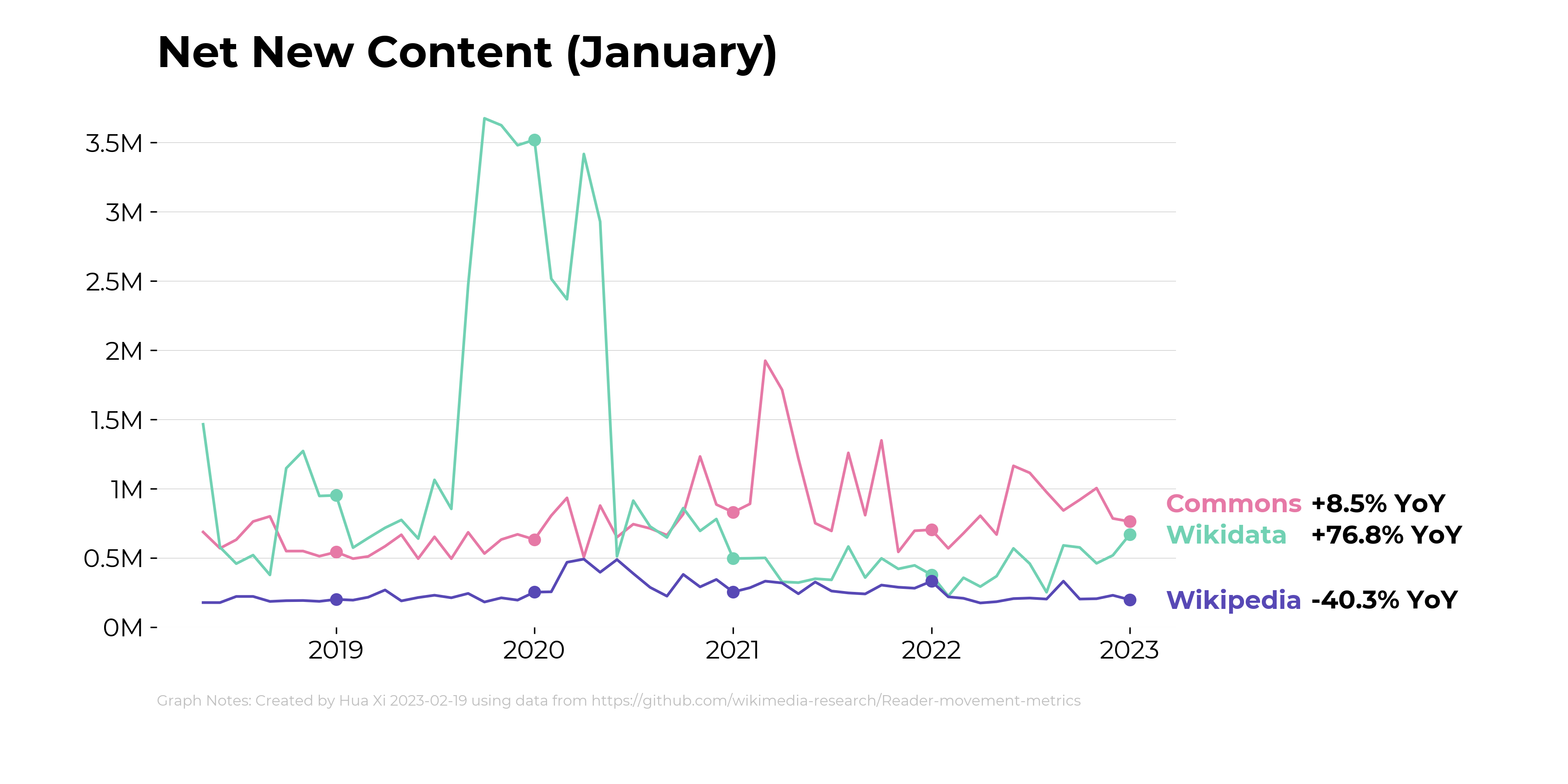
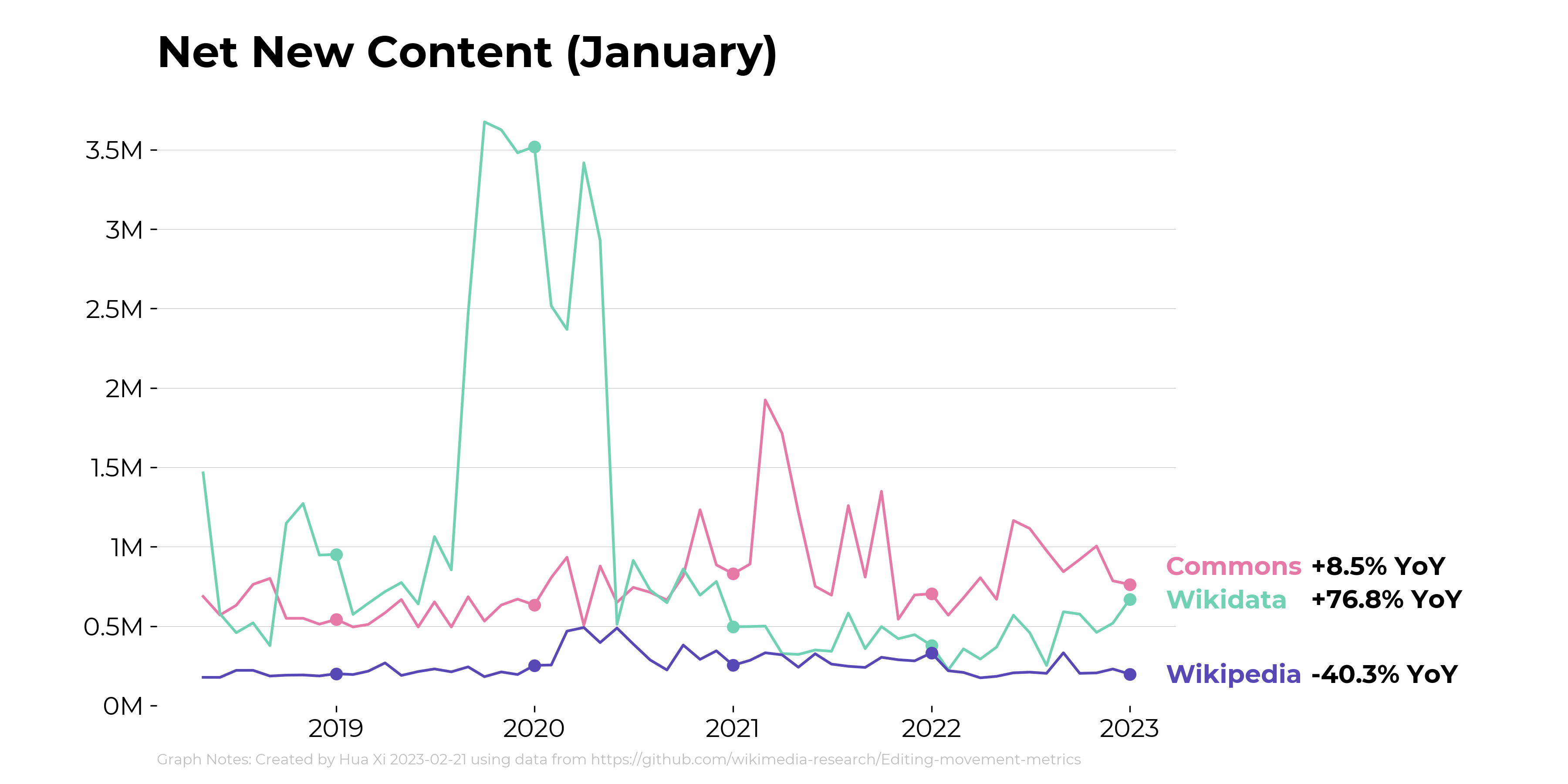
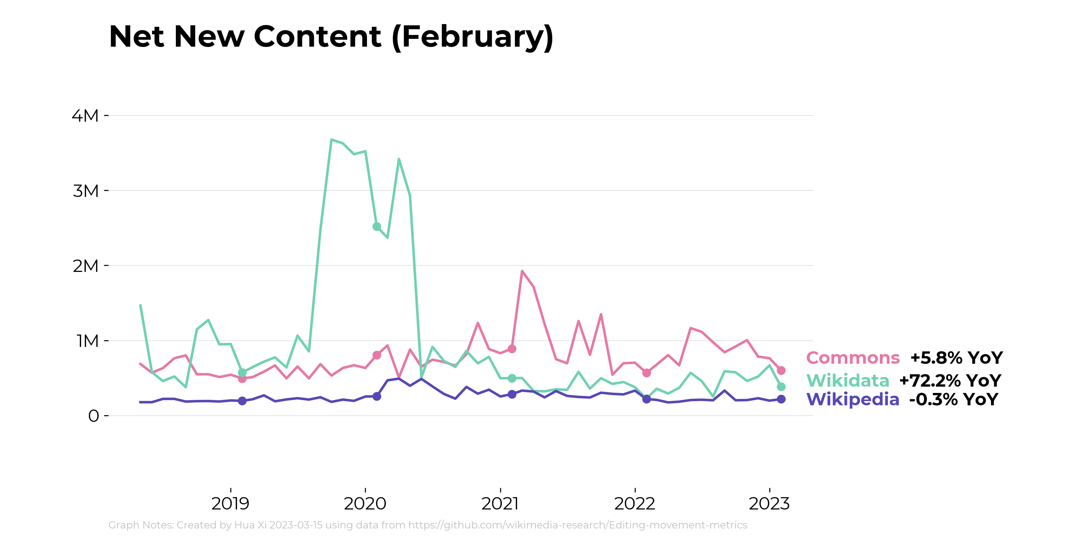
- net new content T326753
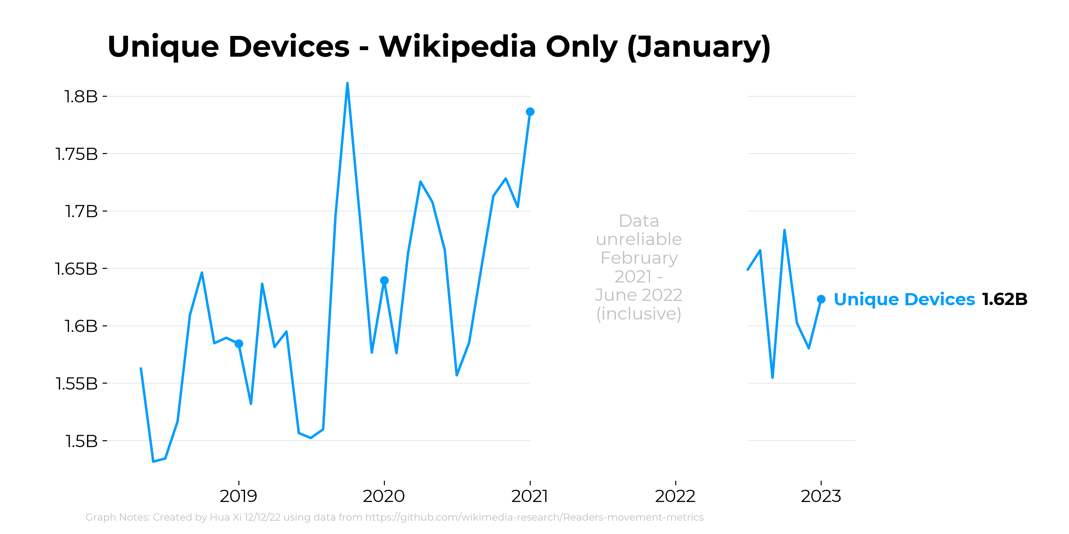
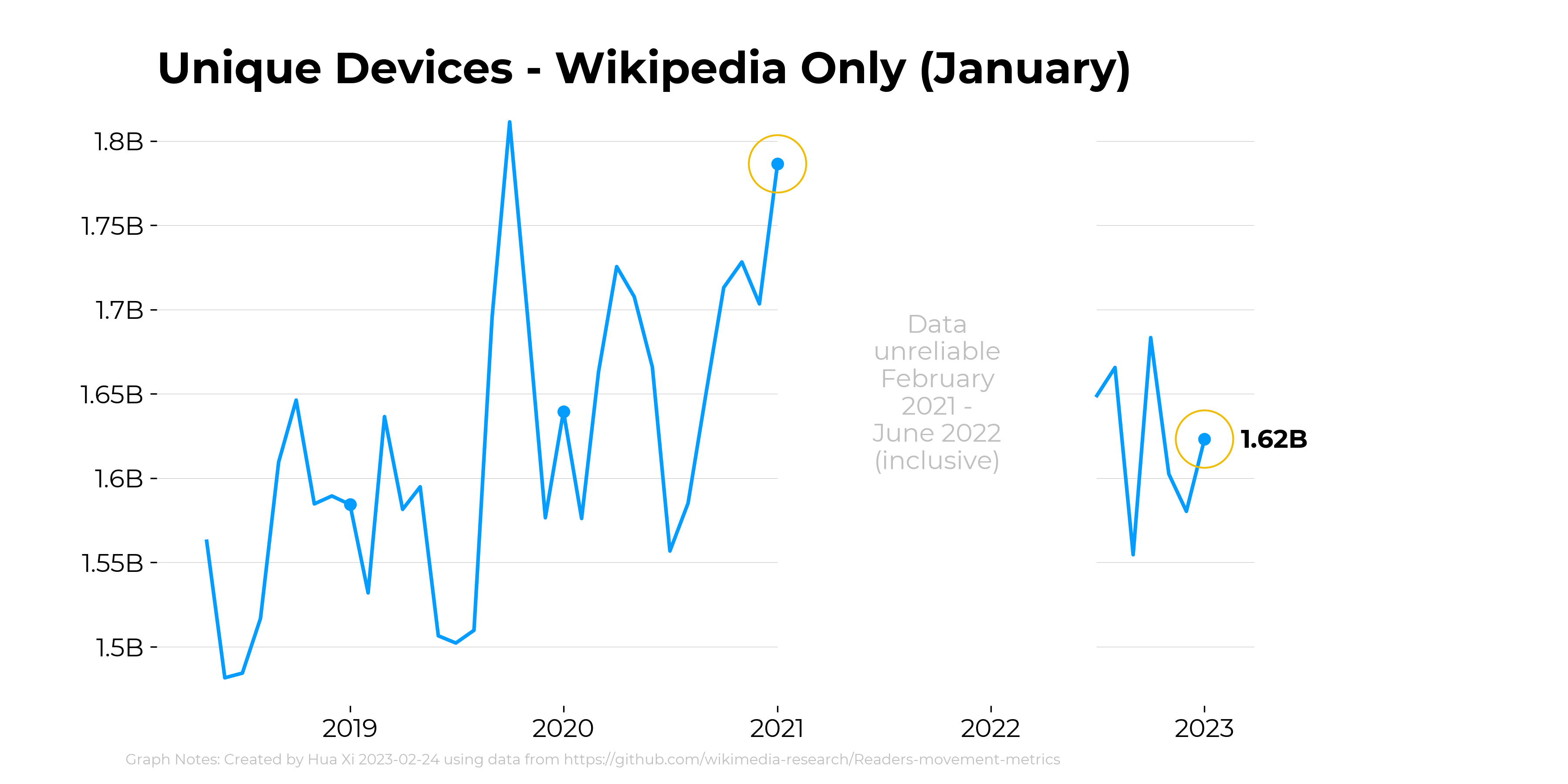
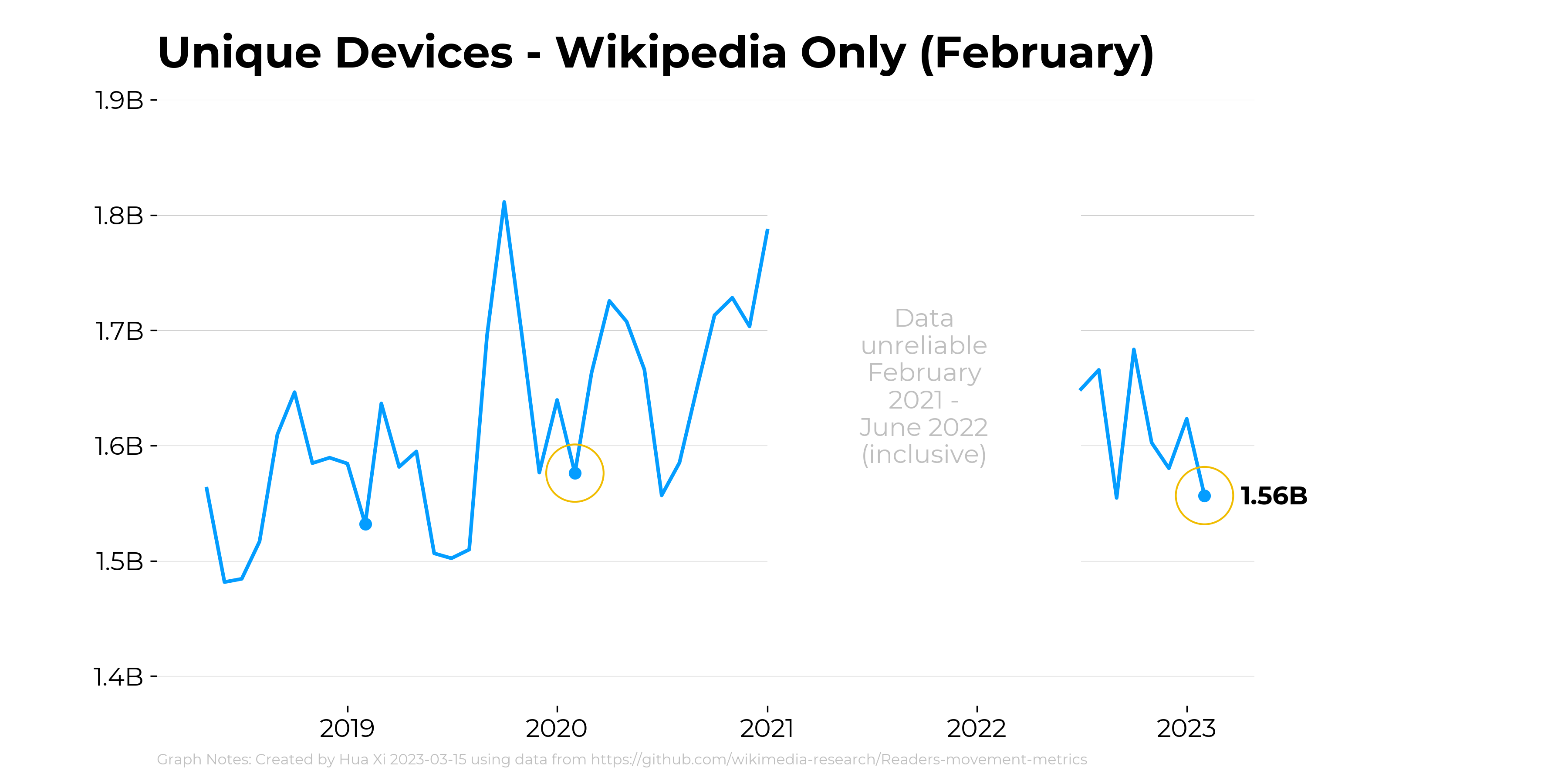
- unique devices T328978
For the final versions, use the updated January data provided by @Mayakp.wiki (T327784) and @Iflorez (T328493)