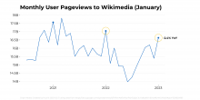
- @Mayakp.wiki to provide refreshed data for user pageviews (to update this slide in the draft deck)
- Time period: from July 2020 to Jan 2023
- @HXi-WMF to visualize the data using the format from T329585
Description
Related Objects
- Mentioned Here
- T329585: Timeline visualization template
Event Timeline
@kzimmerman can you provide more details on what this is about? The linked slide isn't public.
@Legoktm ah, this is not about GlobalUserPages. It's about pageviews to all Wikimedia sites, worldwide (not filtered by country), and only filtered to user traffic. Something like this on Wikistats https://stats.wikimedia.org/#/all-projects/reading/total-page-views/normal|line|2-year|agent~user|monthly
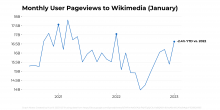
Here are some initial charts I made:
(A) This one simply displays the YTD comparison value at the end:
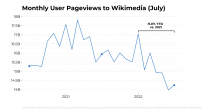
(B) This one uses a bracket to label the YTD comparison period. I used the time period through June 2022 for this first example because the chart for this month (January) wouldn't show a bracket because it is just one month. I chose a bracket instead of an ellipse like we see in the slide deck because an ellipse might not make sense depending on how wide the range of values we're trying to circle whereas a bracket is more predictable to program:
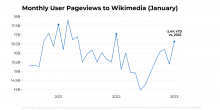
Here is the same code for January 2023:
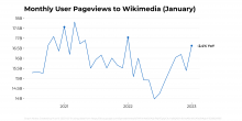
(C) Here is the YoY annotation we've used for other charts:
A few questions:
- Do we want to display the data loss correction here? I can put it in, I was imitating the chart int he deck which didn't have it. https://docs.google.com/spreadsheets/d/1YfKmAe6ViAIjnPejYEq6yCkuYa8QK8-h6VxsAlbnNGA (second column)
- Do we want the annotation to be the YTD comparison like in A and B or a YoY comparison like in C?
@HXi-WMF thank you! I want to go with (C), with the January YoY comparison. Can you also add the yellow circles to flag January 2023 and January 2022?
- Do we want to display the data loss correction here? I can put it in, I was imitating the chart int he deck which didn't have it. https://docs.google.com/spreadsheets/d/1YfKmAe6ViAIjnPejYEq6yCkuYa8QK8-h6VxsAlbnNGA (second column)
No, let's not display the data loss correction here. I will add a note at the bottom of the slide.
- Do we want the annotation to be the YTD comparison like in A and B or a YoY comparison like in C?
YoY comparison
