Page MenuHomePhabricator

Reduce and update type styles in the Android app
Closed, ResolvedPublic

Description

Background

  • Currently, the Wikipedia Android app has inconsistencies in its typography, such as varying font sizes, line heights, and font styles. These inconsistencies can affect the reading experience and make it harder for users to navigate the app efficiently.
  • To improve the user experience, we must ensure consistent typography across the Wikipedia Android app. This effort would involve establishing typography guidelines that specify font sizes, line heights, and font styles for various app components.

Goals

  • More efficient design/development handoff: no more back and forth about details like font family/size, line height, etc.
  • More consistency/better UX due to the reduced number of type styles in the app
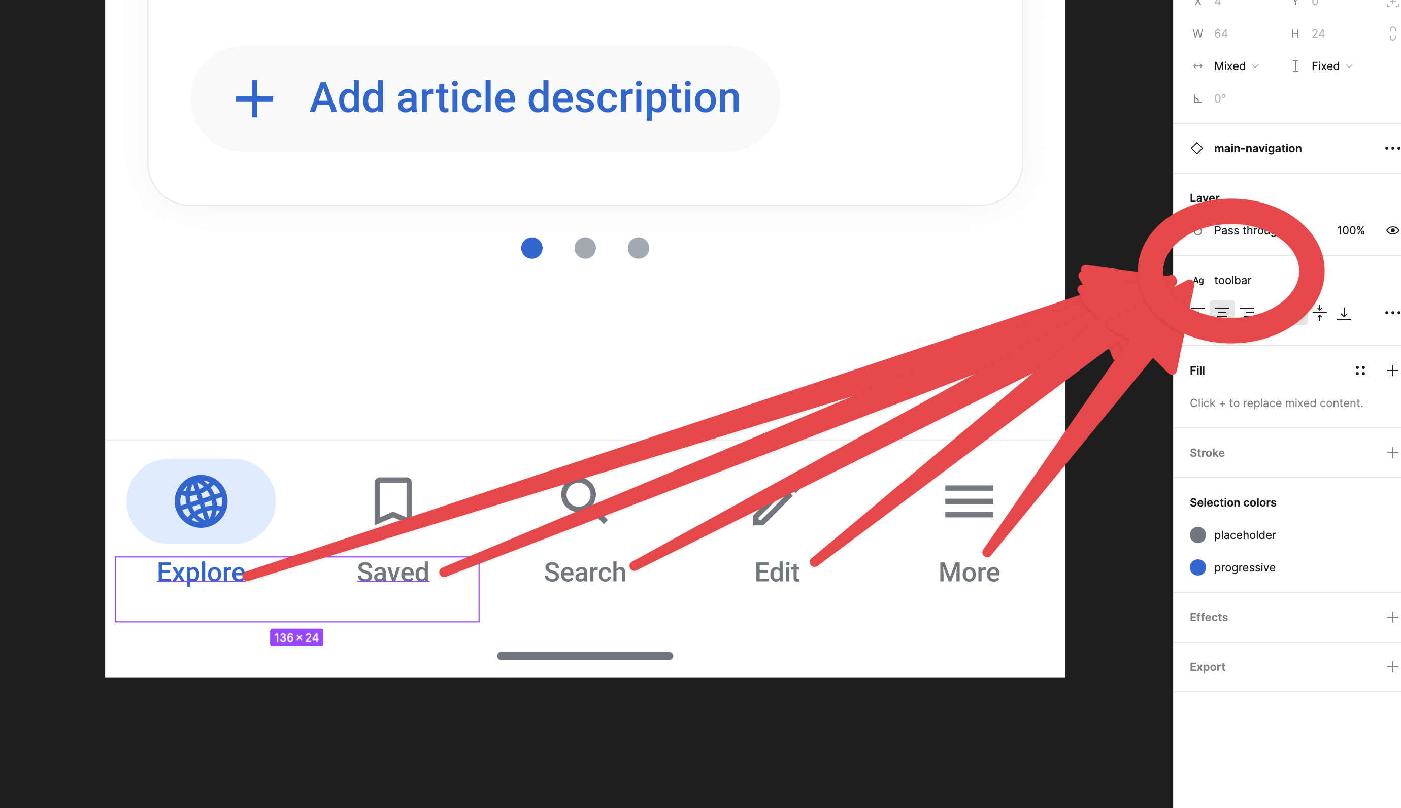
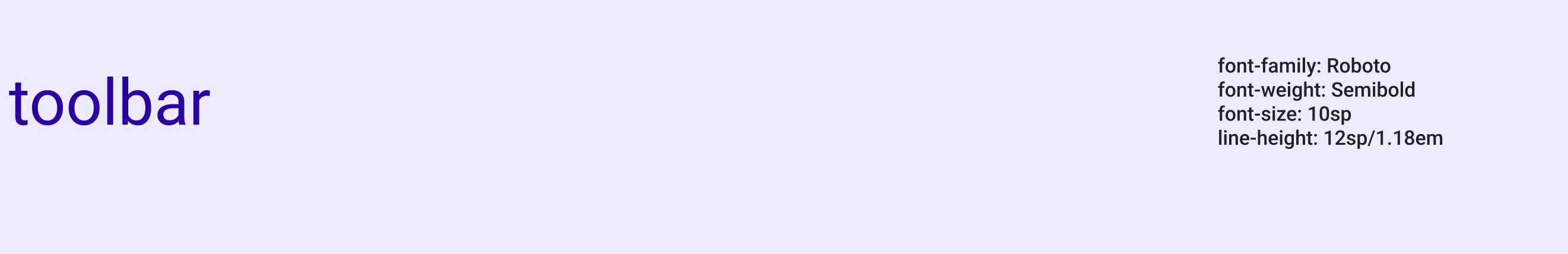
  • Use lineHeight definitions for text views instead of lineSpacingExtra and/or lineSpacingMultiplier
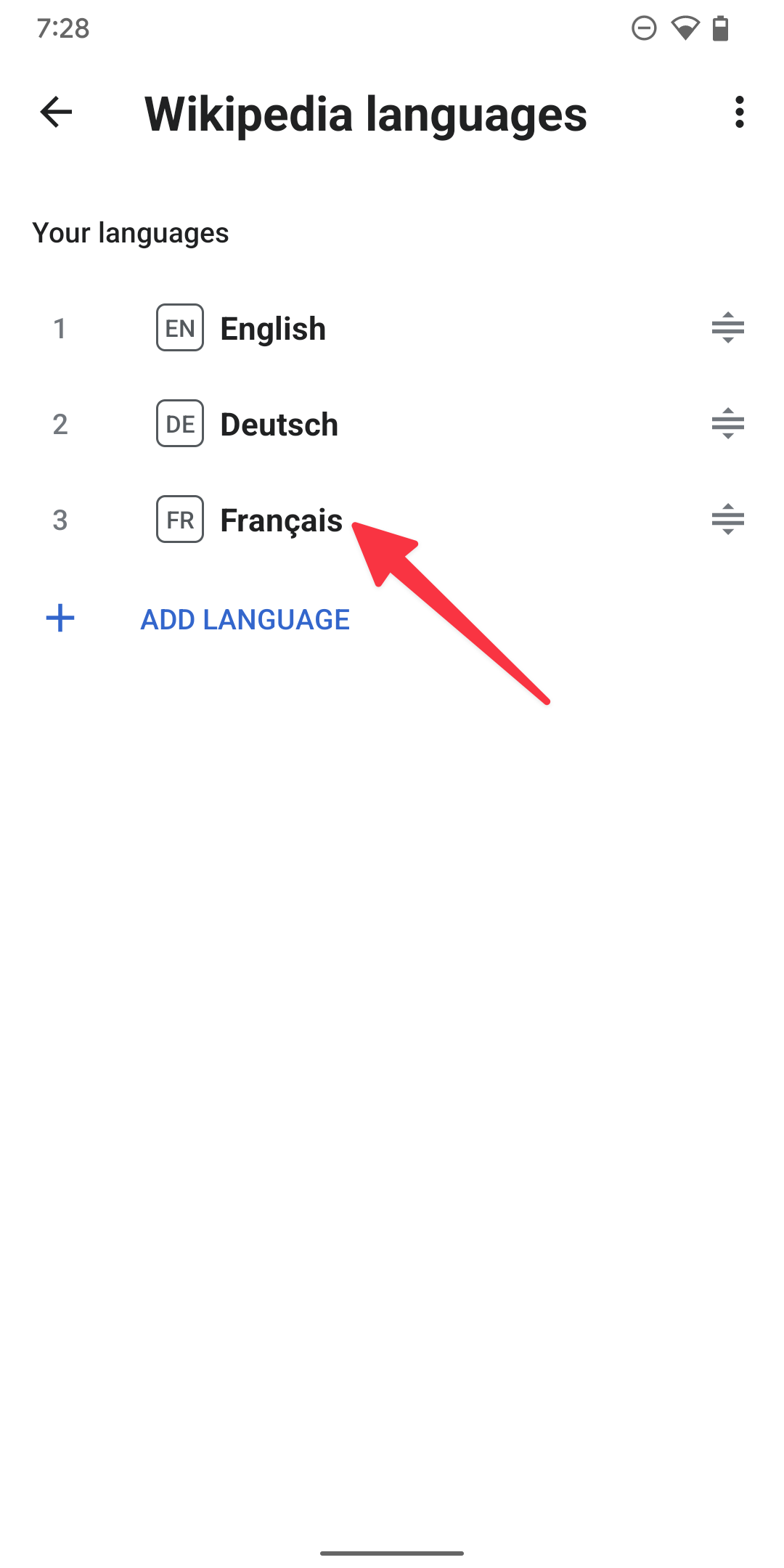
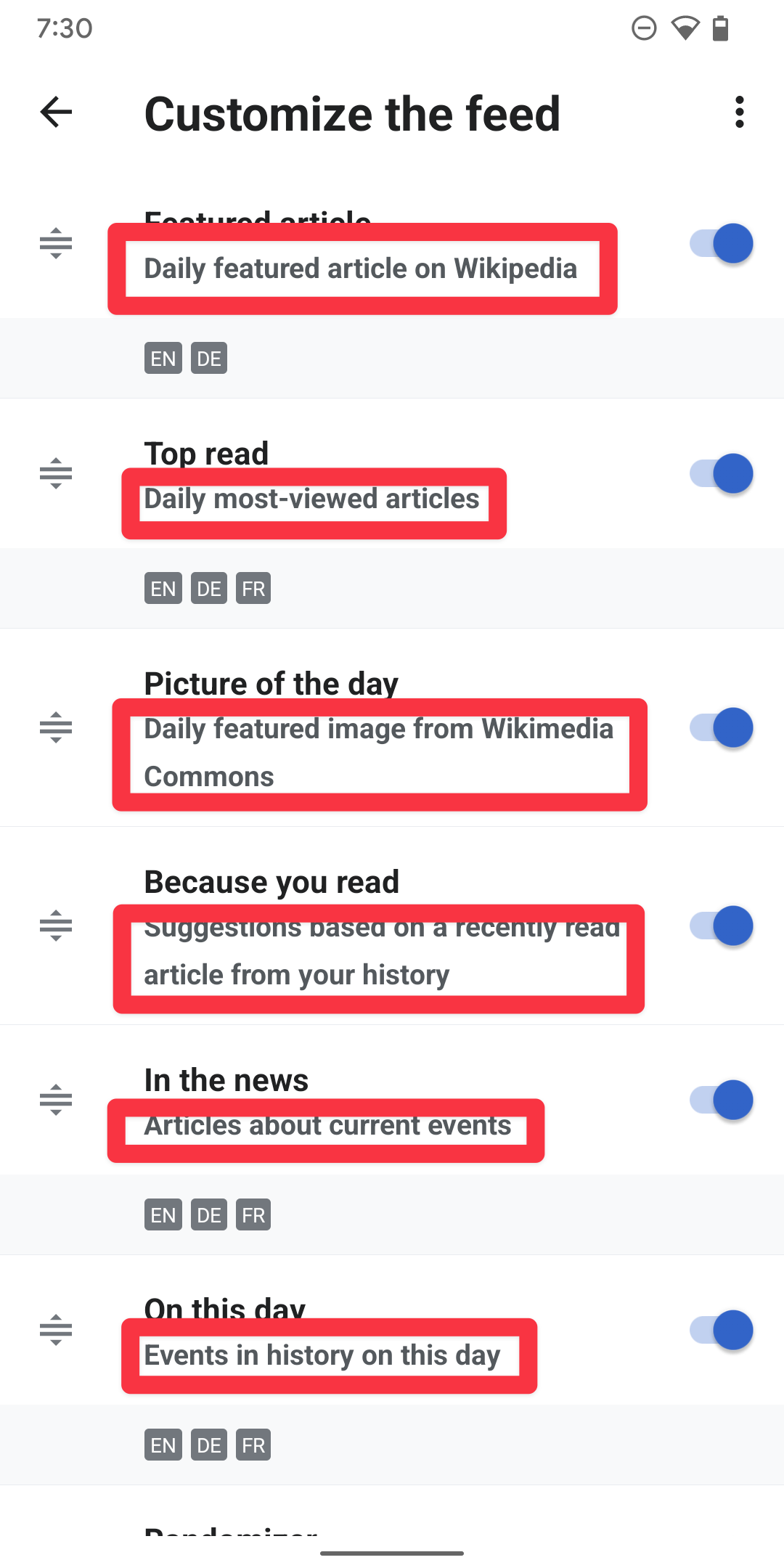
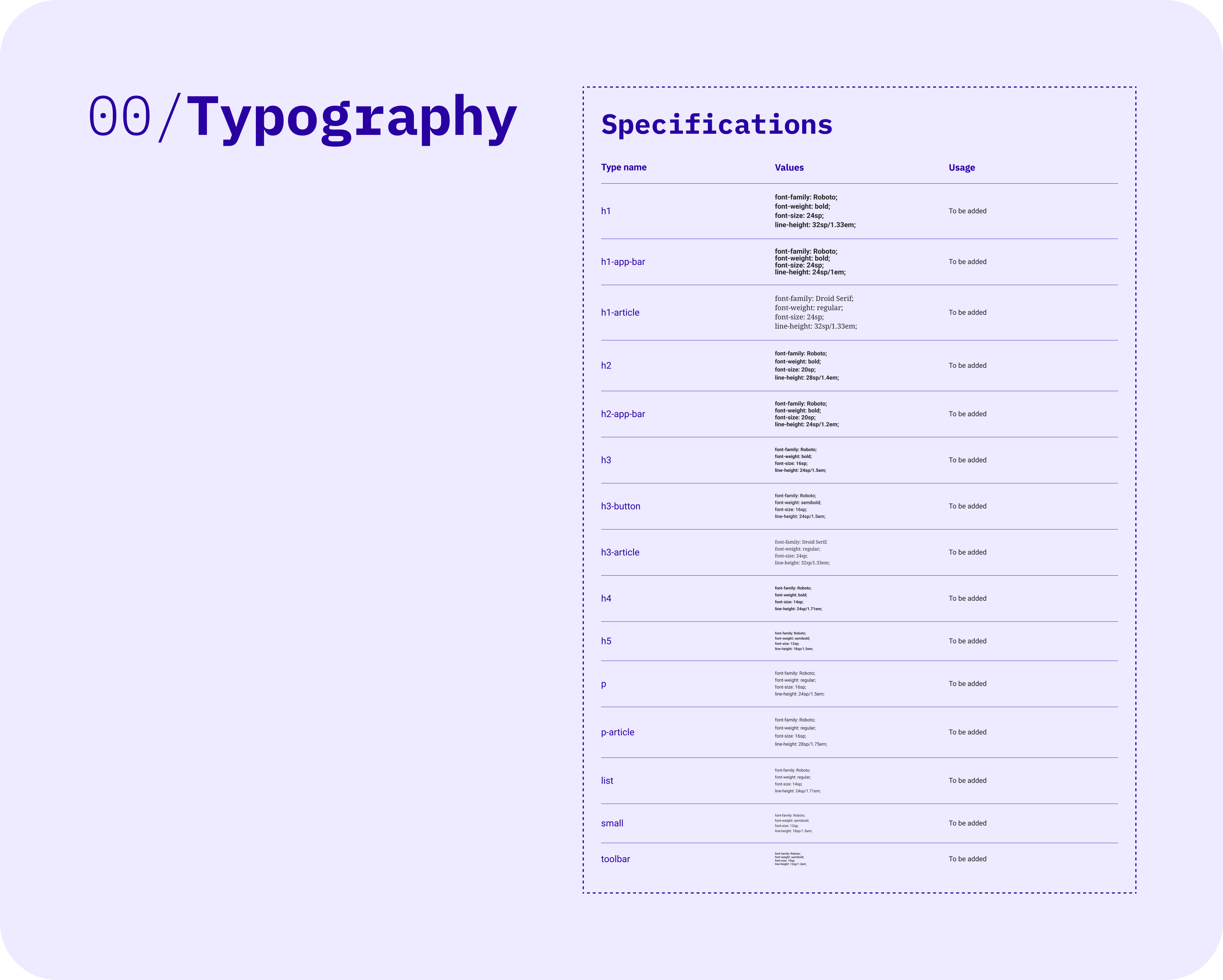
  • Unify type styles: All definitions and names listed are going to be used for updating components

What has changed?

  • Updated type names
  • Updated type definitions
  • No more usage of android:textAllCaps
  • No more usage of android:letterSpacing
  • The source of truth for type styles lives on Figma (previously on MediaWiki)

Instructions

  • Design: Make sure only to use names and definitions type styles listed in this task/Figma when redesigning components.
  • Engineering: Make sure the new font definitions on Figma are represented in the code and can be used for future components work.

To be discussed

  • Are the current type names on Figma feasible for implementation?

APK: https://github.com/wikimedia/apps-android-wikipedia/pull/3894

Event Timeline

LGoto triaged this task as Medium priority.Feb 28 2023, 5:22 PM
scblr removed scblr as the assignee of this task.Mar 6 2023, 9:36 AM

Hi @scblr, here are the text styles we have been using in the app, hope these will help you to define the replacement for the new text components in Figma.

Toolbar style

<style name="ToolBarTitleText" parent="@style/TextAppearance.AppCompat.Widget.ActionBar.Title">
    <item name="android:textColor">?attr/material_theme_primary_color</item>
    <item name="android:fontFamily">sans-serif</item>
    <item name="android:textSize">24sp</item>
    <item name="android:textStyle">bold</item>
</style>

This smaller version of toolbar text, which the base style inherits from the ToolBarTitleText, has been used on the Insert media function.

<style name="ToolBarTitleTextSmall" parent="ToolBarTitleText">
    <item name="android:textSize">20sp</item>
</style>

The following style has been used on the TabLayout, which we have been using on the Notification and Article Category.

<style name="NotificationTabTextAppearance" parent="TextAppearance.Design.Tab">
    <item name="android:fontFamily">sans-serif</item>
    <item name="android:textStyle">bold</item>
    <item name="android:textSize">14sp</item>
    <item name="android:letterSpacing">0.04</item>
</style>

This style has been used on the title under the illustration

<style name="MaterialLargePrimaryTitle">
    <item name="android:textAlignment">center</item>
    <item name="android:textSize">20sp</item>
    <item name="android:lineSpacingExtra">8sp</item>
    <item name="android:textStyle">bold</item>
    <item name="android:textColor">?attr/material_theme_primary_color</item>
</style>

This style has been used in places such as "No results" that need a smaller text.

<style name="MaterialMediumSecondaryCaption">
    <item name="android:textAlignment">center</item>
    <item name="android:textSize">16sp</item>
    <item name="android:lineSpacingExtra">8sp</item>
    <item name="android:textColor">?attr/material_theme_secondary_color</item>
</style>

The following styles are used on list view items (section header, title, and description).

<style name="MaterialListTitle">
    <item name="android:textSize">16sp</item>
    <item name="android:lineSpacingExtra">8sp</item>
    <item name="android:textColor">?attr/material_theme_primary_color</item>
</style>

<style name="MaterialListSubtitle">
    <item name="android:textSize">14sp</item>
    <item name="android:lineSpacingExtra">6sp</item>
    <item name="android:textColor">?attr/material_theme_secondary_color</item>
</style>

<style name="MaterialListSectionHeader">
    <item name="android:textSize">14sp</item>
    <item name="android:lineSpacingExtra">8sp</item>
    <item name="android:textColor">?attr/material_theme_secondary_color</item>
    <item name="android:fontFamily">sans-serif-medium</item>
</style>

This has been only used on the Wikipedia language list page:

<style name="LanguageSpinnerItemTextAppearance">
    <item name="android:textSize">14sp</item>
    <item name="android:singleLine">true</item>
    <item name="android:textColor">?attr/colorAccent</item>
    <item name="android:fontFamily">sans-serif-medium</item>
    <item name="android:paddingStart">16dp</item>
    <item name="android:paddingEnd">16dp</item>
    <item name="android:minHeight">48dp</item>
    <item name="android:ellipsize">marquee</item>
    <item name="android:gravity">center_vertical</item>
    <item name="android:textAlignment">inherit</item>
    <item name="android:textAllCaps">true</item>
</style>

Reading list page title style

<style name="ReadingListTitleTextAppearance">
    <item name="android:textSize">20sp</item>
    <item name="android:fontFamily">sans-serif-medium</item>
</style>

General input field style (e.g. article description).

<style name="TextInputLayoutStyle" parent="Widget.MaterialComponents.TextInputLayout.FilledBox">
    <item name="boxBackgroundColor">?attr/color_group_22</item>
    <item name="android:textColorHint">?attr/material_theme_de_emphasised_color</item>
    <item name="hintTextColor">?attr/colorAccent</item>
    <item name="helperTextTextColor">?attr/material_theme_de_emphasised_color</item>
    <item name="counterTextColor">?attr/material_theme_de_emphasised_color</item>
    <item name="errorTextAppearance">@style/TextInputLayoutErrorTextAppearance</item>
</style>

Article Editor style

<style name="EditSectionTextInputLayoutStyle" parent="TextInputLayoutStyle">
    <item name="android:textColorHighlight">@color/find_in_page_active</item>
    <item name="android:textColor">?attr/primary_text_color</item>
    <item name="strokeColor">@android:color/transparent</item>
</style>

The following styles have been used on AlertDialog, which includes almost every dialog.

<style name="DialogTextAppearance">
    <item name="android:textSize">16sp</item>
    <item name="android:textColor">?attr/material_theme_secondary_color</item>
    <item name="android:lineSpacingExtra">@dimen/dialog_line_spacing_extra</item>
</style>

<style name="DialogTitleAppearance" parent="@style/RtlOverlay.DialogWindowTitle.AppCompat">
    <item name="android:textColor">?attr/material_theme_primary_color</item>
    <item name="android:layout_marginBottom">5dp</item>
</style>

<style name="DialogTitleTextAppearance" parent="TextAppearance.AppCompat.Title">
    <item name="android:textSize">20sp</item>
    <item name="android:fontFamily">sans-serif</item>
</style>

Chip style where has been used on list item chips and edit summaries chips.

<style name="CustomChipStyle">
    <item name="android:textSize">14sp</item>
    <item name="android:fontFamily">sans-serif-medium</item>
    <item name="android:textColor">?attr/color_group_9</item>
    <item name="android:lineSpacingExtra">2sp</item>
    <item name="ensureMinTouchTargetSize">true</item>
    <item name="chipMinTouchTargetSize">48dp</item>
</style>

The article description hint text style

<style name="DescriptionEditViewHintTextStyle">
    <item name="android:fontFamily">sans-serif-medium</item>
    <item name="android:textSize">12sp</item>
    <item name="android:textColor">?attr/colorAccent</item>
</style>

Snackbar text view style

<style name="SnackbarTextViewStyle" parent="Widget.MaterialComponents.Snackbar.TextView">
    <item name="android:textSize">16sp</item>
    <item name="android:lineSpacingExtra">8sp</item>
    <item name="android:maxLines">10</item>
    <item name="android:paddingTop">0dp</item>
    <item name="android:paddingBottom">0dp</item>
    <item name="android:paddingStart">0dp</item>
    <item name="android:paddingEnd">12dp</item>
</style>

Thanks @cooltey, I tried my best to map the old styles to the new ones.

Please make sure to:

  • Not use lineSpacingExtra and lineSpacingMultiplier anymore
  • Use lineHeight which ovverrides lineSpacingExtra and lineSpacingMultiplier (see documentation)
  • Use the new definitions for type listed on Figma

Toolbar style

<style name="ToolBarTitleText" parent="@style/TextAppearance.AppCompat.Widget.ActionBar.Title">
    <item name="android:textColor">?attr/material_theme_primary_color</item>
    <item name="android:fontFamily">sans-serif</item>
    <item name="android:textSize">24sp</item>
    <item name="android:textStyle">bold</item>
</style>

h1-app-bar

This smaller version of toolbar text, which the base style inherits from the ToolBarTitleText, has been used on the Insert media function.

<style name="ToolBarTitleTextSmall" parent="ToolBarTitleText">
    <item name="android:textSize">20sp</item>
</style>

h2-app-bar

The following style has been used on the TabLayout, which we have been using on the Notification and Article Category.

<style name="NotificationTabTextAppearance" parent="TextAppearance.Design.Tab">
    <item name="android:fontFamily">sans-serif</item>
    <item name="android:textStyle">bold</item>
    <item name="android:textSize">14sp</item>
    <item name="android:letterSpacing">0.04</item>
</style>

h3-button

This style has been used on the title under the illustration

<style name="MaterialLargePrimaryTitle">
    <item name="android:textAlignment">center</item>
    <item name="android:textSize">20sp</item>
    <item name="android:lineSpacingExtra">8sp</item>
    <item name="android:textStyle">bold</item>
    <item name="android:textColor">?attr/material_theme_primary_color</item>
</style>

h2

This style has been used in places such as "No results" that need a smaller text.

<style name="MaterialMediumSecondaryCaption">
    <item name="android:textAlignment">center</item>
    <item name="android:textSize">16sp</item>
    <item name="android:lineSpacingExtra">8sp</item>
    <item name="android:textColor">?attr/material_theme_secondary_color</item>
</style>

p

The following styles are used on list view items (section header, title, and description).

<style name="MaterialListTitle">
    <item name="android:textSize">16sp</item>
    <item name="android:lineSpacingExtra">8sp</item>
    <item name="android:textColor">?attr/material_theme_primary_color</item>
</style>

h3

<style name="MaterialListSubtitle">
    <item name="android:textSize">14sp</item>
    <item name="android:lineSpacingExtra">6sp</item>
    <item name="android:textColor">?attr/material_theme_secondary_color</item>
</style>

h4

<style name="MaterialListSectionHeader">
    <item name="android:textSize">14sp</item>
    <item name="android:lineSpacingExtra">8sp</item>
    <item name="android:textColor">?attr/material_theme_secondary_color</item>
    <item name="android:fontFamily">sans-serif-medium</item>
</style>

chip

This has been only used on the Wikipedia language list page:

<style name="LanguageSpinnerItemTextAppearance">
    <item name="android:textSize">14sp</item>
    <item name="android:singleLine">true</item>
    <item name="android:textColor">?attr/colorAccent</item>
    <item name="android:fontFamily">sans-serif-medium</item>
    <item name="android:paddingStart">16dp</item>
    <item name="android:paddingEnd">16dp</item>
    <item name="android:minHeight">48dp</item>
    <item name="android:ellipsize">marquee</item>
    <item name="android:gravity">center_vertical</item>
    <item name="android:textAlignment">inherit</item>
    <item name="android:textAllCaps">true</item>
</style>

p (see list style in T326648)

Reading list page title style

<style name="ReadingListTitleTextAppearance">
    <item name="android:textSize">20sp</item>
    <item name="android:fontFamily">sans-serif-medium</item>
</style>

h2

General input field style (e.g. article description).

<style name="TextInputLayoutStyle" parent="Widget.MaterialComponents.TextInputLayout.FilledBox">
    <item name="boxBackgroundColor">?attr/color_group_22</item>
    <item name="android:textColorHint">?attr/material_theme_de_emphasised_color</item>
    <item name="hintTextColor">?attr/colorAccent</item>
    <item name="helperTextTextColor">?attr/material_theme_de_emphasised_color</item>
    <item name="counterTextColor">?attr/material_theme_de_emphasised_color</item>
    <item name="errorTextAppearance">@style/TextInputLayoutErrorTextAppearance</item>
</style>
  • p (for the main content of the input field)
  • small (for the float label and helper text)

More specs here:

https://www.figma.com/file/RnkoK5dDw3lCOEUooZS4jB/Android-App-Library?node-id=2018%3A6331&t=qBBHIy03AYC85Fqx-4t

Article Editor style

<style name="EditSectionTextInputLayoutStyle" parent="TextInputLayoutStyle">
    <item name="android:textColorHighlight">@color/find_in_page_active</item>
    <item name="android:textColor">?attr/primary_text_color</item>
    <item name="strokeColor">@android:color/transparent</item>
</style>

I don't see a font size here? Is it referring to the style below? 🤔

Screenshot_20230315-142953.png (2×1 px, 267 KB)

If yes, use this style:

p

The following styles have been used on AlertDialog, which includes almost every dialog.

<style name="DialogTextAppearance">
    <item name="android:textSize">16sp</item>
    <item name="android:textColor">?attr/material_theme_secondary_color</item>
    <item name="android:lineSpacingExtra">@dimen/dialog_line_spacing_extra</item>
</style>

p

<style name="DialogTitleAppearance" parent="@style/RtlOverlay.DialogWindowTitle.AppCompat">
    <item name="android:textColor">?attr/material_theme_primary_color</item>
    <item name="android:layout_marginBottom">5dp</item>
</style>

I dont see a font size here? Is it referring to dialog titles? 🤔

Screenshot_20230315-143333.png (2×1 px, 171 KB)

If yes, use this style:

h2

<style name="DialogTitleTextAppearance" parent="TextAppearance.AppCompat.Title">
    <item name="android:textSize">20sp</item>
    <item name="android:fontFamily">sans-serif</item>
</style>

Not quite sure what this is referring to? Likely also use:

h2

Chip style where has been used on list item chips and edit summaries chips.

<style name="CustomChipStyle">
    <item name="android:textSize">14sp</item>
    <item name="android:fontFamily">sans-serif-medium</item>
    <item name="android:textColor">?attr/color_group_9</item>
    <item name="android:lineSpacingExtra">2sp</item>
    <item name="ensureMinTouchTargetSize">true</item>
    <item name="chipMinTouchTargetSize">48dp</item>
</style>

chip

The article description hint text style

<style name="DescriptionEditViewHintTextStyle">
    <item name="android:fontFamily">sans-serif-medium</item>
    <item name="android:textSize">12sp</item>
    <item name="android:textColor">?attr/colorAccent</item>
</style>

small

Snackbar text view style

<style name="SnackbarTextViewStyle" parent="Widget.MaterialComponents.Snackbar.TextView">
    <item name="android:textSize">16sp</item>
    <item name="android:lineSpacingExtra">8sp</item>
    <item name="android:maxLines">10</item>
    <item name="android:paddingTop">0dp</item>
    <item name="android:paddingBottom">0dp</item>
    <item name="android:paddingStart">0dp</item>
    <item name="android:paddingEnd">12dp</item>
</style>

h3-button

Hi @scblr

Thanks for the update, I have updated the ticket description with the APK link.

Please take look at the APK to see the changes, thanks.

@cooltey I haven’t looked at everything yet but here are the things that I spotted. Gotta call it a day for now 😵‍💫

Thanks for the great work!


1) Can you set the inactive state of the navigation to toolbar? (T330804)

Screenshot_20230323-174330.png (2×1 px, 405 KB)

2) I think the arrow (→) is missing in the explore feed titles now:

Screenshot_20230323-175008.png (2×1 px, 1 MB)

3) Set all these to list (Figma)

Screenshot_20230323-174858.png (2×1 px, 623 KB)

4) Does list use 24sp line-height? A comparison shows that it’s not quite the same as in the designs (Figma):

CleanShot 2023-03-23 at 17.57.33@2x.png (1×1 px, 261 KB)

5) Do you use h3 here?

Screenshot_20230323-191912.png (2×1 px, 569 KB)

6) Use h4 here (Figma)

Screenshot_20230323-175919 copy.png (2×1 px, 157 KB)

7) Use p here (Figma)

Screenshot_20230323-175919.png (2×1 px, 157 KB)

8) All buttons use h3-button (and no capitalization) now. Maybe this is M2/M3 related? (Figma)

Screenshot_20230323-180234.png (2×1 px, 297 KB)

More details: T331450

9) Set these card titles (Explore, Reading list, Edits) to h2

Screenshot_20230323-192155.png (2×1 px, 438 KB)

10) Set to p

Screenshot_20230323-192743.png (2×1 px, 151 KB)
Screenshot_20230323-192822.png (2×1 px, 105 KB)

11) Set to list

Screenshot_20230323-193039.png (2×1 px, 207 KB)

@cooltey I haven’t looked at everything yet but here are the things that I spotted for now. Gotta call it a day for now 😵‍💫

Thanks for the great work!


1) Can you set the inactive state of the navigation to toolbar? (T330804)

Not sure what you mean by setting inactive state for the button, but I applied the robot medium to it.

2) I think the arrow (→) is missing in the explore feed titles now:

Fixed!

3) Set all these to list (Figma)

Done

4) Does list use 24sp line-height? A comparison shows that it’s not quite the same as in the designs (Figma):

Done

5) Do you use h3 here?

Done

6) Use h4 here (Figma)

Done

7) Use p here (Figma)

Done

8) All buttons use h3-button (and no capitalization) now. Maybe this is M2/M3 related? (Figma)

This needs to be revisit for material 3 upgrade is completed.

More details: T331450

9) Set these card titles (Explore, Reading list, Edits) to h2

Done.

Please note that the content of the announcement card in Explore feed comes from the API response, which we cannot adjust the text style of the title.

10) Set to p

Done.

11) Set to list`

Done.

@cooltey please make sure the font group styles in the app are aligned with the designs:

https://www.figma.com/file/RnkoK5dDw3lCOEUooZS4jB/Android-App-Library?node-id=2299-14512&t=k64SHjb6TZJSyNyN-4

It differs from it here and there. Also, please review this part in the task’s description:

Goals

  • Use lineHeight definitions instead of lineSpacingExtra or lineSpacingMultiplier

1)

Can you set the inactive state of the navigation to toolbar? (T330804)

Not sure what you mean by setting inactive state for the button, but I applied the robot medium to it.

I mean that the active and the inactive state of the type in the navigation use the same type style:

CleanShot 2023-03-27 at 12.08.18@2x.png (1×2 px, 337 KB)

The type style is called toolbar:

CleanShot 2023-03-27 at 12.09.39@2x.png (428×2 px, 49 KB)

That said, the active state uses a different style (bold or faux bold):

Screenshot_20230327-121152.png (2×1 px, 169 KB)

2)

Set all these to list (Figma)

Done

5) Do you use h3 here?

Done

The reading list home design doesn’t look like the designs yet:

Screenshot_20230327-121116.png (2×1 px, 606 KB)

The title uses `h3:

font-family: Roboto
font-weight: Bold
font-size: 16sp
line-height: 24sp/1.5em

And all the text below uses list:

font-family: Roboto
font-weight: Regular
font-size: 14sp
line-height: 24sp/1.71em

As you can see, both the title and text below use a 24sp line-height. If both use 24sp line-height, it results in a balanced output of the list:

Saved.png (2×720 px, 251 KB)

3)

Does list use 24sp line-height? A comparison shows that it’s not quite the same as in the designs (Figma):

Done

This is not yet the case; see designs on Figma.

The issue is the same as described in 2): Both the title and the text below should use the same line-height (due to usage of h3 and list:

Edits.png (2×720 px, 198 KB)

Hi @scblr

@cooltey please make sure the font group styles in the app are aligned with the designs:

https://www.figma.com/file/RnkoK5dDw3lCOEUooZS4jB/Android-App-Library?node-id=2299-14512&t=k64SHjb6TZJSyNyN-4

It differs from it here and there. Also, please review this part in the task’s description:

Goals

  • Use lineHeight definitions instead of lineSpacingExtra or lineSpacingMultiplier

1)

Can you set the inactive state of the navigation to toolbar? (T330804)

Not sure what you mean by setting inactive state for the button, but I applied the robot medium to it.

I mean that the active and the inactive state of the type in the navigation use the same type style:

The type style is called toolbar:

That said, the active state uses a different style (bold or faux bold):

I am unsure which font-type matches the semibold with font type Robot in Android XML. I made the following screenshot for you to check.

Screenshot_20230327-172134_Wikipedia Dev.jpg (2×1 px, 96 KB)
sans-serif-condensed-medium
Screenshot_20230327-172316_Wikipedia Dev.jpg (2×1 px, 96 KB)
sans-serif-condensed
Screenshot_20230327-172225_Wikipedia Dev.jpg (2×1 px, 95 KB)
sans-serif-condensed-light

2)

Set all these to list (Figma)

Done

5) Do you use h3 here?

Done

The reading list home design doesn’t look like the designs yet:

The title uses `h3:

font-family: Roboto
font-weight: Bold
font-size: 16sp
line-height: 24sp/1.5em

And all the text below uses list:

font-family: Roboto
font-weight: Regular
font-size: 14sp
line-height: 24sp/1.71em

As you can see, both the title and text below use a 24sp line-height. If both use 24sp line-height, it results in a balanced output of the list:

3)

Does list use 24sp line-height? A comparison shows that it’s not quite the same as in the designs (Figma):

Done

This is not yet the case; see designs on Figma.

The issue is the same as described in 2): Both the title and the text below should use the same line-height (due to usage of h3 and list:

For 2) and 3), I have updated the proper style to the list item. You probably will notice some styles do not match the design, that's because we are sharing the same item layout for different places.

For example, history and the reading list items are having the same item layout, and we have to programmatically update the textStyle for the history item.

The other thing I have noticed, since we apply two styles for two views (title view and description view), even though both views have the correct lineHeight: 24sp on them, the "margin" between the two views will not be affected by the line-height. Please see the example below:

Screenshot_20230327-172944_Wikipedia Dev.jpg (2×1 px, 96 KB)
no margin-top on description view
Screenshot_20230327-171702_Wikipedia Dev.jpg (2×1 px, 95 KB)
has margin-top: 6dp on description view

Same thing you may notice in the reading list item or some other places that we have applied styles to title and description views. Do you have any recommendations about the standard margins between the two views to match the line-height settings?

For example: lineHeight: 24sp between two views should be marginTop: 6dp or marginBottom: 6dp

You can download the APK from the ticket description to check the changes, thanks!

Hey @Dbrant 👋

Cooltey made some great progress on this task last week. I think after applying these two minor changes, it’s ready for Code review:

1) Change this font to toolbar per Figma definition 👇

Screenshot_20230405-114120.png (2×1 px, 409 KB)

font-family: Roboto
font-weight: Medium
font-size: 10sp
line-height: 12sp/1.18em

2)

This looks perfect now 👇

Screenshot_20230327-171702_Wikipedia_Dev-1.jpg (2×1 px, 197 KB)

Can you use the same settings (line-height + margin) for reading lists and detail view? 👇

Frame 2.png (1×1 px, 1 MB)

Note for QA: this task can be tested by simply navigating through a good fraction of screens throughout the app and verifying that none of the text looks conspicuously wrong (too large or too small).