Background
- The typography, spacing, colors, and icons used in the app bar are currently inconsistent across different screens
- The app bar component in Material 3 has undergone an update
- The updated design will aim to create a consistent app bar design that provides a seamless experience for the user
- By streamlining the design across all views, we hope to create a consistent visual language that users can easily recognize and understand
Goals
- Create a component in the codebase and design library that can be reused
- The goal of this task is to streamline the app bar's design across all views to create a more cohesive and consistent user experience
- This involves updating the typography, spacing, colors, and icons used in the app bar to better align with Material 3's specifications
What has changed?
- Typography (T330753):
- The only two styles that are used in the app bar per type definitions in T330753 are: h1-app-bar and h2-app-bar
- h1-app-bar is used in most cases
- h2-app-bar is used on:
- user and article talk page
- Suggested edit feed screens: Article descriptions, Image captions, Image tags
- The only two styles that are used in the app bar per type definitions in T330753 are: h1-app-bar and h2-app-bar
- Update type styles in the app bar (e.g. no more capital letters for CTA’s) per specs in T330753
- Color (T330645):
- Use primary color for title and icons per specs in T330645
- Use progressive color for primary links
- Use secondary color for de-emphasized text CTA’s
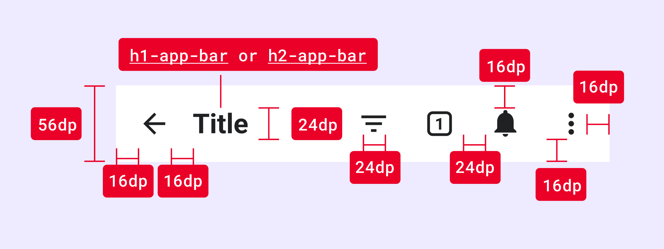
- Color (T330645):
- For spacing details, see the above image
Instructions
- Create a reusable app bar component in the codebase with the new specs
- Replace existing app across the app with the new component