Page MenuHomePhabricator

GrowthExperiments: Replace 'mediawiki.ui/variables' and WikimediaUI Base with skin variables and clarify resulting design questions
Closed, ResolvedPublic

Assigned To
Authored By
Volker_E
Mar 20 2023, 12:12 PM
Referenced Files
F37646907: Screen Shot 2023-09-01 at 12.12.58 PM.png
Sep 1 2023, 7:15 PM
F37646905: Screen Shot 2023-09-01 at 12.11.11 PM.png
Sep 1 2023, 7:15 PM
F37646903: Screen Shot 2023-09-01 at 12.07.40 PM.png
Sep 1 2023, 7:15 PM
F37030298: image.png
May 23 2023, 3:59 PM
F37030311: image.png
May 23 2023, 3:59 PM
F37030314: image.png
May 23 2023, 3:59 PM
F37030304: image.png
May 23 2023, 3:59 PM
Restricted File
May 10 2023, 5:04 PM

Description

Background

As outlined in task T332541 MediaWiki core provides Codex design tokens via mediawiki.skin.variables from v1.41.0 on.
They are much more powerful and comprehensive and aim to replace both, 'mediawiki.ui/variables' and WikimediaUI-Base.

GrowthExperiments have used both variable files interchangeably and extensively.
As we're touching a number of files and also replace some values that are close, but not 1:1 equivalent, this task is providing the venue to discuss possible visual amendments.

Goal

Replace all calls of the former central variable files
While at it, also provide best practice usage of Codex design tokens. For example colors shouldn't be directly referenced in code (don't: color: @wmui-color-base30;, do: color: @color-subtle)

Developer/designer notes
  • color: @wmui-color-base30; (#72777d) is replaced by color: @color-subtle (#54595d) as only disabled and placeholder elements receive 72777d in Codex latest token definition.
  • opacity: 0.64/opacity: 0.65/opacity: 0.66 is replaced by opacity: @opacity-icon-subtle which features 0.67 as value.
  • sup { color: #0645ad; } is replaced by color-progressive. No clue why the legacy Vector was used here.
Open questions
  1. Several modules use border: 1px solid @wmui-color-base80 which equals #eaecf0. This is not a DS border-color yet.
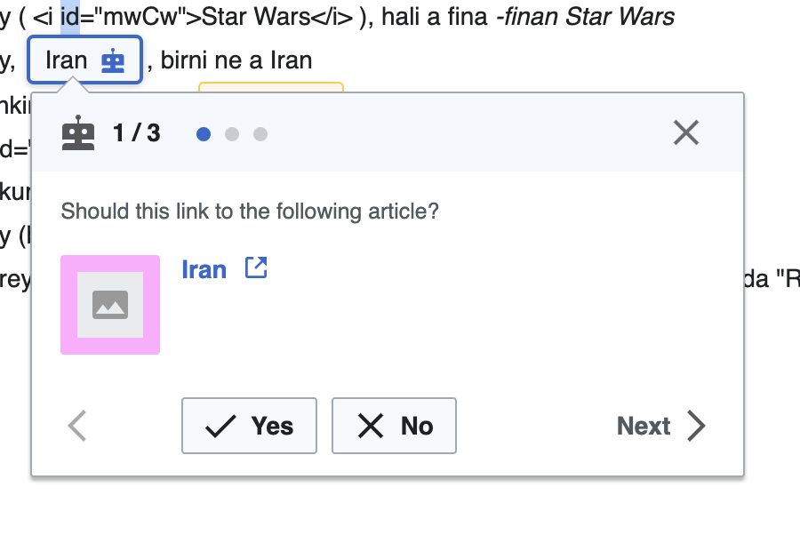
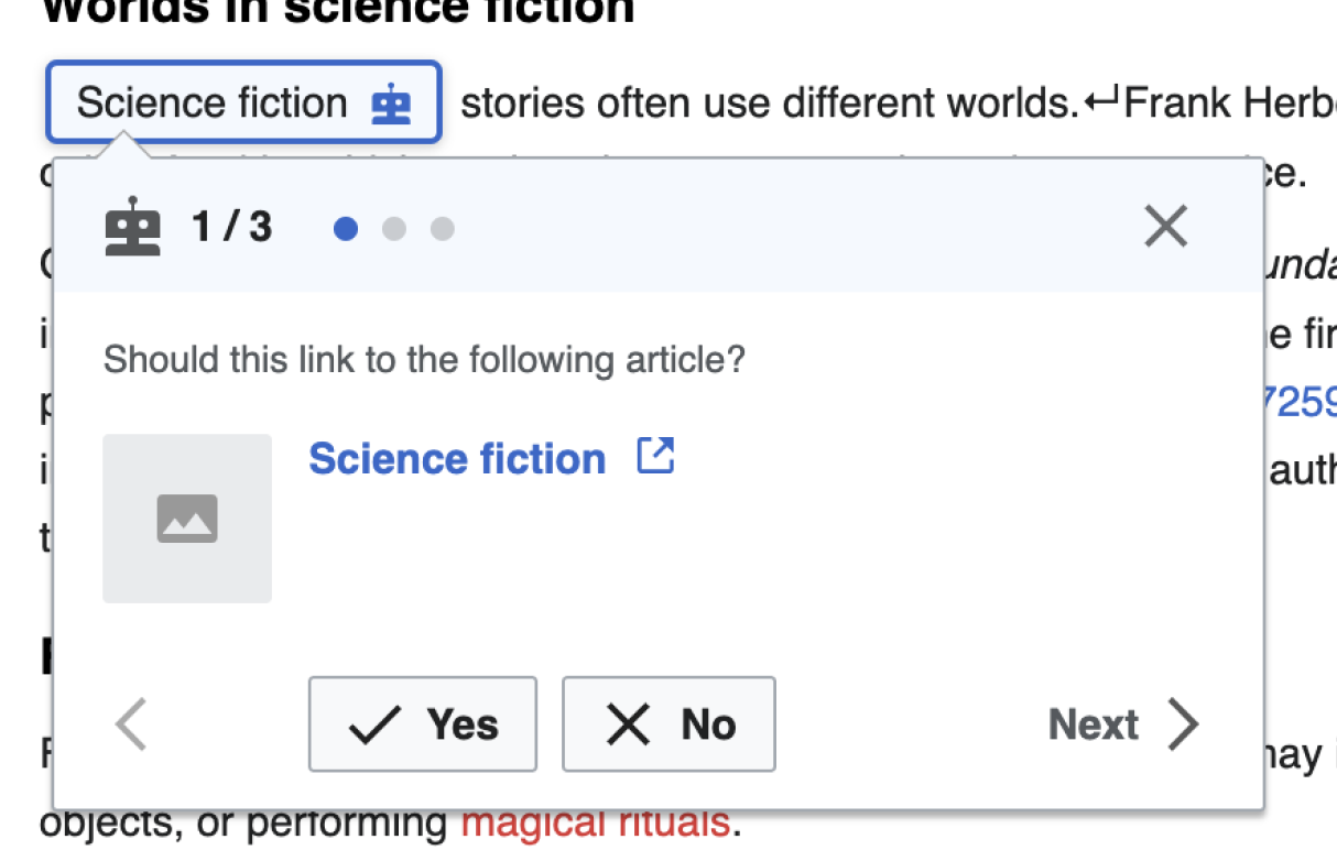
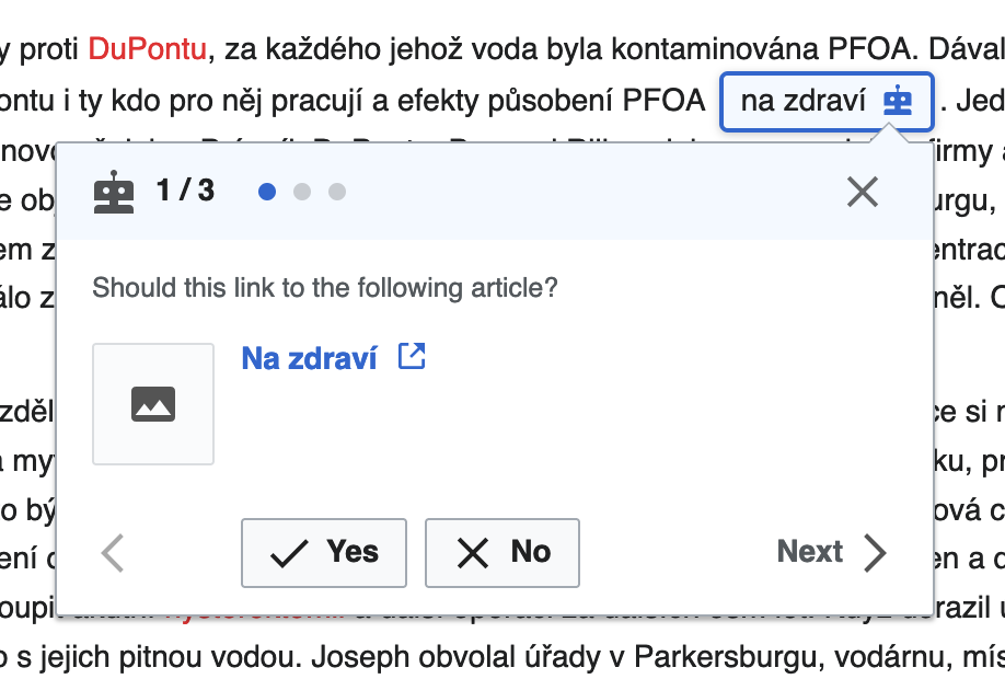
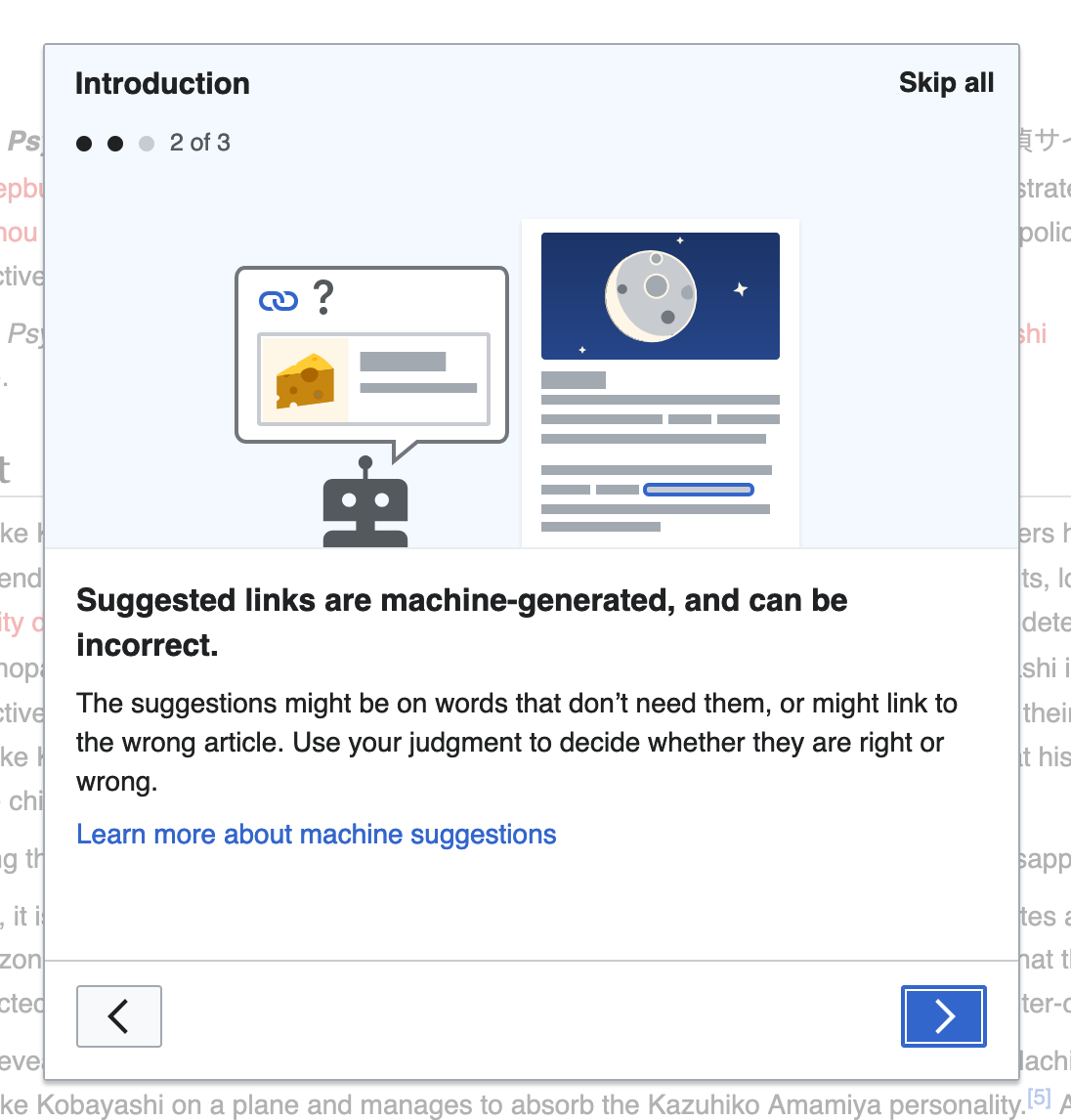
  1. ✓ RESOLVED Structured task onboarding features a “link”? Visited color will be color-progressive-visited
	&-link {
		color: @color-progressive;

		&:visited {
			// TODO: This should actually feature `@color-progressive--visited`.
			color: @color-progressive;
		}

The link is used on step two of the onboarding dialog for the "Learn more about machine suggestions" text

image.png (1×1 px, 153 KB)

  1. StartEditing module features

background-color: #f5f9ff;, which is not part of the color palette. What to do?

(comment from @kostajh: This is particular block of code can be removed; we used to show it in mobile Special:Homepage for unactivated suggested edits module. However, we always show an activated suggested edits module on Special:Homepage. And we use the same background-color: #f5f9ff; rule for that, so we do need to make some kind of update here:

image.png (1×1 px, 159 KB)
)

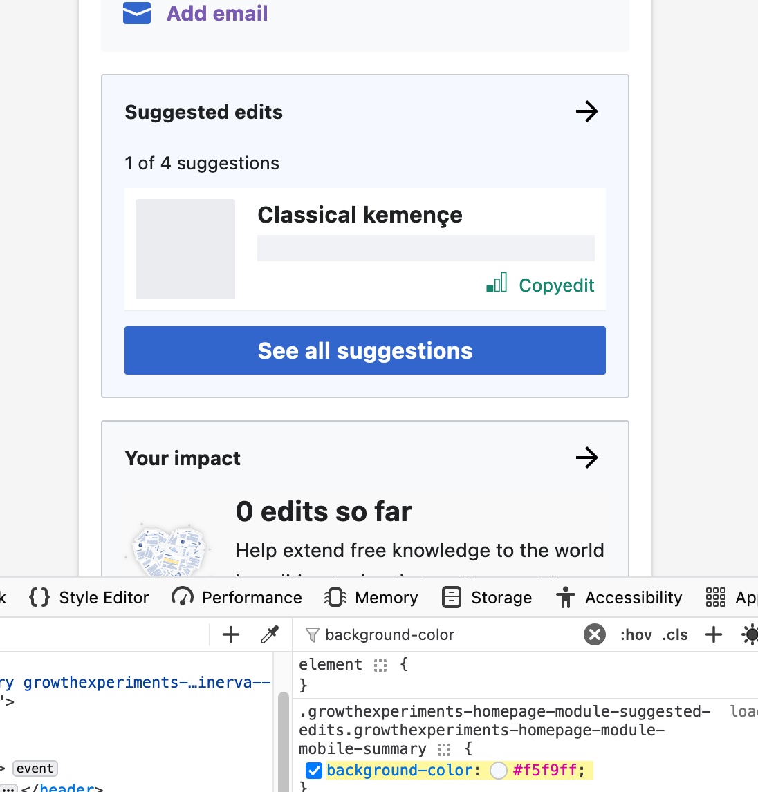
DECISION: CONTINUED AS IS. Not a DS color, might revisit with further color guidance by Codex Design System.

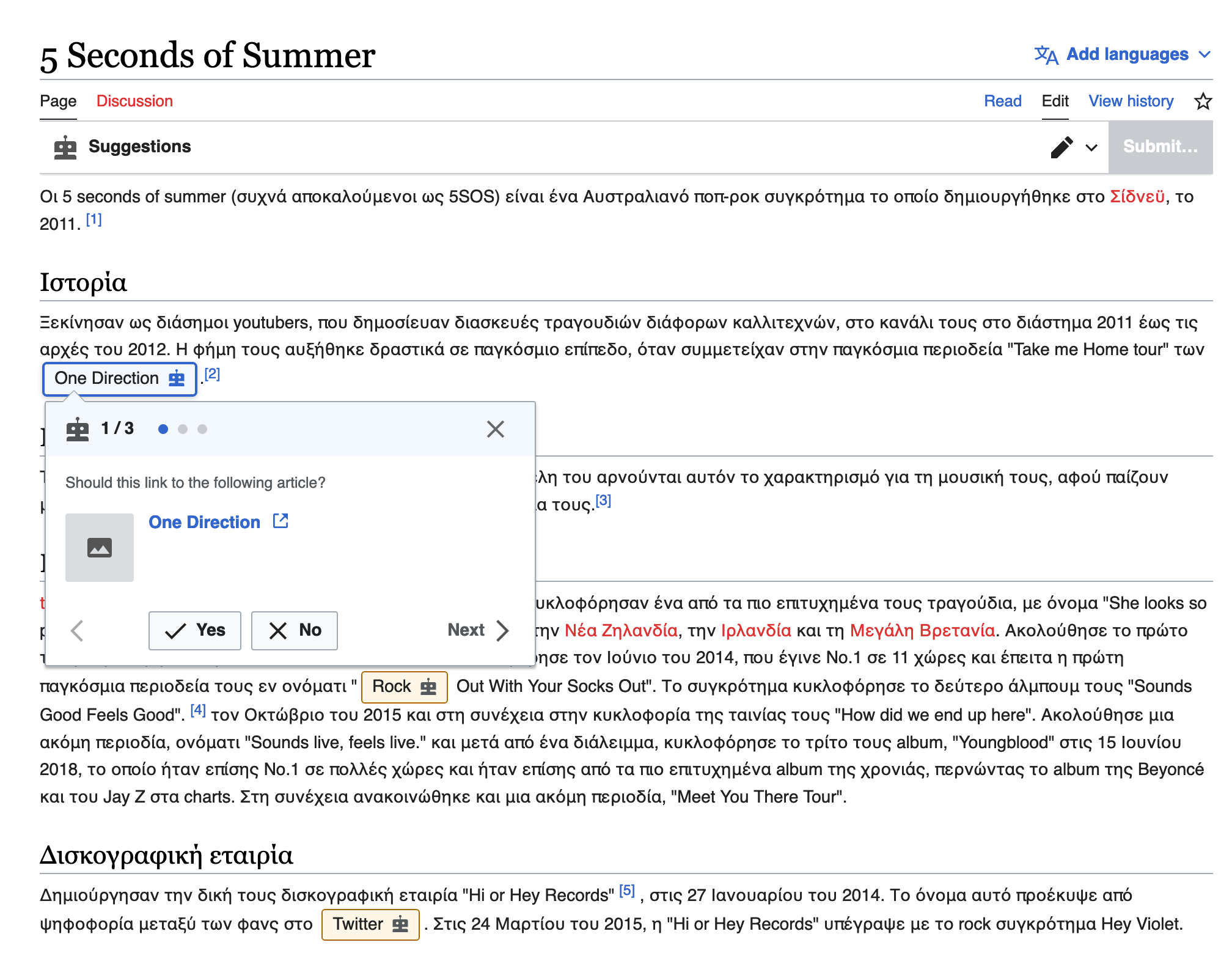
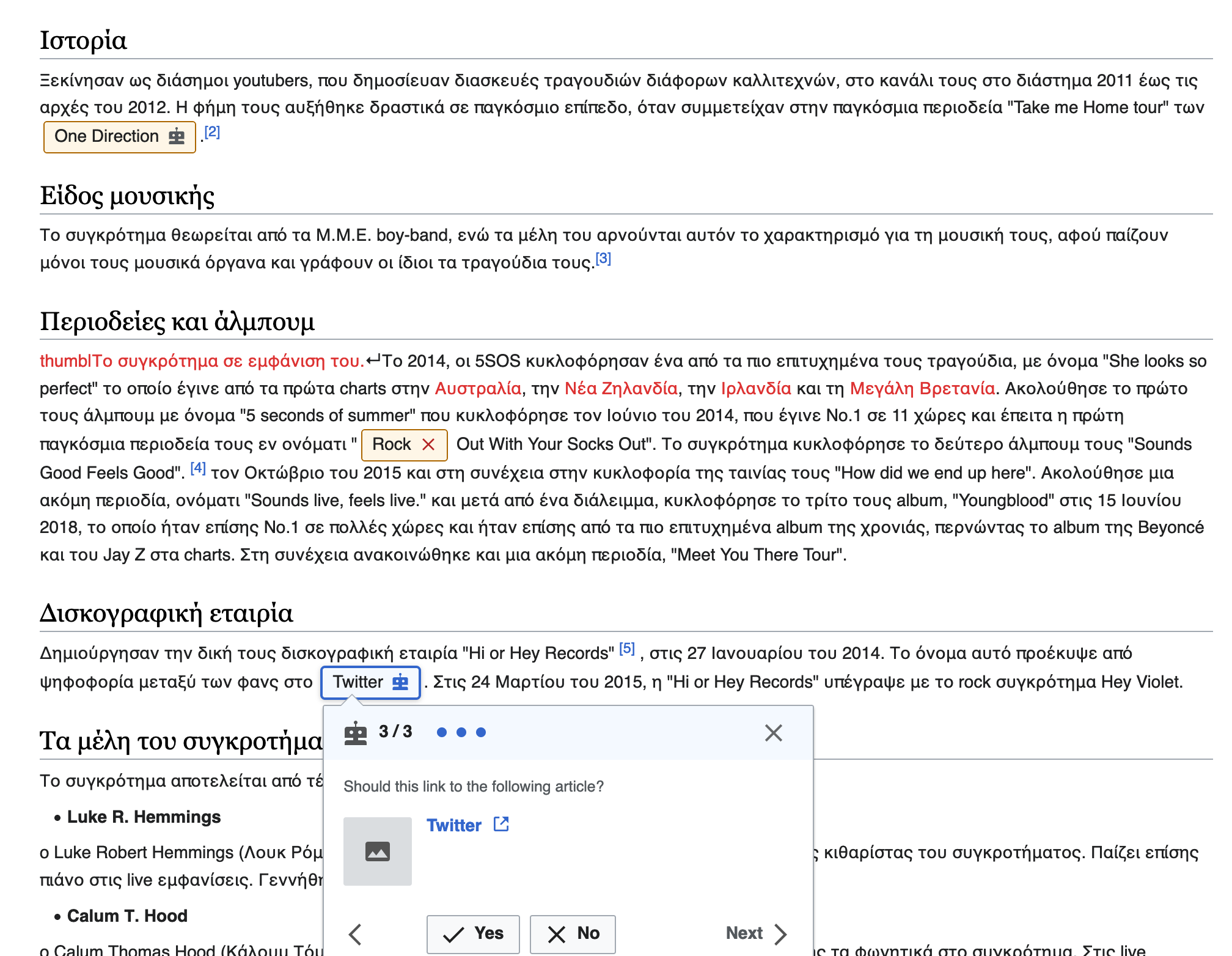
  1. ✓ RESOLVED RecommendedLinkToolbarDialog features
.mw-ge-recommendedLinkToolbarDialog-linkPreview-icon {
	border: 0.35714em solid @wmui-color-base70;

Assuming that this should feature a 5px border, this is also a non-standard border-width.

The icon is used when the article does not have an image

image.png (610×924 px, 105 KB)
, added in rEGRE949e5de721e5: Add a link: Update link inspector styles and overflow state.

Acceptance criteria for done
Original AC as sub task of T332541
  • Replace all calls to 'mediawiki.ui/variables'
    • Replace all mediawiki.ui variables
  • Replace all calls to '[…]lib/wikimedia-ui-base/wikimedia-ui-base.less'
    • Replace all WikimediaUI Base variables
  • Replace close static values, starting with background-colors, colors, opacities, border properties and border-radius
Updated AC
  • Resolve all open design questions

Event Timeline

Volker_E updated the task description. (Show Details)
Volker_E renamed this task from Replace 'mediawiki.ui/variables' and WikimediaUI Base with skin variables to GrowthExperiments: Replace 'mediawiki.ui/variables' and WikimediaUI Base with skin variables.Mar 20 2023, 1:05 PM

Change 901217 had a related patch set uploaded (by VolkerE; author: VolkerE):

[mediawiki/extensions/GrowthExperiments@master] [WIP] styles: Replace old variables calls with skin variables

https://gerrit.wikimedia.org/r/901217

kostajh added a subscriber: JFernandez-WMF.

cc'ing @RHo @JFernandez-WMF about the "Open questions" section of this task.

cc'ing @RHo @JFernandez-WMF about the "Open questions" section of this task.

@kostajh - would it be possible to provide screenshots of the open questions for @JFernandez-WMF to evaluate with my input?

cc'ing @RHo @JFernandez-WMF about the "Open questions" section of this task.

@kostajh - would it be possible to provide screenshots of the open questions for @JFernandez-WMF to evaluate with my input?

Sure thing, done!

@Thanks @kostajh!

  1. darker borders still need feedback
  2. Using :visited on Structured task onboarding

We're enabling different colors for visited links to support basic usability. I'd suggest to use standard :visited treatment here, there's no benefit from my perspective to use always progressive. I've changed it in the latest patch.

  1. StartEditing module features background-color: #f5f9ff;

Should we use @background-color-progressive-subtle: #eaf3ff; for it?
It'd be good to have @RHo and @JFernandez-WMF feedback on the three points above.

  1. RecommendedLinkToolbarDialog border

Is that border expanding the area as the placeholder image wouldn't span the correct size? @kostajh

@Thanks @kostajh!

  1. darker borders still need feedback
  2. Using :visited on Structured task onboarding

We're enabling different colors for visited links to support basic usability. I'd suggest to use standard :visited treatment here, there's no benefit from my perspective to use always progressive. I've changed it in the latest patch.

  1. StartEditing module features background-color: #f5f9ff;

Should we use @background-color-progressive-subtle: #54595D; for it?
It'd be good to have @RHo and @JFernandez-WMF feedback on the three points above.

  1. RecommendedLinkToolbarDialog border

Is that border expanding the area as the placeholder image wouldn't span the correct size? @kostajh

Hi @Volker_E - Growth designer capacity is a little slammed right now, but I can look at this and respond before the end of the week. Would that work?

@RHo Totally. There's no big urge, my concern is that this patch is touching a huge number of files and it's problematic to keep this branch in sync with the other ongoing work (lot of manual rebases at worst). What I'd suggest is that Growth devs could review the status quo of 512 changed lines and possibly merge it timely. While the ~one dozen occurrences of non-token usages are FIXMEs for a later point, kept as static values (the patch does this already) and designers are providing feedback when possible.

Hi, took a look and here's some comments and questions about the items in the task:

  1. Several modules use border: 1px solid @wmui-color-base80 which equals #eaecf0. This is not a DS border-color yet.

@kostajh - can you see where we are using #eaecf0 on borders? I cannot find this anywhere. AFAICT module borders etc use #c8ccd1 (old name base70) and #a2a9b1 (old name base50) which are DS border colours.

  1. Structured task onboarding features a “link”? Visited color should be color-progressive-visited

SGTM.

  1. StartEditing module features

background-color: #f5f9ff;, which is not part of the color palette. What to do?
(comment from @kostajh: This is particular block of code can be removed; we used to show it in mobile Special:Homepage for unactivated suggested edits module. > However, we always show an activated suggested edits module on Special:Homepage. And we use the same background-color: #f5f9ff; rule for that, so we do > need to make some kind of update here:

image.png (1×1 px, 159 KB)
)

This colour is actually the primitive colour Blue100 (old name Accent90) at opacity 50%. I adopted it to as a "brand" colour for Suggested edits module background, and wanted something lighter than Blue100 for the large background area. I would prefer if we could keep the colour (perhaps update to Blue100@50%?), but also won't lose sleep if it is switched to the darker Blue100.

  1. RecommendedLinkToolbarDialog features
.mw-ge-recommendedLinkToolbarDialog-linkPreview-icon {
	border: 0.35714em solid @wmui-color-base70;

Assuming that this should feature a 5px border, this is also a non-standard border-width.

The icon is used when the article does not have an image

image.png (610×924 px, 105 KB)
, added in rEGRE949e5de721e5: Add a link: Update link inspector styles and overflow state.

@kostajh - this does seem to be a non-standard way we should update so that it is an image icon in the thumbnail set to the expected size with background colour, and not even use a border colour at all.

Screenshot showing border changed to #f0f
image.png (602×900 px, 64 KB)

Change 904254 had a related patch set uploaded (by VolkerE; author: VolkerE):

[mediawiki/extensions/Echo@master] styles: Replace old variables calls with skin variables

https://gerrit.wikimedia.org/r/904254

Change 904257 had a related patch set uploaded (by VolkerE; author: VolkerE):

[mediawiki/extensions/MultimediaViewer@master] styles: Replace old variables calls with skin variables

https://gerrit.wikimedia.org/r/904257

Sorry for the patch spam. Small copy&paste mistake while at 17 different patches.

Volker_E changed the task status from Open to In Progress.Apr 17 2023, 1:59 PM

Test wiki created on Patch demo by KHarlan (WMF) using patch(es) linked to this task:
https://patchdemo.wmflabs.org/wikis/cfdfa13682/w

Thanks for the work reviewing and making the PatchDemo @kostajh and @Volker_E. I think only the following items I cannot see from the demo that it'd be good to confirm the result and then this is good to go from my perspective:

Hi, took a look and here's some comments and questions about the items in the task:

  1. Several modules use border: 1px solid @wmui-color-base80 which equals #eaecf0. This is not a DS border-color yet.

@kostajh - can you see where we are using #eaecf0 on borders? I cannot find this anywhere. AFAICT module borders etc use #c8ccd1 (old name base70) and #a2a9b1 (old name base50) which are DS border colours.

Still cannot see where we use this?

  1. StartEditing module features

background-color: #f5f9ff;, which is not part of the color palette. What to do?
(comment from @kostajh: This is particular block of code can be removed; we used to show it in mobile Special:Homepage for unactivated suggested edits module. > However, we always show an activated suggested edits module on Special:Homepage. And we use the same background-color: #f5f9ff; rule for that, so we do > need to make some kind of update here:

image.png (1×1 px, 159 KB)
)

This colour is actually the primitive colour Blue100 (old name Accent90) at opacity 50%. I adopted it to as a "brand" colour for Suggested edits module background, and wanted something lighter than Blue100 for the large background area. I would prefer if we could keep the colour (perhaps update to Blue100@50%?), but also won't lose sleep if it is switched to the darker Blue100.

From PatchDemo it looks like this is still using #f5f9ff... is that expected?

  1. RecommendedLinkToolbarDialog features
.mw-ge-recommendedLinkToolbarDialog-linkPreview-icon {
	border: 0.35714em solid @wmui-color-base70;

Assuming that this should feature a 5px border, this is also a non-standard border-width.

The icon is used when the article does not have an image

image.png (610×924 px, 105 KB)
, added in rEGRE949e5de721e5: Add a link: Update link inspector styles and overflow state.

@kostajh - this does seem to be a non-standard way we should update so that it is an image icon in the thumbnail set to the expected size with background colour, and not even use a border colour at all.

Screenshot showing border changed to #f0f
image.png (602×900 px, 64 KB)

Patchdemo doesn't have link or image recos. Can a screenshot be provided please for review?

@RHo Thanks for picking it up here again. Once more as reminder, the patch I've provided has not included any changes to the open questions.
It doesn't touch them, we're not changing anything of dispute from my perspective right now and do the resolution of open questions in a follow-up patch. It only touches the direct replacement of old keys with unchanged values, with minimally little amendments, for example replacing opacity: 0.65 becomes standard token value 0.67 of key @opacity-icon-subtle.

While re-reviewing, there's another special color, that might end up as open questions.

.mw-ge-inviteToSuggestedEditsDrawer {
	.mw-ge-collapsibleDrawer-content {
		background-color: tint( @background-color-progressive-subtle, 50% );
	}
}

I assume that goes into the same realm what we had once decided, to have special color as modifications of palette colors. Given that it's used more than once I wonder, how we could develop rule around them. As we could end up with tons of colors without guidelines around tint/filter/opacity modifications counter-acting the collective palette.

  1. Several modules use border: 1px solid @wmui-color-base80 which equals #eaecf0. This is not a DS border-color yet.

Again, question is could they use a slightly darker border, the @border-color-subtle #c8ccd1. Files:

  • 'AddLinkDialog.less':

The example and the image.

  • 'MachineSuggestionsMode.less':

.ve-ui-toolbar-group-machineSuggestionsPlaceholder

  • 'StructuredTaskSaveDialog.less'

&-watchlistCheckbox bottom border

  • 'AddImageSaveDialog.less'

&-summaryLabel bottom border
&-bodyContent bottom border

  • 'AddLinkSaveDialog.less'

tr bottom border

Patchdemo doesn't have link or image recos. Can a screenshot be provided please for review?

These are for AddLink:

image.png (1×2 px, 462 KB)

image.png (1×2 px, 442 KB)

image.png (1×2 px, 524 KB)

The visual issues in this dialog are not introduced by the patch for this task, they are documented in T332827: Structured task save dialog on desktop uses different font size and visual display from normal VisualEditor save dialog

image.png (1×2 px, 460 KB)

Thanks @kostajh for providing these screenshots. I have two points areas to revise:

  1. Inactive link suggestion tag border colour is now much darker than expected.
Actual
image.png (1×2 px, 524 KB)
Expected
image.png (432×828 px, 69 KB)

I don't think the border-color-warning is appropriate in this context and as this is custom Growth component that I would prefer we keep as is with the same colour that is expected (and on testwiki now), which is Yellow500 in the new Codex primitive token, or else use border-color-base.

  1. Thumbnail style for articles without an image in the link inspector
Actual
image.png (554×854 px, 131 KB)
Expected
image.png (782×1 px, 184 KB)
Vector2022 Typeahead search result
image.png (660×1 px, 188 KB)

I guess we used the darker border so also darkened the background colour and image icon - is that right? My preference would be to revise the way we have created this thumbnail element anyway so that it is using the 1px border with the background instead of the non-standard thicker border I mentioned in the end of T332567#8820557. And in doing so, also update to use the same style as no-image thumb that is on the Search results panel - background colour #f8f9fa/background-color-interactive-subtle, with border color #c8ccd1 /border-color-subtle`.
Otherwise if we only want to change the colour values for now, then would prefer we keep the same lighter primitive colour color.gray200 for the thumbnail background.

Thanks @RHo for the detailed look.

  1. Inactive link suggestion boundary color

There has been some questions about InfoChip states before. Specifically raise your points on the FeedbackChip proposal in T322524 and

Captura de Pantalla 2022-12-02 a las 12.24.00.png (1×2 px, 947 KB)
. We also use a lighter border color for the normal InfoChip instead of a darker one on Messages. It will be good to merry these two.
For the patch I went ahead and reverted to Yellow500

  1. (4.) Updated with background-color: #f8f9fa and border-color: #c8ccd1. Need to have verified by Kosta if the rendering is as expected, due to the reduced border. We nicely got rid of the 0.35714em from point 4. as well

This is how it looks:

latest patchstatus quo
image.png (620×918 px, 103 KB)
{F36991372}

Change 901217 merged by jenkins-bot:

[mediawiki/extensions/GrowthExperiments@master] styles: Replace old variables calls with skin variables

https://gerrit.wikimedia.org/r/901217

Volker_E renamed this task from GrowthExperiments: Replace 'mediawiki.ui/variables' and WikimediaUI Base with skin variables to GrowthExperiments: Replace 'mediawiki.ui/variables' and WikimediaUI Base with skin variables and clarify resulting design questions.May 10 2023, 9:15 PM
Volker_E removed a project: Patch-For-Review.
Volker_E updated the task description. (Show Details)

Removing T332541 as parent task and updating task description now that patch removing outdated mediawiki.ui and WikimediaUI Base dependencies patch as first big step has been resolved.
The open design quests are tackled in follow-up patches.

Volker_E removed a subscriber: mewoph.

Update: Only the lighter border color choice is remaining on this task. cc: @RHo @kostajh

Thanks @Volker! Responses below inline:

Thanks @RHo for the detailed look.

  1. Inactive link suggestion boundary color

There has been some questions about InfoChip states before. Specifically raise your points on the FeedbackChip proposal in T322524 and

Captura de Pantalla 2022-12-02 a las 12.24.00.png (1×2 px, 947 KB)
. We also use a lighter border color for the normal InfoChip instead of a darker one on Messages. It will be good to merry these two.

For now, I think we should consider this not a infoChip or Feedback chip as the use-case is a little different from cases documented in the component spec.


Update: Only the lighter border color choice is remaining on this task. cc: @RHo @kostajh

Yes I agree. I've reviewed how this looks in the places you've noted (see screenshots below) and it seems fine to use the slightly darker border @border-color-subtle #c8ccd1.

  1. Several modules use border: 1px solid @wmui-color-base80 which equals #eaecf0. This is not a DS border-color yet.

Again, question is could they use a slightly darker border, the @border-color-subtle #c8ccd1. Files:

  • 'AddLinkDialog.less':

The example and the image.

  • 'MachineSuggestionsMode.less':

.ve-ui-toolbar-group-machineSuggestionsPlaceholder

image.png (140×858 px, 16 KB)

  • 'StructuredTaskSaveDialog.less'

&-watchlistCheckbox bottom border

image.png (198×992 px, 35 KB)

  • 'AddImageSaveDialog.less'

&-summaryLabel bottom border
&-bodyContent bottom border

image.png (608×1 px, 258 KB)

  • 'AddLinkSaveDialog.less'

tr bottom border

image.png (304×1 px, 40 KB)

Test wiki on Patch demo by KHarlan (WMF) using patch(es) linked to this task was deleted:

https://patchdemo.wmflabs.org/wikis/cfdfa13682/w/

Etonkovidova claimed this task.
Etonkovidova subscribed.

Checked in wmf.24 - checked all the comments above; here are the screenshots from testwiki wmf.24:

Screen Shot 2023-09-01 at 12.07.40 PM.png (708×1 px, 134 KB)
Screen Shot 2023-09-01 at 12.11.11 PM.png (178×888 px, 15 KB)
Screen Shot 2023-09-01 at 12.12.58 PM.png (762×794 px, 90 KB)