Page MenuHomePhabricator

Vector 2022: Offer a site-level preference to reduce the width of the main sidebar
Open, MediumPublicFeature

Description

Feature summary (what you would like to be able to do and where):

In Vector 2022, the main sidebar is currently significantly wider than previous sidebars, on some wikis leaving a lot of unused horizontal space and resulting in a main sidebar much wider than the tools sidebar on the opposite side.

FR: Make this a site-wide setting, so that sites that don't make use of the main sidebar width can leave it compact.

Use case(s) (list the steps that you performed to discover that problem, and describe the actual underlying problem which you want to solve. Do not describe only a solution):

On Commons for instance, most visitors are viewing the page for a file, which currently has two primary features:

  • no TOC, so the left-hand sidebar is half unused
  • a prominent right-aligned template showing other related images (which pushes down the body text on narrow screens, as the body text starts with a full-width thumbnail of the file, so extra width is at a premium.

Commons editors+designers might want to default to a wide central column and narrow sidebars.

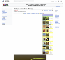
Two images showing the effect with narrow-width, and the extra h-padding in the left margin even at wide-width

Screen Shot 2023-03-21 at 15.22.24.png (1×1 px, 1 MB)

Screen Shot 2023-03-21 at 15.13.13.png (1×3 px, 2 MB)

Benefits (why should this be implemented?):

Community-centered design, flexibility, minimal wasted energy around skin updates.
Event Timeline

ovasileva triaged this task as Medium priority.May 10 2023, 2:09 PM

Taking a note to review this again in the context of the Zebra #9 prototype

Polar Bear image: V2022 | Zebra prototype

It looks like the new prototype reclaimed a small bit of margin on the left and right sides of the page, but made both the main menu and tools menus wider, and added extra padding to the body.* The combined effect is more unused horizontal space in sidebars and less for the content, making the sidebars less compatible with the intended layout for file pages on Commons.

  • The requested preference here should apply to both sidebars, as both are expanding in these design iterations.
  • In Zebra, the horizontal content padding for < 1000px windows has 24px on each side, but this is doubled to 48px for > 1000px windows. It might better match the intent of site curators to have a low-horizontal-padding preference that would also leave out this sort of extra padding.

@ovasileva any updates on this ticket?

FWIW supporting different widths via a preference is going to be very challenging from a technical perspective - we'd need to double the amount of UI regression tests we have to maintain it which would not be practical. Ideally we'd find some kind of compromise default width here if possible.