Page MenuHomePhabricator

Button: add "large" size
Closed, ResolvedPublic1 Estimated Story Points

Description

Summary

The mediawiki.ui button increases its padding on small screens when the button is icon-only (i.e. has no visible text, just an icon), in order to make the touch area larger. See this comment for details. Larger buttons on mobile is an established accessibility standard that should be part of the Codex system.

In order to support use of the Codex Button component in Vector and MinervaNeue, and to meet accessibility standards for other uses buttons on moible, we should consider providing a way to support this behavior in Codex.

Considerations

  • We could increase the size of all buttons on mobile viewports. This has cascading effects, though: if the button inside a Combobox increases in both height and width, the height of the input must also increase to match it. If the Combobox is now bigger on mobile, so should other form inputs be.
  • We could create a prop for button called largeOnMobile that increases button padding only on mobile viewports. But this is very prescriptive and doesn't well-define the larger button size
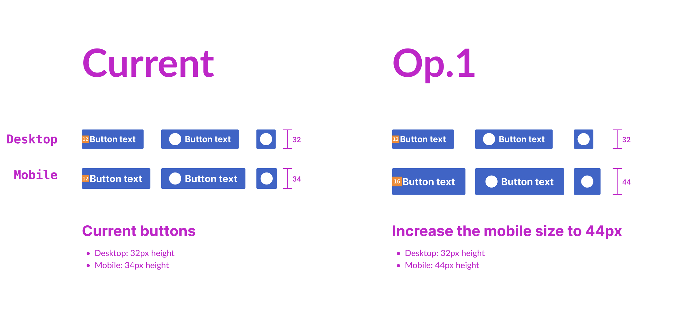
  • We could create a size prop that includes medium (the current size) and large (44px minimum). This would open up usage of large buttons everywhere, which we may not want for consistency's sake.

Solution

In order to limit the scope and complexity of this change, the DST has decided to do the following now:

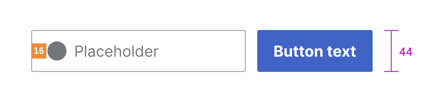
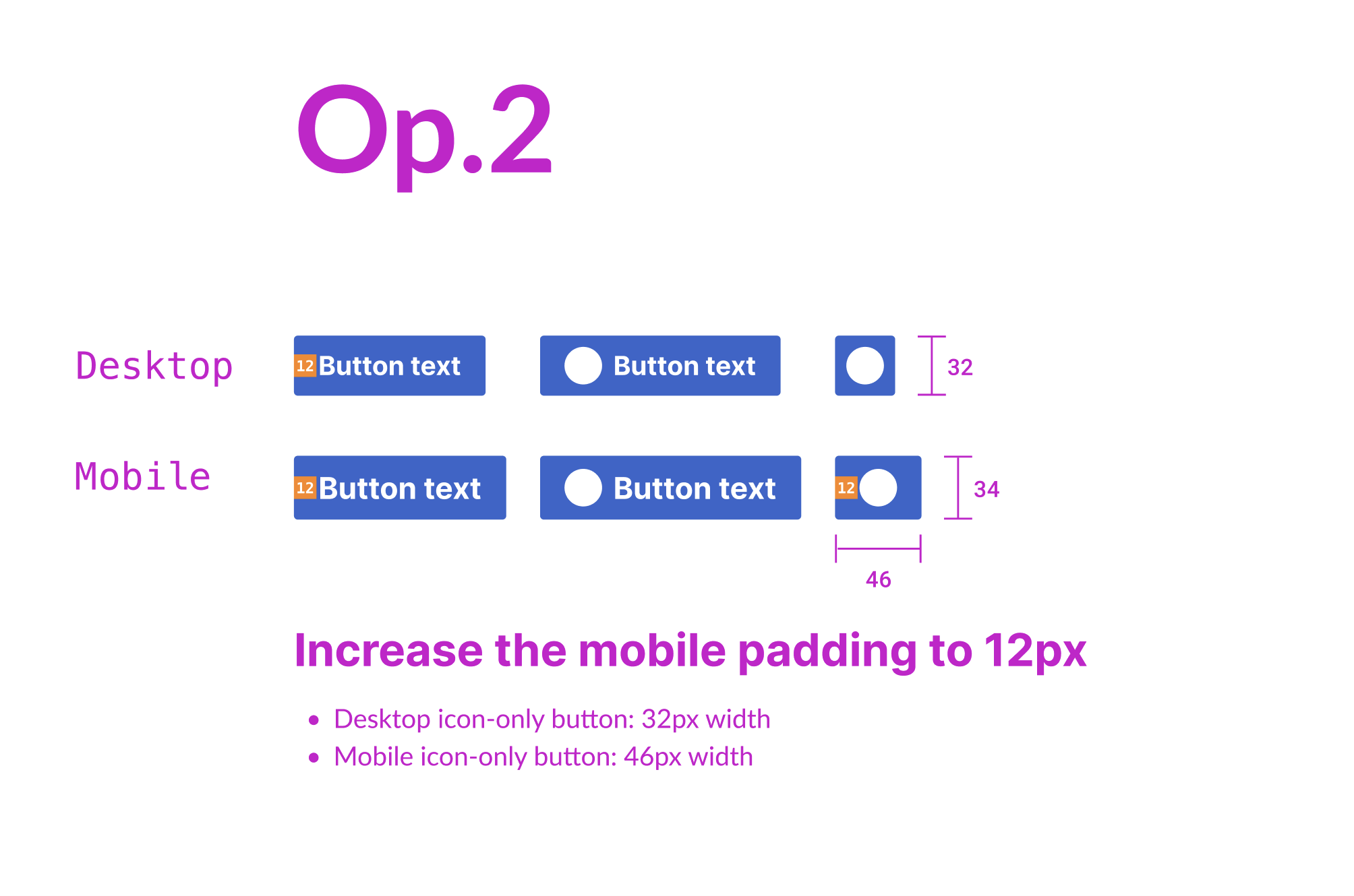
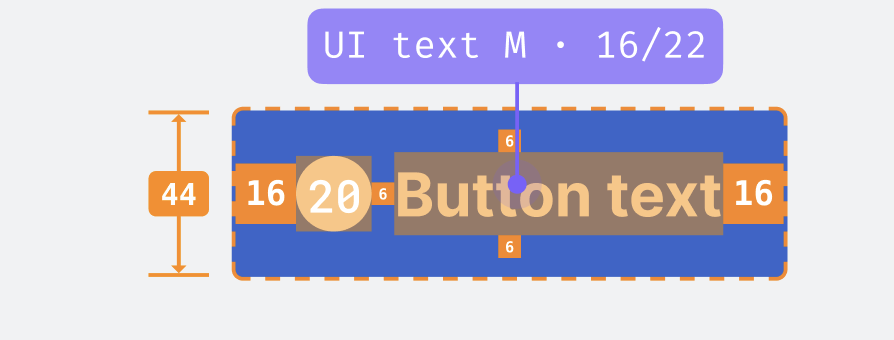
  • Add a size prop to Button. It will allow 2 values: 'medium' (default) and 'large'
  • 'large' will add a CSS class (that can also be used for the CSS-only button) that will increase minimum height to 44px. This will also increase horizontal padding, at least for icon-only buttons
  • Document intended use of the 'large' size, which is really meant for improving accessibility and not increasing the visual weight of a button

Design spec

Related T328628: Evaluate need for bigger button sizes


Acceptance criteria

Note that everything not checked off below will be done as part of T338021

  • Evaluate whether to support increased padding for icon-only buttons on small screens in Codex
  • Determine implementation
  • Define the exact behavior in the Figma design spec
  • Update the Codex Figma library main component and publish the library with the changes
  • Add new component design tokens for the different button padding values
  • Implement the changes in the Button component (Vue and CSS-only)
  • Document usage guidelines

Event Timeline

There are a very large number of changes, so older changes are hidden. Show Older Changes

My proposal to solve this is the following:

Captura de pantalla 2023-04-28 a las 14.27.28.png (1×2 px, 133 KB)

We could increase the mobile buttons from 34px to 44px. If we do this, we should increase the height to 44px also in the text buttons (I've proposed to use a bigger padding of 16px if we don this). If we finally apply this change in the mobile buttons, we should also apply the same changes to the rest of components combined with buttons (e.g. form items such as inputs, selects, etc.) so the height of the elements is the same when combined.

Captura de pantalla 2023-04-28 a las 14.43.43.png (328×1 px, 27 KB)

What do you think?

AnneT renamed this task from Button: Increase padding of icon-only buttons on small screens to Button: Increase padding of buttons on small screens.May 1 2023, 3:31 PM
AnneT changed the task status from Open to In Progress.
AnneT updated the task description. (Show Details)

Change 913971 had a related patch set uploaded (by Anne Tomasevich; author: Anne Tomasevich):

[design/codex@main] Button: Increase size on mobile

https://gerrit.wikimedia.org/r/913971

@bmartinezcalvo That all makes sense to me! I've opened a patch as a proof of concept of this change,here's the preview site. Some details to review on mobile:

  • Buttons
  • Components with buttons:
    • Combobox
    • Message (close button)
    • SearchInput
    • Tabs (scroll buttons)
    • TypeaheadSearch
  • TextInput: This has the same min-height as buttons, and in order to make things like the Combobox and SearchInput look right, the TextInput's min-height must also grow on mobile
  • Select - since all these other form elements are getting taller on mobile, it seems like Select should as well

@AnneT thank you for creating the patch with the preview. I think it makes sense to have a bigger size for buttons on mobile since the current 32px size is too small in many cases. But wondering if we should keep both 32px and 44px size on mobile and decide to use one or other according to each use case, since in some cases the 44px button could be too big even on mobile. For example, in this message component the 44px button seems too prominent now and it makes the close icon too separate from the right edge.

Captura de pantalla 2023-05-02 a las 14.37.20.png (146×530 px, 12 KB)
Captura de pantalla 2023-05-02 a las 14.36.51.png (144×526 px, 12 KB)

Also, if we finally apply this new 44px height to these components, I think we should review the component's padding and maybe increase the side paddings from 12px to 16px to give the text content more space in the box.

Captura de pantalla 2023-05-02 a las 14.38.57.png (138×234 px, 8 KB)
Captura de pantalla 2023-05-02 a las 14.29.48.png (150×656 px, 9 KB)
Captura de pantalla 2023-05-02 a las 14.42.18.png (140×530 px, 10 KB)

Since all these are relevant design changes and they affect too many components in the system, I think we should check this with @RHo and the rest of DS design folks before taking a final decision. cc: @Sarai-WMDE @Volker_E @KieranMcCann

One thing to keep in mind is, we need to consider changing(?) OOUI's button size on mobile as well. Otherwise we might end up with two products in two steps of a user flow with different sizes. And that would have big implications and a lot of in-production interfaces to be changed. Let's be clear how to address this and how to best-possibly move forward with this.

Is this really necessary? I think that the current button sizes work well on mobile. For Minerva, we already produce a build of Codex CSS that uses the larger base font size value of 16px.

Increasing the button size is a pretty fundamental change and it impacts many different components across our system. A lot of elements may need to be re-designed, as @bmartinezcalvo mentions – text sizes inside of buttons, icon sizes, relationships between horizontal and vertical padding, etc.

To put this another way, a change that will have so many downstream impacts (on both design and code) should have an equally (at-least) compelling rationale. We shouldn't do this unless there is a clear need to do so.

If we're only concerned about some buttons in some use-cases, then maybe instead we need to update the Button component to take a size prop similar to how Icon's can (see here – currently Icons support x-small, small, and medium sizes).

Perhaps Buttons should optionally allow a similar set of size values. Maybe we also need to consider adding a large size to the list.

@egardner I agree, this could be a good solution for our system buttons (and form items). What if we crate a new large size for these components so we can use one size or another according to the use case or device? For example, we could always use the large size on mobile as the default size.

One thing to keep in mind is, we need to consider changing(?) OOUI's button size on mobile as well. Otherwise we might end up with two products in two steps of a user flow with different sizes. And that would have big implications and a lot of in-production interfaces to be changed. Let's be clear how to address this and how to best-possibly move forward with this.

Of course, as @Volker_E comments any change or new size in the size of the button should be implemented in both Codex and OOUI to avoid different sizes of buttons in our products.


Although I think the 32px size is not enough in some cases and we need a new size of buttons (and form items) in our system, I'm not sure if this is the best moment to start with this. Should we solve the icon-only button padding in this task and open a different task to create the new large button size?

This could be a possible temporary solution for mobile (and even desktop) buttons where increasing the icon-only button size to 12px the button width would increase to 46px.

Captura de pantalla 2023-05-03 a las 12.55.12.png (1×2 px, 137 KB)

In my opinion, the most scalable and balanced solution would be to implement a larger size for buttons so we can use them as we need. But let's decide if it's worth doing this now.

Looping in @Jdlrobson and @bwang so they can weigh in on the design discussion here.

TL;DR: increasing the padding of all icon-only buttons on mobile so that they are at least 44x44px would require many cascading changes in both Codex and OOUI to maintain consistency. See the comments above for alternative proposals, and please let us know your thoughts.

The 44x44 recommendation is for accessibility and comes from https://www.w3.org/WAI/WCAG21/Understanding/target-size.html

For Minerva, we already produce a build of Codex CSS that uses the larger base font size value of 16px.

Could you elaborate on this? Minerva uses font size 16px, but Codex icons still appear to render smaller than the recommendation.

The 44x44 recommendation is for accessibility and comes from https://www.w3.org/WAI/WCAG21/Understanding/target-size.html
Minerva uses font size 16px, but Codex icons still appear to render smaller than the recommendation.

Is the issue all buttons or just icon-only buttons? For most buttons with text, you are almost always going to have a width of at least 44px; height will be smaller but it also scales up with the user's text size. Upping the vertical padding on all buttons everywhere will impact lots of other components and may require many designs to be re-worked, for questionable gain in the case of standard, text-containing buttons.

If we just need to ensure that icon-only buttons (which are square) have a minimum width & height of 44px or so, then we should consider doing this in way that only applies to icon buttons while leaving other usages alone. Some possible ways we could do that:

  • Add extra padding only in the case of icon-only buttons
  • Add a size prop to the Button component that allows any button (icon-only or not) to become proportionally larger (similar to what we're already doing for Icon)
  • Add a new icon size of large (24px? larger?) in combination with one of the above items

@Jdlrobson would any of these approaches address the use-case (which is icons in the nav bar I assume)?

I'm not sure what you mean by icon-only buttons, but our main concern here is we want to use Codex CSS components on mobile (Minerva skin) eventually and ideally without any visual or accessibility regressions:

Screenshot 2023-05-08 at 2.05.56 PM.png (73×1 px, 8 KB)

Minerva uses a base font size of 16px. and all these icons are icons/buttons without text and you can see them on https://en.m.wikipedia.org/wiki/Main_Page.

I think it's okay if in the case of Vector the regression will get corrected by correcting the font size 16px.

If something is still not clear perhaps we could sync for 15 mins on this matter?

@Jdlrobson we've been referring to these kinds of buttons with icons as icon-only buttons (i.e. no visible text).

Unfortunately the font-size increase from 14px in Vector to 16px in Minerva will not make the icon-only buttons large enough to meet accessibility standards and the current button size: the size you see in the Codex demo, which has a 16px base font size, is the size you will get (32x32px). So we will need to make a change in Codex to meet these standards.

As noted above, increasing the size of all icon-only buttons on mobile will create cascading effects throughout Codex that would also need to be backported to OOUI. Instead, it sounds like we need the option of making buttons larger for cases like the buttons in the header in Minerva. I think we should add a prop to the Button component that can increase the size of the button. This would also mean adding a CSS class that could be used in the CSS-only version of the component.

My initial thought was to make the prop set the larger size below the tablet breakpoint only, but this won't work with the current implementation in Minerva, where the icon-only buttons are 46x46px on all screen sizes. For now, we may want to implement a prop that simply sets the larger size, but in the future as we move toward relying on responsiveness rather than separate skins, we may want to consider a "largeOnMobile" size.

@Jdlrobson let me know if you'd like to have a quick chat to iron out the details here.

Still thinking about what to do here. I think if we switch to Codex for CSS components it makes sense to do that for both desktop and mobile, otherwise development over the next year is going to be painful if we still need to think about mediawiki ui. So I think either way we need to have a solution in Codex or an override in Minerva until the team have more design resources.

Could themes be utilized here? I don't think it should be a problem if OOUI is not in sync with Codex for this particular thing, since we're mostly concerned about the icons in the main UI for mobile and tablet users.

My initial thought was to make the prop set the larger size below the tablet breakpoint only, but this won't work with the current implementation in Minerva, where the icon-only buttons are 46x46px on all screen sizes.

This seems like an okay compromise to me.... I think the reason the icon size is the same everywhere is historic but generally we've been trying to make Minerva and Vector behaviour consistent. Would that be much easier?

@bmartinezcalvo @Volker_E @egardner we're in agreement with the Web team that we should handle this in the Button component and enable dev users to set a larger size in certain contexts, and that it's acceptable to set the larger size only on mobile viewports. We now need to decide what's appropriate in the context of the design system. The remaining questions are:

  1. Should we enable setting the larger size on all screen sizes, just on mobile, or both?
  2. Should we introduce a boolean prop for this (e.g. large or largeOnMobile) or a size prop that could take in multiple different sizes?

IMO, if we do not anticipate offering any other button sizes in the future, we should implement a boolean prop rather than a size prop. I also think we should only make the button larger on mobile, not all screen sizes, since we have no known use cases of larger buttons on larger viewports.

What do you all think?

@bmartinezcalvo @Volker_E @egardner we're in agreement with the Web team that we should handle this in the Button component and enable dev users to set a larger size in certain contexts, and that it's acceptable to set the larger size only on mobile viewports. We now need to decide what's appropriate in the context of the design system. The remaining questions are:

  1. Should we enable setting the larger size on all screen sizes, just on mobile, or both?
  2. Should we introduce a boolean prop for this (e.g. large or largeOnMobile) or a size prop that could take in multiple different sizes?

I suggest creating a new button size large for all types of buttons, including icon-only and text buttons. This way, we can use it whenever needed. We could define or recommend the use of each button size, such as using the medium 32px button on desktop and the large 44px button on tablet and mobile. However, I wouldn't technically restrict the use of button sizes since creating the new large button size will let us use it on desktop in the future, as the current 32px size button is lost within the interface on desktop in many cases.

So my proposal is the following:

{F36993905}

Currently, we have 2 buttons size based on the platform: desktop and mobile. What if we create 2 sizes of buttons (medium 32px and large 44px) and we use them according to each case? This means, removing the platform type desktop/mobile and define/recommend the use of each button size on each platform.

If we do this, we should create the new large size for the different form items too (text input, select, etc.)

@bmartinezcalvo thanks for your thoughts on this! I like the idea of introducing a new size for the 44px version, and agree with the terminology "medium" for the existing size and "large" for the 44px size. Not restricting it to icon-only buttons makes sense to me and makes implementation a bit easier.

In addition to "medium" and "large", should we offer "largeOnMobile"? This would only set the 44px size below the tablet breakpoint. This would be much easier than asking Codex users to set the "large" size on mobile and the "medium" size on desktop (this would require knowing the viewport width in the JavaScript code, which is not ideal for a lot of reasons).

I would propose we do the following:

  1. Now, to resolve this blocker for the Web team: Implement a new size prop of the Button component, with values "medium", "large", and "largeOnMobile". Include in documentation recommendations of when to use the two new sizes. Implement for the Vue and CSS-only versions of Button.
  2. Later: Implement large versions of form inputs, adding a size prop that would apply to the input and button (if there is one)

Update: the engineers have decided against largeOnMobile. Since Minerva only uses large buttons for all viewport widths for now, we will simply add the large size.

AnneT renamed this task from Button: Increase padding of buttons on small screens to Button: add "large" size.May 15 2023, 9:24 PM
AnneT updated the task description. (Show Details)

Change 913971 abandoned by Anne Tomasevich:

[design/codex@main] Button, tokens: Increase size on mobile

Reason:

We'll implement a size prop instead

https://gerrit.wikimedia.org/r/913971

Change 919926 had a related patch set uploaded (by Anne Tomasevich; author: Anne Tomasevich):

[design/codex@main] Button: Add size prop

https://gerrit.wikimedia.org/r/919926

Change 919926 merged by jenkins-bot:

[design/codex@main] Button: Add `size` prop

https://gerrit.wikimedia.org/r/919926

@AnneT checking your last patch. Would it be possible to add the size prop in the configurable demo? It would be great to check each type of button with this new size.

Apart from this, let's keep in mind that the Figma spec sheet should be created before implementing this in Codex, since we should:

  1. Study the new button size paddings in case we want to increase them
  2. Define the use case of each size
  3. Create the Figma component so designers can reuse it

So if we are going to finally implement it, we should create the Figma spec asap. So I guess we will need to remove the mobile-platform variant from the Figma component and create just the medium and large sizes. Is that so?

Change 921072 had a related patch set uploaded (by Anne Tomasevich; author: Anne Tomasevich):

[design/codex@main] docs: Add `size` prop to Button configurable demo

https://gerrit.wikimedia.org/r/921072

@bmartinezcalvo I've added the size prop to the configurable demo, thanks for the reminder!

Right, I'm sorry we've been moving so quickly on this one on the development side - this is a blocker to the Web team's work to implement Codex in skins, so we wanted to get this functionality to them as soon as possible. I do hope that they can start experimenting with the new button size feature while we're completing the design studies and Figma specs.

I think it makes sense to remove the mobile platform variants from the Figm

So if we are going to finally implement it, we should create the Figma spec asap. So I guess we will need to remove the mobile-platform variant from the Figma component and create just the medium and large sizes. Is that so?

I think this makes sense!

Change 921072 merged by jenkins-bot:

[design/codex@main] docs: Add `size` prop to Button configurable demo

https://gerrit.wikimedia.org/r/921072

@bmartinezcalvo I've added the size prop to the configurable demo, thanks for the reminder!

Right, I'm sorry we've been moving so quickly on this one on the development side - this is a blocker to the Web team's work to implement Codex in skins, so we wanted to get this functionality to them as soon as possible. I do hope that they can start experimenting with the new button size feature while we're completing the design studies and Figma specs.

I think it makes sense to remove the mobile platform variants from the Figm

So if we are going to finally implement it, we should create the Figma spec asap. So I guess we will need to remove the mobile-platform variant from the Figma component and create just the medium and large sizes. Is that so?

I think this makes sense!

@AnneT since this task is just to solve the web team blocker, we can publish this new button size and then we could create the design spec and the Figma main component in another task, since we will need to:

  1. Evaluate if we want to increase the side paddings in the large size
  2. Create the large size in other components that usually appear next to buttons, such as TextInput, Select, Combobox, etc.

@CCiufo-WMF do you think it's better to solve the Figma spec in this task or create a new task to solve the new large size for all components (button, text input, select, combobox...) at the same time?

@bmartinezcalvo I think this task should focus on the button specifically, and can include work to add the Figma spec for it.

Bringing consistency with the other components should be filed as separate tasks (if even needed).

Change 922610 had a related patch set uploaded (by VolkerE; author: VolkerE):

[mediawiki/core@master] Update Codex from v0.10.0 to v0.11.0

https://gerrit.wikimedia.org/r/922610

Change 922610 merged by jenkins-bot:

[mediawiki/core@master] Update Codex from v0.10.0 to v0.11.0

https://gerrit.wikimedia.org/r/922610

Thank you all for adding the large size to the button! I see that Codex now provides a class for the large button, I wanted to add that for Vectors' use case (large icon buttons on smaller viewports), we'd likely also need a mixin for setting the button size as well.
When I was discussing this with @AnneT, she mentioned that there was discussion about formally supporting this use case with a "responsive" button. This would also work for us, though I think the mixin approach would be simpler and is more in line with the current implementation of the .cdx-mixin-button-layout-flush mixin. Another thing to note, in Vector we only increase the size for icon buttons on smaller viewports, not all buttons. Presumably the reasoning was that regular buttons are quite a bit wider because of the text so its not necessary to change the padding. I'm not sure if the option of a "responsive" button works the same

AnneT updated the task description. (Show Details)
bmartinezcalvo updated the task description. (Show Details)

@AnneT as defined in the Figma spec, large button should use 16px instead (in the Codex demo we are using 12px). Should we reopen this task to fix it?

Captura de pantalla 2023-06-05 a las 20.08.11.png (340×894 px, 33 KB)

Change 928140 had a related patch set uploaded (by Anne Tomasevich; author: Anne Tomasevich):

[design/codex@main] Button: Organize and correct padding styles

https://gerrit.wikimedia.org/r/928140

Change 928140 merged by jenkins-bot:

[design/codex@main] Button: Organize and correct padding styles

https://gerrit.wikimedia.org/r/928140

@bmartinezcalvo I've updated the Button to increase the horizontal padding for large text buttons - please see the demo here!

Change 931666 had a related patch set uploaded (by Anne Tomasevich; author: Anne Tomasevich):

[mediawiki/core@master] Update Codex from v0.12.0 to v0.13.0

https://gerrit.wikimedia.org/r/931666

Test wiki created on Patch demo by ATomasevich (WMF) using patch(es) linked to this task:
https://patchdemo.wmflabs.org/wikis/2c8b23bc31/w

Change 931666 merged by jenkins-bot:

[mediawiki/core@master] Update Codex from v0.12.0 to v0.13.0

https://gerrit.wikimedia.org/r/931666

Test wiki on Patch demo by ATomasevich (WMF) using patch(es) linked to this task was deleted:

https://patchdemo.wmflabs.org/wikis/2c8b23bc31/w/