Author: philinje
Description:
Make the logo larger so it is equivalent to a normal size.
Version: 1.0.0 (Android)
Severity: enhancement
| • bzimport | |
| Dec 13 2011, 12:06 AM |
| F8604: W_And_about_0109L.png | |
| Nov 22 2014, 12:04 AM |
| F8603: W_And_512_1219.png | |
| Nov 22 2014, 12:04 AM |
| F8602: WikiLogo.png | |
| Nov 22 2014, 12:04 AM |
Author: philinje
Description:
Make the logo larger so it is equivalent to a normal size.
Version: 1.0.0 (Android)
Severity: enhancement
| Status | Subtype | Assigned | Task | ||
|---|---|---|---|---|---|
| Resolved | None | T33702 Android app shows blank screen after network failure | |||
| Resolved | • Tfinc | T33447 Android App 1.0 release (tracking) | |||
| Resolved | • brion | T35013 Fix Wikipedia icon in Android app |
Do we have a master asset for a version of the logo we want to go with? Should we run through Brandon for a little graphic arts magic?
I've put a provisional version in based on one of Heather's mockups:
super high-res Gimp master:
https://github.com/wikimedia/WikipediaMobile/blob/master/scratch/logo-huge.xcf?raw=true
512x512 "app store" version:
https://github.com/wikimedia/WikipediaMobile/blob/master/scratch/logo-512.png
48x48 default size for tablets & medium-res phones:
https://github.com/wikimedia/WikipediaMobile/blob/master/res/drawable-mdpi/icon.png
There may be some updates still coming, so leaving this open for the moment.
Created attachment 9729
Logo on Galaxy 3
Looks awkward on my phone because of the shadow. Looks worse than how the screenshot is when seen directly on the screen.
Attached:
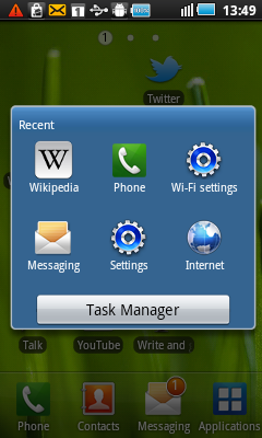
To me that looks pretty good... is it the very slight drop shadow that looks odd to you, or the shading within the square? I believe we're planning to lighten that; Heather's got an improved master copy ready to roll.
hwalls wrote:
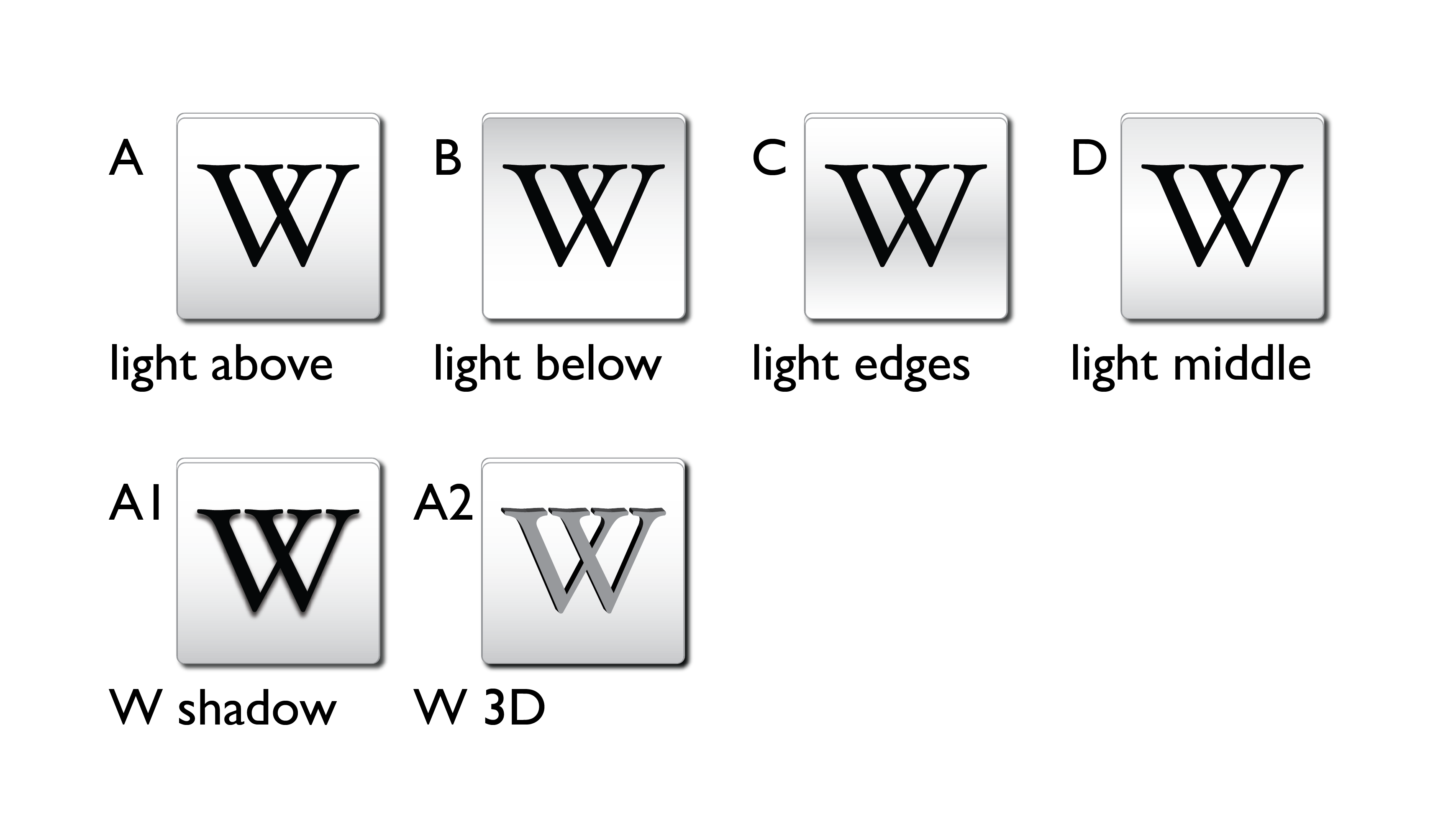
Launch icon, 4 styles
Here are 4 versions of shading and 2 options for the W aside from regular-flat.
I'm happy to make any new sizes or combinations.
Attached:
[master 3ba59ff] Update app icon per https://bugzilla.wikimedia.org/show_bug.cgi?id=33013
Previous commit was missing the actual files. :P
[master 6d87b13] Followup 3ba59ff52b10f30f5d977df9274ab2e47fdc83e4: commit updated icon files!
hwalls wrote:
Revised launch button
Brings back more rounded corners, trying 360 "shadow"
attachment W_And_512_0106.png ignored as obsolete
hwalls wrote:
This is a larger version of the last icon
Once more, with feeling!
attachment W_And_about_0109.png ignored as obsolete
Last update, not cut off, size good, we kinda want *slightly* more shadow if we can figure out how to make it heavier:
[master ffa4578] another icon update :D
hwalls wrote:
Same with darker shadow
After I read your comment, I realized how to make the shadow darker.
Go Team Logo!
(If this is too dark and looks like a line instead of a shadow, I can make it lighter.)
Attached: