Page MenuHomePhabricator

Community Configuration: Save Changes Edit Summary improvements
Open, MediumPublic

Description

User story & summary:

As an editor making Community Configuration changes, I want the Edit Summary to be easy to understand, so that I can make the necessary changes.

Background

We received feedback from @Tacsipacsi in T354463#9674654:

  • (optional) text: it is bold in implementation but uses regular weight in the designs.
  • edit summary text area: "The summary box is huge. In one design, it’s a two-line textbox, in the other one, it’s a one-line input; in the implementation, it’s eight lines tall. This gives the impression that the edit summary can be however long I want it to be (and indeed, nothing on the frontend prevents me from writing an over 1000 characters long summary, even though the backend (MW core) caps the summary at 500 characters)."
  • legal disclaimer: "on submitting edits in VE, there is a footer with legal clause with links to licensees and to the Terms of Use. Do we need a link to the Terms of Use in the Edit Summary too?" / "the placement of the Reminder is the same as for the footer for saving edits which might confuse those users who used to see different footer."

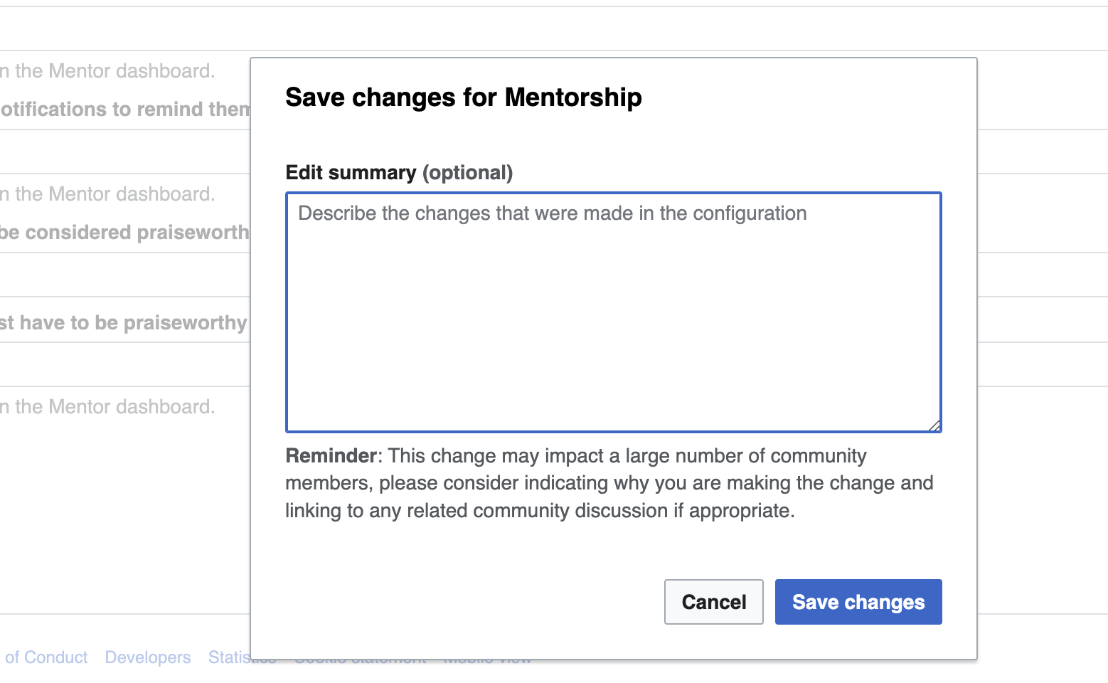
Current implementation:

Screen Shot 2024-03-28 at 2.52.10 PM.png (960×1 px, 162 KB)

Proposed designs/improvements:

  • (optional) text should use Regular weight.
  • use Autosize property for the TextArea, which starts with two lines as default, and the text area’s height automatically resizes with the length of the text. See how the Autosize property behaves here (toggle the 'Autosize' option).
  • add Legal Disclaimer under the Reminder text.
Mock-up

Dialog (14).png (452×518 px, 45 KB)

Acceptance Criteria:
  • (optional) text uses Regular weight and not bold
  • Summary box uses TextArea component with Autosize property
  • Add standard legal disclaimer below Reminder text:

By saving changes, you agree to the Terms of Use, and you irrevocably agree to release your contribution under the CC BY-SA 4.0 License and the GFDL. You agree that a hyperlink or URL is sufficient attribution under the Creative Commons license.

Details

Other Assignee
JFernandez-WMF

Event Timeline

Thanks for filing this @KStoller-WMF and @Tacsipacsi for providing feedback on this. I'll address the different points below:

The (optional) text is bold. In both designs in the description, it has a normal weight.

I am guessing this is minor, but that text should be in regular weight and not bold indeed. See Codex page for the Label component.

The summary box is huge. In one design, it’s a two-line textbox, in the other one, it’s a one-line input; in the implementation, it’s eight lines tall. This gives the impression that the edit summary can be however long I want it to be (and indeed, nothing on the frontend prevents me from writing an over 1000 characters long summary, even though the backend (MW core) caps the summary at 500 characters).

Thank you for noticing the discrepancy here. It looks like the implemenation is using the TextArea component, which is the correct component to use here. But I agree the height of the box is bigger than expected. I suggest we use the Autosize property, which starts with two lines as default, and the text area’s height automatically resizes with the length of the text. You can see how the Autosize property behaves here (toggle the 'Autosize' option).

For the Legal disclaimer and the Reminder, we are adding both on the Edit summary, with the Reminder on top of the disclaimer.

Dialog (14).png (452×518 px, 45 KB)

I will update the task description with these proposals.

I am guessing this is minor, but that text should be in regular weight and not bold indeed. See Codex page for the Label component.

Thanks for confirming!

I suggest we use the Autosize property, which starts with two lines as default, and the text area’s height automatically resizes with the length of the text. You can see how the Autosize property behaves here (toggle the 'Autosize' option).

I also find it a good idea. (VE also uses an autosized box, as I mentioned back in April in T354463#9681704).

For the Legal disclaimer and the Reminder, we are adding both on the Edit summary, with the Reminder on top of the disclaimer.

Dialog (14).png (452×518 px, 45 KB)

I will update the task description with these proposals.

You seem to have not noticed (and have removed from the description) my proposal about having the two blocks of texts have different background colors, which would highlight that they are two different things.