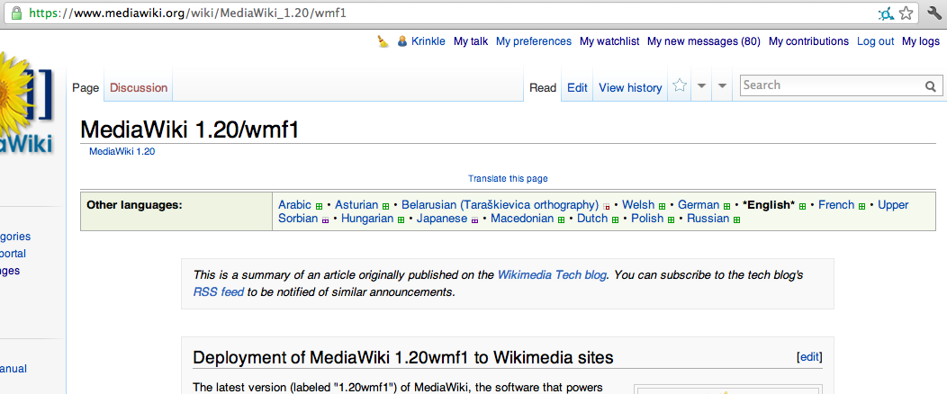
screenshot showing *English* as the current selection
The asterisks add no value whatshowever. The other visual indications using the black color, font-weight and un-clickability of the link already are clear enough (especially in MediaWiki context since this principle is used in core as well - *without* the *asterisks* around *it*).
The asterisks only add more clutter to the screen and are inconsistent with what the user is trained in MediaWiki core. And they also take up precious space in the (already cluttered) language navigation bar. Which has a lot of stuff into it, is clunky and big and should probably get a redesign in general at some point, but for now I'd say the asterisks are low ganging fruit to fix for the user.
Bug 34113 made this configurable with css, but I have no intension of overriding this through css on all wikis using Translate. This is a no brainer and can just done in the extension itself for everyone to enjoy equally.
Version: unspecified
Severity: normal
Attached: