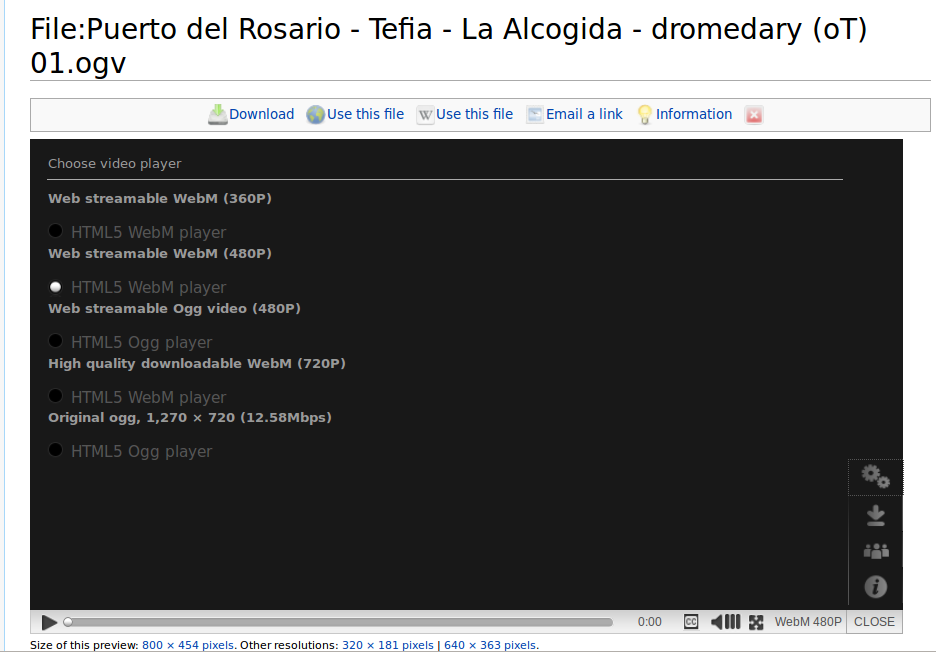
screen capture of MENU > Player options for video
I played around with https://commons.wikimedia.org/wiki/File:Puerto_del_Rosario_-_Tefia_-_La_Alcogida_-_dromedary_%28oT%29_01.ogv
The list of player choices in MENU > Players "Choose video player" is confusing. The headings are smaller than the text next to each radio button, and each button is tightly aligned with the heading below it and is far from the heading above. This happens in both Firefox and Chromium.
Suggestions:
- The spacing should relate the heading to the stuff under it.
- The heading shouldn't be smaller than the radio button text.
- The radio button should be next to the entire item, not nested underneath the heading.
- The text in the heading and next to the radio button repeat each other, maybe they can be on one line if there's room.
- Clicking either the heading or radio button text should select the radio button.
Something more like:
( ) Web streamable WebM (360P)
HTML5 WebM player
( ) Original ogg, 1270x720 (12.58Mbps)
HTML5 Ogg player
Looking at the HTML, the heading is h3 12px with a bottom margin and bottom padding; the regular text is 14px. Semantically, making these hNN heading tags seems wrong, they aren't organizing the page layout.
Version: master
Severity: normal
Attached: