Page MenuHomePhabricator

WTA - Language links split into two lines in Chrome
Closed, ResolvedPublic

Description

Author: thetestchick

Description:
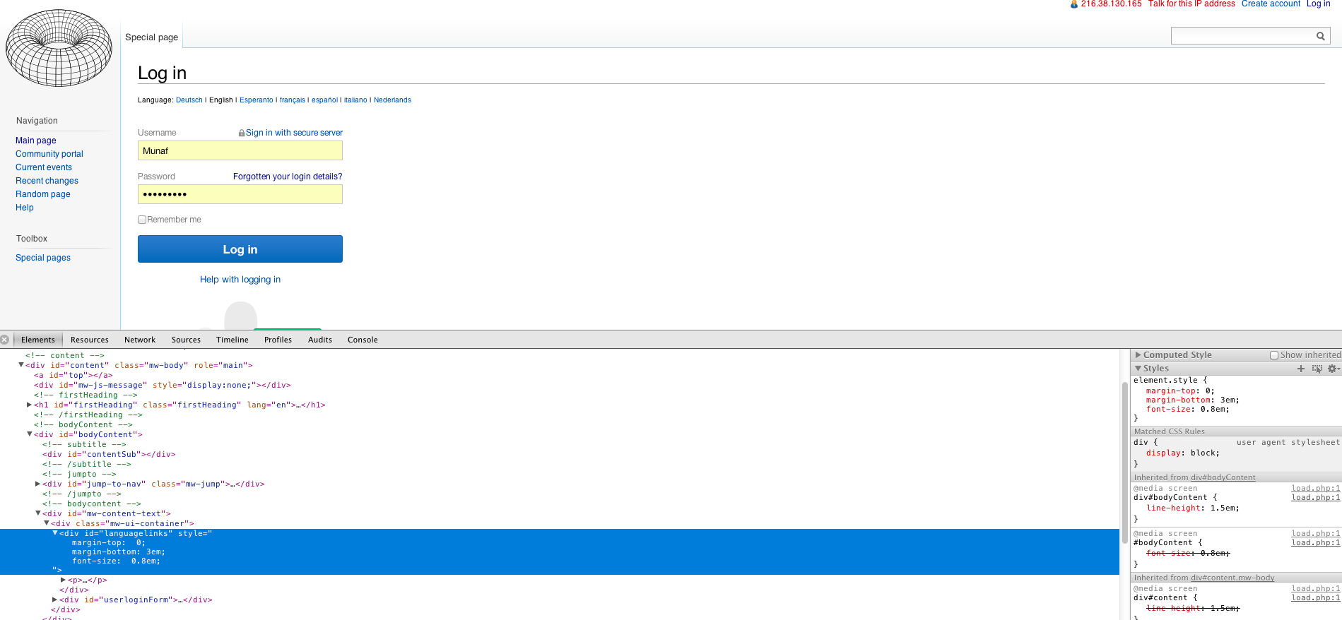
I'm using Chrome on a Mac, comparing the old and new versions of the login page. In the old version the language links are nice and neat in one line, however in the new version they split into two lines, even if the browser window is fully maximised.
It makes the screen look cluttered.


Version: unspecified
Severity: normal

Details

Reference
bz46958

Event Timeline

bzimport raised the priority of this task from to Medium.Nov 22 2014, 1:18 AM
bzimport set Reference to bz46958.

thetestchick wrote:

Just checked it in Firefox and Safari and I'm getting the same results.

thetestchick wrote:

Screenshots

Attached:

The language links are output as part of the form, hence they adopt the compact vertically stacked layout. Since they are the first thing output[*], we could move them outside the form and allow them to spread out; but I'm not sure this improves the page's appearance.

  • Also true in Create account if we reposition the CAPTCHA. And note that if we reintroduce start and end messaging on these pages, we will have a similar issue of whether it should be confined to the narrow layout.

Created attachment 12050
What the page looks like with languagelinks moved out of the narrow form area.

attachment 2013-04-08 bug 46958 spread language links.png ignored as obsolete

massaf wrote:

Possible improvement

It's not the greatest solution, but if we reduce the size and add some margins to the Language Links, it's not terribly obtrusive.

Attached:

LoginFormLangLinks.png (878×1 px, 160 KB)

swalling wrote:

(In reply to comment #5)

Created attachment 12052 [details]
Possible improvement

It's not the greatest solution, but if we reduce the size and add some
margins
to the Language Links, it's not terribly obtrusive.

That's a good interim solution to run. Two more changes I'd like to see:

  • The pipe separators make it harder to scan the list. A bullet or comma separated list may be better, or no punctuation at all perhaps.
  • Retaining the black text color when the field labels are grey is slightly wonky information hierarchy. It may be good to have them be the same color as "Username", "Password", etc.

Attached:

LoginFormLangLinks.png (878×1 px, 160 KB)

Commit I489042c50 has been updated by Munaf with a proposed fix.

The fix is live.

(In reply to comment #6)

Two more changes I'd like to see:

  • The pipe separators make it harder to scan the list. A bullet or comma

separated list may be better, or no punctuation at all perhaps.

  • Retaining the black text color when the field labels are grey is slightly

wonky information hierarchy. It may be good to have them be the same color as
"Username", "Password", etc.

File a separate enhancement bug(s) for language links improvements like these and improve the useless tooltip (title attribute) on the links.