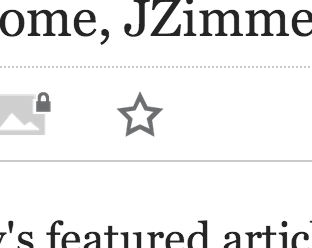
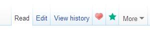
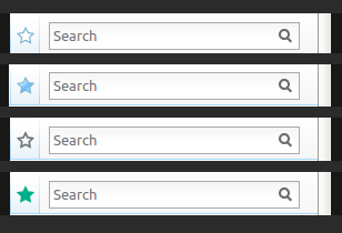
Page MenuHomePhabricator

Watchlist icon does not match on desktop and mobile skin
Closed, DeclinedPublic

Assigned To
Authored By
Jaredzimmerman-WMF
Sep 19 2013, 5:34 AM
Referenced Files
F21246: aSK3bVv.png
Dec 15 2014, 10:12 AM
F21244: dgDAP7i.png
Dec 15 2014, 10:12 AM
F21033: Screenshot_2014-12-11_19.36.01.png
Dec 12 2014, 9:16 PM
F21031: Screenshot_2014-12-11_19.35.41.png
Dec 12 2014, 9:16 PM
F20871: Watchstar-unwatch.png
Dec 11 2014, 8:23 PM
F20870: Watschstar.png
Dec 11 2014, 8:23 PM
F11579: Screen_Shot_2013-09-18_at_10.33.52_PM.png
Nov 23 2014, 11:11 PM
F11583: unstar.svg
Nov 22 2014, 1:59 AM
Tokens
"Like" token, awarded by Ricordisamoa."Like" token, awarded by Qgil."Heartbreak" token, awarded by Edokter."Like" token, awarded by Liuxinyu970226."Like" token, awarded by Florian."Heartbreak" token, awarded by wctaiwan."Heartbreak" token, awarded by matmarex.

Description

Event Timeline

There are a very large number of changes, so older changes are hidden. Show Older Changes

@matmarex, the request is to have the icon states from mobile for watchlist watched/unwatched from mobile be ported to desktop, I think that is a pretty clear task. I'm not sure what the confusion is?

I was confused about which is to be copied to which, so I guess at least that is clear now.

I am also confused about why is this considered a good idea when the skins differ so much. Trying to make the icons "consistent" is just going to make them inconsistent with the rest of the skin. (Consistency being the hobgoblin of minds and all that.)

Consistency is a work in progress. This is a piece of that progress.

Progress implies forward motion. :)

I think the idea is for mobile skin Minerva and desktop skin Vector to one day converge.

However with the reactions I have seen so far to basic things such as buttons becoming biggger and green I worry this approach is not working.

I'd hate a volunteer to do this and then feel the wrath of the community.

Any clever ideas of how we might make these two skins coverge? Maybe building mobile into a desktop vector like skin at desktop resolutions would be a more successful approach?

Change 178048 had a related patch set uploaded (by M4tx):
Replace desktop watchstar icon with mobile skin one

https://gerrit.wikimedia.org/r/178048

Patch-For-Review

Change 178048 merged by jenkins-bot:
Replace desktop watchstar icon with mobile skin one

https://gerrit.wikimedia.org/r/178048

Florian claimed this task.

Change 178468 had a related patch set uploaded (by M4tx):
Optimize assets added in changeset 178048

https://gerrit.wikimedia.org/r/178468

Patch-For-Review

Change 178468 abandoned by M4tx:
Optimize assets added in changeset 178048

https://gerrit.wikimedia.org/r/178468

Change 178467 had a related patch set uploaded (by Florianschmidtwelzow):
Compress some images with svgo and pngcrush

https://gerrit.wikimedia.org/r/178467

Patch-For-Review

Change 178467 abandoned by Nemo bis:
Compress some images with svgo and pngcrush

Reason:
Avoid messing up with possible revert of parent change.

https://gerrit.wikimedia.org/r/178467

Nemo_bis removed Nemo_bis as the assignee of this task.
Nemo_bis edited subscribers, added: TrevorParscal, Edokter; removed: Nemo_bis.

I never bothered to check because I thought this was just a format change. I never expected a *design* change.

Quote from description:

Desktop icon should be replaced to match mobile skin

I personally see no reason to revert this change, the mobile watchstar matches the Vector design much better as the old one.

I personally see no reason to revert this change, the mobile watchstar matches the Vector design much better as the old one.

Then that is where we substantially differ in opinion; I think they don't match at all, and the result (especially the green unwatch) looks out of place. We should not try and make Vector and Minerva look alike; don't we have Winter for that?

I see no point to this change to begin with.

[EDIT:] So here is what it looks now in Vector (on MediaWiki.org):

Watschstar.png (60×300 px, 4 KB)
Watchstar-unwatch.png (60×300 px, 4 KB)

One of the gripes is that the style is a total mismatch with the Wikilove icon, and with Vector in general. This looks really uncohesive...

Copying comments from the change, https://gerrit.wikimedia.org/r/#/c/178048/:

I'm bummed that this got merged. Just because you resolve a bug doesn't mean you've done the right thing, and just > because the watch start on mobile is green doesn't mean that makes sense on desktop.

I'm thinking this should be reverted, anyone agree with me?

@MZMcBride wrote:

Mobile(Frontend?) is using a pretty radically different skin, so I don't think there's much expectation of parity here.

What's the objection to this change? The color green for the star in Vector clashes?

@Edokter wrote:

I'll say it clashes... I never bothered to check because I thought this was just a format change. I never expected a *design* change.

While I understand wanting to harmonize the experience between mobile and desktop, such harmonization should be limited to Wikipedia's content. Graphical elements between Vector and Minerva *not* interchangable (unlike Minerva and Winter).

Please revert.

@Nemo_bis wrote:

Why isn't this discussion happening on phabricator? In general, all the "do like MobileFrontend" changes are radical design changes.

Consistency is a work in progress. This is a piece of that progress.

Skins should be consistent within themselves - not consistency across skins.

+1 for revert. Solid green looks out of place in Vector.

So, how should we call this? I feel like I'm not alone in thinking this should have never been merged, but I'm getting push-back from Jarred over email, asserting that this is what he wants.

"The green star of death"? I don't know... We just have to keep nagging that "Vector != Mobile" until this is reverted.

I personally think this is a lot of conversation over the colour of an icon and there are more important things to be concerning ourselves with.

One observation is that there is a camp of people that do not like incremental skin changes and a camp that hates big changes. As a result Vector never changes, even just yesterday @TrevorParscal lamented this but this is exactly why nothing is happening.

It seems we need to find a better approach for making changes to the skin that the design team need.
Maybe it's time to fork Vector and create a new skin or a beta feature that replaces the existing skin Vector with a Vector2.

Either way I'm tired of all this back and forth on issues like this and it really wastes a lot of my developer time and I'd rather we fixed the bigger problem above.

That's all I've got to say about this matter.
Also removing mobile web as this has nothing to do with that product.

Jon, I feel like you must have misunderstood what I was in fact lamenting about.

It's been about 5 years since Vector was released. I think it's really sad that it's basically unchanged. The reason this has happened is because nobody is interested in making Vector better - everyone just wants to blue-sky the whole thing and reinvent things they don't properly understand. This situation (with the watch star) has nothing to do with that. Changing the color to green has no substantive advantage over the status quo - it's simply been copied it from another place and now it looks wrong because it's out of context. It's also not blue-sky thinking. It's just sloppy.

You talk about wasting time talking about the color of an icon. You say this is a bad thing. What about being the kind of organization that cares about details? Isn't that a good thing? Please stop trying to dismiss arguments with "we have better things to do". Details are important.

Changing the color to green has no substantive advantage over the status quo

The change doesn't contains a new watched color, only. The whole watchstar changed, and if i see the colors correctly, the new one matches the header much more. There are grey fonts, a grey backgrounds, grey input fields (search) and last but not least, the search icon is in grey, too. So the mobile watchstar looks much better in this context.

If the green isn't a color you prefer, i think we can discuss another, maybe better, color, but i would be really sad, if we revert the change because of just the color (despite that the wtachstar matches the context more as the old one).

Isn't this the same type of star used also in compact bar and Flow in desktop? I'm just a user, and it looks good to me, consistent with all the new stuff coming. The flat color / no shade also fits with the Echo notifications icon.

Better than this, I hadn't noticed the change until seeing this thread, and I have been editing pages both in mediawiki.org and the wikipedias, with new and old styles. All this to say that while here we discuss about life or death, for most users it will be a cosmetic change. And I think it's a good one.

You all seem to be missing that this is a tab icon, and these have a specific style, which has now been broken. If we're changing icons, they should be changed all at once as a coherent set (or at least in groups thereof).

Right now, the icon may look sleeker, but the mix of old and new icons looks beyond ugly.

@Edokter, which other icon tabs are you referring to? can you include a screenshot? is it related to a gadget, extension, or special user rights?

@Edokter, ah! thwarted again by Phabricator collapsing comments. You're referring to the wikilove icon tab or others as well?

We should try to avoid treating reverts as a big deal. We can pull back https://gerrit.wikimedia.org/r/178048 for a week or two in order to get firmer consensus for its implementation. For a change to the default skin such as https://gerrit.wikimedia.org/r/178048, it probably needs a bit more agreement, especially as there were repeated concerns raised in this ticket.

Whoever creates a revert commit will necessarily need to include a commit message that explains the issues with the commit. To me, it's still a bit unclear what the objection is. The solid color? The color green? The animation?

You buy a brand new car, sky blue. You walk around it and notice one door is emerald green, and is from a totally different car model... would you still take it?

That is the issue!

@Edokter, ah! thwarted again by Phabricator collapsing comments. You're referring to the wikilove icon tab or others as well?

The Wikilove icon was modeled after the watchstar icon, so they formed a perfect match. I don't know of any other icons off-hand. But equally distracting is how the green, unshaded star clashes with the Vector tab's blue gradient background.

Like I said above, change them as a set if you must. But I share Trevor's sentiment; we is there a need to change Vector to begin with? It is a skin within its own right and should not be polluted with elements from *other* skins.

Consistency is important to establish a mental model for users to have expectation of how things behave, in a situation like ours where users are looking for a consistent access point with a specific meaning "watch this thing for changes, and alert me when they happen"

This functionality is the same in mobile, and desktop (at a page level, as well as at a flow topic level) and therefore should have a similar look and feel, a logical and platform appropriate but consistent location. The idea of "internal consistency to a skin" may be understandable to foundation employees but it pretty meaningless to our users, who for the most part don't even think of the site as having skins, or that mobile and desktop are different skins.

Like @MZMcBride said, I'm still a little unclear about the exact contentious point here other than, change can make people uncomfortable, which I totally understand, but change is a fact of life, and our digital tools are no different.

@Edokter, I think you might be misunderstanding @TrevorParscal, he has no intention for Vector to be an immutable thing, that remains static always. If your concern is that the icon doesn't match the heart from wikilove, lets update the heart, If your concern is that it doesn't match with the blue, I would point out that watching a page on a wiki is a pretty critical action, and having something that stands out feels like a big improvements to me, don't forget that the previous version had some pretty garish color combinations as well.

Screenshot_2014-12-11_19.35.41.png (120×143 px, 11 KB)
Screenshot_2014-12-11_19.36.01.png (121×140 px, 12 KB)

Change is hard, big drastic change is even hard, but I don't think this is either of those things. It feels like a slow steady work towards consistency, in a way that is minimally disruptive (e.g. not changing everything at once) I totally understand the point that while we iterate towards a more consistent end goal there may be some moments along the way that feel less consistent, but that eventually we'll get to a place that we're all happy with.

Here is some further reading about consistency of design and UI elements that might be helpful as well.

If your concern is that the icon doesn't match the heart from wikilove, lets update the heart

[off-topic] I should add that one of WMF wikis doesn't use that heart at all:

#ca-wikilove.icon a {
	background-image: url( //upload.wikimedia.org/wikipedia/commons/thumb/8/87/Symbol_thumbs_up.svg/16px-Symbol_thumbs_up.svg.png );
}
 
#ca-wikilove.icon a:hover,
#ca-wikilove.icon a:focus {
	background-position: 5px 60%;
	background-image: url( //upload.wikimedia.org/wikipedia/commons/thumb/a/ad/Symbol_thumbs_up_color.svg/16px-Symbol_thumbs_up_color.svg.png );
}

https://pt.wikipedia.org/wiki/MediaWiki:Common.css

I asked Jorm for his opinion on this (he currently apparently doesn't have access to his account here):

I think that switching the shape of the star or its border color isn't that big of a deal (though I think the angles on the mobile star are too acute) but the green is too aggressive and clashes with the rest of the skin.

Before and After.

dgDAP7i.png (210×308 px, 10 KB)

Re: the attachment 2 comments above from Jared, note that the gold outline only appears on mouseover.
Relatedly, there is no mouseover effect/change for the green version (neither the "After" for this change to desktop, nor when seen in MobileFrontend). I don't know if that's an issue.

The animation hasn't changed (we're not using the mobile bi-directional spin), so that's not as aspect of this discussion.


Given the wm2014 UI consistency presentation, particularly this slide, I agree that there are a lot of confusing and inconsistent uses of the star iconography, throughout our wikis.

I think the new unwatched-star is generally an improvement, because it gives increased visibility and accessibility. (cf. previous complaints about medium/light grey fonts and icons, being hard to see, for people with imperfect vision or computer-hardware or lighting conditions.) I agree that giving it extra visibility is good. (It's a darn important thing for newcomers to learn about, and many editors don't stumble on it early on).

I'm not sure about the change from graduated-blue to flat-green for the watched-star. I agree that it clashes somewhat with the rest of the Vector skin, and looks out of place. I also think the watched pages are less crucial to draw attention to, and therefor the increased visibility is slightly less important. (Because once someone has watched a page, they've gotten the popout bubble message, which is the important explanatory tip.)

Questions: How does WikiFont tie into these changes? I understand that the font-implementation probably isn't going forward, but I was under the impression that the SVG versions of the glyphs were still intended to be used. Are Mobile and Desktop meant to be migrating to this, or something very similar, in the near future? What color(s) (if any) is the final version going to use for the watched-star? (I believe that the flat-black is just the default, and that many of the samples given in the full icon set can be in 2 or more colors, and that we'd use a dark grey in most instances, rather than black.)

aSK3bVv.png (79×160 px, 3 KB)

I would suggest that it's better to not change the watched-star at all, for now. We should wait until the WikiFont glyphs have been discussed and refined some more, rather than having two changes. The stars aren't listed in OOJS-UI demo, so I'm not sure if that's related, too.

Is it possible to revert the new green watched-star, but retain the new medium-grey unwatched-star? That'd be my recommendation. Even if it means the new darker outline gets applied to the graduated-blue watched-star. (but as always, mockups/previews would be appreciated).

Oppose black, It'll be hard for tablet users.

I would suggest that it's better to not change the watched-star at all, for now. We should wait until the WikiFont glyphs have been discussed and refined some more, rather than having two changes.

+1

"WikiFont" is not going forward as a webfont, but @Quiddity like you said the actual iconography will be part of the Mediawiki UI/ooui set of controls, palettes, etc. There is no plan for a "big switchover" like you were talking about however, rather a slow set of small changes (like this one) that will increase platform consistency over time.

I'd like to point out that, taking the "consistency" argument, green matches the green from MediaWiki UI. So it could be seen as a move towards that. However in that mindset, green indicates performing a constructive action. Here, however, clicking the solid green star doesn't result in adding the page to one's watchlist. It removes the page from one's watchlist. Come to think of it, that may've been counter-intuitive within Mobile as well (possibly this behaviour was copied from Vector when MF was written).

Consistency as a work in progress within a single interface is imho undesirable. Doing one app, and then another makes sense. Ideally core special pages would all move at once, but they're sort of separate so that's OK I guess (though in the future we'll be able to change them at once). Changing one single icon in a toolbar will be seen as plain inconsistency for actual users. I don't think it's in our users best interest to do that bit-by-bit. Rather, figure out which icons exist in Vector, iterate over the transformation internally (or in beta) until it's done, then release at once for an individual component. That's consistency.

What Krinkle said. I just couldn't find the right words.

The new star 's flat design doesn't fit with Vector's gradient style and there's the issue with colour green as per what @Krinkle and @Esanders previously said. Why can't we have Winter (or put our resources into its improvement and development) instead of changing something that people probably love for probably worse (but certainly not for better)?

Given that the change is in wmf12 and is already live on mediawiki.org and test2wiki, I propose this revert be merged today and backported to wmf12. Otherwise the green star will get deployed to Wikipedias tomorrow and will be there for the next three weeks because of the deployment freeze over the holidays.

Thank you guys for stepping up and doing this.

I look forward to an eventual unification, whether it be iterative or not. Something to consider however - there are likely many things on desktop that are good, that mobile has not yet implemented or matched, that should be copied from mobile to desktop, rather than the other way around.

I think this actually may be a good example of this. In mobile, as Timo has noted, the watch star is a gray outline. When clicked, it becomes solid green. According to the MediaWiki UI styleguide, using that green for a button indicates a constructive action. Clicking the green watch star not only does not create anything, but it actually removes the page from the watch list, which is more similar to a destructive action. I believe that this is actually a problem with the guideline first and foremost. The checkbox control is also styled with a green check, so clearly there's a mixture of functional and non-functional coding going on here. I think this is a contradiction in the styleguide that needs to be resolved.

I think a better thing to do would be to replace both the Vector and Minerva watch star active state icons with solid gray icons instead of using any color at all. It solves the confusion in the mobile experience and achieves some consistency between Vector and Minerva.

Edokter claimed this task.
Edokter removed Edokter as the assignee of this task.

Is this really resolved? The change was reverted, both icons are still different? If it is declined, maybe we should close jt as declined not resolved?

Edokter changed the task status from Resolved to Declined.May 2 2015, 10:41 AM
Edokter claimed this task.

The consensus seems to be that they should not be the same. So yes, 'declined' is the better choice.