Page MenuHomePhabricator

Distance between "read in another language" and Nearby
Closed, ResolvedPublic

Description

Not very beautiful distance

For example:
https://en.m.wikipedia.org/wiki/San_Francisco?mobileaction=alpha

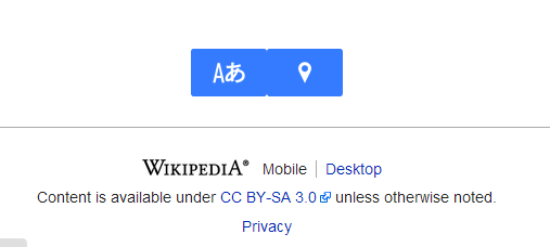
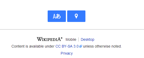
Under content there are the two buttons/links "read in another language" and Nearby, but unhappily they are without any distance, what isn't very beautiful. I sugeest to add a margin-right of 5px to languageSelector, if Nearby button loads.


Version: unspecified
Severity: normal
URL: https://en.m.wikipedia.org/wiki/San_Francisco?mobileaction=beta

Attached:

ugly.png (228×507 px, 8 KB)

Details

Reference
bz65907

Event Timeline

bzimport raised the priority of this task from to Low.Nov 22 2014, 3:15 AM
bzimport set Reference to bz65907.
bzimport added a subscriber: Unknown Object (MLST).

Created attachment 15513
better, have a distnace bewteen buttons

Attached:

better.png (222×553 px, 9 KB)

bingle-admin wrote:

Prioritization and scheduling of this bug is tracked on Trello card https://trello.com/c/6EqCWPOh

Seems like a CSS regression - there just to be a 1px gap between them I think. Adding Moiz and May to give us an idea if this is a problem.

Is there a new status of this? :)

Should be an easy fix, I guess just adding 1px gap would be enough for time being.

Yeah, 1 or 2 pixels should be fine.

This is slated for removal in https://trello.com/c/XYYmrBqn
If someone wants to remove it in the mean time...

Change 161025 had a related patch set uploaded by Florianschmidtwelzow:
Remove Language selector as image in beta

https://gerrit.wikimedia.org/r/161025

Change 161025 merged by jenkins-bot:
Remove Language and Nearby Beta features

https://gerrit.wikimedia.org/r/161025