Description
Description
Details
Details
- Reference
- bz70417
Related Objects
Related Objects
- Mentioned In
- T92260: Progress states for buttons
- Mentioned Here
- T75972: Loading indicators / Progress indicators are inconsistent.
Event Timeline
Comment Actions
Please clarify here how you envision this working. Mockups attached to this bug may be helpful.
That card has no description and the only mockup is apparently unrelated to this.
Comment Actions
This bug is not actionable and lacks a use case. Judging on the photo this looks like it might be good to be implemented as part of Multimedia viewer.
Comment Actions
Jon, not all bugs are targeted to developers first. This is a bug for design. Once assets are created and uploaded to trello or bugzilla someone from dev can prioritize. Someone on the design team needs to provide this design. This component will be used in Flow (submit post) and login as well.
Comment Actions
All bugs should be actionable and clear to people that are outside Wikimedia.
As pointed out by Matt and myself this is not clear at all. The trello card linked to is very ambiguous.
It also confuses the meaning of "MediaWiki UI" which is why it is becoming a buzz word.
Please remember, Bugzilla is a public tool and primarily serves as a way for community members to contribute to our project. We should be more responsible in how we use it, please do not use it as a dumping ground (a private team trello board seems better for the use case for design).
Developers shouldn't be prioritizing bugs. That's what product managers are for... but if you have a clear bug, any developer can pick it up in their free time.
Please do flesh this out some more if you want to keep it on Bugzilla with view of the above. I'm marking as enhancement on that basis, as this is about building something new.
Comment Actions
It is fine to make a bug for designers (when we have Phabricator, bugs, enhancements, design requests, etc. will all be called "tasks").
However, that needs to be made clear (whether it's an implementation request or a design task) in the description. Please also clarify (in the future, the description is a good place for this) what exactly the design task is.
Comment Actions
I like these (especially the text change, to explain to the user whats happening, I do worry about the translations, if the strings get really long, Initially I was thinking about a way to reuse the indeterminate loading animation that @Pginer-WMF made for other cases here as well. Pau, any thoughts here, esp. as it comes to the save/saving… text change and a text change vs text switching to the loader animation you made?
Comment Actions
@Jaredzimmerman-WMF the last one (refresh) uses the loading animation that's being used for media viewer, I believe that's the one @Pginer-WMF made
Comment Actions
@Nirzar this is the one I think we're trying to synchronize on T75972: Loading indicators / Progress indicators are inconsistent.
Comment Actions
@Jaredzimmerman-WMF In English, noun to verb is often as easy as adding -ing. Other languages might not be so convenient and the text can grow from one word to five.
I generally like the idea of reusing existing elements, for the sake of exploring other ideas, what if the text changed into this animation or something similar while loading? That way whether is it a button, an in-line text, icon button link, it behaves consistently and also consistent with other languages.
Comment Actions
My only concern with 3-dot indicator is, it cannot adapt for determinate loading. in case of tiny progress bar in button or striped animation, there is a obvious adaptation for determinate loader. if we are not looking for determinate loading state, then it's not that important
Comment Actions
@Nirzar, what we can do is:
For indeterminate loading, it uses an animation similar to 3-dot indicator.
For determinate loading, we use a numbered percentage indication.
The goal aside of clearly communicating the loading status is making sure we're designing a solution that's extensible for various kinds of buttons and links, whatever they may be now and possibly in the future.
Comment Actions
Regarding the use of text, it is true that "save" can become longer when it becomes "saving". In the linked examples from our Android app I found Indonesian going from "Simpan" to "Sedang menyimpan...", and Bengali going from "সংরক্ষণ" to "সংরক্ষণ করা হচ্ছে..." which can make "saving" more than 2x the length of "save". So giving extra room to accommodate both words may not work for those examples (would make the "save" version too wide).
Comment Actions
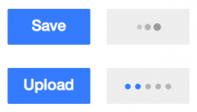
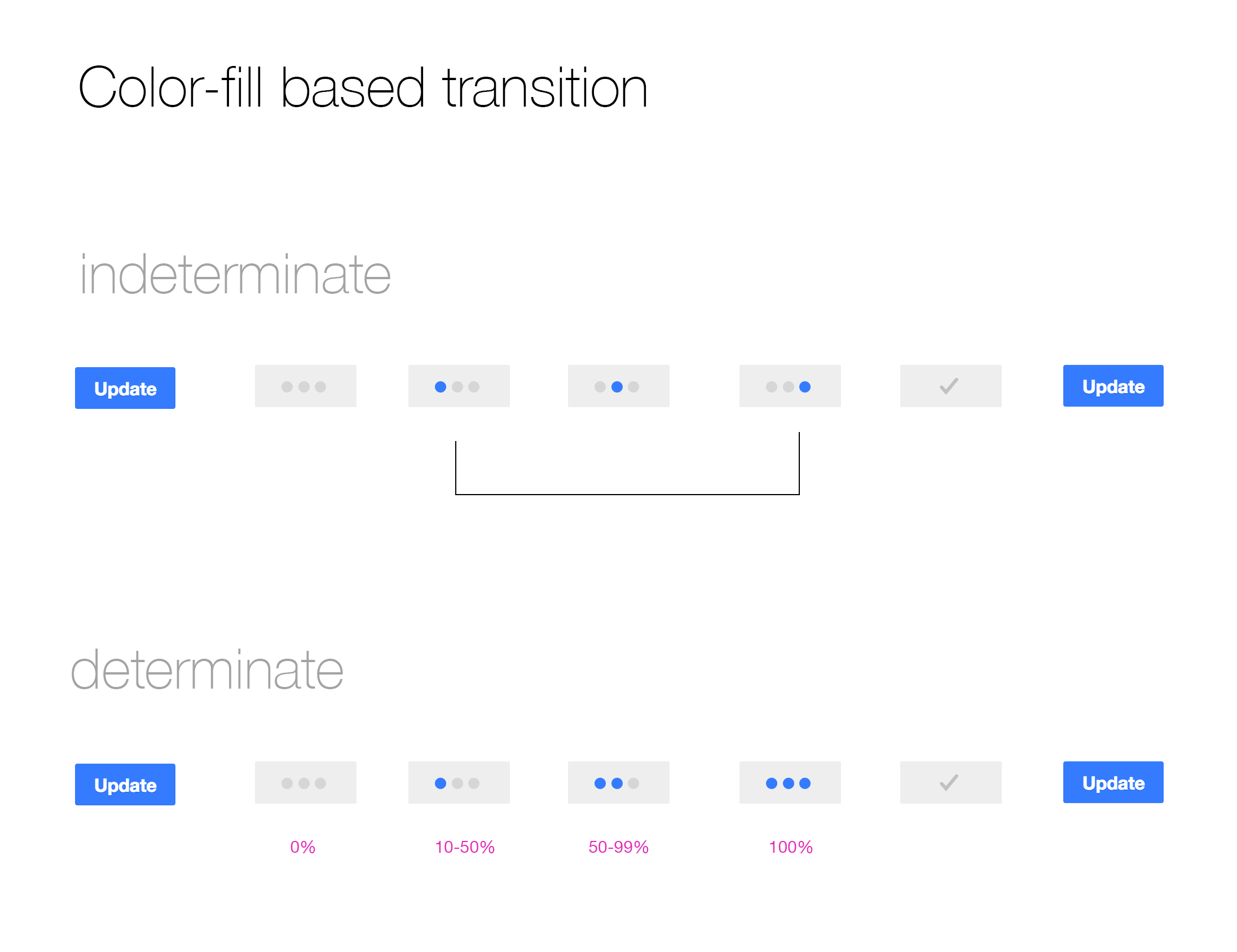
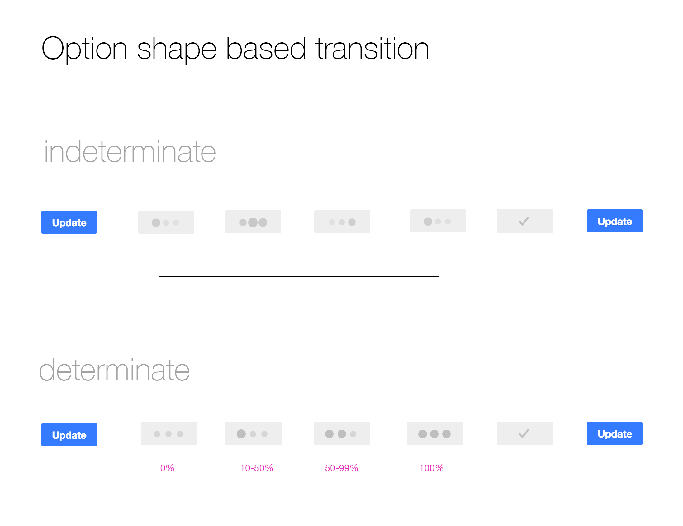
In many cases the indeterminate version is adapted to fit the standard determinate loading pattern of the progress bar. While keeping both consistent makes sense, we could explore how a determinate loading could be consistent with the indeterminate one proposed. Bellow I included a mockup with indeterminate (save) and determinate (upload) examples:
The determinate version can have some kind of pulse (e.g. changes in intensity through the blue dots) to communicate there is continuous activity while at the same time provide 5 steps to indicate progress.
Comment Actions
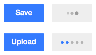
I think that's a good idea! I was doing similar thing earlier - have a look - this is with Pau's indicator
I made two versions since i thought background blue to light grey transition might look bit abrupt.
Comment Actions
I made two versions since i thought background blue to light grey transition might look bit abrupt.
Makes sense, but keeping the loading stage as "active blue" while the button is not interactive may be confusing.
We can iterate on the enable-disabled transition for buttons (or the style of colour buttons when disabled) to make it more fluent.
Comment Actions
I added a subtle transition on the background. You can see by tapping the button under 'Try me'
also tweaked the indicator dimensions a bit.
Comment Actions
@Prtksxna can you work with Nirzar to see if we can get this or some variation in the backlog for integration.
Comment Actions
@Jaredzimmerman-WMF, neither OOjs-UI nor mediawiki.ui have an element that supports this kind of an interaction yet.
@matmarex, to implement this should I just make a new widget that inherits from Button or, just extend the Button widget?
Comment Actions
What do you guys think of these these loader styles, especially:
Fill horizontal
Shrink horizontal
Comment Actions
My thinking was we could reuse current elements on the button instead of adding another element to show the loader.
@Jaredzimmerman-WMF, you think even "fill horizontal" is complicated too?
Comment Actions
@Nirzar I like them. The colour-based ones look good but I have some comments:
- Will the colour depend on the button colour (e.g., green dots for green buttons)?
- For the determinate version since there are three indicators, for longer waits it may feel there is no progress. Some indication of continuous progress (e.g., pulse in colour intensity) would help to communicate that the system is working.
- I like the final tick mark, but we should not assume that the wait always leads to a success state and consider also cases where it will fail and cases where we can't tell.
@violetto My main concerns are:
- How to make those approaches consistent with both determinate and indeterminate loading?
- The consistency in communicating the enabled/disabled state. We cannot assume much about the final state of the button. For example, a "save" button can become disabled after saving action (until there is a new modification in the document). If we use the "fill horizontal" pattern, do we expect the button to progress from gray to blue? If that is the case, it will become grey at the end of the process again when it is disabled. In Nirzar's example the buttons turn grey while there is progress because they are disabled and then they may continue to be grey or turn into blue (calling your attention that the action is available again).
- Noticing the action has taking an effect from the very first moment. Right after you click, you may not be sure if your command has taken effect if the progress bar increases slowly. Especially for "fill horizontal" the difference is a darker line that may take some time to grow. in Nirzars's example, the button changes visibly once you act on it.
- For "fill horizontal" keeping the text (the label as "save" while saving is in progress) seems contradictory, but updating the label has the localisation problems we wanting to avoid.
Comment Actions
Will the colour depend on the button colour (e.g., green dots for green buttons)?
Yes
For the determinate version since there are three indicators, for longer waits it may feel there is no progress. Some indication of continuous progress (e.g., pulse in colour intensity) would help to communicate that the system is working.
I was thinking of pulse. the one that is about to be completed will fade in and fade out subtly
I like the final tick mark, but we should not assume that the wait always leads to a success state and consider also cases where it will fail and cases where we can't tell.
we have to look at where this will be used most. We can create a parameter in OOJS that says "show success state after loading" yes/no
so overall, this is adding two more params to the current button widget.
Type of loading: indeterminate
Success state: yes/no
Comment Actions
we have to look at where this will be used most. We can create a parameter in OOJS that says "show success state after loading" yes/no
We may need some feedback from engineers on this, since I guess we cannot anticipate if the process will succeed or fail from the beginning. In any case, my point was to provide that flexibility, so I'm happy to hear it is taken into account.
Comment Actions
In 99% of cases, all we need is an indeterminate pending state (with no checkmark stage). Once the process is complete, whatever page or dialog the button was in will normally be replaced with something else. I think we could ditch the checkmark stage entirely for the indeterminate version of the button (especially since not all processes will be successful). It should just revert back to the original label if the process completes and the button remains. I'm also not convinced we really need a determinate loader button. We can use a progress bar for most of those cases. It's a great design, but I think we should concentrate on what we really need right now, which is just a simple indeterminate pending button state.