Page MenuHomePhabricator

Echo: Flyout renders unclickable "Alerts" word that looks like a link
Closed, DuplicatePublic

Description

Screenshot of bug.

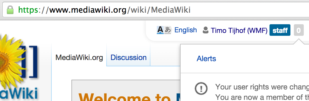
Echo renders a single "Alerts" tab atop the fly-out that by all accounts looks like link. Except it's not clickable (no pointer cursor on hover, no underline on hover).

Internally it seems it is a real <a> element, with rule ".mw-echo-overlay .mw-ui-progressive.mw-ui-quiet" applied, giving it "pointer-events: none;". Thus the browser will not register the cursor being on the element and no style changes or events are fired as a result.

This seems like a design/usability flaw. I know from other versions or states that there can be multiple tabs up there, so I guess in my state this is the only tab available, and its' already selected (naturally) and thus has no action tied to it.

However it doesn't look like tab without a border or separator or other tabs of any kind, it also doesn't have any styling applied suggesting it is currently selected (e.g. greyed out, bolded, black instead of blue, etc.).


Version: unspecified
Severity: normal

Attached:

Screen_Shot_2014-10-07_at_06.23.34.png (350×1 px, 116 KB)

Details

Reference
bz71733

Event Timeline

bzimport raised the priority of this task from to Needs Triage.Nov 22 2014, 3:50 AM
bzimport set Reference to bz71733.
bzimport added a subscriber: Unknown Object (MLST).

Looking at e.g. mediawiki.org where Flow is also installed the Alerts tab gets accompanied by a Message tab where one of the two is always clickable. (see attachment)

Still it would be much clearer if the active tab had its lable in black text rather than looking like a link. This would also solve the confusion on all wikis that have Echo but not Flow installed.

Created attachment 17182
On a wiki with Flow and Echo

Screenshot of the text on a wiki with Flow and Echo

Attached:

Screenshot_from_2014-11-20_10:19:05.png (294×462 px, 21 KB)

Looking at e.g. mediawiki.org where Flow is also installed the Alerts tab gets accompanied by a Message tab where one of the two is always clickable. (see attachment)

Still it would be much clearer if the active tab had its label in black text rather than looking like a link. This would also solve the confusion on all wikis that have Echo but not Flow installed.

As seen in my screenshot, this is on MediaWiki.org. Unless this changed, afaik there is nothing in Echo or Flow that ensures "Message" is rendered. It is rendered when there is content only. Which isn't always the case.

There are 2 related issues here:

Context: The "Message" group/tab is only rendered if a user has interacted with a Flow Board (on a particular wiki) in some way. So the vast majority of users (99.9%) will only see "Alerts".

For the original bug-report, we really just need to change the word "Alerts" to black text, so that it doesn't look like a link.

For users who have interacted with Flow, we need to change the active tab's title to black text, and leave the inactive tab as a blue link.

(I'm not sure if that needs to be split into a separate task. Hopefully both issues are simple enough to solve in one go.)