Page MenuHomePhabricator

Can't see or click login button due to fundraising banner
Closed, InvalidPublic

Description

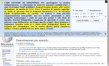
Trying to click the login button with a fundraising banner in my way

The image speaks by itself.

Yes, if I know there is a register/login button I can move the cursor away and then back, but this doesn't help anything.

P.s.: Yes, the banner as a whole takes more space than is available for the article (T108256). I guess that's a milestone too.


Version: unspecified
Severity: normal
OS: Linux
Platform: PC

Attached:
CNLogin.png (625×1 px, 121 KB)

Details

Reference
bz72013

Event Timeline

bzimport raised the priority of this task from to Needs Triage.Nov 22 2014, 3:51 AM
bzimport set Reference to bz72013.
bzimport added a subscriber: Unknown Object (MLST).

Please provide browser information for such rendering issues...

Hmm, what was the URL parameter to enforce showing that banner...

(In reply to Andre Klapper from comment #2)

Hmm, what was the URL parameter to enforce showing that banner...

?force=1&banner=$name. Names can be retrieved from the banners associated to active (green) campaigns at [[m:Special:CentralNotice]]. Oh, there's even an "on-wiki preview" link now from [[m:Special:CentralNoticeBanners]] and individual banner pages.

That part of the banner only appears when a user's cursor is over the banner. It is the most unobtrusive way we've found to present the information which we are legally obliged to display to donors. The alternatives are to always show it, and make the whole banner bigger by default. Or we can add extra space below the banner so that it never covers the log in links, at which point people will complain that we are wasting space. I'm going to close this as WONTFIX, although suggestions for a better way to do it are always welcome.

As for the overall size, it looks like you're using a browser width of 1024px. Estimates are that only around 6% of users have their browser at or below this size, but I'll see if we can add some media queries to reduce the font-size for them. You also seem to be overriding font settings, which is making the banner appear larger than it would normally.

(In reply to Peter Coombe from comment #5)

suggestions for a better
way to do it are always welcome.

  • Not using the full width, so that the login button isn't covered.
  • Dismissing upon click.
  • Using some transparency so that the button is partly visible behind the banner.
  • Pushing the page down so that everything is visible below the banner.
  • Uncollapse towards the top rather than the bottom, by covering part of the banner rather than the content and personal tools.

LOL, even https://archive.today/TSorY does "better", one can see the buttons in transparency.

Should this be blocked on something about fullscreen banners?

I'm not sure how this task is low priority.

TheDJ subscribed.

This ticket is from 2014. We probably don't even use that particular banner anymore. Can be reopened if the issue is encountered again.