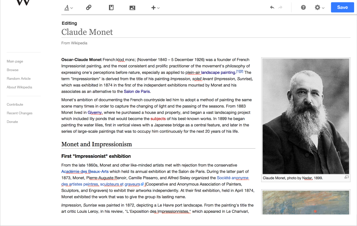
4 pixel line under the toolbar
black at 15% opacity
| Jdforrester-WMF | |
| Dec 9 2014, 10:48 PM |
| F20891: pasted_file | |
| Dec 11 2014, 9:53 PM |
| F20880: toolbar--02.png | |
| Dec 11 2014, 9:12 PM |
| F20864: Screen_Shot_2014-12-11_at_11.58.06_AM.png | |
| Dec 11 2014, 7:59 PM |
4 pixel line under the toolbar
black at 15% opacity
| Subject | Repo | Branch | Lines +/- | |
|---|---|---|---|---|
| MediaWiki theme: Add thematic border to the bottom of toolbars | oojs/ui | master | +1 -1 |
| Status | Subtype | Assigned | Task | ||
|---|---|---|---|---|---|
| Open | None | T49145 Formally deprecate jQuery UI after we've stopped using jQuery UI in extensions and core | |||
| Open | None | T100270 Replace use of jQuery UI and MW UI with OOUI across all Wikimedia-deployed extensions and core | |||
| Resolved | matmarex | T74715 Convert some MW core special pages to OOUI | |||
| Resolved | • TrevorParscal | T74714 Provide the OOUI PHP module inside MW core | |||
| Resolved | Jdforrester-WMF | T78054 Switch MediaWiki core's use of OOjs UI to use the MediaWiki theme, not Apex | |||
| Resolved | matmarex | T78085 Toolbars should have a heavy shadow on their bottom in the MediaWiki theme |
Got any of these mockups? Asking because "shadows" in the MediaWiki theme usually look extremely unlike real shadows.
Actually, these are implemented to spec.
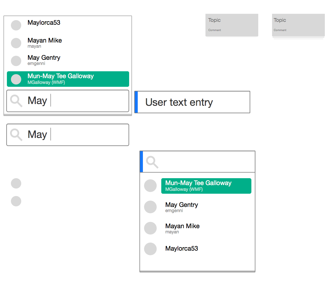
This is a menu example in the UI graphics provided to create this theme. This is the most recent version of the file as of today:
I figure that this should match the design from T78083: Shadow at the bottom of buttons, dropdown menus is intentionally vertically mis-aligned by a pixel or two in the MediaWiki theme, so waiting on that.
So in context, it's supposed to look like this? I can't quite tell from this mockup if the line is supposed to reach screen edges or not.
Bartosz, I think you have it right - unfortunately the mockup is based on a hypothetical skin that doesn't have a line on the left so it's unclear.
Change 179221 had a related patch set uploaded (by Bartosz Dziewoński):
MediaWiki theme: Update toolbar design
Change 179221 merged by jenkins-bot:
MediaWiki theme: Add thematic border to the bottom of toolbars