Drop a shadow on the bottom-right side of the Hovercard.
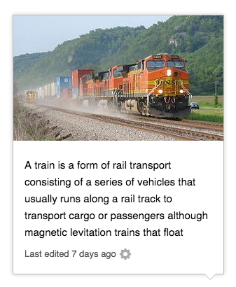
Description
Description
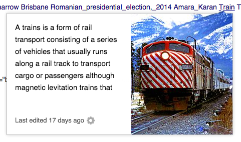
Details
Details
| Subject | Repo | Branch | Lines +/- | |
|---|---|---|---|---|
| core.less: Visual refinement & drop shadow | mediawiki/extensions/Popups | master | +1 -0 |
Related Objects
Related Objects
Event Timeline
Comment Actions
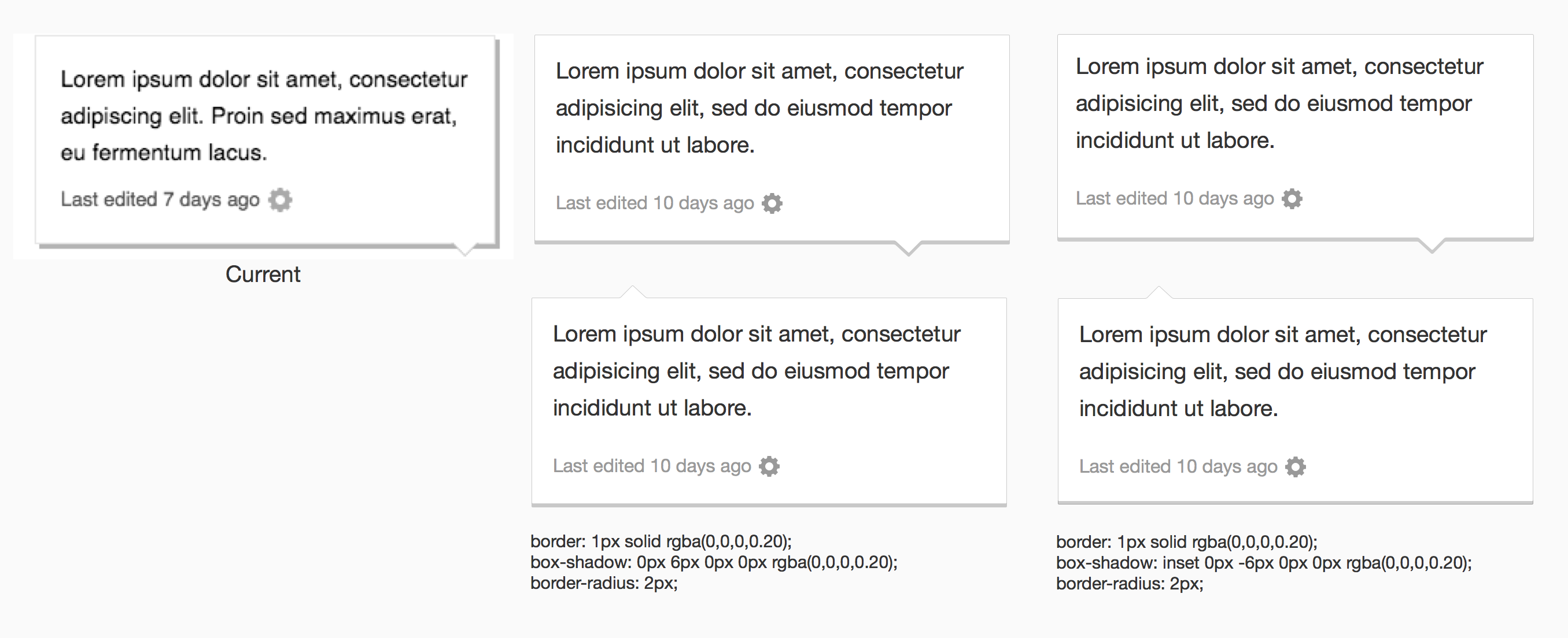
Yeah thats certainly not a good look, based on how your code is, will either of these work out better? you get a similar enough look with an inner box shadow, and it has the upside of being more consistent with the other controls.
Comment Actions
Jared I think, this solution carries half of the same issue that prateek mentioned.
Can we consider doing a regular box shadow (like facebook and twitter) without the grey hard offset?
Comment Actions
the shadow I'm proposing is inside, the one from facebook is still outside. Also we're not using soft shadows anywhere else so it could be odd. I thought the issue was we can't have the shadow outside for some reason?
Comment Actions
Prateek,
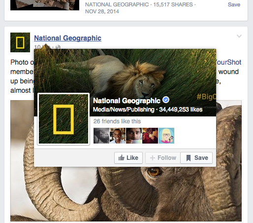
Can we try doing a regular drop shadow/ outer glow that applies to the entire card (like the facebook/ national geographic screenshot)
What this will accomplish:
It will create depth between the card and the background.
If i'm correctly understanding, we wont have to deal with the position of the pokey.
Con's:
I have discussed the consistency concern with Jared, but IMO, this seems to be the simplest way to work around the pokey issue and the enormous testing involved.
Comment Actions
Change 140265 had a related patch set uploaded (by Prtksxna):
[wip] core.less: Visual refinement & drop shadow
Comment Actions
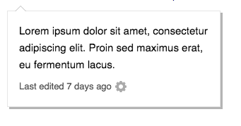
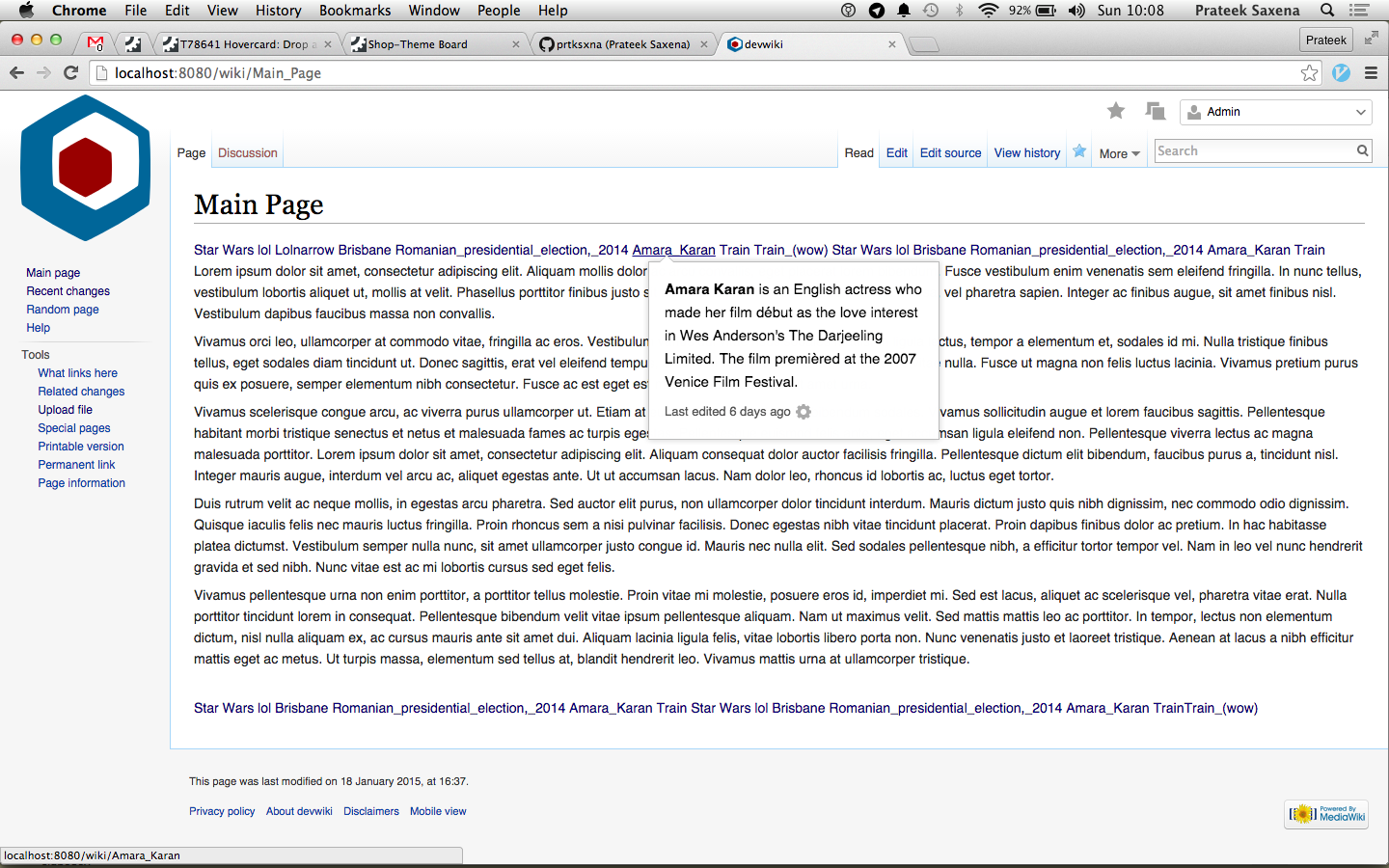
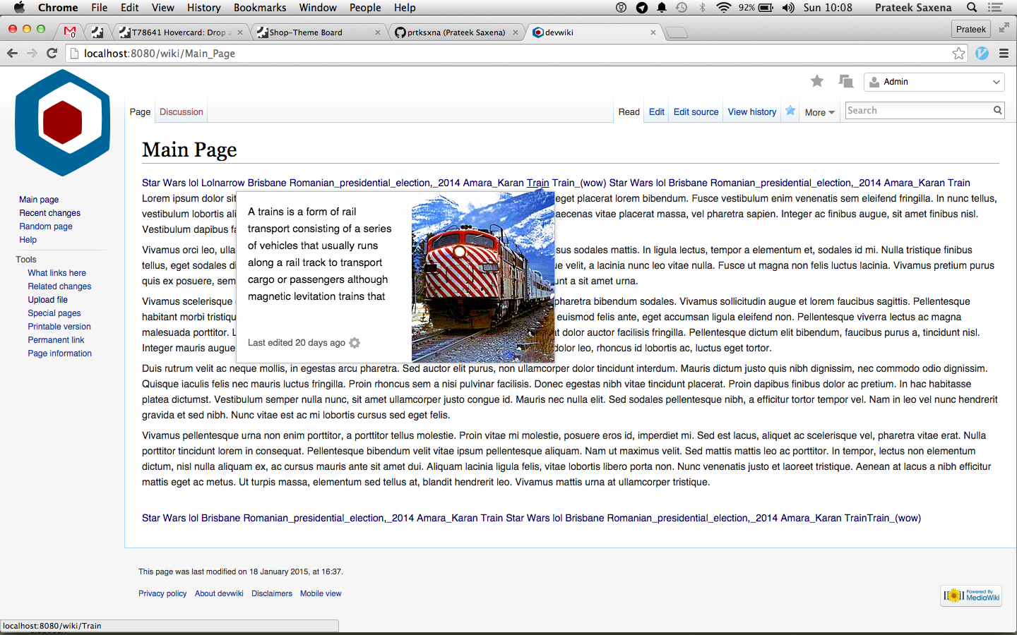
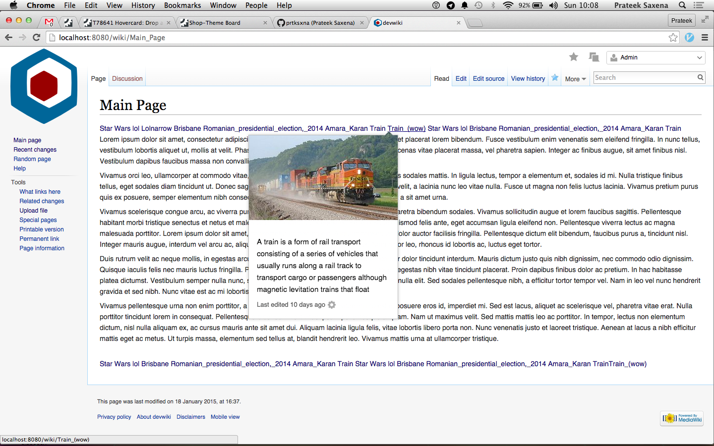
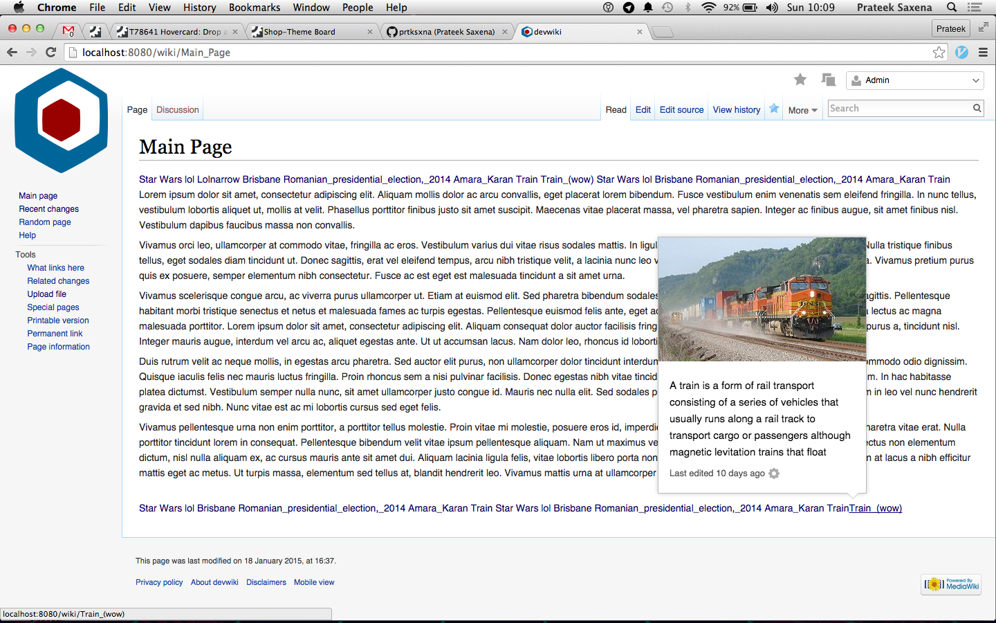
I think this drop shadow is working.
Its giving the modal overlay some depth.
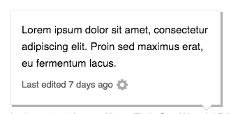
Can you include a full page screenshot, so I can see a good portion of the article text around it?
also cc: @Jaredzimmerman
Comment Actions
I think its workable, I still have concerns about inconsistencies but it is solving for the primary issue of making the card clearly stand out from the page body.


Comment Actions
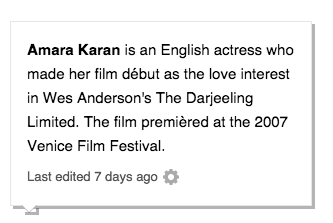
OOjs UI gives its PopupWidget a drop-shadow by default:
here is a test with Prtksxna's drop-shadow:
Comment Actions
I know, its great! But I don't think I want to transition to it in the near future.
T88882: Move Hovercards to OOjs and OOjs UI (I know you're already subscribed)
Comment Actions
Also we're not using soft shadows anywhere else so it could be odd.
We are using soft shadows. The most prominent shadowed UI element on Wikipedia is the notifications pop-up which uses:
box-shadow: 0 3px 8px rgba( 50, 50, 50, 0.35 );
This is a very soft shadow and looks a lot better IMO than the hard-edged shadow.