Page MenuHomePhabricator

Redesign Phabricator login page: LDAP login too prominent; position of MediaWiki SUL login not prominent enough
Closed, DeclinedPublic

Description

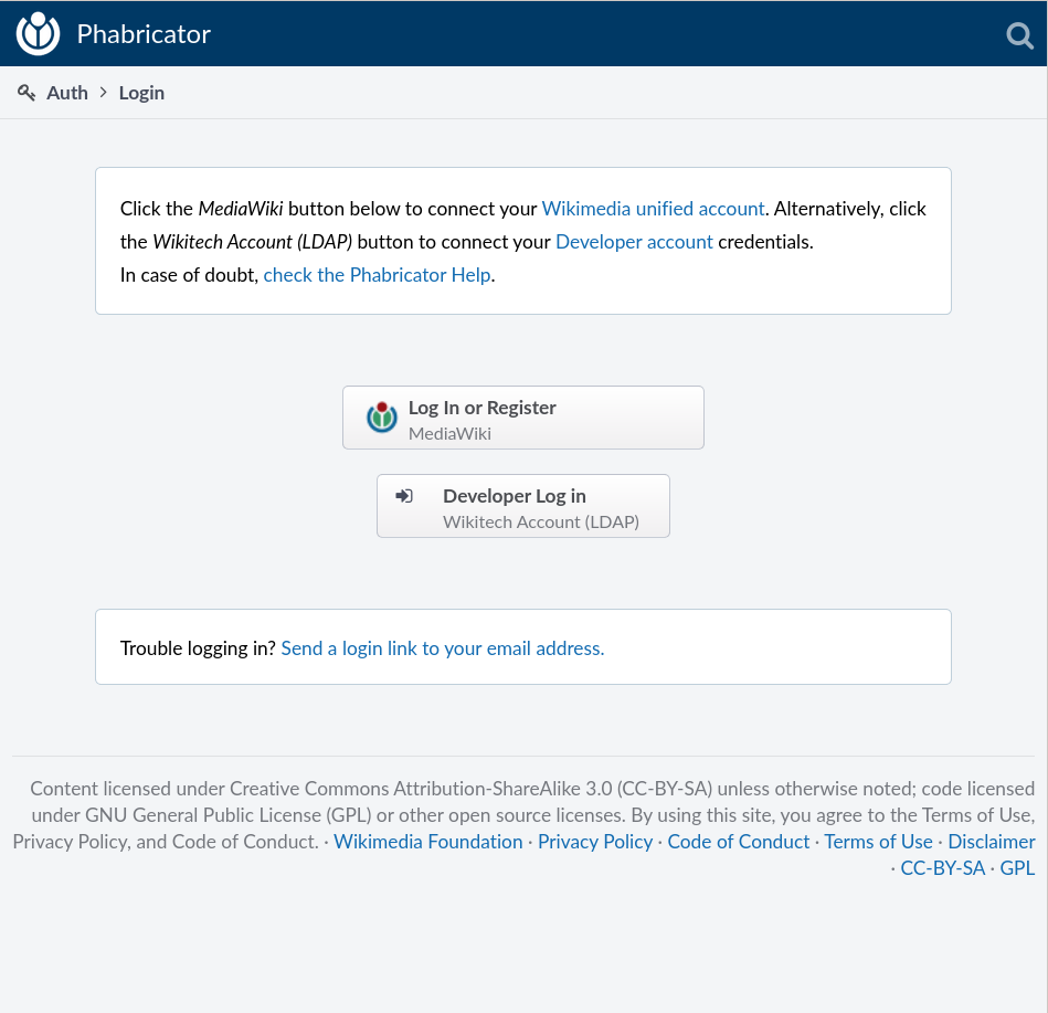
Let's improve https://phabricator.wikimedia.org/auth/start/

  • The LDAP login form is the most prominent element, but in fact most users can't use it, or have no idea what LDAP is, and just confuse it with a Wikimedia login.
  • The position of the MediaWiki login down there is too secondary. Many users have no clue that THIS is what you need to click.
  • The text at the top could be put to better use. (Currently You can use your unified Wikimedia account or your Labs/LDAP user to login.)

Jared has volunteered to work on a mockup. We will need to agree on its feasibility. Phabricator doesn't offer any configuration of this page out of the box.

Revisions and Commits

Related Objects

Event Timeline

There are a very large number of changes, so older changes are hidden. Show Older Changes

AFAIK there is no team or development resources designated for maintaining any local changes long term. Until that is figured out there is little point in forking locally for anything that is not an extreme functionality or security issue. This will not be addressed from my perspective until post migration.

@chasemp If we find that login issues are high enough priority then we might want to promote this to a blocker for release.

We have more than 600 users registered by now: https://phabricator.wikimedia.org/people/query/all/

I agree the login page can be improved, but I don't consider it an obstacle for the launch.

T545 is low-hanging fruit and probably the most efficient way to reduce confusion right now. That text is already customized for Wikimedia, and can be edited without adding any local patch.

600… how many total and active users does Bugzilla+Trello+Mingle+Gerrit have?

Active Bugzilla users per month: 2014-06: 509; 2014-07: 501; 2014-08: 515; 2014-09: 475. Total number of Bugzilla accounts today: 19936. Don't have stats for other systems.

What I mean is that Phabricator hasn't even announced a launch date, we have already more than 600 users, and people seem to be finding their way through. We have some blockers for the launch, but at this point they are mostly problems related with the migration of Bugzilla / RT data. The login page functionally works, and we can keep improving its usability also after the launch. The changes proposed in M7 are not supported by Phabricator, and therefore we need to either change the plan or allocate significantresources to implement it.

@Qgil this is symptomatic of our projects at large to me, "why make it simple or easy when people seem to be getting by with what we give them now, as broken as it is" I don't mean to call you out specifically but I think its been ingrained in our culture to the point that that kind of thinking has become pervasive. I don't think the current flow or design is acceptable, and I'd like to see us prioritize an experience that invites non-technical people to contribute to the project via this tool, both with the words we use and with the interface we expose to them.

@Jaredzimmerman-WMF, first we need to launch Phabricator at a level that satisfies our current Bugzilla and RT users. Developers and their managers are waiting. Our current focus is to clean these busy backlogs as soon as possible: Bugzilla-Preview, Bugzilla-Migration, RT-Migration. And then launch.

Compared with Bugzilla (leave alone RT), this launch already brings a more inviting experience to non-technical people. Maybe we can improve the login page around the launch through steps simple to implement. We simply cannot implement your proposal without postponing the launch date by several days, and this doesn't even tackle the question of the extra resources that maintaining such local patch would imply.

In T862#16371, @Qgil wrote:

@Jaredzimmerman-WMF, first we need to launch Phabricator at a level that satisfies our current Bugzilla and RT users. Developers and their managers are waiting.

I'm quite annoyed at the comments that suggest that there's a rush here. People are waiting for what, exactly? Bugzilla has served us for a decade. We will take our time and do any type of migration properly rather than pretending as though the arbitrary erected timelines are anything more than mere guesstimates.

Let me be clear: there is to be nobody involved in this migration process who would rather hastily push through one of the largest changes to Wikimedia's development ecosystem over taking the time necessary to act judiciously.

Maybe we can improve the login page around the launch through steps simple to implement. We simply cannot implement your proposal without postponing the launch date by several days, and this doesn't even tackle the question of the extra resources that maintaining such local patch would imply.

This is a hostile false dilemma. We will use this task to discuss redesigning the Phabricator login page, which is demonstrably confusing and in need of love.

MZ, if you think this must be done before migration it seems you'd need to add it to blockers of T174.

The Phabricator launch focuses on the Bugzilla and RT migrations, and we pay especial attention to regressions.

  • Bugzilla's registration process is indeed simple if you understand the small prints: you are giving away your privacy by sharing your email address with all registered users. Wikimedia SUL is heaven compared to this, and a very old request of Bugzilla users.
  • RT registration process is so simple and so complex at the same time that only a handful of Wikimedia users really understand how it works.
  • Both Bugzilla and RT accounts are local (small prints probably apply for the RT case, I don't even know for sure), and they need to be created in addition to mediawiki.org account and Wikitech/Labs/Gerrit account if you want to do any serious technical work. Compared to this scenario, now we have two instead of four accounts: the Wikimedia SUL all of us have, and an optional LDAP backup that anybody can use even if the whole centralauth sites are down.

Therefore, I dare to say that even the current Phabricator login page with all its usability flaws represent a huge functional improvement over the current situation with Bugzilla and RT (and Trello and Mingle, needless to say). Progress is progress.

Now, when it comes to tackle the usability problems, it is good that any ideas proposed take into account the fact that Phabricator is a tool that comes with certain features and behavior out of the box, and any improvement needs to be developed (which takes resources), and then either upstreamed (more resources) or maintained locally (more resources). This is why anybody interested in improving the current situation will have more chances of quick success by proposing simple modular improvements rather than a total rewrite. This is exactly the same situation that applies to anybody willing to improve certain parts of MediaWiki: understand how things work now and why, and propose evolutionary improvements easy to agree upon and to implement.

We have three parallel paths of potential progress:

  • Improve the text of the login page (very easy to implement, after agreeing on the text, T545)
  • Make the Wikimedia SUL login more prominent than the LDAP login (T963)
  • Bonus point: introduce Wikimedia branding in the header (something that Bugzilla and RT never had, T69)

Your help is welcome contributing to these tasks with solutions that can be implemented fast and be either configurable, upstreameable, or easily maintained locally. Not easy, but probably doable.

@saper, thank you very much for your ideas and your mockup in T1156. Please have a look at the discussion above and to the specific subtasks and feed your ideas in. F721 is interesting because it uses Phabricator UI elements and, therefore, provides a possible plan for shorter-term implementation (that still would require us to extend or patch Phabricator locally).

Quick_and_dirty_mock_of_the_registration_page (590×1 px, 66 KB)

We keep working as fast as we can with the Bugzilla migration blocking tasks. We have decided that this is not a blocker, but is at the top of the Phabricator priorities, and I expect us to start working on it as soon as @mmodell is liberated from migration specific tasks. How far can we go with short term improvements, we still don't know.

It just a couple CSS changes (and I think I have reordered two divs).

But my question from T1156 remains:

  • How are we going to migrate users?
  • What is the migration path for Bugzilla (possibly Bugzilla-only) users?
    • claiming of an account created by the migration process
    • create new account using bugzilla email address?

It does not belong to this bug, maybe to one of the mw.org pages?

Everybody registers using Wikimedia SUL or LDAP. In order to claim your Bugzilla activity, you need to specify the email address(es) that you used in Bugzilla. That's all.

It is explained at https://www.mediawiki.org/wiki/Phabricator/Help#Claiming_your_previous_Bugzilla_and_RT_accounts -- and improvements are welcome.

Thank you for working on this. Your perspective as Phabricator newcomer is appreciated, it helps us seeing details difficult to see when you have gone through this process some time ago.

Thanks, posted to https://www.mediawiki.org/wiki/Topic:S5sbkpsibnps5e1p (first time used Flow, beeeh)

Thanks for working on this. Actually I have installed and used Phabricator before for my clients, so I am not that new :)

Qgil changed the task status from Stalled to Open.Nov 13 2014, 10:51 AM
Qgil lowered the priority of this task from Medium to Low.Nov 26 2014, 4:33 PM

Even if the login page is far from perfect, beautiful or even easy to use, we are getting new users every day, and I'm not seeing complaints about the design. Lowering priority only because we have many other tasks at the moment.

If someone wants to step in, it will help accelerating this discussion and the eventual implementation of improvements.

Not related to login page design, but I think T76146 will improve the process (it certainly saves adding half a page of disclaimers).

The fact that users are joining is not convincing: how many are put off? I joined after finding and reading https://meta.wikimedia.org/wiki/User_talk:Erik_Moeller_%28WMF%29#Phabricator_login_sequence — but did not know what Phabricator actually was, and I’m still not sure what it wants me to allow it to do. I decided the evidence was that it it was safe (partly because it is within wikimedia.org), and there was a discussion I thought I might contribute to. That I saw the confirmation link was (truly) from wikimedia reassured me sufficiently to click it.

I think the screen should say (or link to a page/pop-up saying) what phabricator-production is, what “this site” refers to, what it will do with the access it is granted, under what conditions it will do it and whether one can revoke it.

Aklapper renamed this task from Redesign phabricator login page to Redesign Phabricator login page: LDAP login too prominent; position of MediaWiki SUL login not promiment enough.Oct 2 2016, 3:45 PM
Aklapper renamed this task from Redesign Phabricator login page: LDAP login too prominent; position of MediaWiki SUL login not promiment enough to Redesign Phabricator login page: LDAP login too prominent; position of MediaWiki SUL login not prominent enough.

Also, the MediaWiki logo is not necessarily recognizable (e.g. to Wikipedia editors who might want to report some UI bug). It would be nice to dislplay the other project logos around the login button.

It would also be nice to do the OAuth sequence in the user's own language but I imagine that does not have a good effort/benefit ratio.

mmodell added a revision: Restricted Differential Revision.Oct 20 2017, 9:21 PM

So I finally got around to dealing with this (D831)... Some years later. I know this should have been resolved a long time ago and I apologize for letting it rot.

@mmodell The changes looks great in the screenshot at top there, thanks!

Can I suggest 3 additional changes, here?

  1. Change the 2nd text-line's wording from Alternatively, you can introduce your - into: Alternatively, you can use your
  2. Change the icon on the LDAP login button from the generic "arrow-pointing-to-square" into the Wikitech logo. -- Using either https://wikitech.wikimedia.org/static/images/project-logos/wikitech.png (PNG) or https://commons.wikimedia.org/wiki/File:Wikitech_logo.svg (SVG).
  3. Add the Wikimedia Movement logo to the right-hand side of the Mediawikiwiki login button. This will more strongly hint at the SUL nature of the button, and make it even more prominent.

The MediaWiki button could also be centered imo.

  1. Change the icon on the LDAP login button from the generic "arrow-pointing-to-square" into the Wikitech logo. -- Using either https://wikitech.wikimedia.org/static/images/project-logos/wikitech.png (PNG) or https://commons.wikimedia.org/wiki/File:Wikitech_logo.svg (SVG).

I would just turn that from a button into a plain link, to better emphasize which is the primary option. There is very little reason to use it under normal circumstances (really the only reason to have it at all is that people sometimes lock themselves out of their Wikimedia accounts). Unnecessary choices are bad for UX.

  1. Add the Wikimedia Movement logo to the right-hand side of the Mediawikiwiki login button. This will more strongly hint at the SUL nature of the button, and make it even more prominent.

Done.

Not an issue anymore these days due to customization ( Auth > Customize Messages > Login Screen Instructions):

Screenshot from 2020-01-15 17-12-55.png (917×949 px, 98 KB)

Could the button text be centered and make the buttons the same width?

That would be a separate upstream request, as we don't plan to investigate.

@Aklapper I thought the login page we have here on phab was custom and done by us? (I'm talking about the page where you select SUL or LDAP, not the actual login forum)

Not an issue anymore these days due to customization ( Auth > Customize Messages > Login Screen Instructions):

Screenshot from 2020-01-15 17-12-55.png (917×949 px, 98 KB)

That's not the login screen I get when I browse in an incognito browser:

image.png (515×1 px, 92 KB)

Not an issue anymore these days due to customization ( Auth > Customize Messages > Login Screen Instructions):

Screenshot from 2020-01-15 17-12-55.png (917×949 px, 98 KB)

That's not the login screen I get when I browse in an incognito browser:

image.png (515×1 px, 92 KB)

Thats due to the window size, when the window is small the buttons get moved on top of each other, but when the window is big (like in your screenshot) the buttons are next to each other instead

Ah.

Well, I'd say this isn't Resolved, then.

I don't see any real difference in the two screenshots. Anyway if it's not resolved then I'm going to decline this as we don't plan to make changes.