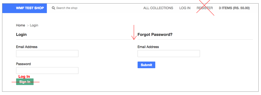
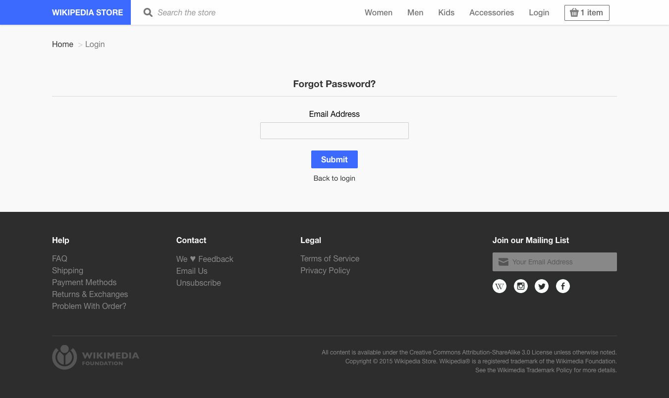
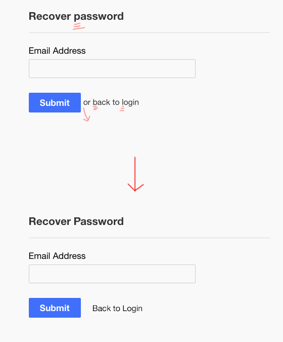
Gap of border line between Login / Forgot Password does not do much, just gave one continuous line.
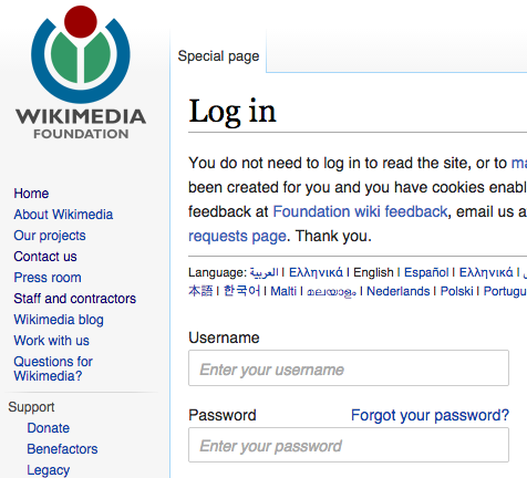
Create separate Forgot Password page (same how it looks now but on its own page) that users will be redirected to from a link next to the Password option for Log-In. Follow how Wikimedia's log in is set up.
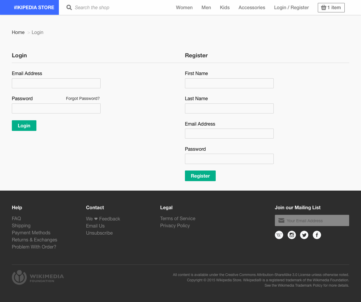
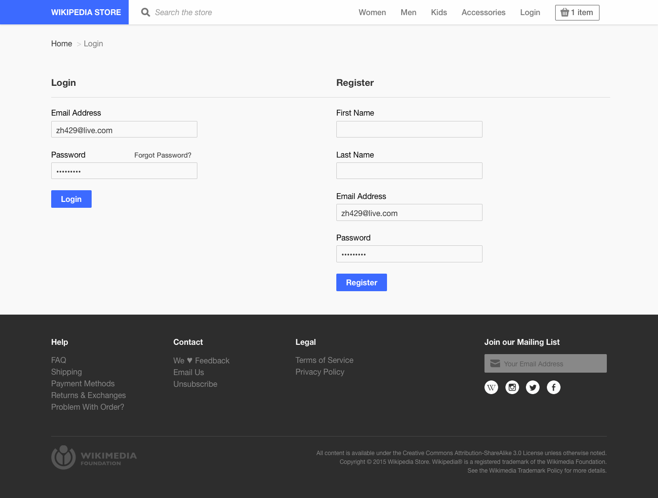
Replace right side with “Register” (& corresponding entries)
Eliminate "Register"'s own page / link on the top navigation
Change “Sign In” button to “Log In” to keep terms consistent
Change "Create" button to "Register".