Page MenuHomePhabricator

Polish the CX Dashboard
Closed, ResolvedPublic

Assigned To
Authored By
Nirzar
Feb 2 2015, 10:24 PM
Referenced Files
F14342476: image.png
Mar 3 2018, 1:18 AM
F182084: dashboard-empty-suggestions.png
Jun 22 2015, 11:17 AM
F182079: cx-circle.svg
Jun 22 2015, 10:58 AM
F182075: dashboard-empty-published.png
Jun 22 2015, 10:58 AM
F182073: dashboard-empty-ongoing.png
Jun 22 2015, 10:58 AM
F182077: dashboard-empty-ongoing-bottom.png
Jun 22 2015, 10:58 AM
F150567: white-plus.svg
Apr 21 2015, 11:25 PM
F150560: Shape_15@2x.svg
Apr 21 2015, 11:22 PM

Description

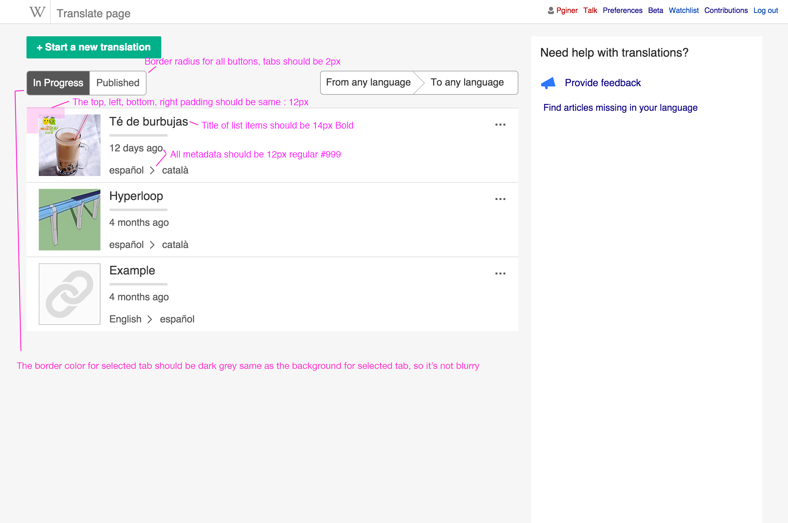
Polish the current content translation dashboard before adding in suggestions and first-run experience.
Mostly aesthetic changes, very little functional changes required.

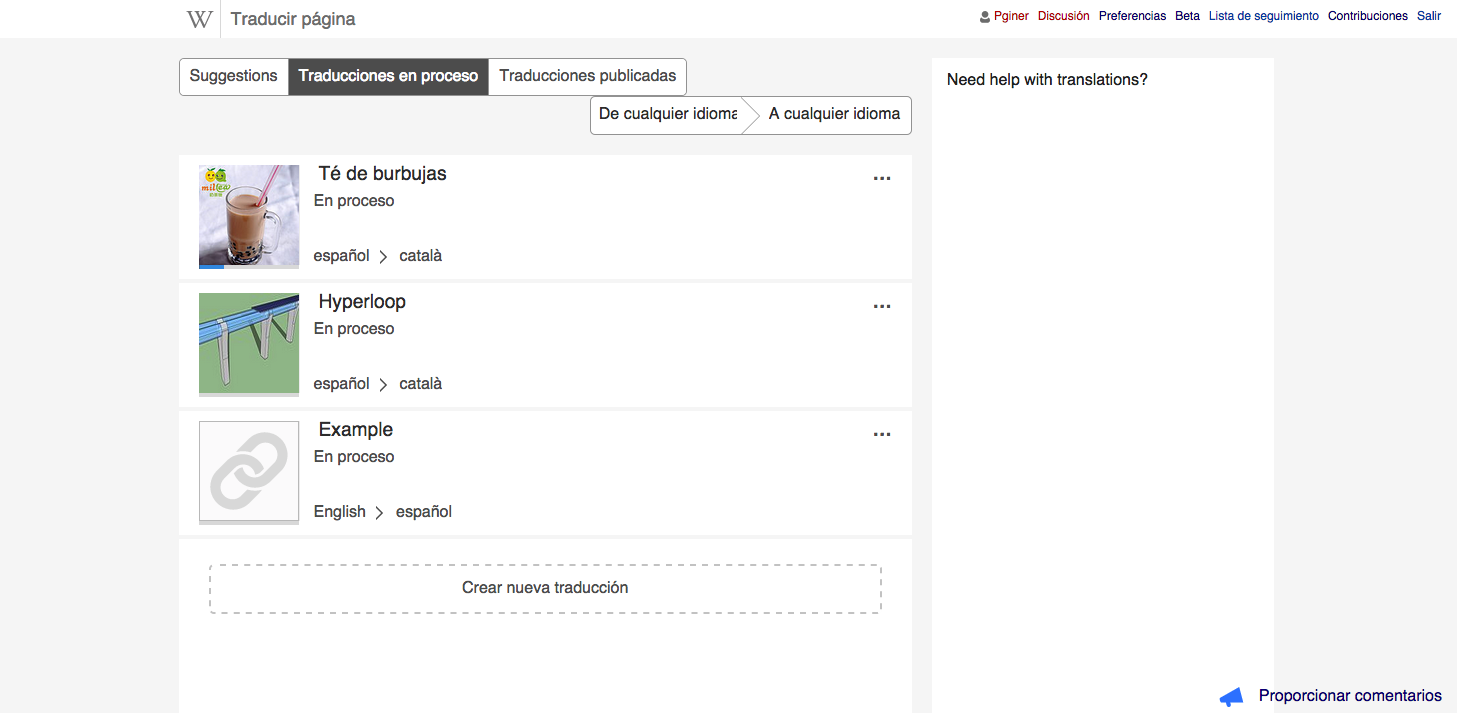
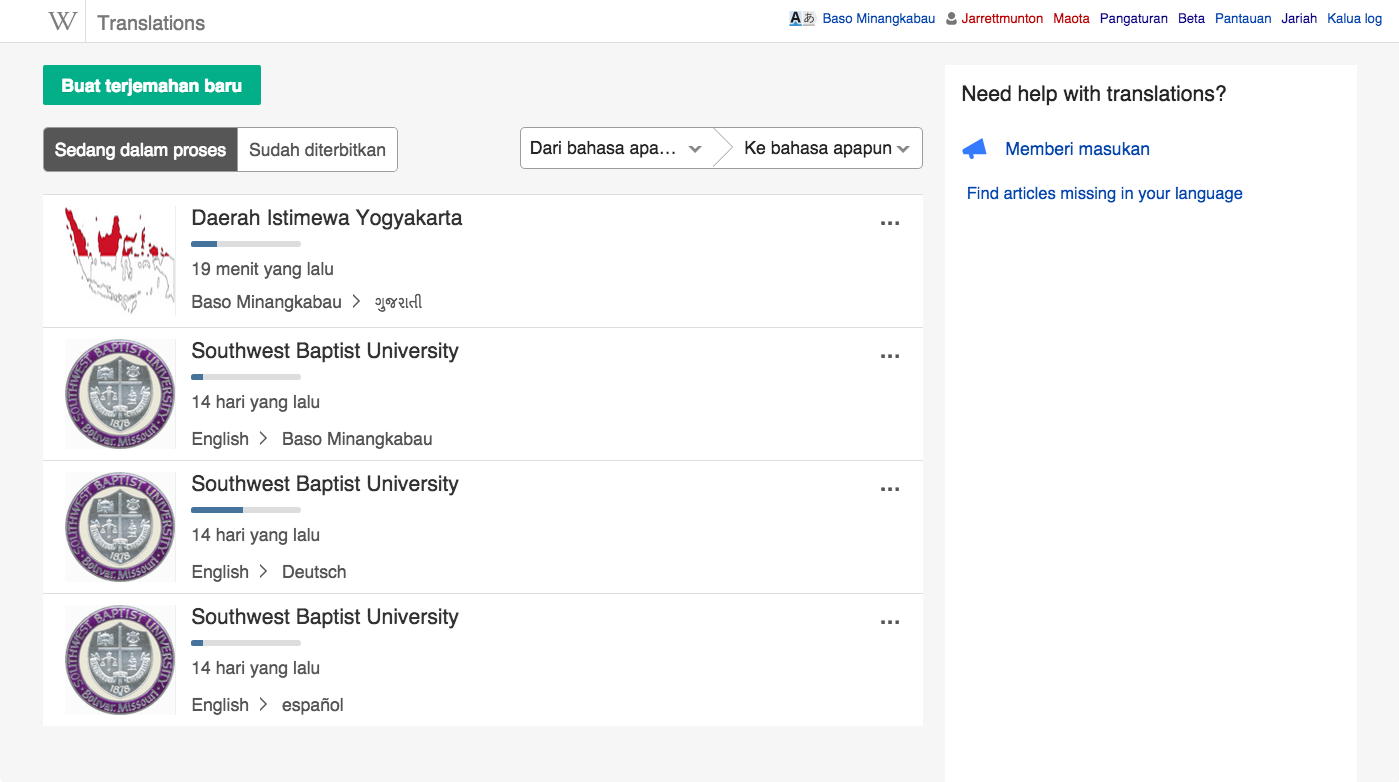
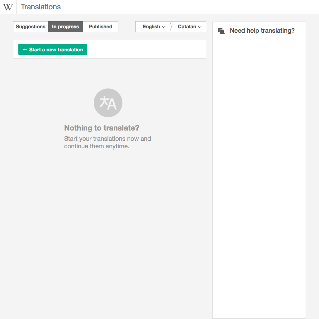
Here are list of changes

  • Max width to the whole page. this will center the content and give more structure
  • Simpler button group selector for the published, drafts and suggestions
  • New design for language selector
  • List items are clickable and not only the title link
  • Realignment of items inside list item
  • Grouped and contextual menu on the right hand side.

We can do these changes before - T87439: [Tracking] Suggest articles to translate from the dashboard

some of the parts of T87439 depend on these changes.

see pholio for mocks:

  • Related Objects

    StatusSubtypeAssignedTask
    OpenNone
    OpenNone
    OpenNone
    OpenNone
    OpenNone
    DuplicateNone
    DuplicateNone
    OpenNone
    ResolvedAmire80
    OpenNone
    OpenNone
    OpenNone
    Resolved santhosh
    Declinedleila
    Resolved santhosh
    ResolvedPginer-WMF
    Resolved santhosh
    Resolved santhosh
    Resolved santhosh
    DeclinedPginer-WMF
    ResolvedPginer-WMF
    ResolvedAmire80
    Resolved santhosh
    ResolvedNikerabbit
    Resolved santhosh
    Resolved santhosh
    OpenNone
    Resolved santhosh
    ResolvedPginer-WMF
    OpenNone
    ResolvedPginer-WMF
    ResolvedPginer-WMF
    OpenFeatureNone
    DeclinedNone
    Resolved santhosh
    Resolved santhosh
    ResolvedKartikMistry
    Resolved santhosh
    ResolvedKartikMistry
    ResolvedArrbee
    Resolved santhosh
    DuplicateNone
    Resolved santhosh
    ResolvedAmire80
    Duplicate santhosh
    DuplicateNone
    OpenNone
    ResolvedKartikMistry
    Resolved santhosh
    Resolved santhosh
    OpenNone
    Resolved santhosh
    OpenNone
    Resolved santhosh
    ResolvedKartikMistry
    ResolvedKartikMistry
    OpenNone
    ResolvedAmire80
    OpenNone
    ResolvedPginer-WMF
    DuplicateEtonkovidova
    OpenNone
    Resolved Petar.petkovic
    OpenNone
    Resolved Petar.petkovic
    Resolved santhosh
    OpenNone
    ResolvedPginer-WMF
    DuplicateEtonkovidova
    OpenNone
    ResolvedPginer-WMF
    ResolvedPginer-WMF
    Resolved Petar.petkovic
    OpenNone
    ResolvedPginer-WMF
    DeclinedNone
    ResolvedPginer-WMF
    OpenNone
    Resolved santhosh
    OpenNone
    OpenNone
    DuplicateNone
    OpenNone

    Event Timeline

    There are a very large number of changes, so older changes are hidden. Show Older Changes

    Change 202385 had a related patch set uploaded (by Jarrettmunton):
    Redesigned the Content Translation dashboard

    https://gerrit.wikimedia.org/r/202385

    @Pginer-WMF, where is the "Magnus tool" link supposed to appear in this new design? I can't find it in the mocks.

    @Amire80 sorry for the not knowing this :) but what is Magnus tool?

    @Amire80 sorry for the not knowing this :) but what is Magnus tool?

    :)

    It's a link to a tool in wmflabs, which shows missing articles. It was made by the amazing Magnus Manske, who has a holiday named after him.

    You can see it at https://es.wikipedia.org/wiki/Especial:ContentTranslation?uselang=en under the "Create new translation" button - it says "Find articles missing in your language".

    @Nirzar, I see you remove the relative timestamps from UI(3 days ago etc). Any reason for that?

    Also, the design shows the whole content centralized, but you commented about using whole page width. Could you please clarify. I think it should be consistent with the CX translation view(the translation editor) which use full screen width.

    The new translation button should be the first item in translation list, otherwise I have to scroll all the previous translations to see that button

    @Nirzar, Do you have a prototype for this? If not please give the color codes for important elements, also the hover interaction if any. Thanks

    @Amire80, no. Linking to Magnus tool is a workaround for the lack of translation suggestions. Magnus tool is a great tool but it is a general purpose tool not integrated with CX. Thus, a CX user has to make several unnecessary steps to start a translation (go to a different page, copy the article title, go back to CX and search for it). The suggestions in the dashboard (and a better typeahead function in the new dialog) should be able to cover the usecase of "finding a great article to translate which is missing in a language I know" in a more fluent way for the users of CX.

    @Amire80, no. Linking to Magnus tool is a workaround for the lack of translation suggestions. Magnus tool is a great tool but it is a general purpose tool not integrated with CX. Thus, a CX user has to make several unnecessary steps to start a translation (go to a different page, copy the article title, go back to CX and search for it). The suggestions in the dashboard (and a better typeahead function in the new dialog) should be able to cover the usecase of "finding a great article to translate which is missing in a language I know" in a more fluent way for the users of CX.

    I see - so once actual suggestions are implemented we are just removing this link?

    There is the possibility that we'll have this redesigned/polished dashboard without suggestions for some time until there's a real (not testing) suggestion feed. So maybe till then we'll just have the "Published" and "Drafts" tabs, without the "Suggestions" tab? Or have the "Suggestions" tab, and put the Magnus link there? Or put it elsewhere?

    (In fact, theoretically we can read a list of articles directly from the tool and show it in the suggestions tab, but Leila's suggestion project will probably provide something very similar, but more fine-tuned.)

    here is the possibility that we'll have this redesigned/polished dashboard without suggestions for some time

    If there are no suggestions at all, I think we should:

    • Not show the suggestions tab.
    • Keep the Magnus tool as a link on the side column where the help links are. the help links shown in the mockup are not a final. I'd recommend reducing them to just About this tool and feedback (plus the Magnus tool while the suggestions feature is not available)

    (In fact, theoretically we can read a list of articles directly from the tool and show it in the suggestions tab, but Leila's suggestion project will probably provide something very similar, but more fine-tuned.)

    Following agile principles, we can do this incrementally. So I'm ok in either starting without suggestions at all, or starting with a really simple suggestion approach (e.g., based on missing vital articles or random missing articles when the former are all already available). Whichever helps us get started to keep iterating on it.

    I took a look at the initial change, and it is definitely a great step in the right direction. Well done!
    I went with @Nirzar through the following observations and he will be providing more design details.

    cx-dash-es-screenshot.png (713×1 px, 135 KB)

    • The layout gets broken with long translations and small screens. If you look at the screenshot above, you'll see that filters are wrapped in two lines and things get worse when making the window small. Some changes to solve this issue:
      • Shorter labels. I'm not sure why the labels in Spanish do not correspond with the much shorter versions used in English (e.g. using "published translations" instead of just "published"). Spanish version seems to use [[ I'm not sure why the labels in spanish do not correspond with the much shorter versions used in English (e.g. using "published translations" instead of just "published"). Also, please, do not use "Drafts". Use "In progress" instead. | this message ]]. Also, please, do not use "Drafts". Use "In progress" instead.
      • Make the view selector responsive When the viewport is really small, instead of breaking, the view selector can use icons: light bulb for suggestions, list for the in-progress translations and a tick mark for published pages. Adding tooltips with the labels will help in this case. This may make unnecesary the change below.
      • Make the right column to hide when the viewport is too small. The sidebar could turn into a help icon that expands the sidebar over the content. This may make unnecessary the change above.
      • Make use of more room when it is available. In the above screenshot, the UI could be accommodated by taking a little bit of the margins.
    • The title heading for the dashboard should say "Translations" (not "Translate page"). "Translate page" should be used when translating a page in the translation editor. So make sure the former change is only applied to the Dashboard view.
    • Widgets are not completely following the styling guidelines (e.g., missing hover state). CX uses Mediawiki-UI Buttons and button groups have styles defined that take care of several aspects (such as hover and active states or making sure the mouse cursor turns into a hand when hovering them). Controls should use these styles to apply them to the components or extend them when needed (e.g., the language selector would require to extend the styles for that particular split button).
    • The language selector needs some polishing
      • Avoid overlapping the text. In the screenshot, the "from" value is partially hidden by the triangle arrow. We should avoid it from overlapping with text.
      • Remove the outline for the language selectors. When the user selects the language control, the real control inside of it gets highlighted with an outline making it look unpolished. Ideally we should highlight it in a way that is consistent with the triangular border.
      • A caret is missing next to the language labels.
    • Top bar (the one with the W icon) needs to be separated by a border. If you compare it to the translation editor you'll notice a missing border. Notice that the border is not a bottom border of the bar itself but a top border of the element below it (the reason is that the bar does not really exist as an element going from one side to the other). Thus, we need to add such top border (1px solid #eee) to the element below the top bar.
    • The list of items needs some polishing:
      • The list of items should have a thin but visible border to separate elements. Currently each element has a top and bottom borders in the same color used for the background. We should make sure to use only the top border and make it look like the design.
      • The progress bar on each item should appear below the article title.
      • Title, progress bar, and language info should be aligned. Check the documentation about the grid system used.
    • Improve the help area. The right column is for helping new users, but it is currently empty:
      • The "Feedback link" should not be floating but integrated inside the help column on the right.
      • The help column needs an icon and adjusting font size
      • A "More about this tool" link pointing to https://www.mediawiki.org/wiki/Content_translation should be added.
    • Showing "New translation call to action at the top of the list instead of bottom, as a constructive (green) button. @Nirzar will update the mockups for this.
    • The "..." menu needs polishing:
      • Make sure there is no gap between the "..." and the options that makes it to accidentally hide when the user moves the mouse to reach it.
      • Reduce the width of the menu item to better fit the menu option. Currently there is too much margin.
      • Place the menu so that when it opens it is attached to the "..." on the right side, not the left one.

    @Nirzar will add some more details, but feel free to ask for any clarification on the issues or the proposed solutions.

    Hey sorry about the late comment.

    the create new translation needs to be up on the top. I have updated the task description mockup to reflect that. sorry about this late change.

  • I have finished many of the specifications. Until we have a suggestions list, I have removed the suggestions tab.

    Completed:
    -The header for the dashboard says "Translations" while the other pages still say "Translate Page".
    -Added mouse pointer changes for controls. Trying to apply mw-ui-button styles to the tabs and select controls made them difficult to style, and the hover states didn't look great with those controls to me so maybe I can create custom hover states.
    -Improved the language selector. Now it will shrink to fit smaller words and will use an ellipsis to trim content beyond a max length. Plus CSS-made down-arrows.
    -Added border to top bar.
    -Translation list elements are rearranged with the progress bar below the title and the time stamp below that since many wanted to keep the time stamp somewhere.
    -Moved the New Translation button to the top. @Nirzar put in the specs for it to be below the translation list controls, but I put it above them before he posted the new mockup. However, I'm wondering if it can/should go above, so it is always there and easily accessible from any tab. Also wondering because if I put it in the middle of the translation list, it doesn't display for any user that has not yet started a translation.

    Todo:
    -Improve the sidebar. Where can I get the icons used in the mockups?
    -Make the design responsive for smaller windows. I haven't had time to try anything for this yet, but collapsing the sidebar seems like the simplest solution.

    Here's a screenshot after patch 14. I chose a language with long strings to demonstrate the content trimming in the language selectors.

    dashboard14.png (782×1 px, 201 KB)

    Thanks Jarrettmunton for taking the initiative on this task. It's coming along great.
    here are some of the polish notes.

    spec.png (1×2 px, 282 KB)

    also the hover highlight background color for the list item can be #eff7ff

    If you see the new mockup it shows the correct position for "start new translation" button

    Here are the SVGs for the sidebar icons and also the placeholder image for the articles without lead images.

    Amire80 raised the priority of this task from Medium to High.Jun 10 2015, 7:11 AM

    It is almost ready, except the important one: How the page should look like when there is no translation for the user is currently undefined.Currently it looks like http://i.imgur.com/a8ggFwY.png and I dont think it is nice. @Pginer-WMF, can you define it?

    For the initial empty state the goal would be to :

    • Orient. Let the user know that there will be a list with their translations.
    • Encourage to start. Make the user to pick an an article and start translating.
    • Inform. Tell the user that it is possible to continue translations in multiple sessions, which may not be the initial assumption.

    I created some mockups to illustrate a possible solution. The text color used for text is #999 with the first line being bold (and bigger in size) and the rest regular width. The image used is attached below.

    Mockups:

    dashboard-empty-ongoing.png (1×1 px, 62 KB)

    For empty in-progress translations:
    Nothing to translate?
    Start your translations now and continue them anytime.

    dashboard-empty-published.png (1×1 px, 60 KB)

    For published translations:
    Nothing published?
    Publish your translations when they are ready.

    dashboard-empty-ongoing-bottom.png (1×1 px, 62 KB)

    Note that (as mentioned int he patchset comments), the "start a new translation" button is supposed to appear as part of the item list (more on that later). So I illustrated how that should look once that is fixed.

    dashboard-empty-suggestions.png (1×1 px, 69 KB)

    Although suggestions are not supported yet, and we should never run out of them, the same approach can be applied for the suggestions empty state in case it is ever shown.

    I took a look at the current version, and there are some issues pending solving:

    • The "Start a new translation" action should be placed below the filters, and integrated in the list of articles as illustrated in M36.
    • For article titles, use the font size "large" instead of "larger" to make the visual hierarchy more clear.
    • The start new translation sticking to the top makes the page jump.
    • "Delete translation" is hidden by the panel on the right.
    • Two shades of grey are mixed in the page background.
    • The help panel is missing a heading image and icons on the different options.
    • "Know more about the feature" is linking to the extension page. It should link to the project page instead.
    • There are too many help links on the side. Let's remove "Frequently asked questions" since it can be found through the main help link.

    Change 202385 merged by jenkins-bot:
    Redesign the Content Translation dashboard

    https://gerrit.wikimedia.org/r/202385

    The help panel is missing a heading image and icons on the different options.

    @Pginer-WMF, can you please give those icons and images?

    Change 220732 had a related patch set uploaded (by Santhosh):
    Dashboard: Add icons to the sidebar links

    https://gerrit.wikimedia.org/r/220732

    Change 220732 merged by jenkins-bot:
    Dashboard: Add icons to the sidebar links

    https://gerrit.wikimedia.org/r/220732

    • The "Start a new translation" action should be placed below the filters, and integrated in the list of articles as illustrated in M36.

    T104567

    • For article titles, use the font size "large" instead of "larger" to make the visual hierarchy more clear.

    Appears to be done.

    • The start new translation sticking to the top makes the page jump.

    This is probably T103837.

    • "Delete translation" is hidden by the panel on the right.

    Appears to be fixed.

    • Two shades of grey are mixed in the page background.

    Is it still a problem? Can you please give details?

    • The help panel is missing a heading image and icons on the different options.

    Icons seem to be done. What should be the heading image? Split to T104569.

    • "Know more about the feature" is linking to the extension page. It should link to the project page instead.

    Done.

    Amire80 lowered the priority of this task from High to Low.Jul 2 2015, 9:39 PM
    Amire80 edited a custom field.
    Amire80 moved this task from CX8 to CX9 candidates on the ContentTranslation board.
    Petar.petkovic subscribed.

    All of the bullet points under list of changes are now done.