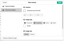
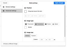
We have changed the background color of disabled button to light grey (#eeeeee?) from white recently, I feel it makes it visibly difficult to differentiate from Active or Selected tab. Compare the screenshots attached
Description
Description
| Status | Subtype | Assigned | Task | ||
|---|---|---|---|---|---|
| Open | None | T113560 Standardize MediaWiki components (tracking) | |||
| Resolved | Jdforrester-WMF | T88449 Buttons differ between OOjs UI and mediawiki UI (tracking) | |||
| Duplicate | None | T88592 [Suggestion for improvement] The difference between the background colors for disabled button and selected button is not much visibly apparent now |

