Page MenuHomePhabricator

Onboarding for Share A Fact and beyond.
Closed, ResolvedPublic5 Estimated Story Points

Description

Design
https://trello.com/c/S7q0A4P8/119-shareafact-onboarding-png

Acceptance Criteria:

  • Choose a fork of the SuperToolTips library (https://github.com/nhaarman/supertooltips), and use it for onboarding going forward. Ideally, abstract away the actual library used for displaying tooltips, so that we could swap it out if necessary.
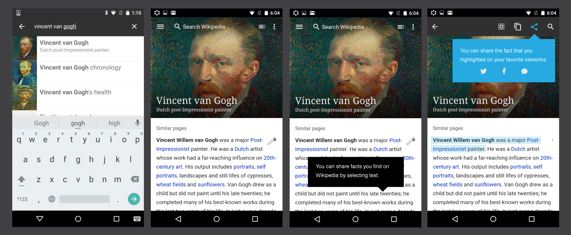
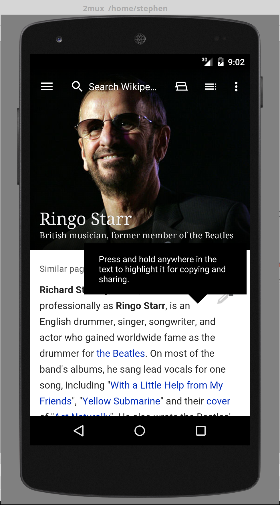
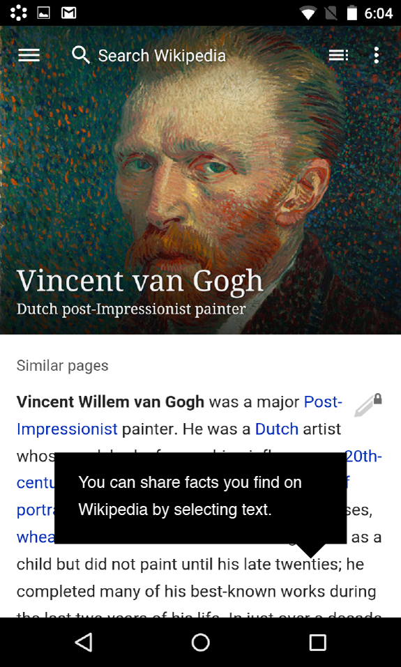
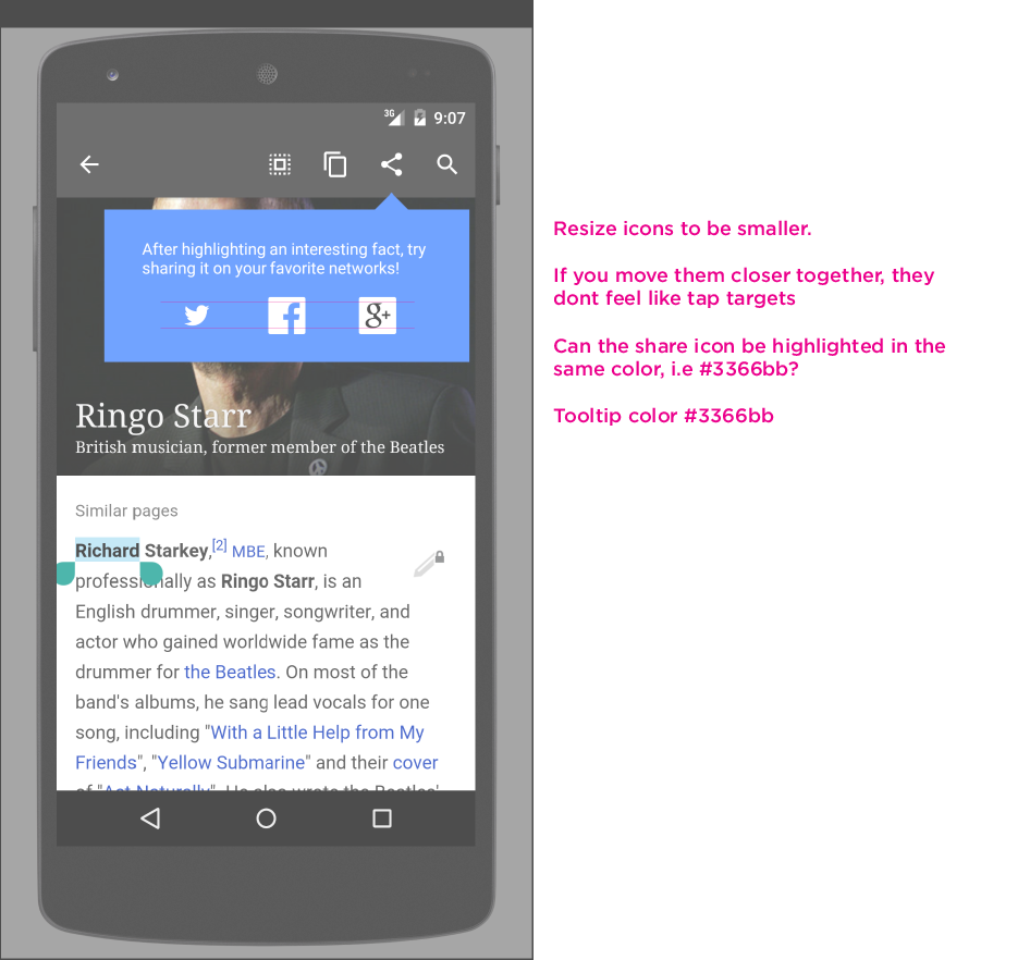
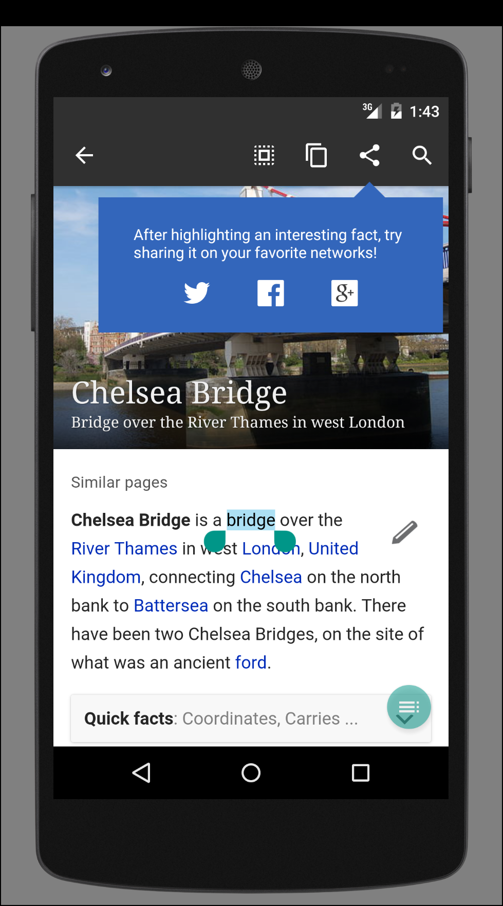
  • When an article first loads, show a tooltip pointing at the first paragraph of text, saying "Tip: press and hold to highlight text for copying and sharing." (exact verbiage tbd).
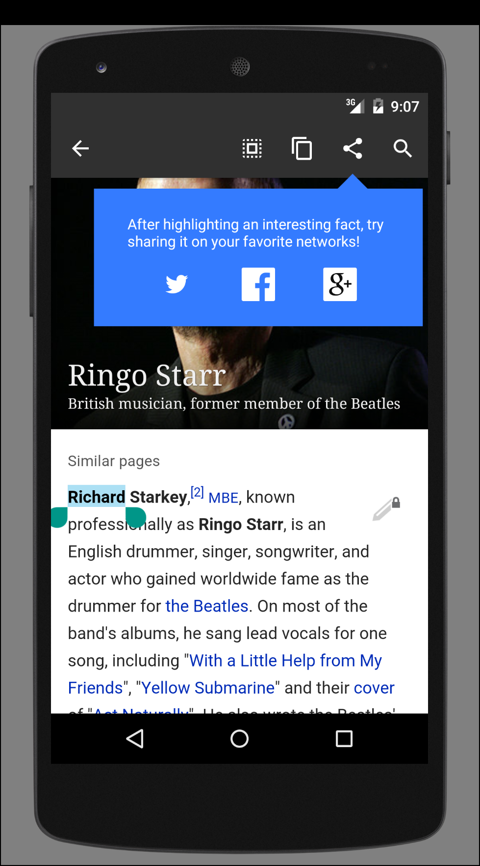
  • The first time a user highlights text, show a tooltip pointing at the Share button, saying "Tap the Share button to share your selection with your favorite social media apps." (exact verbiage tbd)
  • Show only one onboarding item per article (e.g. don't show ToC onboarding together with the Highlighting tooltip).
  • Do an A/B split (50/50) for showing versus not showing the onboarding tooltips.

Event Timeline

There are a very large number of changes, so older changes are hidden. Show Older Changes
KLans_WMF subscribed.

Note that we are backlogging this task, as we are blocked on design.

Vibhabamba renamed this task from Epic: Onboarding, both generally and for Tweet A Fact to Onboarding for Tweet A Fact.May 4 2015, 8:35 PM

Need a prototype here, and it will come soon.
Assume BearND will work on this so I will scheudle a detailed syncup with him.

Please add some more specs (text). I'm not sure who will pick up this task next sprint. I don't think we need a library for the dialog you plan to have here.
Are you sure you want to say "strange facts"?
Are you sure you want to tell the user to tap the share button but not show how it looks like; instead you show Twitter, FB, and some other icon I don't recognize.

@Vibhabamba hey I like this! I have a few suggestions mostly around language. Lets meet up sometime today to chat

This comment has been deleted.

Added feedback from JonKatz and updated mocks

  • Need to show the actual action so users can do this on their own.
  • Moiz had a comment that we should also get users to select the text.

@Vibhabamba, I'm finally coming up to speed on Share A Fact so please excuse any daftness on my part. This is such a great feature to highlight! After exploring the implementation for a while, I feel the onboarding flow should be a little more similar to the table of contents onboarding experience. I put a lot of thought into it and can appreciate the difficulty of teaching a user so I hope my remarks don't come off as flippant.

The TOC onboarding experience all happens in-page and feels very soft. I like it! Modal dialogs, or "pop ups," on the other hand, were very popular on older versions of Windows but don't seem a natural fit for Share A Fact. I worry this will be too "in your face" for our users.

Additionally, an in-page experience will work very well with @MSyed's suggestion that we engage the user in highlighting text. The third screen shows a block of text taken from the article that the user can choose to highlight a portion of. There a couple shortcomings with this approach:

  • The user may not care to share any of the text within the block chosen. We should afford them the flexibility of the whole article.
  • It's not clear what the logic is for choosing a block within the article.
  • All tutorial interactions are happening outside the context of the page which creates a small disconnect between what the user is learning to do and what the user will actually have to do.
  • There's no clear dismissal button in the dialog.

I think we should highlight text on the actual article itself the user is visiting and guide them with tool tips. We can have tips for adjusting the highlight handles and also pointing out the share button. What do you think?

@Niedzielski I generally agree with you and I considered another approach earlier -
Some news sites have a sentence underlined and there is a tooltip saying 'See how to share this'

I struggled with the text selection approach because - 'Fundamentally why will I as a user go through the painful process of selecting a sentence when I don't know what the end purpose is?

There are a couple of things we need to address in the workflow:

  1. You may have to draw the reader's attention to upfront explain what this is interruption is about
  2. You have to point to a sentence in read mode and get the user to highlight it
  3. As the user highlights it, a share button is revealed.
  4. User taps share button.
  5. Card is generated.

When the card is generated is critical - it is the first time the user experiences the feature.
Now beyond this if sharing works then it is successful. My concern with this approach is Steps 1, 2 , 3 are fairly high friction in the absence of prior knowledge of this feature ( aka motivation ) & a native text selector.

@neidzielski, now replies to your specific comments:

The user may not care to share any of the text within the block chosen. We should afford them the flexibility of the whole article.
We could anchor a tooltip somewhere which says 'Find an interesting sentence to share and highlight it. Wikipedia has a new share a fact feature for the strange facts that you read'

It's not clear what the logic is for choosing a block within the article.
In the approach I proposed, its simply a non first sentence to educate the user that they can share any sentence. In that sense it wouldn't always turn out perfect.

All tutorial interactions are happening outside the context of the page which creates a small disconnect between what the user is learning to do and what the user will actually have to do.
Agree

There's no clear dismissal button in the dialog.
This is minor, we can add a link.

@Niedzielski - I'll work on an alternate idea and add the mocks.
@Dbrant - Its likely that this card may spill over into unstructured sprint, since the design is being iterated on based on recent comments.

@Vibhabamba, thanks for your nice and thoughtful comments. I totally agree
with your insight about the friction / payoff. Maybe we can do a crossover
and put an eyeful of the share header image in a tool tip bubble next to
some more terse instructions. Something like "Share a fact! Drag the
highlight handles to pick a fact." When the user adjusts the selection or
there's timeout, we pop the old bubble and add a new one next to the share
button in the action bar: "Now press share!"

Niedzielski renamed this task from Onboarding for Tweet A Fact to Onboarding for Share A Fact.May 19 2015, 5:11 PM
Niedzielski changed the task status from Open to Stalled.May 19 2015, 5:24 PM
Niedzielski renamed this task from Onboarding for Share A Fact to (Blocked by design) Onboarding for Share A Fact.May 20 2015, 8:38 PM
Dbrant renamed this task from (Blocked by design) Onboarding for Share A Fact to Onboarding for Share A Fact and beyond..Jun 19 2015, 3:52 PM
Dbrant updated the task description. (Show Details)

Need to meet with @JKatz and @Neidzielski to discuss event logging and success criteria for the onboarding.

@Jkatz, @Dbrant and I had a quick chat about this.
The proposal is to run an AB test with basic tooltips.

shareafact_onboarding.png (823×1 px, 914 KB)

50% of the users see tooltip A
50% of the users see tooltip B

We compare which bucket converts into sharing more facts based on App install ID.

@JKatzWMF Please add any additional comments as necessary.

@Vibhabamba -
we need a control of 'user sees nothing' to ensure that there is any impact

recommended:

50% no tooltip
50% both tooltips

or
not recommended--we might find that tooltip a drives 100% of the effect or vice verse, but who cares. Could also find that 1 is more effective than both, but this is highly unlikely.

25% no tooltip
25% both tooltips
25% tooltip a only
25% tooltip b only

Side note: Initial data shows us that the bottleneck in the funnel is from highlight-->click share (7%). So just increasing this behavior will drive significant improvements.

Change 222193 had a related patch set uploaded (by Niedzielski):
Add tool tip UI components for onboarding

https://gerrit.wikimedia.org/r/222193

Change 222212 had a related patch set uploaded (by Niedzielski):
Add tool tip onboarding state

https://gerrit.wikimedia.org/r/222212

Change 222218 had a related patch set uploaded (by Niedzielski):
Add tool tip onboarding A/B testing

https://gerrit.wikimedia.org/r/222218

Change 222193 merged by jenkins-bot:
Add tool tip UI components for onboarding

https://gerrit.wikimedia.org/r/222193

Change 222212 merged by jenkins-bot:
Add tool tip onboarding state

https://gerrit.wikimedia.org/r/222212

Change 222218 merged by jenkins-bot:
Add tool tip onboarding A/B testing

https://gerrit.wikimedia.org/r/222218

Examined most recent alpha (June 30th), didn't see handy tooltips.
Please add screenshots.

Sorry! I didn't realize the alpha builds were down (again?). Here's the shots:

This is the select text tip:

2015-07-07-09-03-00-071704738.png (1×979 px, 820 KB)

The share text tip has a highlight animation that's difficult to capture in a screenshot. Here's the animation starting:

2015-07-07-09-05-24-099949549.png (1×979 px, 750 KB)

And here's the tip itself after it's been out a while:

2015-07-07-09-07-12-281814817.png (1×979 px, 625 KB)

hi @Niedzielski
Few feedback comments

  1. Select Text tip
  • Need a one second delay with basic css fade in for the tip, instead of display on page load. We need to choreograph the attention of the user a little bit.
  • Tip must not snap to lead image
  • Horizontal centers of the main tooltip are and the article page should be aligned (as seen below)

shareafact_tip.png (957×575 px, 552 KB)

  • Vertical positioning of the tooltip should be towards the lower end of the screen, so it does not look continuous with the lead image.

Tip after text has been selected:

shareafact_tip2_tweaks.png (882×946 px, 194 KB)

Also set up a chat for us to sync up Monday for follow up questions.

TBD on monday

  • Color of the first tooltip (Consider making it lighter)
  • Changes in m version for long press menu
  • Social media icons should be consistent (use a set where all have bg or all are shapes)

Change 224183 had a related patch set uploaded (by Niedzielski):
Share a fact onboarding design tweaks

https://gerrit.wikimedia.org/r/224183

Hey, @Vibhabamba! Please excuse the lengthy comment.

Select text tip

Need a one second delay with basic css fade in for the tip, instead of display on page load. We need to choreograph the attention of the user a little bit.

Updated. We wait for the article text to be available and then start a one second timer before triggering the tool tip animation. I oppose the one second timer because quick users may be confronted with the tip mid interaction but see how this feels to you and we can keep or adjust accordingly.

The current animation is a fade pop-in that emits from the pointer target. If we want a custom animation, we will need to fork the tool tip library. I didn't make this change because forking the library is a bit of work. I find the default animation pleasant so I oppose customization. If this is important, let's talk with @Dbrant and figure out a plan.

Tip must not snap to lead image
Vertical positioning of the tooltip should be towards the lower end of the screen, so it does not look continuous with the lead image.

Done. The pointer target is now precisely at 88% from the top and 70% from the left on all screens.

2015-07-10-13-44-05-868073413.png (1×979 px, 921 KB)

Horizontal centers of the main tooltip are and the article page should be aligned (as seen below)

I played around with this quite a bit and I'm sorry to report this feature is also unsupported by the tool tip library. The library considers a tool tip as two pieces: a bubble and a little pointer sticking off the bubble. The library positions the pointer perfectly onto the target view, then tries to center the bubble WRT the pointer within the confines of the physical screen dimensions. If a constraining parent view could be injected instead of the library just grabbing the entirety of the screen, we could fix this. As it stands, a centered bubble with a hanging right arrow is not possible without forking the library. I like the appearance of the bubble in your mock far more than that supported by the library, so I support this change. As mentioned, forking the library is a bit of work so if this is important, let's bug @Dbrant and figure out a plan.

Share text tip

Resize icons to be smaller

Done. I've recut all the assets at 24dp wide and proportionally tall from the source materials.

If you move them closer together, they don't feel like tap targets

Done. The icons are equidistant apart but I've added 16dp padding on the left and right sides of the bubble to force them in tighter. I've fixed the icons to be vertically centered too.

Can the share icon be highlighted in the same color, i.e. #3366bb?

Done.

Tooltip color #3366bb

Done.

2015-07-10-13-44-26-028083268.png (1×979 px, 685 KB)

TBD

Changes in m version for long press menu

I'm happy to discuss but any work will be independent of this card.

Social media icons should be consistent (use a set where all have bg or all are shapes)

I'm happy to apply new assets. The existing social media icons used are according to each entity's brand guidelines. Detail as follows:

  • All images were cut using a script with a target mdpi size of 24px sq. Each density was run through Pngcrush.
  • Facebook, Twitter, and Plus logos were acquired and applied according to individual brand guidelines. Details on whice icon was used below. Icons were renamed <social network>_logo.png.

Twitter
https://about.twitter.com/company/brand-assets

https://g.twimg.com/brand_guideline_logos_0.zip
  brand_guideline_logos_0.zip
    brand guideline logos/
      TwitterLogo_white.eps

Facebook
https://www.facebookbrand.com/

logos-and-badges_f-logo_online.zip
  logos-and-badges_f-logo_online/
    ai/
    psd/

Plus
http://gplus-brand.appspot.com/

g+icon_white.zip
  /g+icon_white/
    g+icon_white.eps

Change 224183 merged by jenkins-bot:
Share a fact onboarding design tweaks

https://gerrit.wikimedia.org/r/224183

Hello! Highlight changes are in draft patch. Patch publication pending new icons.

Breaking out a dependent task which requires some customization/ extension to the library.
https://phabricator.wikimedia.org/T105820

Change 224528 had a related patch set uploaded (by Niedzielski):
Share A Fact onboarding design tweaks

https://gerrit.wikimedia.org/r/224528

Change 224528 merged by jenkins-bot:
Share A Fact onboarding design tweaks

https://gerrit.wikimedia.org/r/224528