It would be nice if there were a key explaining the meaning of the lines and their labels on the burndown chart. It is not immediately clear; many people I've shown charts to ask about what the lines mean - I can provide my best guess answer, but it would be great if this were more clear.
Description
Description
Related Objects
Related Objects
- Mentioned Here
- T90826: Questions about arithmetic in burndown
Event Timeline
Comment Actions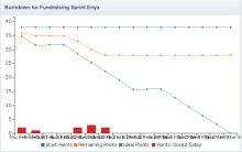
if there were a key explaining the meaning of the lines and their labels on the burndown chart. It is not immediately clear; many people I've shown charts to ask about what the lines mean

Not entirely sure what this refers to. I see the colors of the lines explained at the very bottom (FF35), don't you?
Or do you mean explicitly stating the y axis is the number of tasks and the x axis is time? Or something else?
Comment Actions
Not entirely sure what this refers to. I see the colors of the lines explained at the very bottom (FF35), don't you?
Or do you mean explicitly stating the y axis is the number of tasks and the x axis is time? Or something else?
It would be nice if the labels were explained, either on/near the chart, or there was a link provided to an explanation. For instance, 'start points' doesn't really mean 'how many points did this project start with' like one might infer from the title (see T90826)