Page MenuHomePhabricator

Improve readability of pages with large amounts of links
Closed, DeclinedPublic

Description

From User request at https://trello.com/c/V4mWpB9H/1-comment-on-this-card-if-you-don-t-have-an-account-and-we-ll-make-it-into-a-top-level-card


Anyway, I've been thinking about the readability of pages with large amounts of links.

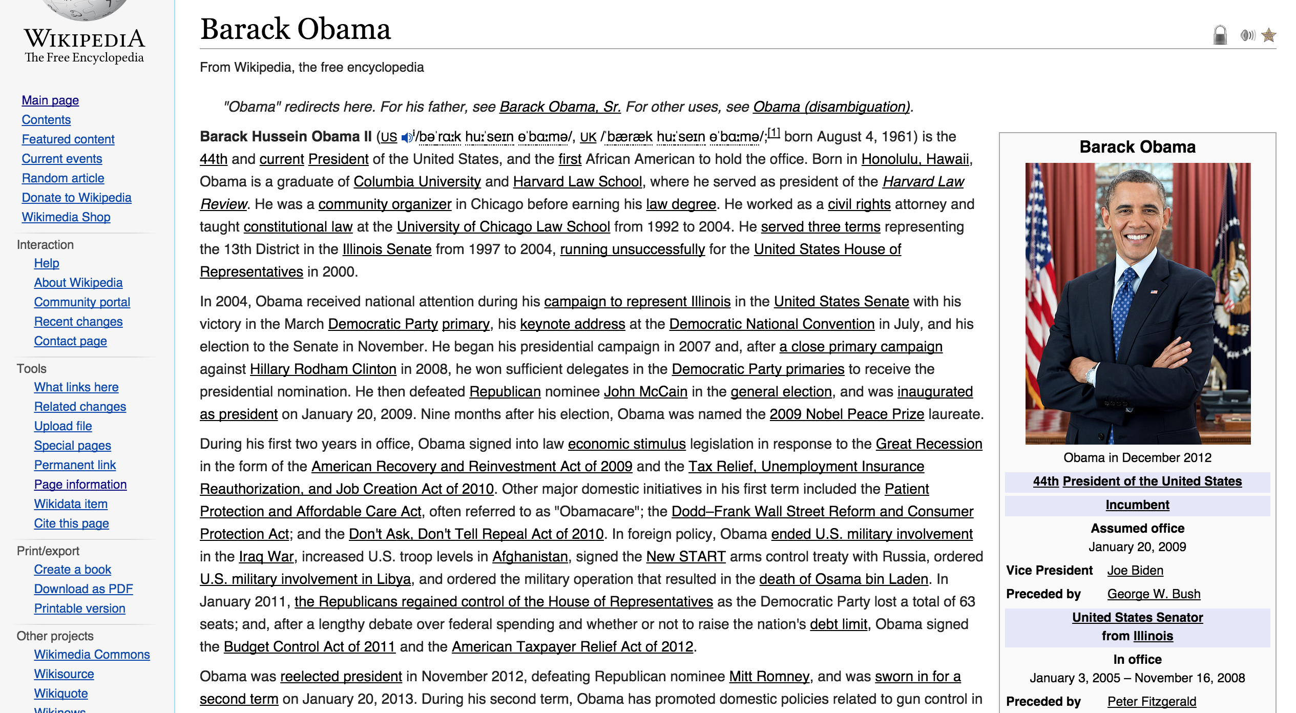
It's actually unneccesarily hard to read something like https://en.wikipedia.org/wiki/Barack_Obama (regardless of device/browser) because of the constant color changes between link-free text and the links.

Toggling the link color to black (while keeping the text-decoration: underline) makes it a lot easier to read. There are plenty of other design solutions that could help with this very basic feature of wikipedia; to easily be able to read the hypertext.

It could e.g. be simple a setting on https://en.wikipedia.org/wiki/Special:Preferences – or a theme with more subtle link styling selectable from the prefs.

Try looking at
https://www.evernote.com/shard/s1/sh/4bae338a-d18c-4316-b696-45400f34bca2/04eea6f4a68aee0b123068ce45a6bbf9/res/37f9df84-896a-434b-aa0f-71efd1f41a8d/skitch.png
and actually read the text there. Then go back to the normal setting with blue links to compare it.

Toggling the link color also doesn't negatively impact the accessibility (also not for the color-blind since the underlining is still there).

I would just generally love to have wikipedia more more easily readable/scannable. And only very few of the themes on https://userstyles.org/styles/browse/wikipedia significantly improve readability.

Event Timeline

Jaredzimmerman-WMF raised the priority of this task from to Needs Triage.
Jaredzimmerman-WMF updated the task description. (Show Details)

Your Evernote is private or otherwise not accessible for me (so much for the 'ever' part, heh). Can you upload the contents as an attachment here?

Hi,

Attaching screenshot here (the evernote link is bugged, it actually works if you open it in incoqnito mode—aka. it's not private).

Best, Rasmus

Screen_Shot_2015-03-14_at_17.29.25.png (1×2 px, 1 MB)

When evaluating the suggestion, please actually read a paragraph or two of both black and blue links. I'm not saying it should be exactly this design solution—basically just wanted to discuss (and maybe help with) the readability of texts with many links.

Jdlrobson triaged this task as Medium priority.Sep 24 2015, 12:19 AM
Jdlrobson subscribed.
Jdlrobson changed the task status from Open to Stalled.Dec 21 2015, 4:57 PM

I agree it's much more readable but given how the last typography refresh went we'd need to invest more time in this before doing.

Tracking for now. @Nirzar seems like a pure Design task for now.

@rasmusskjoldan I agree with this proposal. but it's there are a lot of considerations here :) in-fact wanted to do the same when i was working around things to improve the readability.

Here's something i was working on prior to this. i have a css version of this which i use for my personal wikipedia use to see how it impacts the readability.

type.png (773×1 px, 132 KB)

few considerations

  1. additional thing we get out of this is accessibility. right now color is the only indicator for denoting that it's a link and not text. with an underline instead of color, it would be easier to distinguish
  1. this begs the question about our font size and line height particularly. with underlines, we need to add extra line height for it to work.
  1. any change, as small change as typography refresh creates huge uproar for people who don't like things changed. Unless this change ensures better readability through rigorous research and data we won't be able to convince anyone that this should stay.
  1. on top of that, there will be some valid concerns or bugs in implementation, just as we had with typography refresh.

overall, it seems like it would take a lot of community consultation, careful analysis of the impact and big battle for designers. if we have support, i'm all in to actually work on the design and specifications.

one more note, if i had to choose which readability problem i would solve with wikipedia, i would say the center column reading with bigger typeface and enough leading. i think that's a high priority issue for readability. so if i had to choose where i want to invest design resources then i would say a cleaner article layout. similar to mobile front-end but even better :)

Unfortunately, a lot of things boil down to resource allocation and prioritization. I wish we can work on this request.

@rasmusskjoldan I don't like it. Those black underlined words give me uncertainty about what they are. Whereas blue links are standard on the web. :/