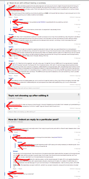
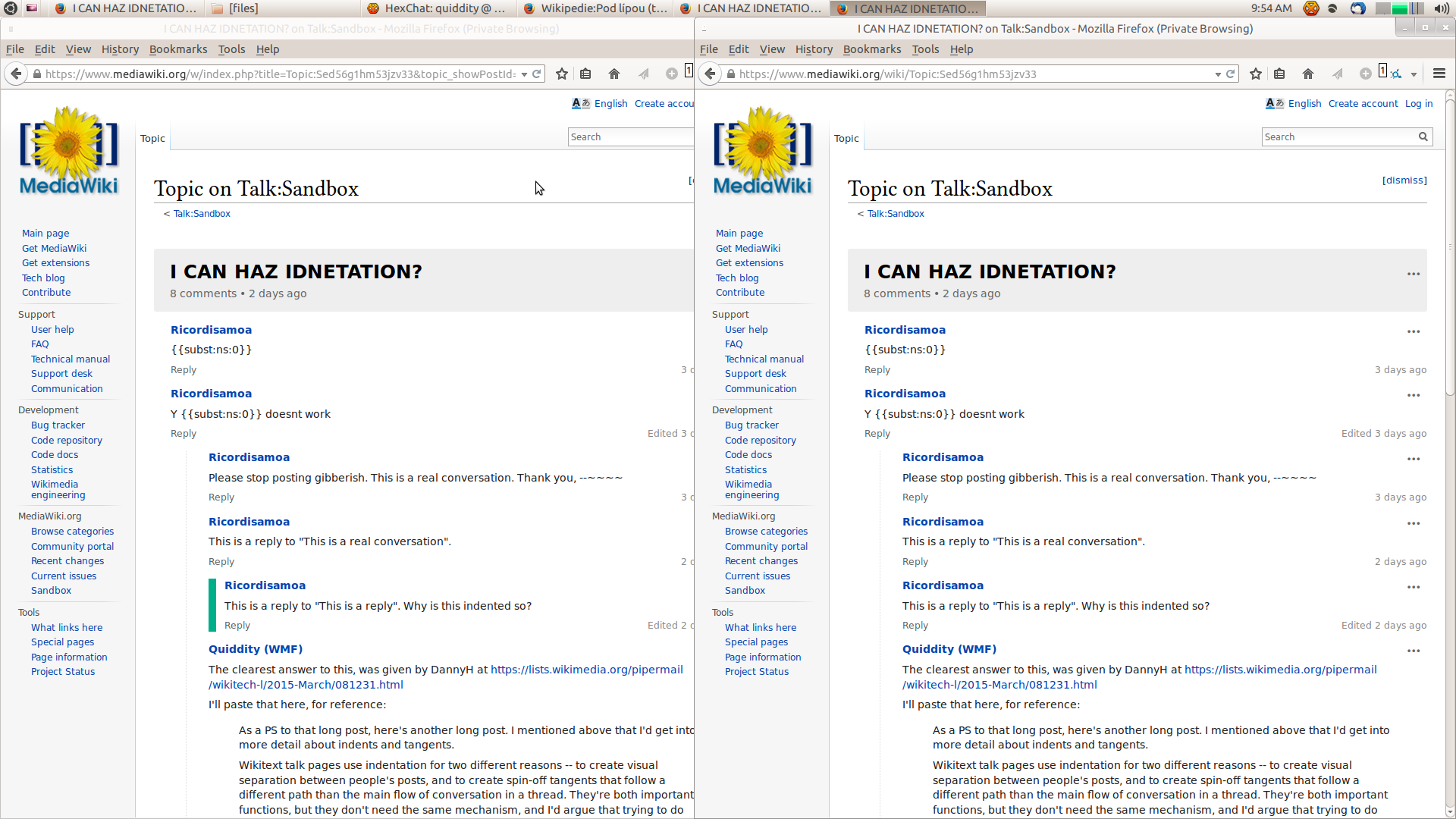
See screenshot comparison. The green-bar in the permalinked-post, alters the indent, making it appear as if that post is not at the same indent-level.
| Quiddity | |
| Mar 30 2015, 4:56 PM |
| F107077: flow-highlight.png | |
| Mar 30 2015, 5:59 PM |
| F107071: Screenshot_from_2015-03-30_09:54:01.png | |
| Mar 30 2015, 4:56 PM |
See screenshot comparison. The green-bar in the permalinked-post, alters the indent, making it appear as if that post is not at the same indent-level.
We could take a few different aproaches:
Move all the highlights to the left in a consistent spot
Use a transparent left border that changes to blue/green as necessary
Reduce the padding when adding a left border
The "all the highlights" in this option is related to the "new posts" blue-highlighting, as seen in this screenshot (from an unrelated task). Moving them all to a consistent vertical location, might be good? Not sure.