Page MenuHomePhabricator

As a user, I would like to search for text within articles
Closed, ResolvedPublic3 Estimated Story Points

Description

Problem
This improves the reading experience for users who want to traverse quickly through articles (particularly longer articles) to find a specific word or phrase they are interested in, but cannot do so because searching within an article does not exist in the app. This is a commonly requested function that exists on the web via 'find in page' available on browsers like Safari and Chrome.

User story
As a reader on the iOS app, I want to be able to find instances of a particular word or phrase within an article without having to read through the entire article.

Proposed design

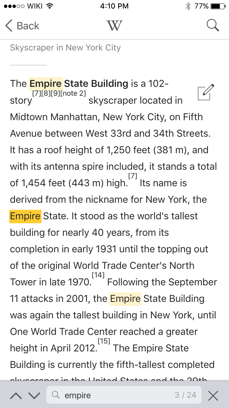
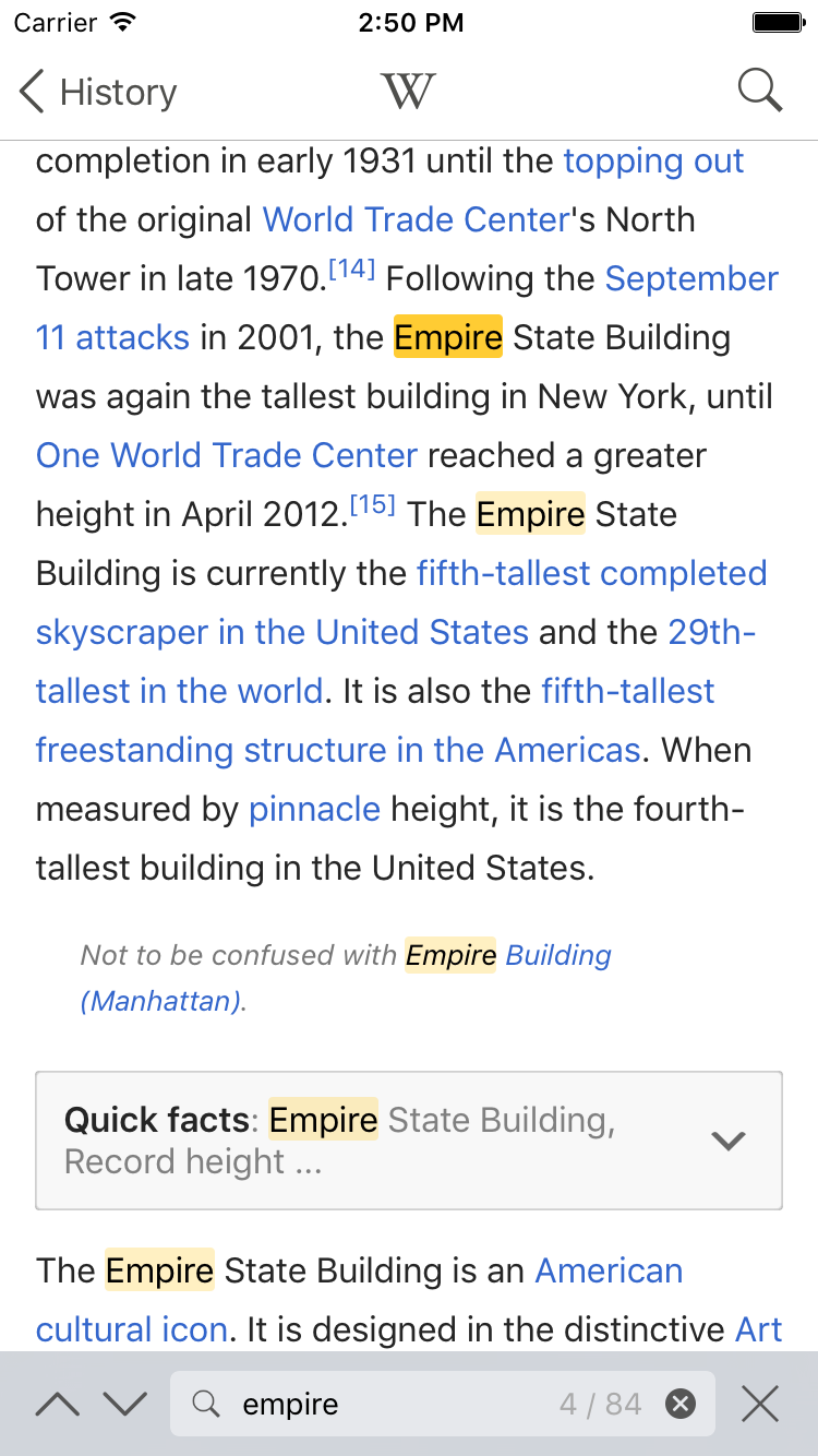
  1. New 'Find in page' icon on Article toolbar
  2. Find in page bar that appears above keyboard upon tapping on the 'Find in page' icon.
  3. On scrolling, the keyboard is hidden with only the 'Find in page' search bar shown, showing an example of highlighted text.

  • Key aspects of design to note:

    • New 'find in page' icon appears to the right most of the toolbar, and other icons are rearranged accordingly
    • 'Find in page' search bar is the same height as the article toolbar
    • Read-only counter of search results of is always shown RHS of the search input bar

    Event Timeline

    Fjalapeno raised the priority of this task from to Needs Triage.
    Fjalapeno updated the task description. (Show Details)
    Fjalapeno subscribed.
    Fjalapeno renamed this task from In Article Search to As a user, I would like to search for text within articles.May 7 2015, 4:01 PM
    Fjalapeno updated the task description. (Show Details)
    Fjalapeno set Security to None.

    I just want to raise the question if we might be having too many icons in the footer bar. Another option could be to use the normal search icon for this as well, as Safari does...?

    But if we are going to have 6 icons, we might be using the same spacing between all icons, and not group the four in the middle and have a bigger space between the outer and inner icons....

    @Josve05a – just updated the mocks to evenly space the article toolbar items. Granted it is getting a little cramped with 6 icons, and text settings is most likely to move since this is a more general setting rather than the other article-specific actions, and we are looking to utilise dynamic text in the near future to further optimise text size view. Leaving as six icons in the initial mocks for now pending further discussion.

    I had the same thought here as well.

    @RHo some backstory - we had this discussion last year before releasing 5.0 as well. And were starting to prioritize actions.

    What really needs to be visible at all times on an article?
    What actions can be more than 1 touch away?
    What actions only need to be at the top of an article?

    We side-stepped this by having less actions than we planned, but it looks like its time to re-evaluate.

    In general Apple's guidance has been to keep buttons to 5 or less in a tool bar on an iPhone.

    6 buttons Is definitely looking cramped on an iPhone 6 - and on an iPhone 5 or SE its pretty bad.

    We should start trying out some alternate ideas here to see if we can come up with some other viable options.

    some options to relieve crowding in the bottom tool bar:

    • add arrow icon ">" on one side of the tool bar, tapping it scrolls over to lesser used set of icons, or can drag back and forth
    • add up icon "^" on bottom toolbar, tapping shows secondary row of icons above
    • move lesser used icons to top of page in toolbar that only appears when you drag down from the top of the article
    Mhurd set the point value for this task to 3.Jul 28 2016, 5:26 PM

    Testing criteria:

    • Load the "Color" article
    • Tap the "find" icon in the bottom toolbar (it's the magnifying glass icon - second icon from right)
    • A search box on top of keyboard should have appeared. Enter a search term, for example, the word "purple", into the search box
    • When you have entered the search term, the article should scroll to the first match found for that search term. The number of times the search term was found in the article should also appear to the right of the search box - for example "1 / 4" which means we're currently scrolled to the first match of four.
    • You can tap the previous "^" and next "v" icons to the left of the search box to jump between the search matches found in the article.
    • When you tap "^" or "v" to jump between matches the article will scroll to the previous or next match, it will also highlight the current match with a slightly darker color and it will do a small animation on the current match. This animation makes the match grow larger then quickly shrink back to normal size.
    • When you tap "^" or "v" to jump between matches, the number on the right of the search box will update: for example, when on the first match it will say something like "1 / 4", when on the second match it will say "2 / 4" and so on.
    • When you are on the last match, for example, "4 / 4", and you tap the next "v" button to jump to the next match, it will jump back to the first match "1 / 4". The reverse is also true - if you are on the first match '1 / 4" and you tap the previous "^" button it will jump to the last match "4 / 4".
    • If you scroll the article while the search box and keyboard are onscreen, the keyboard will minimize, but you will still see the search box at the bottom of the screen, and you can still use the "^" previous and "v" next buttons to scroll between matches. If you tap of the text box again the keyboard will re-appear.
    • If no matches for a search term are found (enter a search term like "sdfadfs") you will see the text "0 matches" appear to the right of the search box.

    Tap this image to see an animation:

    find in page.mov.gif (720×396 px, 2 MB)

    I'm testing on iOS 9.3.4 and Wikipedia 5.1.0 (901). The Search works in the ways described above, except that there is no "small animation" on the current match with the device I'm using, as shown in the above image. I'll still move this to fixed based on meeting the overall criteria.

    I just noticed a bit of unintended behaviour when swiping the screen up or down when find in page is active.

    Steps to reproduce

    1. Tap 'Find in page' icon in an article and start typing a word with multiple matches on the screen.
    2. Use swipe down gesture on the screen to scroll down the screen.

    Expected
    Keyboard should minimize and the smaller circular "x" inside the input box should be hidden.

    iPhone 6S - Find in page 03@2x.png (1×750 px, 198 KB)

    Actual
    The small "x" is still visible.

    Simulator Screen Shot 15 Aug 2016, 2.50.18 PM.png (1×750 px, 194 KB)

    Good catch @RHo I created T143024 with your full comment, so we can have a focused ticket just for that fix.

    JMinor awarded a token.

    I've already used this feature multiple times in just a few days. I think our users will love it.