Page MenuHomePhabricator

As a multi-lingual user, I want to be able to change article languages quickly
Closed, ResolvedPublic5 Estimated Story Points

Assigned To
Authored By
Fjalapeno
May 1 2015, 3:34 PM
Referenced Files
F183746: IMG_0234.PNG
Jun 26 2015, 7:12 PM
F183743: IMG_0232.PNG
Jun 26 2015, 7:12 PM
F182663: IMG_0228.PNG
Jun 23 2015, 7:34 PM
F182665: IMG_0229.PNG
Jun 23 2015, 7:34 PM
F181294: image1-3.PNG
Jun 20 2015, 4:24 AM
F181289: image1-2.PNG
Jun 20 2015, 4:17 AM
F181285: Screen Shot 2015-06-19 at 9.00.26 PM.png
Jun 20 2015, 4:02 AM
F181281: Screen Shot 2015-06-19 at 8.52.58 PM.png
Jun 20 2015, 3:58 AM

Description

As a multi-lingual user I want to be able to change article languages quickly.

Acceptance criteria

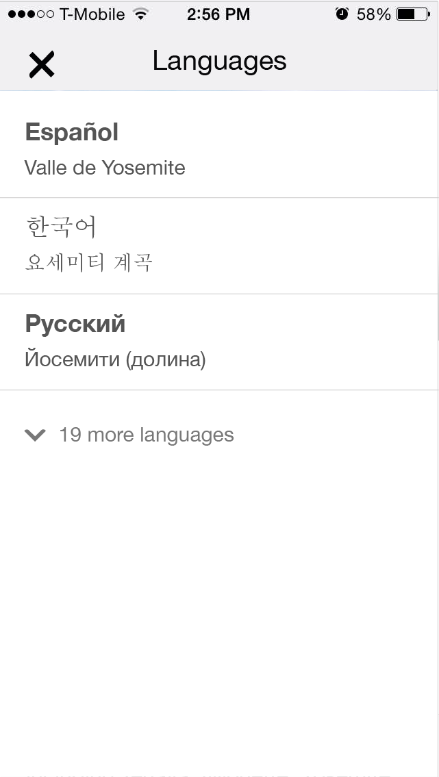
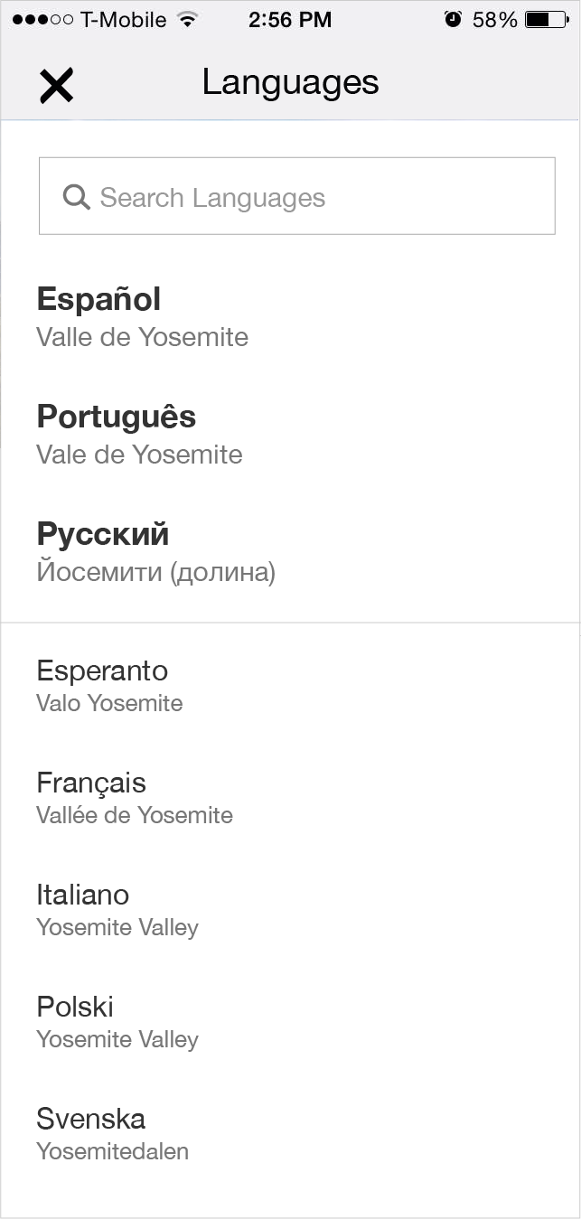
  • Add language icon to toolbar
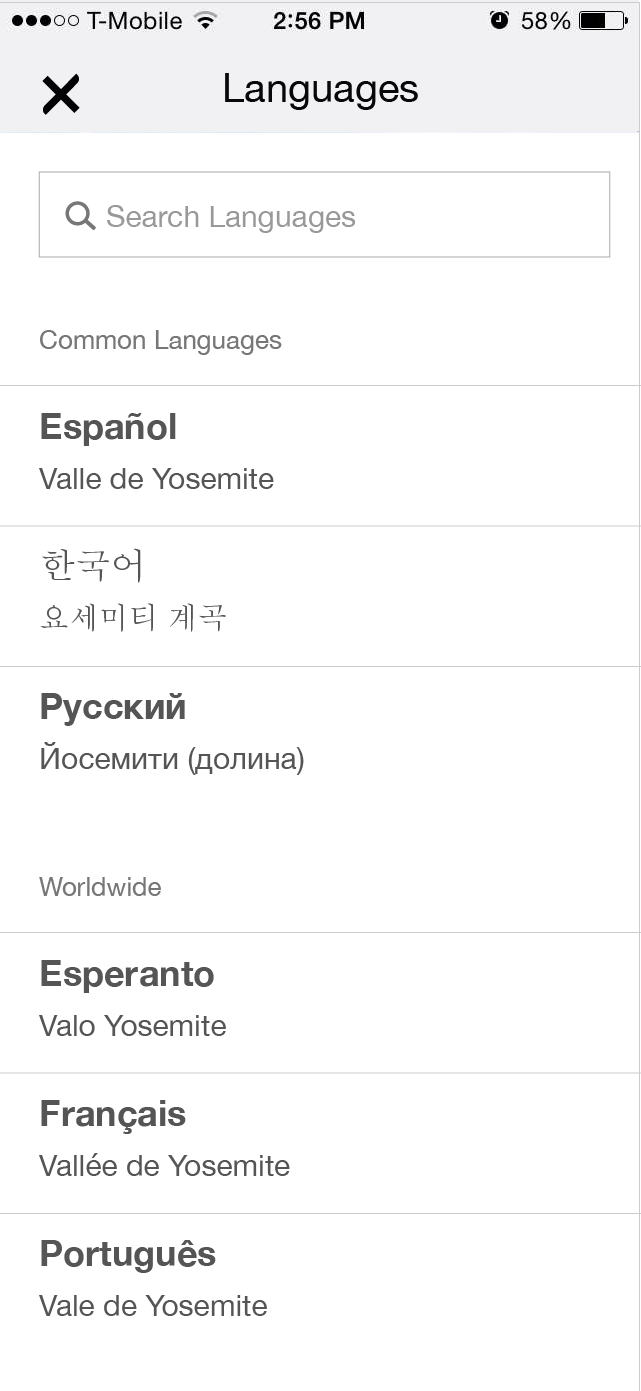
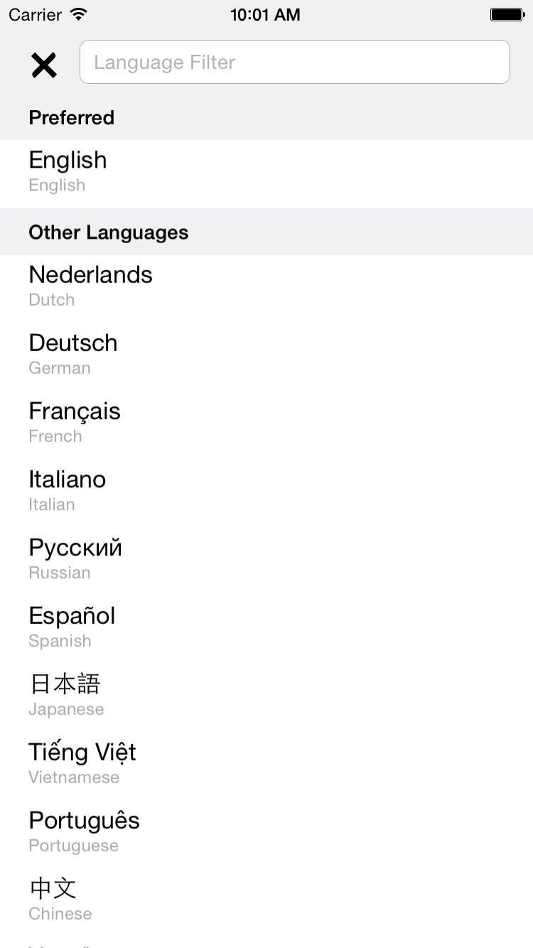
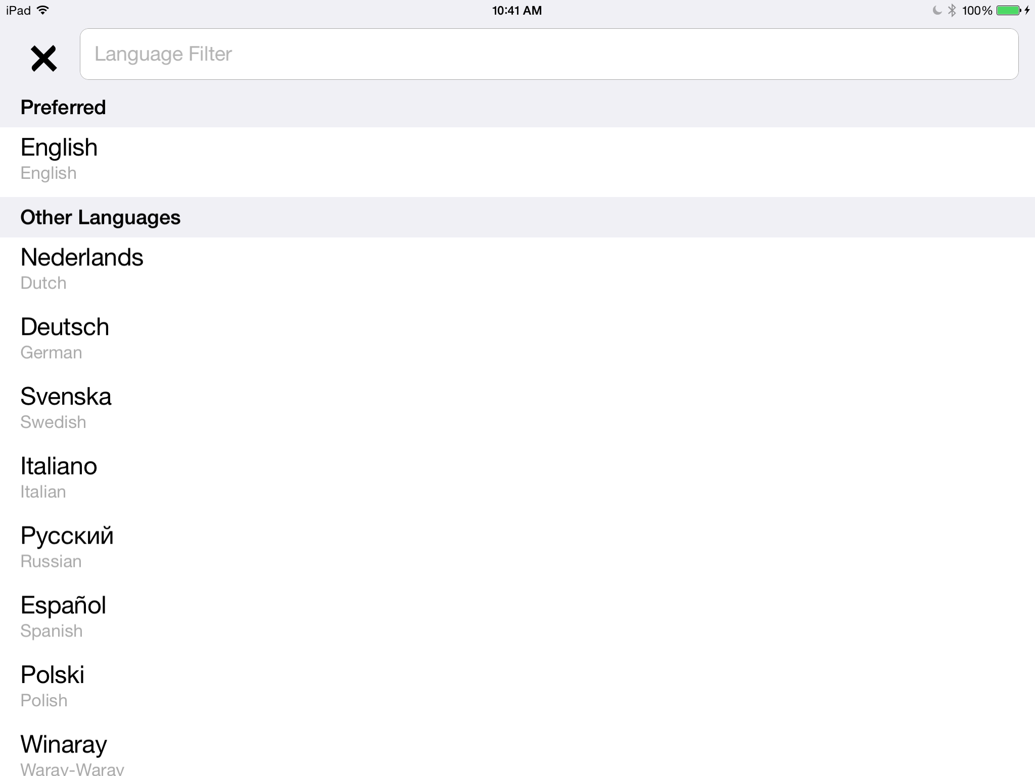
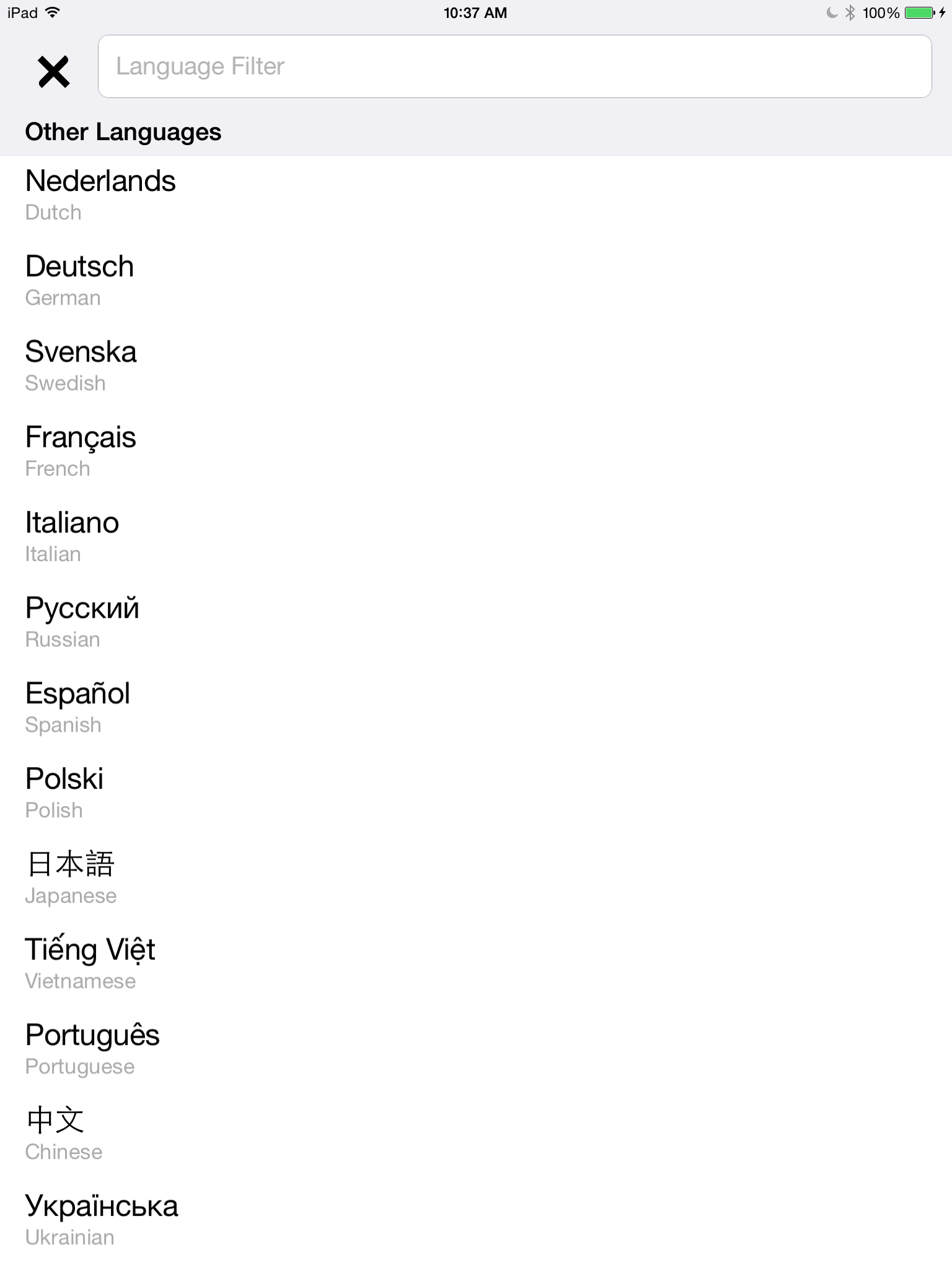
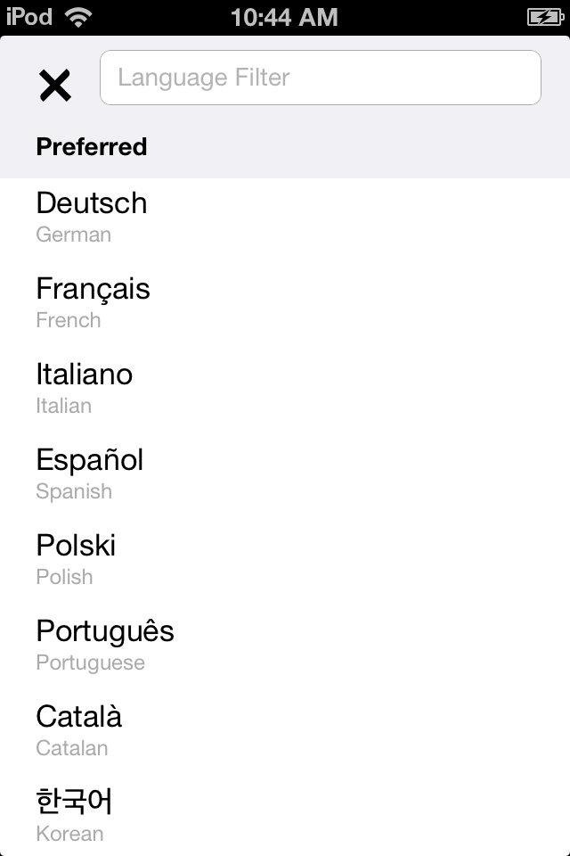
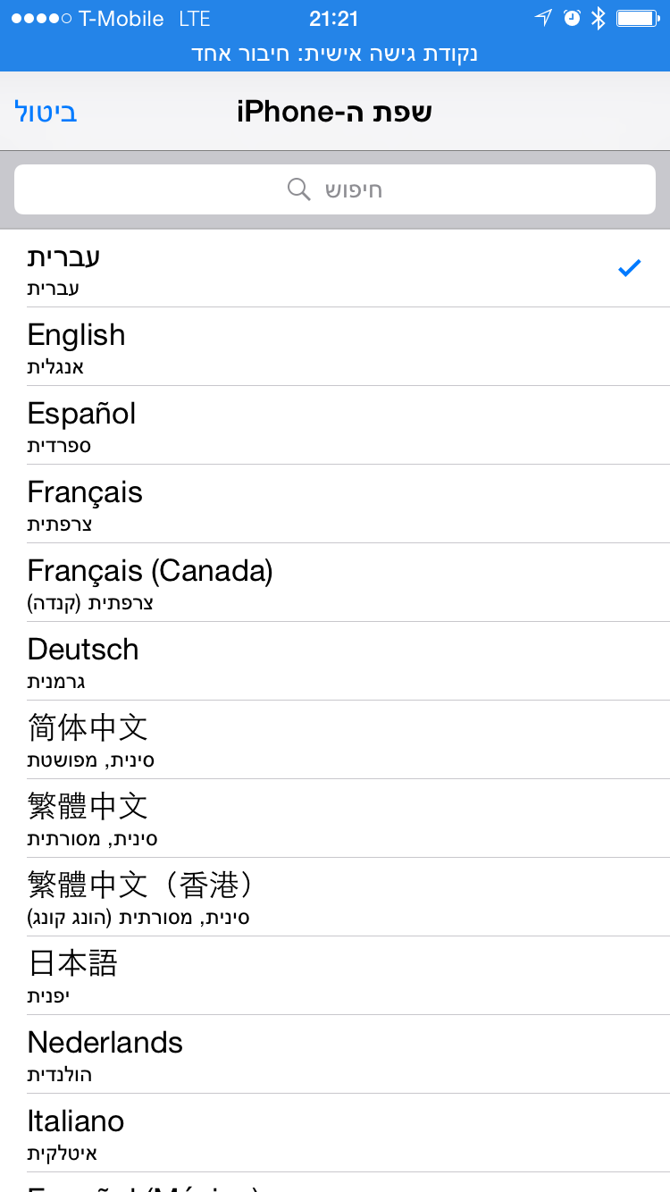
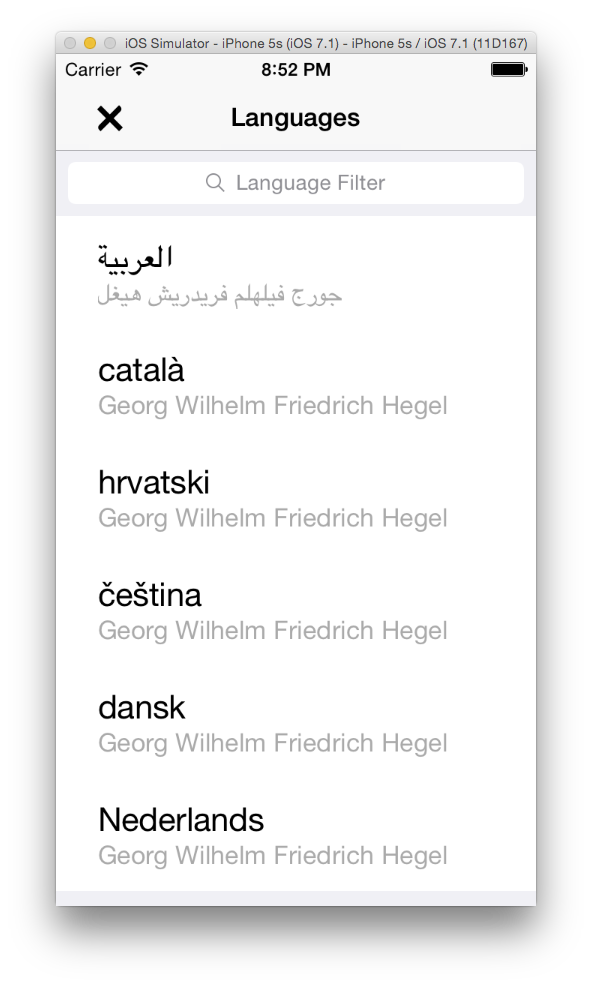
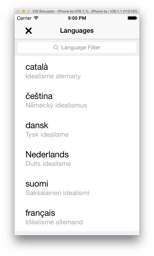
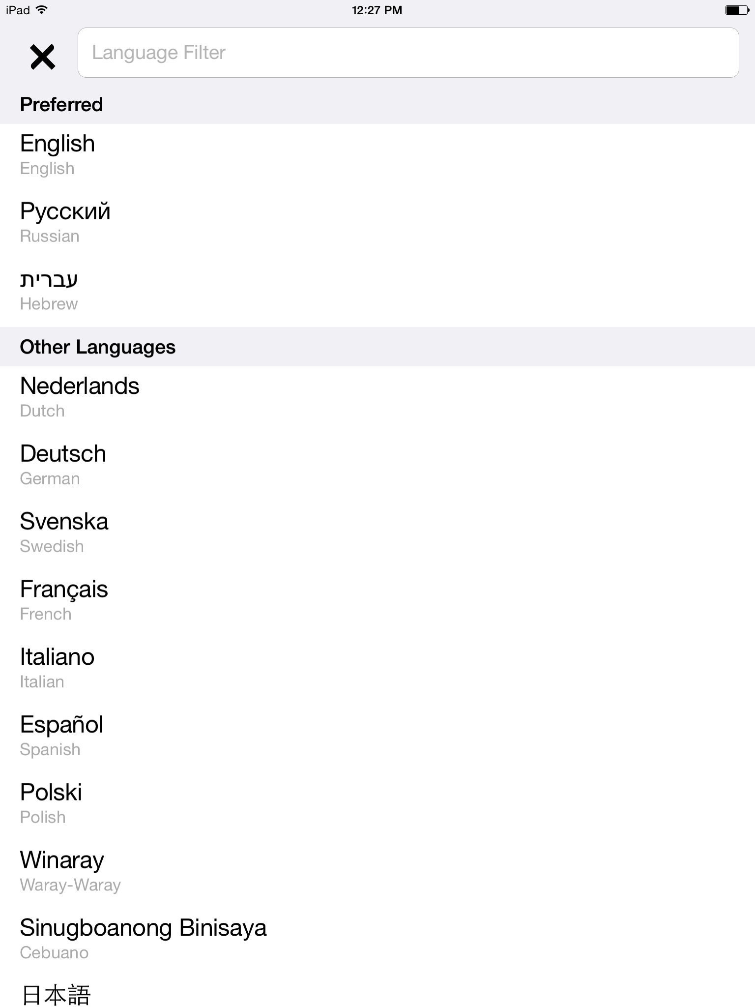
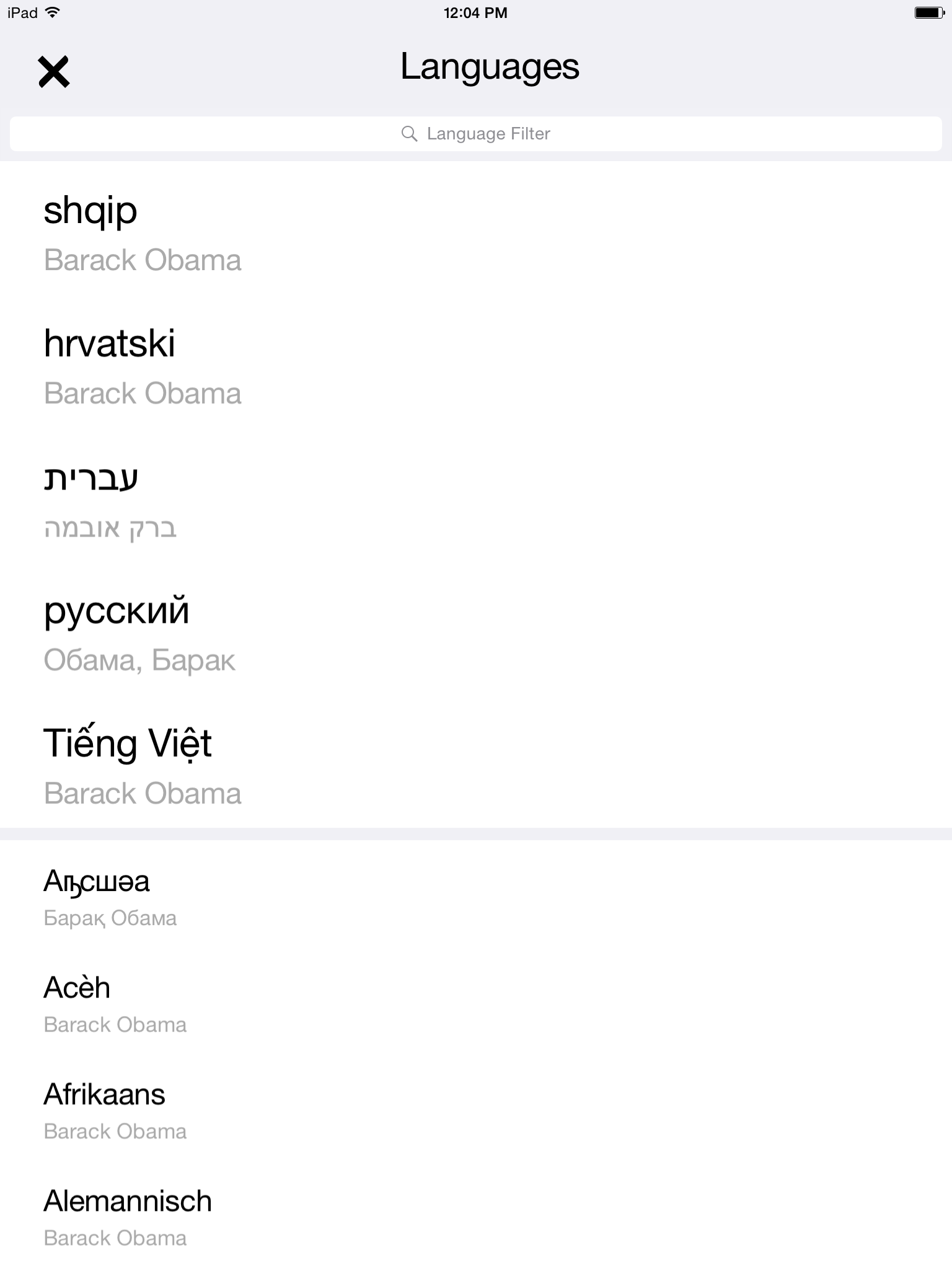
  • List is shown as "Language name" (in native language) and below "Article title" (in native language)
  • Initial number of links are shortened when the list is longer than 6 items. If that happens, only 3 items are shown initially.
  • The initial languages are decided based on the previous user selections and device settings
  • Region titles are shown in the current language

TBD - The following are not known to be possible via the API yet, until them consider them not part of the ticket

  • Geo-ip information available languages
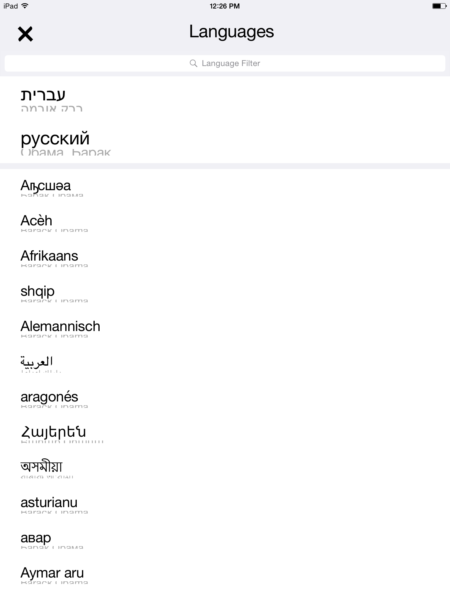
  • If there are more than 20 languages, organize the list by region. Include "Common languages" and "Worldwide" before regions

Implementation on desktop
https://www.mediawiki.org/wiki/Universal_Language_Selector/Design/Interlanguage_links

Prototype
http://invis.io/4N2WGE17H

Design
Access in the toolbar

article-04.png (1×641 px, 460 KB)

First screen

language-04.png (1×641 px, 40 KB)

More Languages

more-04.png (1×641 px, 55 KB)


Notes for QA

iOS

New language picker test cases:
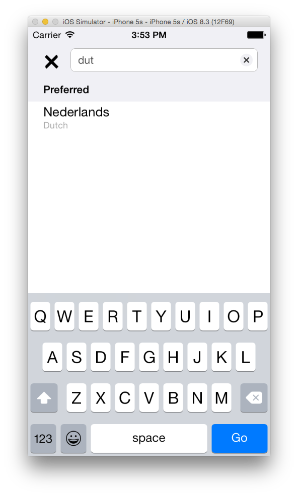
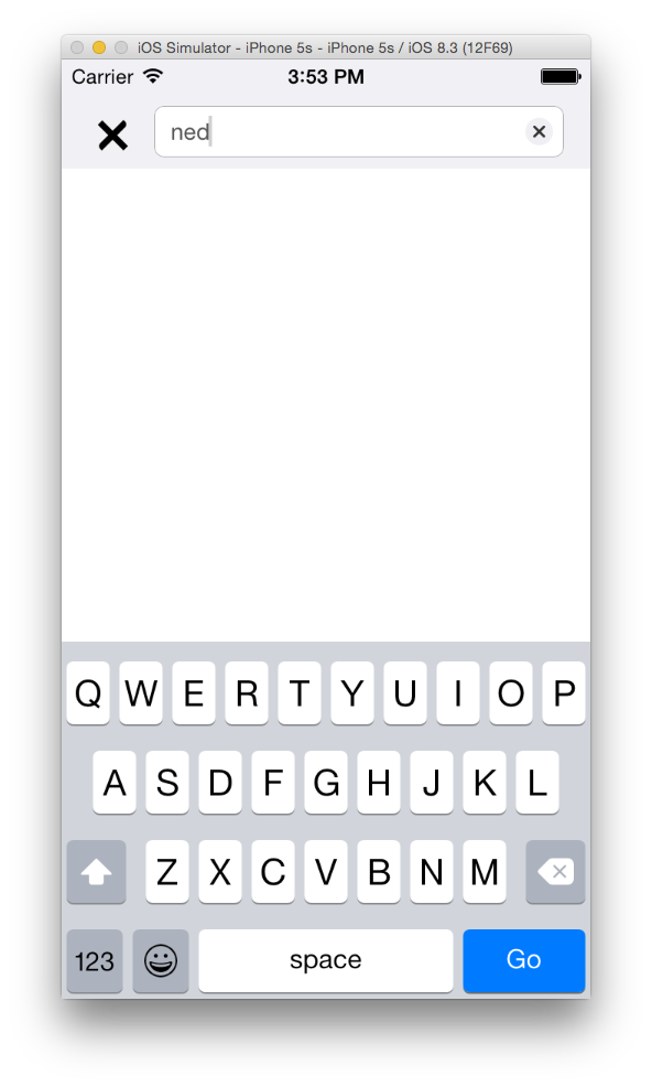
  • Language filter
    • precondition: go to translation view
    • test: type in the first few characters of a language
    • expected results: languages in list should narrow down until only the matching language is displayed
  • "Preferred" language section should collapse when empty
    • precondition: english device language
    • test: go to any page > click on translations > filter out "preferred" languages (e.g. type one of the non-preferred languages)
    • expected result: "preferred" section collapses
  • "Other" language section should collapse when empty
    • precondition: w/ english device language
    • test: go to any page > click on translations > filter out "other" languages (e.g. type one of the preferred languages)
    • expected result: "non-preferred" section collapses
  • Keyboard handling
    • Precondition: go to translations view for a page (or site picker)
    • test: tap on search bar to bring up keyboard, then drag on table
    • expected result: keyboard is dismissed
  • "Done" button handling
    • Precondition: go to translations view for a page (or site picker)
    • test: tap on search bar to bring up keyboard, then tap on "Done" keyboard button
    • expected result: keyboard is dismissed
  • Unsupported languages
    • test: go to site picker
    • expected result: none of the list items show weird unicode boxes (square w/ ? mark)
  • Language loading
    • precondition: go to any page
    • test: tap on translation picker view
    • expected results: the search bar animates into view when the "loading languages" alert is dismissed

Regression test cases

  • Language selection goes to that language's main page
  • Language picker works in landscape & portrait orientation

Event Timeline

There are a very large number of changes, so older changes are hidden. Show Older Changes

@Fjalapeno that logic is part of the Universal Language Selector Extension. I worked on the design part but @santhosh, @Amire80, and @Nikerabbit can provide the technical details.

@Pginer-WMF thanks for the info.

@BGerstle-WMF looks like no API for the last bits… so we can ignore for now. We need to kick a request to services to get this implemented.

@KHammerstein I have some feedback on the mocks…

What do you think about evenly spacing the bottom toolbar buttons like Safari does? It will reduce accidental misses by giving some room to breath for fat fingers.

Also, in my own opinion is that the gap between the forward button and the save button looks off - the heart looks “almost” centered. Since its so close to center, it almost looks like its a misalignment rather than an intentional design decision.

Let me know what you think.

@Fjalapeno Evenly spacing them sounds good.
@Vibhabamba also say we should move Language to be the middle icon.
So lets evenly space Back, Forward, Language, Save, Share in that order.
Thanks!

KHammerstein sounds good to me. I think the language icon will look better in the center as well.

Published WIP here in case anyone picks this up while I'm out the next couple of days: https://gerrit.wikimedia.org/r/210823

After realizing how languages (and main pages) are handled in the app, I think we need to discuss this further. In short, we need a way to get more reliable language options, perhaps derived from the meta SiteMatrix.

@KHammerstein do you have specs for fonts & text sizes? I'm specifically wondering which font & size you want for the section headers on iOS, perhaps relative to the cells. Ping me on IRC (bgerstle) or Hangout if you want to chat.

iOS implementation screenshots!

Caveat, I got a little creative w/ the section headers to make them more idiomatic and handle cases where they overlapped the rows (as is done in iOS table views).

iPhone 6 simulator

Here's the new bottom bar w/ the (enabled) languages button:

lang button enabled.png (1×750 px, 551 KB)

You can see here how the "Preferred" section isn't displayed, because it's empty.

collapsed preferred lang.png (1×750 px, 89 KB)

Here, I've filtered selections by "en", which shows the matching "Preferred" and "Other" languages

filtered languages.png (1×750 px, 79 KB)

This was after I selected another language, and then tapped on the picker to switch back to English. It shows "English" is my preferred language.

grouped languages.png (1×750 px, 84 KB)

You can see the languages button is disabled since there aren't any other translations available for this page.

no addl languages.png (1×750 px, 437 KB)

iPad (retina) iOS 8

iPad landscape grouped langs.png (1×2 px, 162 KB)

iPad language picker collapsed preferred.png (2×1 px, 193 KB)

iPad bottom bar.png (2×1 px, 1 MB)

iPod touch iOS 6

iPod iOS 6 picker screenshot.png (960×640 px, 58 KB)

iPod iOS 6 bottom bar.png (960×640 px, 850 KB)

Change 216706 had a related patch set uploaded (by Bgerstle):
add language picker to bottom bar & group langs

https://gerrit.wikimedia.org/r/216706

Change 216706 merged by jenkins-bot:
add language picker to bottom bar & group langs

https://gerrit.wikimedia.org/r/216706

@BGerstle-WMF

Visual regressions:

  • Edit pencil button no longer round
  • No space between top of "Wikipedia" word mark an bottom of edit pencil button

Screen Shot 2015-06-08 at 3.46.08 PM.png (986×592 px, 172 KB)

Functional regression:

  • Lang filter no longer filters on both display and canonical (i.e. second screenshot should also show "Nederlands Dutch")

Screen Shot 2015-06-08 at 3.53.42 PM.png (986×592 px, 77 KB)

Screen Shot 2015-06-08 at 3.53.48 PM.png (986×592 px, 70 KB)

Ah, I knew I forgot something. I'll fix the options footer. Not sure why the filtering is broken, but that should be simple to fix too (and something I need to add tests for anyway).

This seems better, @Mhurd can you confirm when you come online tomorrow? I'll add unit tests once I refactor stuff into model objects.

pasted_file (1×750 px, 194 KB)

Change 216903 had a related patch set uploaded (by Bgerstle):
fix visual & fnl lang picker regressions

https://gerrit.wikimedia.org/r/216903

Almost! The circle button & text should be centered instead of left align...

Screen Shot 2015-06-09 at 9.59.35 AM.png (614×964 px, 107 KB)

@Mhurd as of PS3

  • iPhone
    • Landcape
      • RTL:

pasted_file (750×1 px, 88 KB)

  • LTR:

pasted_file (750×1 px, 88 KB)

  • Portrait:
    • RTL:

pasted_file (1×750 px, 164 KB)

  • LTR:

pasted_file (1×750 px, 163 KB)

iOS 7

  • iPad
    • Portrait
      • LTR

pasted_file (2×1 px, 354 KB)

  • RTL

pasted_file (2×1 px, 332 KB)

  • Landscape
    • LTR

pasted_file (1×2 px, 256 KB)

  • RTL

pasted_file (1×2 px, 266 KB)

Change 216903 merged by jenkins-bot:
fix visual & fnl lang picker regressions

https://gerrit.wikimedia.org/r/216903

Change 217579 had a related patch set uploaded (by Fjalapeno):
fix visual & fnl lang picker regressions

https://gerrit.wikimedia.org/r/217579

Change 217579 merged by jenkins-bot:
fix visual & fnl lang picker regressions

https://gerrit.wikimedia.org/r/217579

Just saw this feature on Beta, look great.

@bgerstle @KHammerstein

2 minor comments:

  1. The icon seems to have heavier strokes than the others.
  2. Any way we could consider consistent styling with the 'recent' page?

IMG_9114.PNG (1×750 px, 85 KB)

IMG_9113 2.PNG (1×750 px, 357 KB)

@Fjalapeno @BGerstle-WMF Sorry for the delay getting back to you on this.
BGerstle-WMF and I discussed refinements to the interface.
In order of highest priority first:
Remove headings, they are unnecessary and preferred could be misleading as it is a mix of system and recently selected
Increase the size of preferred languages to provide hierarchy - because we aren't going with original mock that shows only preferred at first
Move search out of the toolbar Because there is no title from access point icon in bottom toolbar, we need a title shown in the top toolbar

Mock

language-05.png (1×643 px, 59 KB)

Design signoff is pending until changes are addressed.

@KHammerstein @Vibhabamba let me know when you're free to talk about addressing above changes. I have something that works but doesn't look exactly like the mock, would like to discuss some potential compromises:

Checked with 4.1.5.145.

I suppose it's ok that

  • 'Main page' has the Language icon disabled?
  • Some Disambiguation pages have the Language icon disabled? e.g. 'Old English(disambiguation)' and others are not 'Parrot(disambiguation)'?

'Main page' has the Language icon disabled?

That's correct, main pages don't really have translations (just main pages of language sites).

Some Disambiguation pages have the Language icon disabled? e.g. 'Old English(disambiguation)' and others are not 'Parrot(disambiguation)'?

That would mean that there aren't any translations. We can confirm this w/ the API, but it sounds right to me.

@KHammerstein, @Mhurd, @Fjalapeno: made some more changes, let me know if you approve:

BGerstle-WMF edited a custom field.

@Mhurd @Fjalapeno I bumped this to an 8 due to add'l refactoring & visual work. let me know if you think that's the wrong way to account for "amount of work actually done"

@BGerstle-WMF While I think I understand the spirit of what you're trying to do (capture how much effort a story actually took), changing the estimate retroactively in mid-sprint takes away the value of tracking what we planned vs. what we accomplished and the opportunity to learn from that.

The points associated with a story aren't meant to necessarily always reflect reality, but serve as a reminder of how well the story was fleshed out and how the team estimated effort based on what they knew at the time. When there is a discrepancy between the estimate and how much effort it actually took, it's a learning opportunity to think about how to be more accurate in the future, and to adjust estimates for similar stories accordingly in future estimation meetings.

With that being said, I understand the instinct to track what we estimated v what a story actually took, and some agile teams actually do that. If we want to do that going forward, we should try to find a way to do that which preserves the ability tot track our velocity and learn from it.

@KLans_WMF bringin' the truth as usual. I agree changing the story points on the card itself isn't how we track estimated vs. actual time spent. This is probably something we can do by tracking state transitions of cards themselves, if/when we have time to figure out how to do it.

@BGerstle-WMF Looks great, excellent work. Sign off from me!

The stroke weight on the icons needs to match with the left two icons. It looks heavier when compared.

This comment was removed by Mhurd.

@BGerstle-WMF @Mhurd
Lets move language in between save and share so that those remain in easily tapped spaces.
Order is Save, Language, Share

This is pending Design signoff until Monday.
Stroke weight for the icon needs fixing.

Kindly Hold off on merging.

@Vibhabamba @KHammerstein @Fjalapeno

Without the language names we now have a list which is mostly meaningless to the average person who only speaks at most a couple languages and can only make sense of at most a couple items on the list. Previously every item on the list was meaningful - I would even sometimes linger on the picker because the lang names made it fun to see, "oh, that's what Urdu script looks like" :(

I realize the lang names were in English, but I think we should spend the time to show them translated to the current device lang just like Apple does:

When my device lang is English Apple also shows each lang name (the smaller font) in English:

image1-2.PNG (1×750 px, 98 KB)

When my device lang is Hebrew Apple also shows each lang name in Hebrew:

image1-3.PNG (1×750 px, 83 KB)

Technically, we can probably get most of the lang name translations from NSLocale: http://stackoverflow.com/a/26644566/135557

Also, adding titles seems somewhat redundant* as you're already on that page. For some pages it gets *very* redundant:

Screen Shot 2015-06-19 at 8.52.58 PM.png (986×592 px, 97 KB)

With the following one there's no redundancy and it looks cool, but again, if I only speak one or 2 languages, w/o the canonical name, most of these list items mean nothing to me:

Screen Shot 2015-06-19 at 9.00.26 PM.png (986×592 px, 89 KB)

*I say the titles are redundant because I imagine the user, for example, reading about "Fish", now they tap the "read in other languages" button, they don't need to be reminded by every item on the list that each item is also about fish. The point of the picker is to choose another language, if we think they've forgotten what they're picking I'd rather show a single text box near the top of the picker which says something like "You can read about Fish in the following languages".

But I'm even ok with sometimes-redundant-titles as long as we can have the lang names back :)

@Mhurd @Fjalapeno
Thanks for making that point. I agree, lets show the subtitles as translated to the current device language. Sorry I know I went back on that choice - it was in Pau's original design but I think this makes more sense.

I updated the languages glyph based on katie's svg:
https://gerrit.wikimedia.org/r/#/c/220027/

Checked on 4.1.5.146 on iPad mini iOS 8.2 .

article 'Baack Obama' - need Design sign off on

  1. 'Language filter' label has a small font
  2. the article title is cut off in different language display
  3. 'Language filter' text is centered first, after user input it becomes left-aligned.

To compare:
4.1.5.146

IMG_0228.PNG (2×1 px, 128 KB)

vs 4.1.5.144 and 145

IMG_0229.PNG (2×1 px, 147 KB)

We're now using the built-in iOS search bar, so:

'Language filter' label has a small font

Now that I look at the docs, I think I can increase this. @Vibhabamba let me know if that's what you want.

the article title is cut off in different language display

Eek, will need to fix that. nice catch @Etonkovidova!

'Language filter' text is centered first, after user input it becomes left-aligned.

That's a built-in behavior. I think it's rather nice :-)

Change 220609 had a related patch set uploaded (by Bgerstle):
scale language row height w/ device

https://gerrit.wikimedia.org/r/220609

Change 220609 merged by jenkins-bot:
scale language row height w/ device

https://gerrit.wikimedia.org/r/220609

Re-checked on 4.1.6.150 on iPad mini iOS 8.2

  1. The screenshot for 'Barack Obama' lang selection (fixed).

IMG_0234.PNG (2×1 px, 141 KB)

  1. the screenshot of Language selection for the article with relatively long title

IMG_0232.PNG (2×1 px, 170 KB)

Checking in with @BGerstle-WMF about

'Language filter' label has a small font

Language filter type on phone is fine, on tablet is too small.