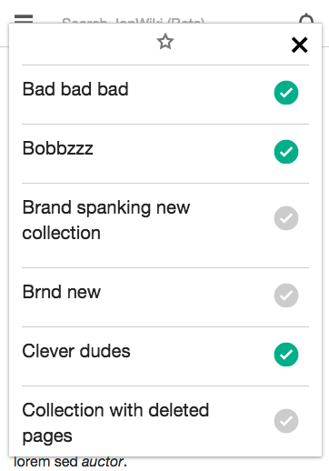
Click watchstar
Decide you don't want to add it to a collection and try to exit - it's not possible.
Clicking outside the overlay should make this disappear.
Add a X icon to upper right of overlay

| Jdlrobson | |
| May 6 2015, 7:54 AM |
| F179391: Screen Shot 2015-06-15 at 11.26.40 AM.png | |
| Jun 15 2015, 6:25 PM |
| F179390: Screen Shot 2015-06-15 at 11.26.26 AM.png | |
| Jun 15 2015, 6:25 PM |
| F173217: close-01.png | |
| Jun 2 2015, 7:30 PM |
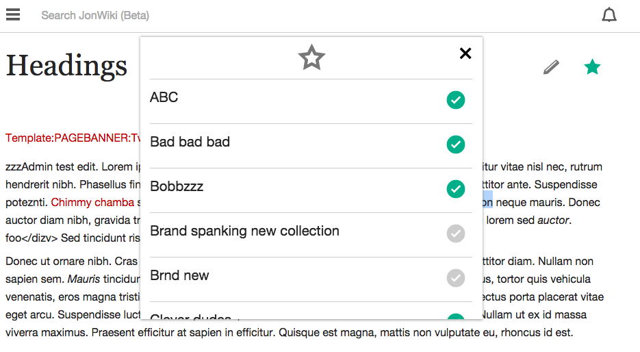
Click watchstar
Decide you don't want to add it to a collection and try to exit - it's not possible.
Clicking outside the overlay should make this disappear.
Add a X icon to upper right of overlay
| Subject | Repo | Branch | Lines +/- | |
|---|---|---|---|---|
| Add close icon to the collections content overlay | mediawiki/extensions/Gather | master | +25 -2 |
@KHammerstein any thoughts around this? The tap area outside the modal can be tiny - should we introduce a close icon or some other design element to allow you to exit?
Change 217757 had a related patch set uploaded (by Jdlrobson):
Add close icon to the collections content overlay
Copying across comments from @phuedx "The close icon functions as expected. However, the icon isn't grey – I see there's no asset assigned to T98293 – and it's slightly larger than the main watchstar icon, which has a side of 1.4 em. I'd recommend increasing the size of the watchstar icon to match."
Some design guidance needed here. I'm not sure what to do to get this fixed.
On mobile:
On desktop:
Note we can introduce a variant of the black icon relatively easily but you'll need to let me know the precise hexcode.
The sizes of icons need to be relatively large because of tap area, so I'm not sure what to do with the mobile example but agree it looks odd.
@phuedx @Jdlrobson Still trying to learn how to use the new icons! I'll make a separate discussion about ooui or where else to source them, sizing and color process.
Color should be #999.
Lets make the watchstar follow the original mock which had it at ~50px square so that it stands out.
@KHammerstein if you are referring to the mock in the description then I must point out we need to rethink T92251 - the reason it is small is to allow space for the keyboard without the user having to scroll down.
Talked to Kaity in person. She said to just change the icon colour and we'll live with the size issue for the time being and come back to it later.
I would suggest reducing the size of the close button (or rather increasing it on tablet and desktop since we do mobile-first). The small watchstar icon is small because of how tiny the viewport is once the keyboard is up on a mobile phone, so let's not raise the size.
@Jdlrobson I'm able to close the overlay as expected by clicking outside of it. Testing in both chrome and Firefox
@rmoen the issue is only on certain devices at a certain resolution where the screen is so small there is no space to click outside. Try ios or just the Chrome emulator.
@Jhernandez shrinking the icon also shrinks the tappable error. When I spoke to @KHammerstein she said to leave as is as we have more important design problems to focus on. Things like icon size are easy to tweak later.
Change 217757 merged by jenkins-bot:
Add close icon to the collections content overlay