The recently revised link inspector has buttons that behave like tabs, but don't look like tabs (or buttons). There only being two modes is a textbook example of UI patterns that demand disambiguation for which is the current mode (even more so than any other tabbed area since one perception is more tolerant if there are more tabs, the odd one is the active one).
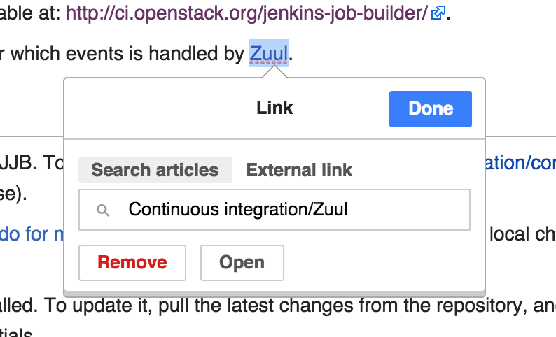
If these were to look like tabs, the currently selected one would be white (or blue). However it is actually the grey one that is the active one. This makes sense from a technical standpoint since it is implemented as "a (button-ish) item in a list", which (similar to dropdown menus, and outlined booklet dialogs) display the active item as grey. But in this context this looks off. It needs to be better integrated in the overall dialog and not as an inline block with no context.