We used to provide the ability to view prices in multiple currencies on the previous store themes. Could we add it to this theme as well?
Description
Description
Event Timeline
Comment Actions
I'm working on this task currently. @vshchepakina @violetto
I need a decision of that where should we place the currencies menu on the page.
Comment Actions
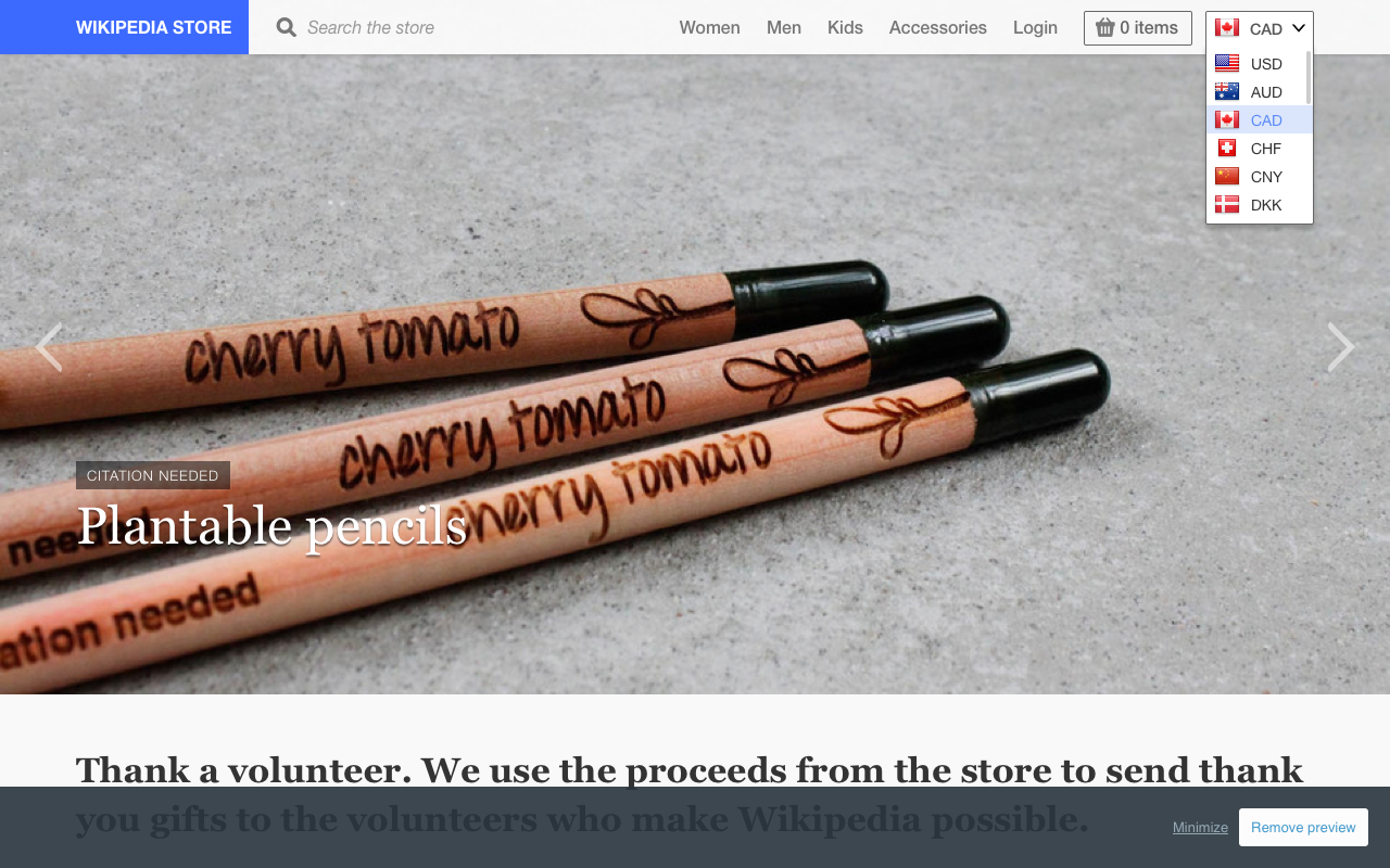
It's typically found on the main site toolbar, but since ours is full at the moment (until we remove "Sign In"), the next best venue is here: F174500
When user changes the currency once, it changes for all other pages in the store.
Here's a dropdown menu spec. You can work out the details with @goenning.
Comment Actions

@violetto @vshchepakina
As we will merge login and register pages, so we will get more room in the toolbar. I made a mockup of the currencies picker menu here:


Shopify provides the API for multiple currencies support, and it only can be implemented as a drop-down selector, so I am going to use the way presented in the screenshot.
Also, is that ok if we use country flags here? (the flag is colorful but the icon the card is not.)


Comment Actions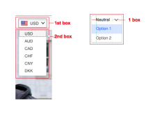
We should add flag for the rest in the menu if we're deciding to go that route. @goenning, what do you think?
Here is the spec for any menu that we're using in the foundation. Here's the difference:

Comment Actions
@violetto
Got it.
It's able to add flags to the rest of options. And I will unify the appearance with the spec soon when we decide the new locate of the currency picker.