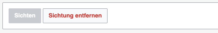
So this was stated so far as mainly about TextInput, but equivalent this change should also cover TextArea.
And then we already got a third and a forth error border style in place: Select and Checkbox. While latter already features the same logic, Select would be untouched right now when in error state.
In my opinion providing the same error hover border feedback would make sense on Select.
Feed Advanced Search
Today
Today
Volker_E edited projects for T346168: TextInput: update error-hover state, added: Design-System-Team (DST-Sprint-21 (2024-04-15 to 2024-04-26)); removed Design-System-Team.
Volker_E added a comment to T346168: TextInput: update error-hover state.
Yesterday
Yesterday
Volker_E updated the task description for T346168: TextInput: update error-hover state.
Wed, Apr 17
Wed, Apr 17
Volker_E updated the task description for T362546: Release Codex v1.4.0.
Volker_E moved T362546: Release Codex v1.4.0 from Committed to In Progress on the Design-System-Team (DST-Sprint-21 (2024-04-15 to 2024-04-26)) board.
Tue, Apr 16
Tue, Apr 16
Volker_E changed the status of T358861: Figma content to Codex: include Keyboard Navigation in Codex from Open to In Progress.
Volker_E changed the status of T358861: Figma content to Codex: include Keyboard Navigation in Codex, a subtask of T357714: Components Guidelines: Include the rest of the Figma specs info in Codex, from Open to In Progress.
Volker_E removed a project from T361994: Improve and phrase alternative text consistently: Patch-For-Review.
Volker_E moved T361490: Release OOUI v0.49.1 from In Progress to Product Sign-Off on the Design-System-Team (DST-Sprint-20 (2024-04-01 to 2024-04-12)) board.
Volker_E moved T361472: Release Codex v1.3.6 from Code Review to Product Sign-Off on the Design-System-Team (DST-Sprint-20 (2024-04-01 to 2024-04-12)) board.
Mon, Apr 15
Mon, Apr 15
Volker_E closed T361032: HTMLForm: Remove unused reset button, a subtask of T355148: [EPIC] Multiblocks, as Resolved.
Volker_E updated the task description for T340456: Tooltip: Add Tooltip component to Codex.
htmlform: Remove call to `suppressReset()`
Thu, Apr 11
Thu, Apr 11
Volker_E added a comment to T361032: HTMLForm: Remove unused reset button.
I've shared my minor concern about if a reset button might be a useful usability feature in certain contexts of MediaWiki consumers outside. But I'll go ahead with the removal of the functionality.
Volker_E updated the task description for T361032: HTMLForm: Remove unused reset button.
Volker_E added a comment to T333890: Implement typographic public mixin.
Note to myself: Where does styles like kbd fit in a public Codex typography mixin? See T358861 for context.
Volker_E edited projects for T361994: Improve and phrase alternative text consistently, added: Design-System-Team (DST-Sprint-20 (2024-04-01 to 2024-04-12)); removed Design-System-Team.
Volker E. <volker.e@wikimedia.org> committed rEPGE9a70fa8d61ec: styles: Update destructive color slightly.
styles: Update destructive color slightly
Volker_E closed T359012: Migrate Special:Block to CodexHTMLForm, a subtask of T355148: [EPIC] Multiblocks, as Resolved.
Volker_E updated the task description for T361783: CodexHTMLForm should feature a max-width for Codex components.
Volker_E renamed T361783: CodexHTMLForm should feature a max-width for Codex components from CodexHTMLForm for Multiblocks should feature a max-width for Codex components to CodexHTMLForm should feature a max-width for Codex components.
Volker_E removed a project from T361115: Design Contribution documentation: Update the "Guidelines" section: Patch-For-Review.
Volker_E updated the task description for T362270: Add new spacing token of 40rem.
Volker_E added a comment to T360917: [Spike 3hrs] Unintended vertical spacing behaviour .
I've just shared on a vertical spacing question for Fields in Codex, but aimed for a general approach, that might be something worth to consider here as well.
Volker_E added a comment to T361908: docs: amend form guidelines for complex combinations.
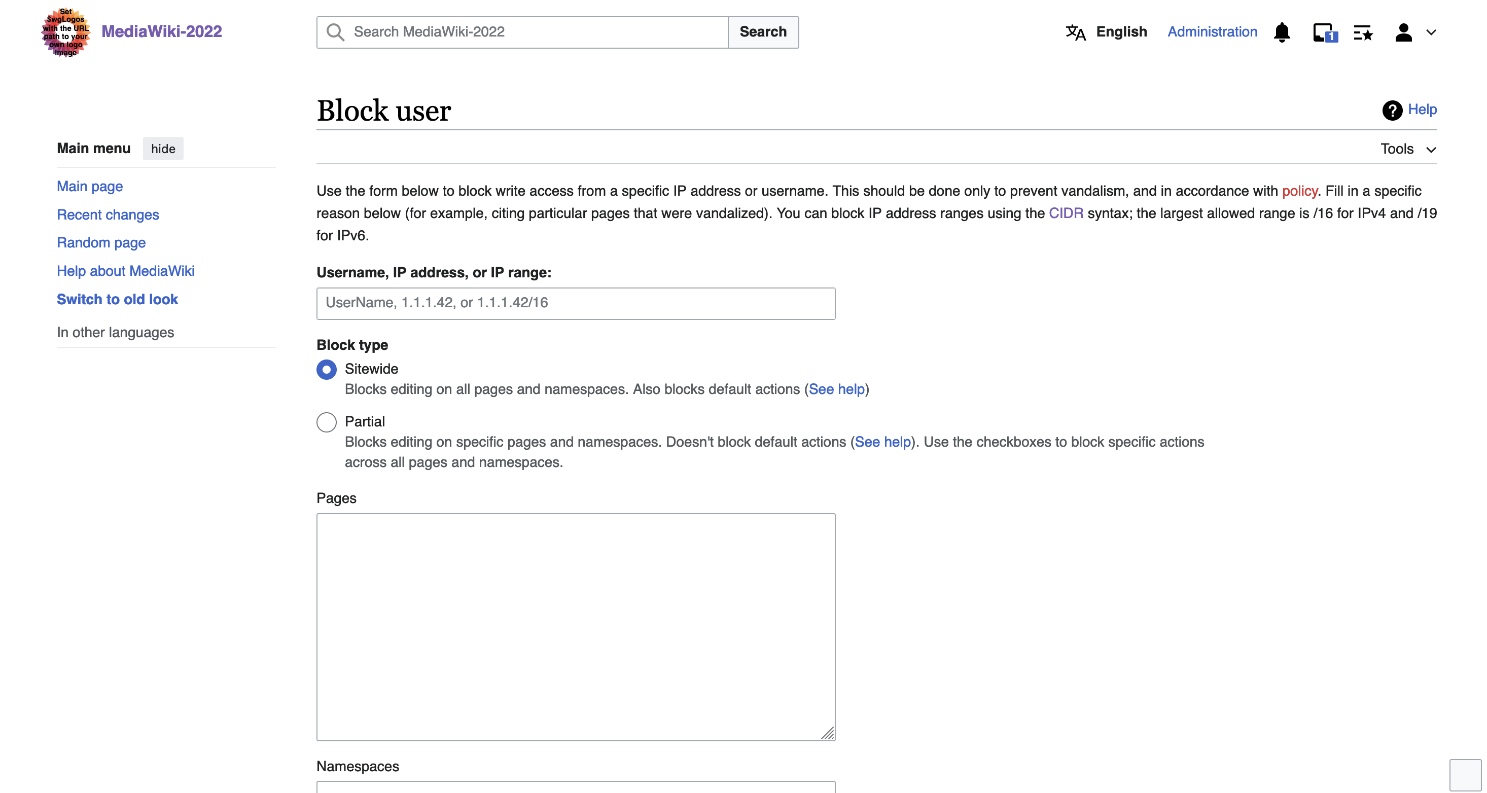
It's from the FlaggedRevision extension.
Volker_E removed a project from T361908: docs: amend form guidelines for complex combinations: Patch-For-Review.
Wed, Apr 10
Wed, Apr 10
Volker_E updated the task description for T361734: Update focus color to be the same everywhere.
Volker_E removed a project from T361734: Update focus color to be the same everywhere: Patch-For-Review.
Volker_E edited projects for T361734: Update focus color to be the same everywhere, added: Design-System-Team (DST-Sprint-20 (2024-04-01 to 2024-04-12)); removed Design-System-Team.
Tue, Apr 9
Tue, Apr 9
Volker_E removed a project from T360939: Field: demo with horizontal layout is broken: Patch-For-Review.
Sun, Apr 7
Sun, Apr 7
Volker_E added a comment to T361908: docs: amend form guidelines for complex combinations.
Another example to be amended:
Sat, Apr 6
Sat, Apr 6
Fri, Apr 5
Fri, Apr 5
Volker_E added a comment to T361783: CodexHTMLForm should feature a max-width for Codex components.
I agree with your statement @DTorsani-WMF. Would you make a proposal (with my help in testing on Special:Block, as already shared we had somewhat arbitray 50em on OOUI) and discuss it in next design sync?
Volker_E added a comment to T361908: docs: amend form guidelines for complex combinations.
A decision here might also affect Dialog button spacing.
Volker_E added a comment to T361170: Establish codex.wikimedia.org subdomain.
With call for help by collaboration-services team… :)
Volker_E added a project to T361170: Establish codex.wikimedia.org subdomain: collaboration-services.
Volker_E updated the task description for T356675: Deprecate the codex-search modules and migrate away from them.
Volker_E added a comment to T361878: Checkbox, ToggleSwitch: add name prop for submittable forms.
Do we really need a name prop for ToggleSwitches?
In my understanding they should never be connected even though they are a hidden checkbox under the hood.
Volker_E changed the status of T360939: Field: demo with horizontal layout is broken from Open to In Progress.
Volker_E changed the status of T361541: Field: Add a CSS class to differentiate between a `.cdx-field` and a fieldset from Open to In Progress.
Volker_E added a comment to T361783: CodexHTMLForm should feature a max-width for Codex components.
This captures the problems with both size tokens quite well:
Thu, Apr 4
Thu, Apr 4
Volker_E closed T360343: Tokens: Produce a "dark mode" build of Codex design tokens, a subtask of T355147: [EPIC] Dark Mode, as Resolved.
Volker_E closed T359017: CodexHTMLForm: Codexify buttons at the bottom of the form, a subtask of T359011: [EPIC] CodexHTMLForm improvements for Multiblocks, as Resolved.
Volker_E closed T360577: Split experimental tokens output into separate CSS and Less files as Resolved.
Volker_E closed T358031: Tokens: reorganize token files, a subtask of T355147: [EPIC] Dark Mode, as Resolved.
Volker_E closed T360349: Table: Add alignment prop, a subtask of T303320: Table: Add Table component to Codex, as Resolved.
Volker_E closed T350477: Add SortVertical icon to OOUI and Codex, a subtask of T303320: Table: Add Table component to Codex, as Resolved.
Volker_E updated the task description for T359011: [EPIC] CodexHTMLForm improvements for Multiblocks.
Wed, Apr 3
Wed, Apr 3
Volker_E updated the task description for T359012: Migrate Special:Block to CodexHTMLForm.
Volker_E removed a project from T361408: CodexHTMLForm: fix spacing around buttons at the bottom of the form: Patch-For-Review.
Tue, Apr 2
Tue, Apr 2
Volker_E set the point value for T361541: Field: Add a CSS class to differentiate between a `.cdx-field` and a fieldset to 2.
Volker_E renamed T361490: Release OOUI v0.49.1 from [Placeholder] Release OOUI v0.49.1 to Release OOUI v0.49.1.
This is resolved \o/
Thanks to @lwatson for the pro-active work and collaboration here!