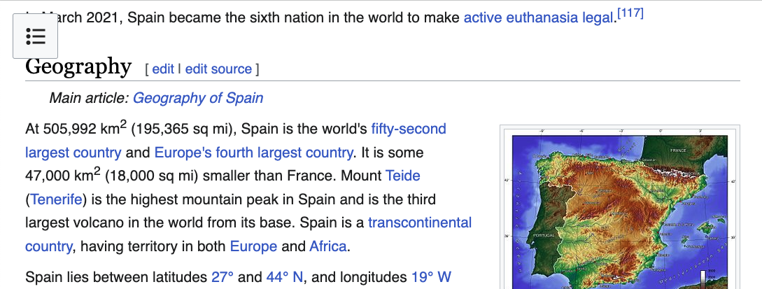
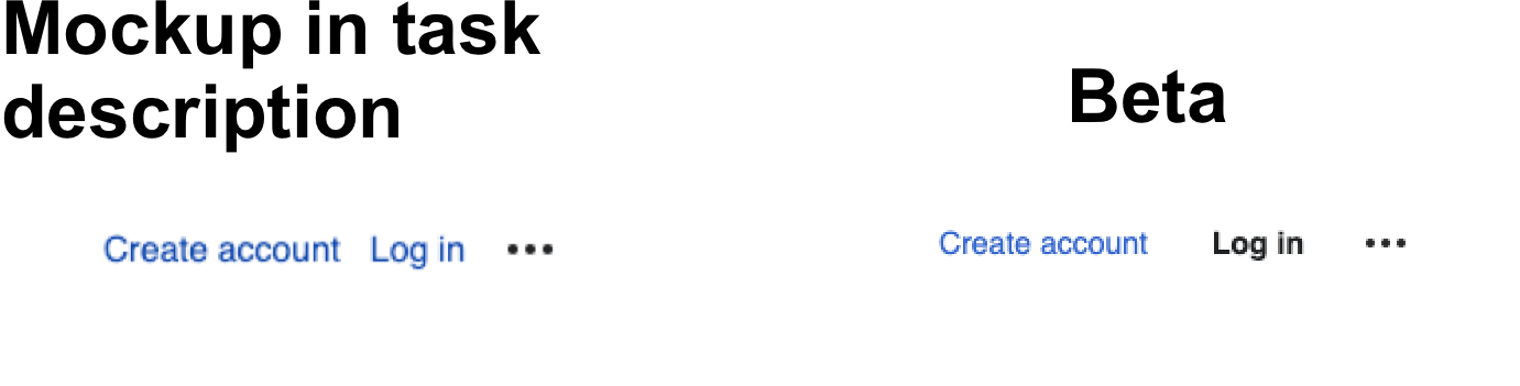
important to consider the length of the text labels in various languages:
Feed Advanced Search
Jun 16 2023
Jun 16 2023
Jdlrobson awarded T323245: Weird flash when opening sticky search a Like token.
Jun 14 2023
Jun 14 2023
Apr 4 2023
Apr 4 2023
alistair3149 awarded T317818: [L] [SPIKE] Add configurability options for table of contents a Love token.
Mar 10 2023
Mar 10 2023
• alexhollender_WMF added a comment to T325553: [Design spike] Style "hide" and "move to sidebar" buttons as buttons (not links).
• alexhollender_WMF updated subscribers of T328069: "Edit interlanguage link" is styled incorrectly with page tools enabled.

• alexhollender_WMF updated subscribers of T330351: Reconsider behavior of "Search" button.
Mar 9 2023
Mar 9 2023
• alexhollender_WMF updated subscribers of T315611: Keep sticky header visible until 720px (vs. hiding at 1000px).
• alexhollender_WMF renamed T315611: Keep sticky header visible until 720px (vs. hiding at 1000px) from Hide sticky header at 720px wide window to Keep sticky header visible until 720px (vs. hiding at 1000px).
• alexhollender_WMF updated subscribers of T316950: [Visual refinements] Reduce height of article toolbar.
• alexhollender_WMF updated subscribers of T314328: [Visual refinements] Decrease height of sticky header.
• alexhollender_WMF updated subscribers of T327718: Increase space between groups in main menu and page tools menu.
• alexhollender_WMF added a comment to T330532: Re-evaluate breakpoint for hiding page tools/toc to keep content width more consistent.
Two thoughts:
Mar 8 2023
Mar 8 2023
Jdlrobson awarded T323625: Add label and title attribute/tooltip to full-screen toggle button a Like token.
Mar 6 2023
Mar 6 2023
• alexhollender_WMF added a comment to T314419: Increase offset for headings when clicking TOC links.
right, sounds good. as a reminder: one thing we discussed last week was that we might need to make the spacing here match the spacing in T317661: [Table of contents] Increase threshold for when a section is active, so maybe they could both be 75px or something
• alexhollender_WMF added a comment to T330665: MenuItem: refine highlight behavior.
• alexhollender_WMF added a comment to T314419: Increase offset for headings when clicking TOC links.
Feb 23 2023
Feb 23 2023
• alexhollender_WMF updated the task description for T317661: [Table of contents] Increase threshold for when a section is active.
Feb 22 2023
Feb 22 2023
• alexhollender_WMF updated subscribers of T330351: Reconsider behavior of "Search" button.
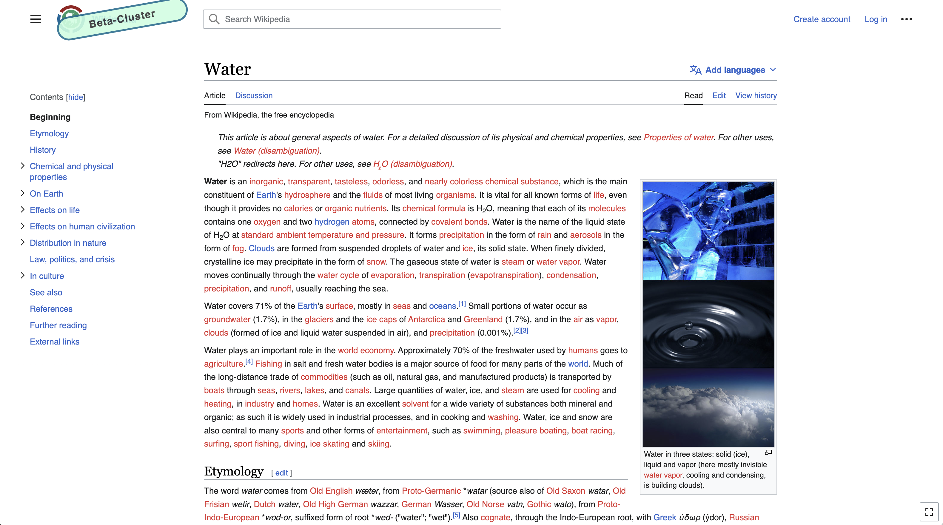
• alexhollender_WMF closed T261174: Review and summarize research on line-length + readability as Resolved.
research summary is here: https://www.mediawiki.org/wiki/Reading/Web/Desktop_Improvements/Features/Limiting_content_width#Research
Feb 21 2023
Feb 21 2023
• alexhollender_WMF renamed T259240: [Design] Discussion: differentiation/separation of interface elements/regions in Vector 2022 from Discussion: differentiation of interface elements/regions in Vector 2022 to Discussion: differentiation/separation of interface elements/regions in Vector 2022.
• alexhollender_WMF added a comment to T298198: [EPIC] Define a responsive column grid system.
On larger screens this doesn't present an issue, however on smaller screens it means that the content gets squished more than it needs to, for example:
| tools menu hidden (smaller screen) |
|---|
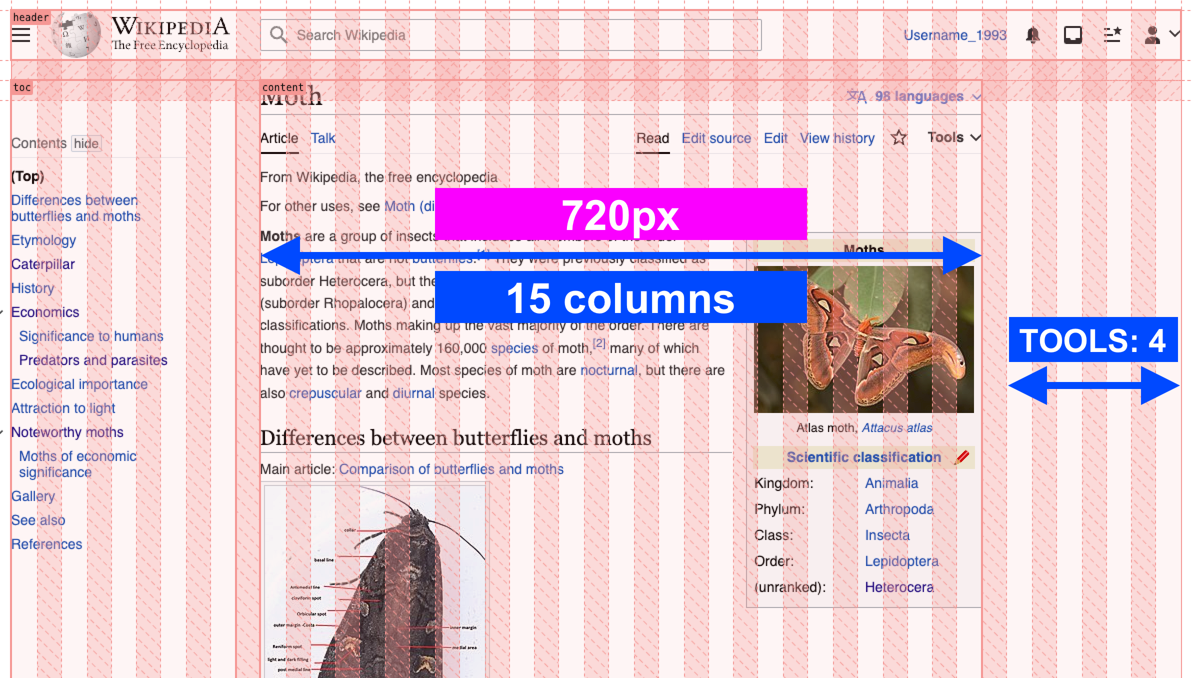 |
Feb 20 2023
Feb 20 2023
• alexhollender_WMF added a comment to T259240: [Design] Discussion: differentiation/separation of interface elements/regions in Vector 2022.
• alexhollender_WMF renamed T259240: [Design] Discussion: differentiation/separation of interface elements/regions in Vector 2022 from Discussion: background color of new modern Vector skin to Discussion: differentiation of interface elements/regions in Vector 2022.
• alexhollender_WMF added a comment to T328111: tools menu is wrong color when popped out.
@Novem_Linguae thanks for raising this issue. We've been discussing this topic over at T259240: [Design] Discussion: differentiation/separation of interface elements/regions in Vector 2022. Could you add a comment over there, explaining why you think the tools menu should have a gray background? That would be helpful. Thanks : )
Feb 15 2023
Feb 15 2023
• alexhollender_WMF added a comment to T318169: [Page tools] Make page tools menu sticky.
• alexhollender_WMF added a comment to T291011: Order/rearrange user menu items based on usage and hierarchy.
something I've wondered about in the past, which seems worth bringing up again given some people's frustration with the personal tools menu, is showing a few more items from the menu (and potentially adding labels) at larger screen resolutions:
• alexhollender_WMF added a comment to T310893: Deployed table of contents (TOC) in sidebar differs from tested version of Desktop Improvements: the line height is too small with font-size 24 in Firefox.
@Prototyperspective a lot of updates have been made to the table of contents since you filed this task. Most notably the table of contents is now wider, and soon will be able to to take up more vertical space (T319315: [Table of contents] Increase max-height of TOC). Several other table of contents tasks we will be working on soon:
- T318186: [sub task] Show table of contents for pages with less than 4 sections
- T317818: [L] [SPIKE] Add configurability options for table of contents
- T314419: Increase offset for headings when clicking TOC links
- T317661: [Table of contents] Increase threshold for when a section is active
- T325086: When navigating directly to a sub-section, the table of contents section should expand (if collapsed) and be bolded
- T316060: [anon prefs] TOC pinned / unpinned status should persist across page views for anonymous users
Feb 14 2023
Feb 14 2023
• alexhollender_WMF updated subscribers of T317710: Consider allowing icons with color (wikilove and watchstar).
• alexhollender_WMF added a comment to T315932: TOC should float on larger screen sizes when the "hide" button is pressed.
• alexhollender_WMF added a comment to T324877: Style the page tools and main menu dropdown feature.
@Sj I think it might make sense to wait another few weeks — once we've done T318186: [sub task] Show table of contents for pages with less than 4 sections and T316060: [anon prefs] TOC pinned / unpinned status should persist across page views for anonymous users — to re-assess questions/concerns of the layout shifting around. I think it will be happening much less frequently in general. Also I think it's reasonable that if someone collapses a sidebar the layout shifts, especially if our assumption turns out to be true that people aren't frequently expanding and collapsing the sidebars.
• alexhollender_WMF added a comment to T328574: Update Vector 22 skin Figma template.
Feb 13 2023
Feb 13 2023
• alexhollender_WMF updated the task description for T329534: Add missing title attributes to Vector 2022 elements.
• alexhollender_WMF added a comment to T324877: Style the page tools and main menu dropdown feature.
@Sj apologies for the confusion, I forgot we hadn't implemented this yet: T316060: [anon prefs] TOC pinned / unpinned status should persist across page views for anonymous users. We will be working on that soon.
Sj awarded T318168: [Page tools] Make sections of the page tools collapsible/expandable a 100 token.
Feb 9 2023
Feb 9 2023
• alexhollender_WMF changed the visibility for F36818160: image.png.
• alexhollender_WMF changed the visibility for F36818159: image.png.
• alexhollender_WMF changed the visibility for F36818158: image.png.
• alexhollender_WMF changed the visibility for F36818157: image.png.
• alexhollender_WMF reassigned T318169: [Page tools] Make page tools menu sticky from Edtadros to • nray.
Feb 8 2023
Feb 8 2023
• alexhollender_WMF added a comment to T327732: Vector 2022 sidebar font size & padding & line-spacing too large, sidebar alignment is off.
• alexhollender_WMF added a comment to T317818: [L] [SPIKE] Add configurability options for table of contents.
• alexhollender_WMF placed T289212: Feature request: Make login button appear besides the create account text outside new compact user menu up for grabs.
all set 👍
Feb 7 2023
Feb 7 2023
• alexhollender_WMF added a comment to T327732: Vector 2022 sidebar font size & padding & line-spacing too large, sidebar alignment is off.
@Sj thank you so much for all of this feedback (and your continued feedback elsewhere).
• alexhollender_WMF added a comment to T289212: Feature request: Make login button appear besides the create account text outside new compact user menu.
• alexhollender_WMF updated the task description for T328720: Decrease vertical spacing between menu items (main menu, toc, page tools, personal tools).
Feb 6 2023
Feb 6 2023
• alexhollender_WMF reassigned T328069: "Edit interlanguage link" is styled incorrectly with page tools enabled from • alexhollender_WMF to Jdlrobson.
@Jdlrobson sorry for not providing mockups earlier on.
• alexhollender_WMF closed T324877: Style the page tools and main menu dropdown feature as Resolved.
• alexhollender_WMF closed T324877: Style the page tools and main menu dropdown feature, a subtask of T302073: [GOAL] Page Tools available on all wikis, as Resolved.
• alexhollender_WMF edited projects for T324877: Style the page tools and main menu dropdown feature, added: Web-Team FY2022-23 Q3 Sprint 1; removed Web-Team FY2022-23 Q3 Sprint 2.
I'm going to resolve this task now because the original work has been completed, and our team is doing some board cleanup. I will of course continue to work on improvements relating to all of the above feedback. Where possible please direct further comments to the more specific, open tasks that I've linked to. Or to create a new task if there isn't one that corresponds with a given topic.
• alexhollender_WMF added a comment to T324877: Style the page tools and main menu dropdown feature.
thanks @TheDJ @Jonesey95 & @Sj for all of this feedback, and for your continued, deep engagement with this work. I'm glad to hear that everyone thinks things are moving in the right direction.
• alexhollender_WMF added a comment to T318169: [Page tools] Make page tools menu sticky.
just discussed with @nray
• alexhollender_WMF edited projects for T324877: Style the page tools and main menu dropdown feature, added: Web-Team FY2022-23 Q3 Sprint 2; removed Web-Team FY2022-23 Q3 Sprint 1.
Feb 3 2023
Feb 3 2023
• alexhollender_WMF updated the task description for T319315: [Table of contents] Increase max-height of TOC.
Feb 1 2023
Feb 1 2023
Jan 30 2023
Jan 30 2023
Jan 27 2023
Jan 27 2023
• alexhollender_WMF added a comment to T327110: Invert "limited-width" setting to be a "full-width" setting.
@Jdlrobson I defer to @ovasileva regarding the importance of this change, and how much work is worth putting into it.
In case it wasn't clear, my thinking was just that: optional preferences are off by default, and then turning one on should modify the default experience (like the preference right above, "Enable responsive mode"). But perhaps that's overthinking it...maybe it's fine for some preferences to be on by default.
Sj awarded T317818: [L] [SPIKE] Add configurability options for table of contents a Doubloon token.
Jan 26 2023
Jan 26 2023
• alexhollender_WMF added a comment to T259240: [Design] Discussion: differentiation/separation of interface elements/regions in Vector 2022.
hey @Ferret & others, @ovasileva and I were discussing this some more today, and are curious what you think of https://di-article-tools-2.web.app/Blue_whale ? I think adding gray backgrounds to the TOC and page tools does a good job of making them distinct from the article content, and makes the page structure/areas much more clear (see https://www.w3.org/WAI/WCAG2/supplemental/patterns/o2p03-page-structure/ which recommends using background colors). I prefer it to Zebra #9, where the article content is framed in a white box, and everything else on the page is in a gray background. I still feel that Zebra #9 de-emphasizes the table of contents too much, and also adds unnecessary visual heaviness to the whole page (though I recognize that's quite subjective).
Jan 25 2023
Jan 25 2023
• alexhollender_WMF added a comment to T324877: Style the page tools and main menu dropdown feature.
yup, that definitely looks better. I was trying to have consistent styling between the TOC, main menu, page tools, and personal tools, since they are all similar in many ways. thinking at this point it's okay to special-case the TOC (because I think that's one case where we want more line-height between the elements). I will create a separate task for that change.
• alexhollender_WMF added a comment to T326887: Show the wide page layout button (toggle) at lower widths (1400px).
Jan 24 2023
Jan 24 2023
• alexhollender_WMF added a comment to T327718: Increase space between groups in main menu and page tools menu.
• alexhollender_WMF added a comment to T318169: [Page tools] Make page tools menu sticky.
Jan 23 2023
Jan 23 2023
• alexhollender_WMF placed T326887: Show the wide page layout button (toggle) at lower widths (1400px) up for grabs.
looks good to me 👍
• alexhollender_WMF added a comment to T324877: Style the page tools and main menu dropdown feature.
Jan 19 2023
Jan 19 2023
• alexhollender_WMF added a comment to T324877: Style the page tools and main menu dropdown feature.
• alexhollender_WMF added a comment to T326887: Show the wide page layout button (toggle) at lower widths (1400px).
on articles with a table of contents, assuming the table of contents is pinned (which is the default) the toggle wouldn't do anything at 1200px
• alexhollender_WMF added a comment to T259240: [Design] Discussion: differentiation/separation of interface elements/regions in Vector 2022.
• alexhollender_WMF added a comment to T326672: Vector 2022 Toc ::after fade positioned slightly over scroll bar..
• alexhollender_WMF added a comment to T259240: [Design] Discussion: differentiation/separation of interface elements/regions in Vector 2022.
circling back to @VulpesVulpes825's idea of adding a slight box-shadow to the main (white) container, to make it more clear/intentional that the gray area is out of bounds:
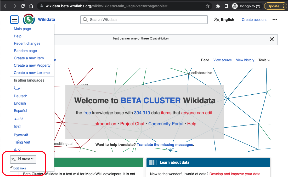
• alexhollender_WMF added a comment to T293470: Easier language switching from Main page.
• alexhollender_WMF added a comment to T326887: Show the wide page layout button (toggle) at lower widths (1400px).
Noting that we've heard a bunch of additional feedback from people:
- people are using the full-width toggle
- people would like the full-width toggle available at lower resolutions
Jan 17 2023
Jan 17 2023
• alexhollender_WMF added a comment to T324877: Style the page tools and main menu dropdown feature.
@ovasileva looks like we still don't have tooltips on a few things, and this hasn't been fixed:
Jan 16 2023
Jan 16 2023