Checked this out and it looks good. I've added T237019 as a subtask to this and think we should address the spacing issue there.
Feed Advanced Search
Nov 7 2019
Nov 7 2019
• alexhollender_WMF edited projects for T237019: Spacing between icons and labels is too large in tablet mode, added: Web-Team-Backlog; removed Web-Team-Backlog (Design).
• alexhollender_WMF placed T226562: AMC - display labels for toolbar actions on larger screens up for grabs.
• alexhollender_WMF updated the task description for T237589: [Bug] Add discussion button and confusing message appears on Flow Talk Pages on Beta.
• alexhollender_WMF added a comment to T211006: Add red link experience to empty search results for Codex/mobile.
• alexhollender_WMF added a comment to T237561: [SPIKE 10hrs] Investigate how skin suboptions can be presented in Special:Preferences.
• alexhollender_WMF updated the task description for T237636: [SPIKE 10hrs] Build new header within the Vector skin.
Nov 6 2019
Nov 6 2019
• alexhollender_WMF placed T237230: Long edit summary/titles/user breaking AMC special pages up for grabs.
• alexhollender_WMF added a comment to T236328: Username should be on its own line (Recent changes & Watchlist).
• alexhollender_WMF updated the task description for T236176: [EPIC] Build opt-in/opt-out mechanism for desktop improvements project.
• alexhollender_WMF updated the task description for T236176: [EPIC] Build opt-in/opt-out mechanism for desktop improvements project.
• alexhollender_WMF added a comment to T236328: Username should be on its own line (Recent changes & Watchlist).
• alexhollender_WMF added a comment to T235737: Discuss and decide on underspecified behavior for anonymous users.
I agree with T235737#5639644. Here are two ways we could do that:
Nov 5 2019
Nov 5 2019
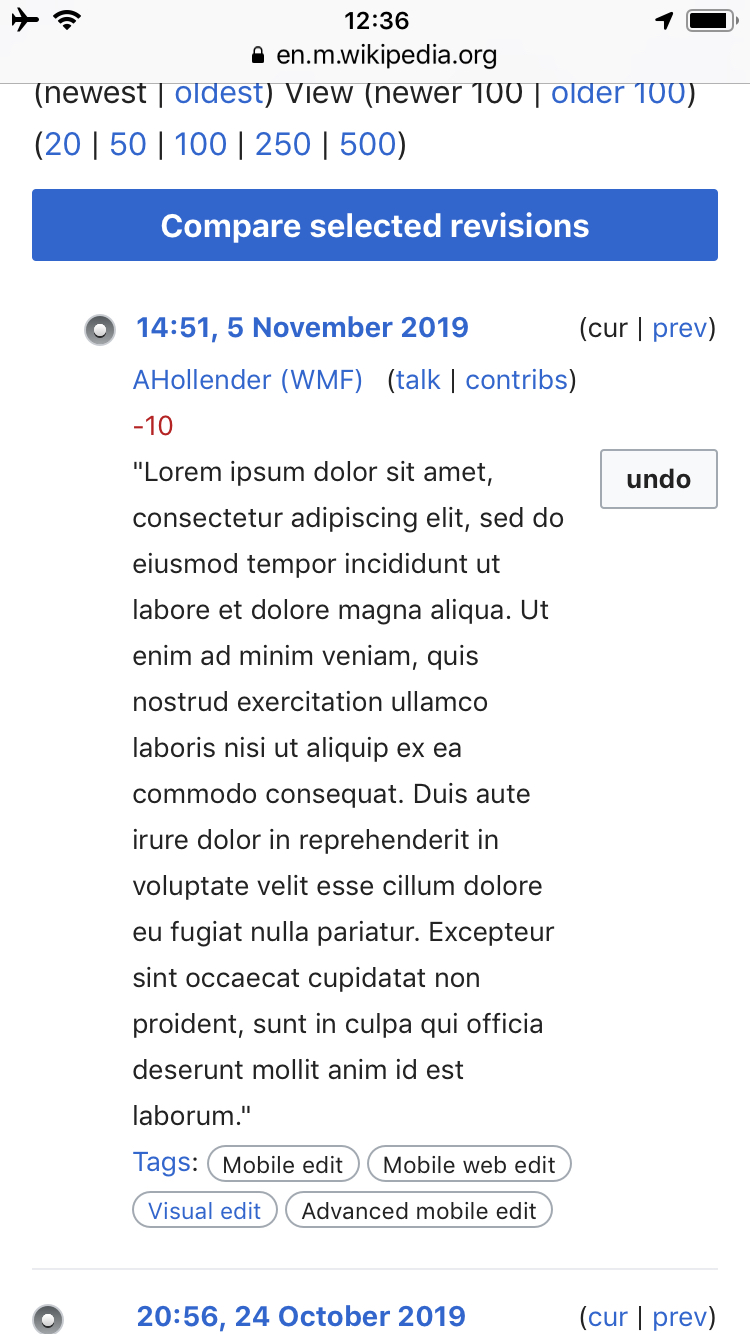
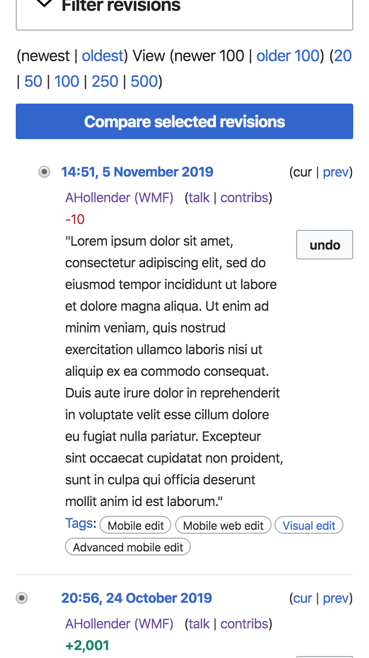
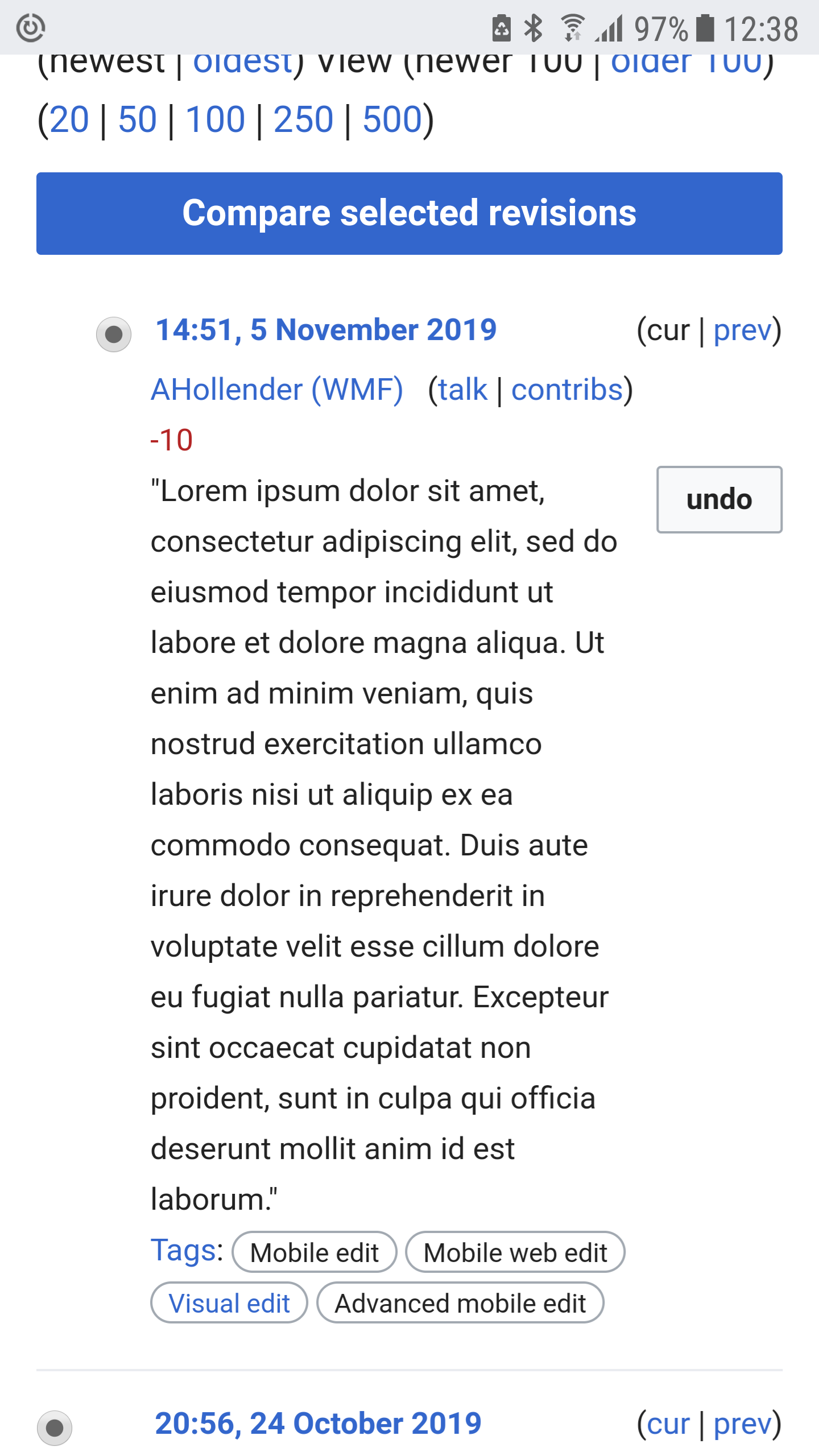
• alexhollender_WMF added a comment to T237230: Long edit summary/titles/user breaking AMC special pages.
• alexhollender_WMF added a comment to T237230: Long edit summary/titles/user breaking AMC special pages.
@Jdlrobson where are you seeing this? Here is what it looks like for me on History:
| iOS / Safari | Mac / Chrome | Android / Chrome |
 |  |  |
• alexhollender_WMF added a comment to T236328: Username should be on its own line (Recent changes & Watchlist).
There have been complaints about the size of links and how close together they are (see T237204) so theoretically this could help with that. Increasing the font-size seems worth considering as well.
Nov 4 2019
Nov 4 2019
• alexhollender_WMF updated the task description for T236176: [EPIC] Build opt-in/opt-out mechanism for desktop improvements project.
• alexhollender_WMF added a comment to T215419: Clicking on links to the same page inside of a reference preview .
If possible links to sections or footnotes within the same page should not open in a new tab.
• alexhollender_WMF updated the task description for T237204: Make the new design of mobile watchlist opt-in.
• alexhollender_WMF updated the task description for T237204: Make the new design of mobile watchlist opt-in.
• alexhollender_WMF added a comment to T237204: Make the new design of mobile watchlist opt-in.
@Masumrezarock100 thanks for creating this task
• alexhollender_WMF updated the task description for T237204: Make the new design of mobile watchlist opt-in.
Oct 31 2019
Oct 31 2019
• alexhollender_WMF added a comment to T236176: [EPIC] Build opt-in/opt-out mechanism for desktop improvements project.
• alexhollender_WMF updated the task description for T236176: [EPIC] Build opt-in/opt-out mechanism for desktop improvements project.
Oct 30 2019
Oct 30 2019
• alexhollender_WMF moved T230695: Render talk page as a tab (rather than a modal) from Needs Design Review to Needs More Work on the Web-Team-Backlog (Kanbanana-2019-20-Q2) board.
@nray and I just reviewed. Remaining items:
- move Add discussion button to top of topics list (or create a second button there)
- fix View as Wiki page button to bottom of viewport
- add Active discussions header to top of topics list
• alexhollender_WMF moved T221603: Disabled progressive buttons in MobileFrontend header should be gray, not 50% opacity from Needs Design Review to Ready for Signoff on the Web-Team-Backlog (Kanbanana-2019-20-Q2) board.
Looks good to me
• alexhollender_WMF moved T236328: Username should be on its own line (Recent changes & Watchlist) from Needs Design Review to Ready for Development on the Web-Team-Backlog (Kanbanana-2019-20-Q2) board.
Since we've already broken up the text-blog as it appears on desktop I think we should continue on and put the username on its own line
• alexhollender_WMF moved T226562: AMC - display labels for toolbar actions on larger screens from Needs Design Review to Needs More Work on the Web-Team-Backlog (Kanbanana-2019-20-Q2) board.

Oct 29 2019
Oct 29 2019
• alexhollender_WMF added a comment to T233104: Add localized Wikipedia wordmark to the Silesian (szl) mobile frontend.
@Masumrezarock100 @Uostofchuodnego my apologies for the problematic SVG and the delay in responding (I was having a difficult time figuring out what the issue was). I think the issues are fixed now, can you please take a look at this SVG:
Oct 28 2019
Oct 28 2019
• alexhollender_WMF placed T226562: AMC - display labels for toolbar actions on larger screens up for grabs.
@Jdrewniak and I looked at this together — looks good. Any ideas how we want to do QA?
• alexhollender_WMF added a comment to T200870: Deploy localized wordmark of Wikipedia on mobile site of sdwiki.
@Masumrezarock100 apologies here as well. I believe this is fixed now:
Oct 23 2019
Oct 23 2019

• alexhollender_WMF placed T225127: Display core version of watchlist page for AMC users up for grabs.
• alexhollender_WMF updated the task description for T236328: Username should be on its own line (Recent changes & Watchlist).
• alexhollender_WMF updated the task description for T236328: Username should be on its own line (Recent changes & Watchlist).
• alexhollender_WMF placed T235690: [AMC] Navigating from history to article up for grabs.
• alexhollender_WMF added a comment to T233649: Stray semicolons in RecentChanges, Watchlist, History and Contributions interface.
Noting that this issue is also present on Watchlist in Advanced mode (https://en.m.wikipedia.beta.wmflabs.org/wiki/Special:Watchlist?hidepreviousrevisions=1&hidecategorization=1&hideWikibase=1&limit=250&days=3&urlversion=2)
• alexhollender_WMF updated the task description for T235690: [AMC] Navigating from history to article.
• alexhollender_WMF updated the task description for T235690: [AMC] Navigating from history to article.
• alexhollender_WMF renamed T236176: [EPIC] Build opt-in/opt-out mechanism for desktop improvements project from Build opt-in toggle for desktop improvements project to Build opt-out toggle for desktop improvements project.
• alexhollender_WMF added a comment to T235690: [AMC] Navigating from history to article.
Oct 22 2019
Oct 22 2019
Masumrezarock100 awarded T235681: [AMC] Toolbar on User talk page should match toolbar on User page a Love token.
Masumrezarock100 awarded T235681: [AMC] Toolbar on User talk page should match toolbar on User page a Heartbreak token.
Masumrezarock100 awarded T235681: [AMC] Toolbar on User talk page should match toolbar on User page a Heartbreak token.
Oct 21 2019
Oct 21 2019
• alexhollender_WMF updated the task description for T235750: [20hrs] Prototype first few feature ideas for desktop improvements.
• alexhollender_WMF added a comment to T200870: Deploy localized wordmark of Wikipedia on mobile site of sdwiki.
Updated SVG
width = 77px
height = 22px
• alexhollender_WMF added a comment to T233104: Add localized Wikipedia wordmark to the Silesian (szl) mobile frontend.
I've checked in with the design team about how we usually create these. Here is an updated SVG to use at the proper dimensions:
width = 118px
height = 22px
• alexhollender_WMF updated subscribers of T235939: Add "userContributions" icon in OOUI.
Oct 17 2019
Oct 17 2019
• alexhollender_WMF added a comment to T226125: Updates to notifications container on mobile to make it more consistent with desktop.
@Jdlrobson we discussed this yesterday in kickoff and identified it as a potential iceberg situation. It sounds like this is the right solution but it's not clear that it's worth taking on this work right now. Also to clarify, this task is about the container that notifications get rendered in. There are two other tasks about the styling of the notifications elements within that container (T225535 and T228819) which I've just made children of this task.
• alexhollender_WMF edited projects for T225535: Notifications tray (mobile) - design refinements, added: Web-Team-Backlog; removed Web-Team-Backlog (Design).
Oct 16 2019
Oct 16 2019
• alexhollender_WMF placed T232837: Use mw-ui-icon-flush- classes on various icons to fix alignment: search within pages and block drawer icons up for grabs.
awesome, all set
• alexhollender_WMF updated the task description for T232837: Use mw-ui-icon-flush- classes on various icons to fix alignment: search within pages and block drawer icons.
• alexhollender_WMF added a comment to T226562: AMC - display labels for toolbar actions on larger screens.
@Jdrewniak it's kind of difficult to say which option is better until we see how long some of the strings are. If they are rarely long enough to warrant the truncation I think that works fine, however if the majority of the time they're getting truncated we should go with the underneath approach. Perhaps we move forward with the truncation approach for now and then revisit this down the road if we see that they're often being truncated?
• alexhollender_WMF added a comment to T235416: Bullet points are not centered in horizontal lists.
Oct 15 2019
Oct 15 2019
• alexhollender_WMF placed T234254: Page issues icon is misaligned vertically up for grabs.
checked on beta...
 |  |
• alexhollender_WMF assigned T225127: Display core version of watchlist page for AMC users to Edtadros.
I've created tasks for the two current issues. Moving this along.
• alexhollender_WMF updated the task description for T225127: Display core version of watchlist page for AMC users.
• alexhollender_WMF closed T235534: [AMC] fix alignment of "Edit your list of watched pages, a subtask of T225127: Display core version of watchlist page for AMC users, as Invalid.
• alexhollender_WMF renamed T235535: [AMC] fix alignment of "Edit your list of watched pages" button on AMC watchlist page from [AMC] fix alignment of "Edit your list of watched pages" on AMC watchlist page to [AMC] fix alignment of "Edit your list of watched pages" button on AMC watchlist page.
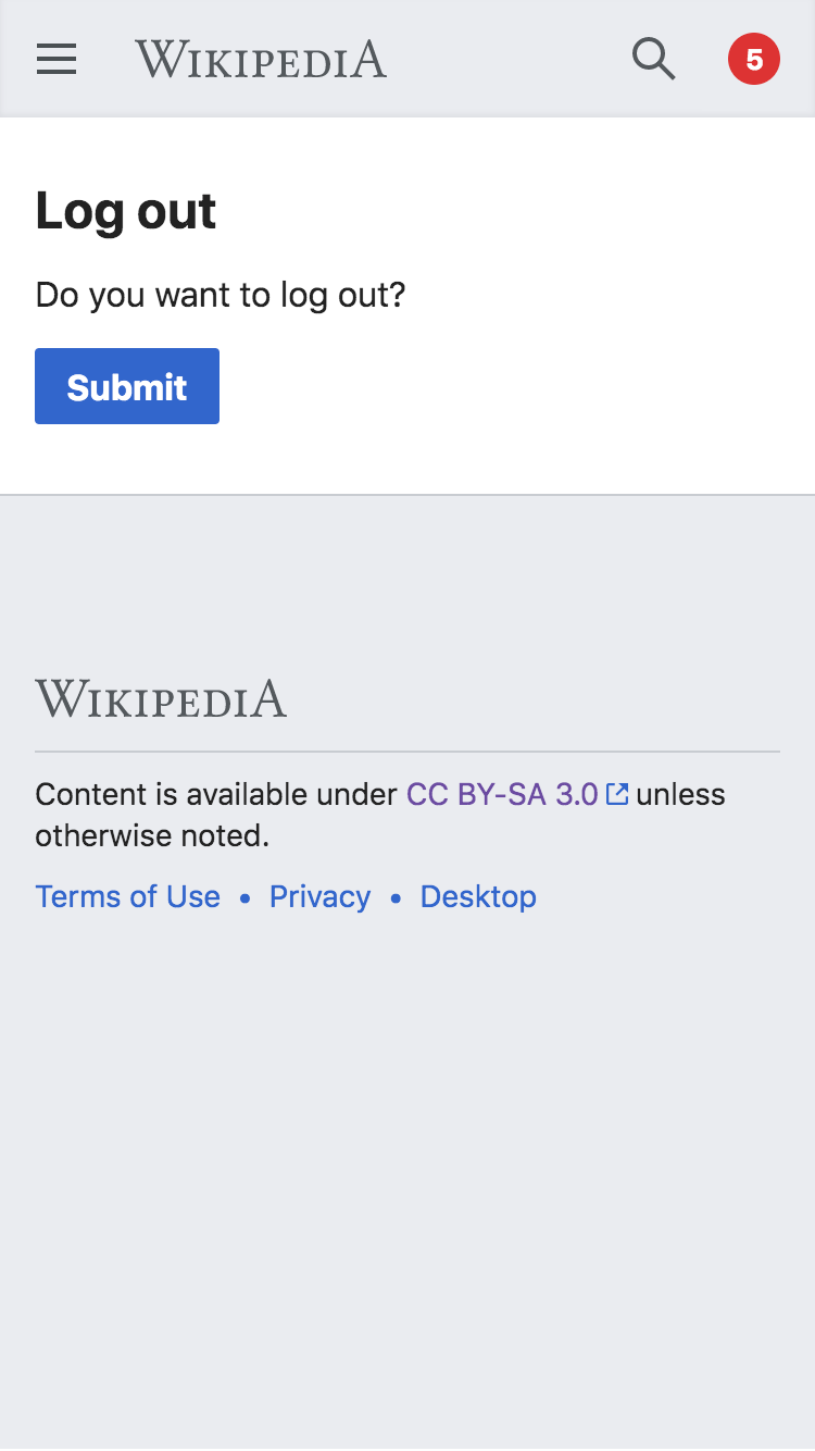
• alexhollender_WMF updated the task description for T232734: Mobile logout should not involve an interstitial.
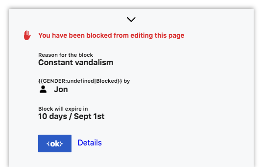
• alexhollender_WMF added a comment to T232734: Mobile logout should not involve an interstitial.
• alexhollender_WMF added a comment to T232734: Mobile logout should not involve an interstitial.
For clarification are we talking about this screen?
• alexhollender_WMF added a comment to T235416: Bullet points are not centered in horizontal lists.
Great catch @Aklapper
• alexhollender_WMF awarded T235416: Bullet points are not centered in horizontal lists a Love token.
• alexhollender_WMF renamed T151115: [EPIC] Improve in-article navigation from [EPIC] in-article navigation using sticky section headers to [EPIC] Improve in-article navigation.
• alexhollender_WMF updated subscribers of T216789: Use display locking to allow browser's native "Find in page" function to work with collapsed sections.
Thanks for your comments @Volker_E @RHo. Your points on the shortcomings of the demo are noted, though just as an FYI it did perform well during our user research.
• alexhollender_WMF added a comment to T151115: [EPIC] Improve in-article navigation.
T216789 suggests expanding all sections by default which adds a new dimension to how we go about solving the in-article navigation problem. Depending on how important we view that need it would be necessary to re-evaluate potential solutions here.
• alexhollender_WMF added a comment to T191176: Use the correct Persian Wikipedia logo on mobile site (by editing the SVG file).
• alexhollender_WMF added a comment to T234550: Mobile version Star for Watchlist not consistent with desktop (blue fill vs black fill).
Oct 11 2019
Oct 11 2019
• alexhollender_WMF updated subscribers of T216789: Use display locking to allow browser's native "Find in page" function to work with collapsed sections.
I created a demo to explore the proposal of rendering all sections open by default, while providing a new table of contents mechanism: view demo here. Some tradeoffs worth considering:
• alexhollender_WMF added a comment to T232284: Rollback link on mobile should be styled on Special:Watchlist, Special:RecentChanges and Special:Contributions.
@Jdlrobson @nray here's what I'm seeing:
• alexhollender_WMF added a comment to T191706: It's not possible to undo/rollback edits from diff on Mobile.
• alexhollender_WMF updated the task description for T191706: It's not possible to undo/rollback edits from diff on Mobile.
Oct 9 2019
Oct 9 2019
• alexhollender_WMF added a comment to T230016: Update description under AMC setting.
• alexhollender_WMF updated the task description for T230016: Update description under AMC setting.
• alexhollender_WMF added a comment to T218451: MinervaNeue icons standardization.
Oct 8 2019
Oct 8 2019
• alexhollender_WMF added a comment to T234550: Mobile version Star for Watchlist not consistent with desktop (blue fill vs black fill).
Spoke with @Volker_E and we agreed to remove the flip/spin animation but keep the color change. Also noting that it would make sense to remove the spin animation from Vector as well for consistency, but that's not a blocker here.
• alexhollender_WMF added a comment to T234278: Add localized Wikivoyage wordmark to the Hebrew mobile frontend.
Oct 7 2019
Oct 7 2019
• alexhollender_WMF added a comment to T234550: Mobile version Star for Watchlist not consistent with desktop (blue fill vs black fill).
• alexhollender_WMF moved T232837: Use mw-ui-icon-flush- classes on various icons to fix alignment: search within pages and block drawer icons from Needs Design Review to Blocked on Others on the Web-Team-Backlog (Kanbanana-2019-20-Q2) board.
@Jdlrobson even with flush-top the block hand icon is still too low. Since this UI is infrequently seen I don't think it's worth more work here and would be fine moving forward as-is.
Oct 4 2019
Oct 4 2019
• alexhollender_WMF placed T233151: Remove mobile diff page drawer margin up for grabs.
looks good
• alexhollender_WMF moved T230033: [ICONS] Increase touch targets from 40x40 to 44x44 from Needs Design Review to Ready for Signoff on the Web-Team-Backlog (Kanbanana-2019-20-Q2) board.
Took a look around, things seem to be fine.
• alexhollender_WMF placed T233152: [ICONS] reference drawer icon and alignment up for grabs.
looks good
• alexhollender_WMF placed T225127: Display core version of watchlist page for AMC users up for grabs.
Looking good. Could we left-align the Edit your list of watched pages and Saved filters buttons? The Saved filters button also needs some padding/margin on top.
| current | updated |
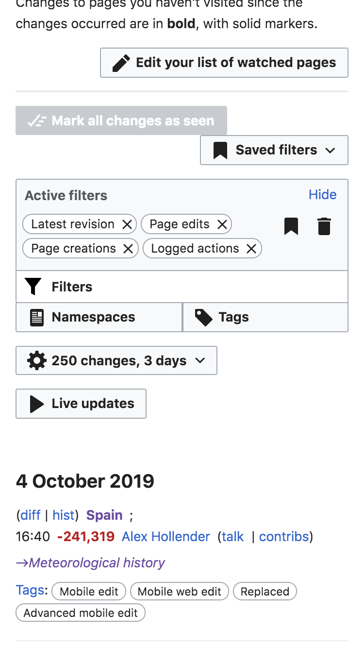 | 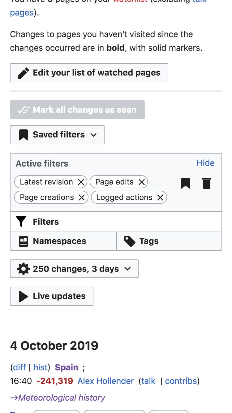 |