checked on Hindi wikipedia.
Feed Advanced Search
Mar 26 2018
Mar 26 2018
• Nirzar closed T190558: Follow up: Disambiguation icon on popups preview is non-standard as Resolved.
• Nirzar closed T66617: List of languages looks strange when mixes RTL and LTR languages as Resolved.
as per the screenshot.
• Nirzar closed T66617: List of languages looks strange when mixes RTL and LTR languages, a subtask of T30708: BiDi: LTR and RTL mixed up (tracking), as Resolved.
Mar 23 2018
Mar 23 2018
• Nirzar added a comment to T190558: Follow up: Disambiguation icon on popups preview is non-standard.
This icon is non standard because it is used in context as a visual illustrative element and not in action/button context. we have 20x20 icons* as standard size.
• Nirzar added a comment to T178862: Revisit different color of links for internal (inner-domain) and interwiki/external links.
As an editor, I greatly appreciate the color difference, and would want to retain it.
• Nirzar moved T190469: Top alignment for Page Issues Modal from Needs analysis to Designing/discussing right now on the Web-Team-Backlog (Design) board.
• Nirzar updated the task description for T190549: Differentiate between internal, sister-wiki, interwiki, and external links visually.
Mar 22 2018
Mar 22 2018
• Nirzar added a comment to T190469: Top alignment for Page Issues Modal.
@alexhollender to followup on these
should we set up a separate task for the followup changes?
• Nirzar closed T188581: Avoid gradient fading on Page Previews, if there is only one line of text in the text summary as Resolved.
Fixed on production now.
Mar 21 2018
Mar 21 2018
• Nirzar added a comment to T190101: Apply styles to mobile only for Hindi campaign.
Who will do this and how?
• Nirzar added a comment to T190101: Apply styles to mobile only for Hindi campaign.
@Jdlrobson sounds great, I leave the SWATING decisions up to @ovasileva and @atgo
• Nirzar updated the task description for T190348: Improve usability of TemplateWizard.
• Nirzar updated the task description for T190348: Improve usability of TemplateWizard.
• Nirzar added a comment to T189066: Watchlist should not show wikidata descriptions, it should show last modified timestamp.
@Jdlrobson should show the metadata and not the wikidata description. looks like a bug to me. the intended behaviour is to show the timestamp and user
• Nirzar closed T125820: Special:Nearby lacks to show purpose of the feature to the user as Resolved.
I tested this on slow internet connection.. 3mbps. and we need a spinner while we fetch the list of articles. right now, i only see "Nearby" as a title and nothing happens for 5-7 seconds and then you see the list. let's create a followup for that @alexhollender
• Nirzar closed T125820: Special:Nearby lacks to show purpose of the feature to the user, a subtask of T120520: [Story] make it easier to understand what Special:Nearby is, as Resolved.
• Nirzar closed T168392: Page previews should display custom preview for disambiguation pages as Resolved.
• Nirzar closed T168392: Page previews should display custom preview for disambiguation pages, a subtask of T130671: Hovercards should show for disambiguation pages, as Resolved.
Mar 20 2018
Mar 20 2018
• Nirzar added a comment to T189177: Fix colours of form section headers (required/suggested/optional).
These colors do not follow guidelines https://wikimedia.github.io/WikimediaUI-Style-Guide/visual-style_colors.html
Mar 19 2018
Mar 19 2018
• atgo awarded T189316: Developer review of changes to Hindi Wikipedia Main_page [3 hours] a 100 token.
• Nirzar added a comment to T187916: Improve Page Issue modal.
Tested... Looks great! a minor followup would be the top alignment of icon and the text but not a blocker.
• Nirzar added a comment to T190037: Page preview doesn't trigger when link already hovered at page load time.
this could actually be favourable behaviour as it might suggest an "accidental/unintentional hover"
• Nirzar added a comment to T188581: Avoid gradient fading on Page Previews, if there is only one line of text in the text summary.
You should't be seeing gradient on it. since the sentence or text ends where it ends. if it wraps to second line. it will start showing the gradient. that is intended.
• Nirzar added a comment to T125820: Special:Nearby lacks to show purpose of the feature to the user.
@ovasileva Let's get rid of it.. we can bring that feature back when we work on special pages to have call to action. as of now the refresh button is not even in the right place.
Mar 16 2018
Mar 16 2018
• Nirzar added a comment to T187916: Improve Page Issue modal.
Is the purpose to align it with the X (close) icon? In which case it looks like it should be 54px, no (that's it's width)?
the purpose is to align the Page Issues title to the content.
• Nirzar added a comment to T125820: Special:Nearby lacks to show purpose of the feature to the user.
The notifications are missing
the notification count is missing in the header as you can see in the screenshot. I'm assuming that space is reserved for refresh icon when the permission is given but at the empty state, either the search icon should move to the right or we should show notification. the search icon looks like it's floating out of no where.
• Nirzar added a comment to T168392: Page previews should display custom preview for disambiguation pages.
please assign designer for sign off for user facing changes
• Nirzar added a comment to T187916: Improve Page Issue modal.
.overlay-cleanup .issue-details {
padding-left:55px;
}
.overlay-cleanup .cleanup li .issue-notice .mw-ui-icon {
top:3px;
}• Nirzar reopened T168392: Page previews should display custom preview for disambiguation pages as "Open".
This did not go through design!!!
• Nirzar added a comment to T125820: Special:Nearby lacks to show purpose of the feature to the user.

- The notifications are missing
- I could not test the main workflow here since dev wiki can't determine location. the transition from accepting location vs not accepting
• Nirzar added a comment to T187916: Improve Page Issue modal.
- The icon types are missing on staging. I could see them before i can't now
- The modal title is issues instead of page issues
- the alignments are off
- the font size needs fixin
• Nirzar added a comment to T188581: Avoid gradient fading on Page Previews, if there is only one line of text in the text summary.
10.1093/acprof:oso/9780195314250.003.0001 < this link has a preview that ends in one line at the edge. it doesn't fade into the gradient.
• Nirzar moved T187916: Improve Page Issue modal from Ready for Signoff to Needs More Work on the Readers-Web-Kanbanana-Board-Old board.
Mar 14 2018
Mar 14 2018
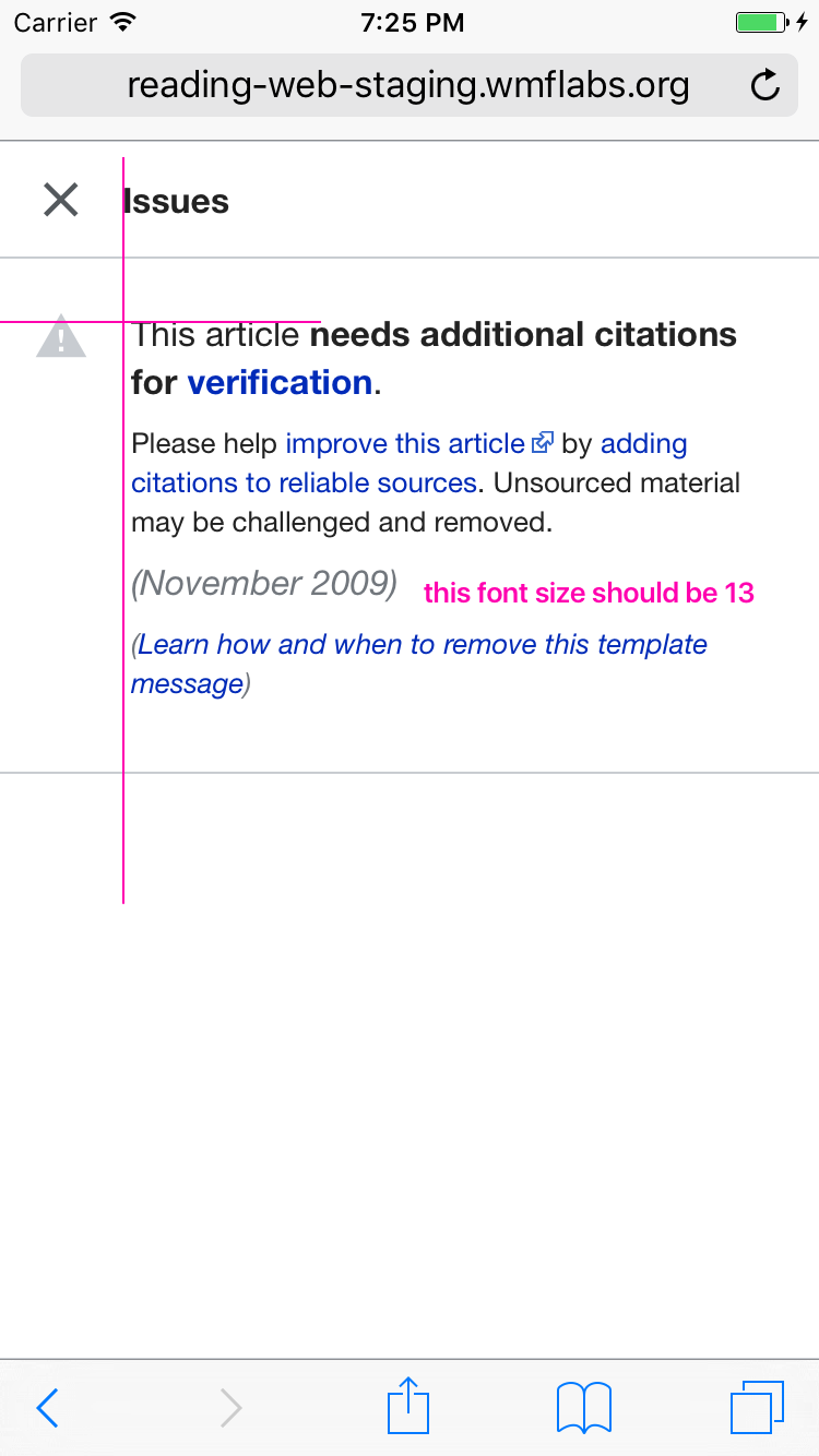
• Nirzar added a comment to T187916: Improve Page Issue modal.
one small style fix with the styles
hide-when-compact computed font size is 14.4 in your change. it should 13px. same for the date and the "learn more" link as well. 16px for the main title and 13px for everything else
• Nirzar updated the task description for T187916: Improve Page Issue modal.
• Nirzar added a comment to T188581: Avoid gradient fading on Page Previews, if there is only one line of text in the text summary.
Looks good on beta!
Mar 13 2018
Mar 13 2018
• Nirzar added a comment to T125820: Special:Nearby lacks to show purpose of the feature to the user.
that's cheating!
• Nirzar added a comment to T189533: [Bug] Search overlay isn't always full screen.
@Jdlrobson nah this is just some inconsistent behaviour of going inside search for the first time vs the second time. seems like a bug
• Nirzar added a comment to T189316: Developer review of changes to Hindi Wikipedia Main_page [3 hours].
@atgo just to clarify the video shows 3 flashes. they are triggered by reloads which are not captured in the screen there.
Mar 12 2018
Mar 12 2018
• Nirzar added a comment to T189316: Developer review of changes to Hindi Wikipedia Main_page [3 hours].
I spent 30 mins with JR. we have figured out 80% of the things. the only thing remains now is the flash of unstyled content.
we are trying to target
• Nirzar moved T189316: Developer review of changes to Hindi Wikipedia Main_page [3 hours] from To Do to Doing on the Readers-Web-Kanbanana-Board-Old board.
• Nirzar updated subscribers of T125820: Special:Nearby lacks to show purpose of the feature to the user.
no one here answered about the the first AC here!
• Nirzar renamed T125820: Special:Nearby lacks to show purpose of the feature to the user from Special:Nearby does not give correct feedback to Special:Nearby lacks to show purpose of the feature to the user.
• Nirzar renamed T189316: Developer review of changes to Hindi Wikipedia Main_page [3 hours] from Developer review of changes to Hindi Wikipedia Main_page to Developer review of changes to Hindi Wikipedia Main_page [3 hours].
Mar 9 2018
Mar 9 2018
• Nirzar added a comment to T189316: Developer review of changes to Hindi Wikipedia Main_page [3 hours].
^ I've put that on the beta cluster. any element with class skin-minerva-search-trigger when clicked will trigger the search now. Does that solve your problem?
• Nirzar added a comment to T189316: Developer review of changes to Hindi Wikipedia Main_page [3 hours].
Just a word of warning.. any css in mobile provided by editors is loaded via JS. Does Hindi have template styles? If not that problem goes away, otherways you'll need to inline them :/
Mar 8 2018
Mar 8 2018
• Nirzar moved T189258: Update place refresh icon in Special:Nearby from Backlog to UI Standardization on the Design (RW-Design-Debt) board.
• Nirzar updated subscribers of T189258: Update place refresh icon in Special:Nearby.
Mar 7 2018
Mar 7 2018
• Nirzar added a comment to T168392: Page previews should display custom preview for disambiguation pages.
@Jdrewniak Zeplin doesn't allow public boards unfortunately, I have added you to the board.
you can now get the asset
Mar 6 2018
Mar 6 2018
• Nirzar added a comment to T187672: Release jsdoc-wmf-theme 1.0 (Wikimedia theme for JSDoc3).
Thanks, that's helpful. is there a way I can see the progress of applying our style to jsdocs? i saw a link on github that was broken
• Nirzar added a comment to T187672: Release jsdoc-wmf-theme 1.0 (Wikimedia theme for JSDoc3).
Thanks Volker for separating out the content types. I will get on it :) much easier to do this now
• Nirzar added a comment to T188043: Missing active state on touch for hyperlinks in article namespace on iOS devices.
UPDATE: after more discussion, we have decided this change should go live. we will be creating some design debt and follow ups. for now I can confirm this should get merged.
• Nirzar added a comment to T125820: Special:Nearby lacks to show purpose of the feature to the user.
When the user has blocked permissions for providing geolocation the "show nearby articles" button will be disabled.
• Nirzar added a comment to T188043: Missing active state on touch for hyperlinks in article namespace on iOS devices.
@alexhollender and I are working on coming up with our options. we identified some trade offs as the change intended here is getting applied to all interactive elements and not only hyperlinks.
• Nirzar added a comment to T188581: Avoid gradient fading on Page Previews, if there is only one line of text in the text summary.
min-height prevents the gradient to be applied to first line, it starts with second line given our line height
Mar 4 2018
Mar 4 2018
• Nirzar added a comment to T165535: Block notices on mobile web for logged-in users provide insufficient information about the block.
We use two patterns when it comes to displaying information about an action that cannot be done for various reason.
• Nirzar added a comment to T188435: Bring consistency to visual design of Interaction Timeline.
@TBolliger Here's a compact version with exact same content and comparison with current version.
Mar 3 2018
Mar 3 2018
• Nirzar added a comment to T88344: Polish the CX Dashboard.

three year anniversary!!!
Mar 2 2018
Mar 2 2018
• Nirzar moved T188793: Create a landing page for design.wikimedia.org from Backlog to v1.1 (Goal) on the Wikimedia Design Style Guide board.
• Nirzar moved T188799: Update the fontstack for Wikimedia Design Style Guide from Backlog to v1.1 (Goal) on the Wikimedia Design Style Guide board.
• Nirzar updated the task description for T188793: Create a landing page for design.wikimedia.org.
• Nirzar updated the task description for T188793: Create a landing page for design.wikimedia.org.
• Nirzar added a comment to T188043: Missing active state on touch for hyperlinks in article namespace on iOS devices.
tested on staging, this is getting applied to all the links and buttons including the UI. i think that's because we removed the property completely. we might need to do a {-webkit-tap-highlight-color:default; } override for article hyperlinks and keep the transparent property for body.
• Nirzar added a comment to T188435: Bring consistency to visual design of Interaction Timeline.
I think a lot of these visual changes will be simple and unintrusive, but I'm concerned about the spacing of elements. We've worked really hard on making sure the tools has high information density so our target users (administrators and power users) can see a lot of information in one go. The margins, spacing of elements, and font sizes were all decreased to have as many 'edit cards' on a 1366x768 monitor. This is the timeline now versus last November.
Mar 1 2018
Mar 1 2018
• Nirzar lowered the priority of T188665: Update layout to match wikimedia style guide from Medium to Low.
Volker_E awarded T188435: Bring consistency to visual design of Interaction Timeline a Doubloon token.
• Nirzar added a comment to T188435: Bring consistency to visual design of Interaction Timeline.
I applied the UI style guide to the interaction timeline
https://wikimedia.invisionapp.com/share/VRG4FI7NDJY#/282441034_Landing
• Nirzar triaged T188664: Update Interaction Timeline Visual Style to match Wikimedia Design Style Guide as Medium priority.
• Nirzar added a comment to T182319: Show HTML summaries on all wikis.
The line height here is rather -- variable.
• Nirzar updated the task description for T188043: Missing active state on touch for hyperlinks in article namespace on iOS devices.
• Nirzar added a comment to T167164: Improve mobile header .
for desktop
https://zpl.io/bLNGAvJ
• Nirzar renamed T188581: Avoid gradient fading on Page Previews, if there is only one line of text in the text summary from Avoid gradient fading if there is only one line of text in the text summary to Avoid gradient fading on Page Previews, if there is only one line of text in the text summary.
• Nirzar added a comment to T182321: Show HTML summaries on cswiki.
@Vachovec1 created a card to fix this issue
https://phabricator.wikimedia.org/T188581
• Nirzar added a comment to T182321: Show HTML summaries on cswiki.
The fading should definitely not be applied to the first line of the text
Feb 28 2018
Feb 28 2018
• Nirzar added a comment to T182319: Show HTML summaries on all wikis.
ar wikipedia changes line-height to 1.6em for their script.
• Nirzar updated the task description for T125820: Special:Nearby lacks to show purpose of the feature to the user.
• Nirzar updated the task description for T187916: Improve Page Issue modal.
• Nirzar added a comment to T165535: Block notices on mobile web for logged-in users provide insufficient information about the block.
@TBolliger apologies, I was OOO during this period. I will make sure this is posted before March 14