
User Details
- User Since
- Sep 1 2021, 1:45 PM (138 w, 9 h)
- Availability
- Available
- LDAP User
- Unknown
- MediaWiki User
- AAlhazwani (WMF) [ Global Accounts ]
Thu, Apr 18
can't scroll down when there is too much text. https://wikimedia.slack.com/archives/C06KW5BGEBB/p1713364682437669
Tue, Apr 16
Fri, Apr 12
Thu, Apr 11
thank you @GrounderUK
Wed, Apr 10
@Jdforrester-WMF when an editor enters "edit source" mode, would it be possible to check what are their user rights, and programmatically display a message in-page? very poorly written message eg. "⚠️ While you can edit this page, based on your current user group you will not be able to publish your changes."
tested on beta today, and the issue is still present. if possible, we'd like to vertically align the text with the bullet (or the chevron). both for single-line text,
Tue, Apr 9
as a first step, we are thinking about leveraging the existing contextual menu (use to change the mode or delete a list item) to also display 2 new options: move up, and move down.
Thu, Apr 4
Tue, Apr 2
Thu, Mar 28
this work can be part of a larger area of work on translation and multilingual editing, if it gets accepted for the upcoming quarter, see PRD.
Wed, Mar 27
un-assigning and moving back go the ready column as we might address this as part of a larger area of work on multilingual contributions
un-assigning and moving back go the ready column as we might address this as part of a larger area of work on multilingual contributions
Tue, Mar 26
i've been testing this on betacluster and i'd like to report a couple of minor things for us or the web team to consider.
Mar 25 2024
Mar 21 2024
there might be a couple of options to address this. when someone clicks on "cancel" button in the publish dialog, what is their expectation? are they cancelling the publishing step (to go back to their edits/changes), or are they cancelling "everything" (similarly to refresh/close the tab of the browser)?
Mar 18 2024
Mar 15 2024
that could work! i would also like to explore how might we include the zid directly to about widget, rather than the mediawiki header.
after chatting with @gengh it seems that is not possible to assert when to trigger a warning and when not to. i would wait to see what happens when renderers and parsers are in use.
I.e. if you go to https://www.wikifunctions.org/view/en/Z10000 and tripleclick on join, it selects "join strings Z10000" (but weirdly not the brackets around the ZID).
I think we can drop the ZID from the title, and maybe even the type (i.e. "Function" in the example), so it is only
"join strings - Wikifunctions"
Mar 14 2024
Mar 6 2024
posting final decisions after chatting with @gengh
Mar 5 2024
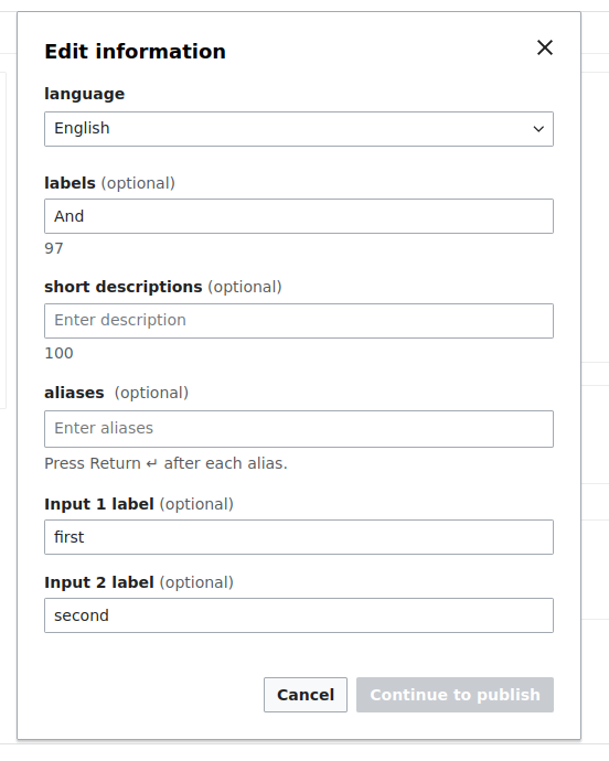
If we add a float: right property to the __counter css, when the page is rtl, it will replace that style with float: left automatically:
Mar 4 2024
Mar 1 2024
ooooh sorry, i didn't see my own typo 🤦🏼♂️
thank you @gengh!
pinging @Jdforrester-WMF for guidance, see comment above ^
Feb 23 2024
You can see this in the current WIP ZObjectStringRenderer.vue component, in the methods from lines 134 and 164.
Feb 22 2024
tested in production, seems to be fixed now.
Feb 21 2024
Feb 19 2024
i've tested this on beta/prod and we consistently display floating messages at the center-bottom of the screen.
Feb 15 2024
this is looking gooood! thank you @AnneT @Catrope @CCiufo-WMF 🙏🏼
Feb 14 2024
Feb 13 2024
Feb 8 2024
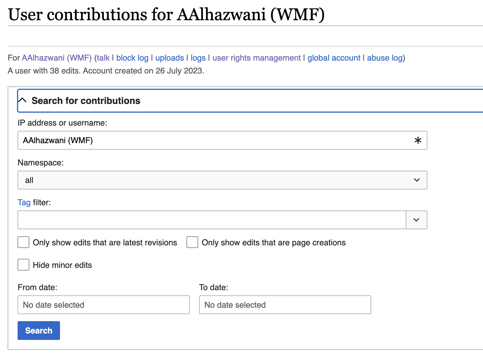
UI-wise we could drive inspiration from the user contributions page et similar where there is an accordion at the top of the page with bespoke filters based on the page type.
Feb 7 2024
note to self, found this neat visual treatment on slack for uncomplete usernames
sharing a few examples that i've been collecting in the past months as we've been working on the nested/expanding/collapsing UI on wikifuntions
some more updates after a first round of feedback. left is current, centered is proposal with all accordions collapsed, and right is proposal with all accordions expanded
Feb 6 2024
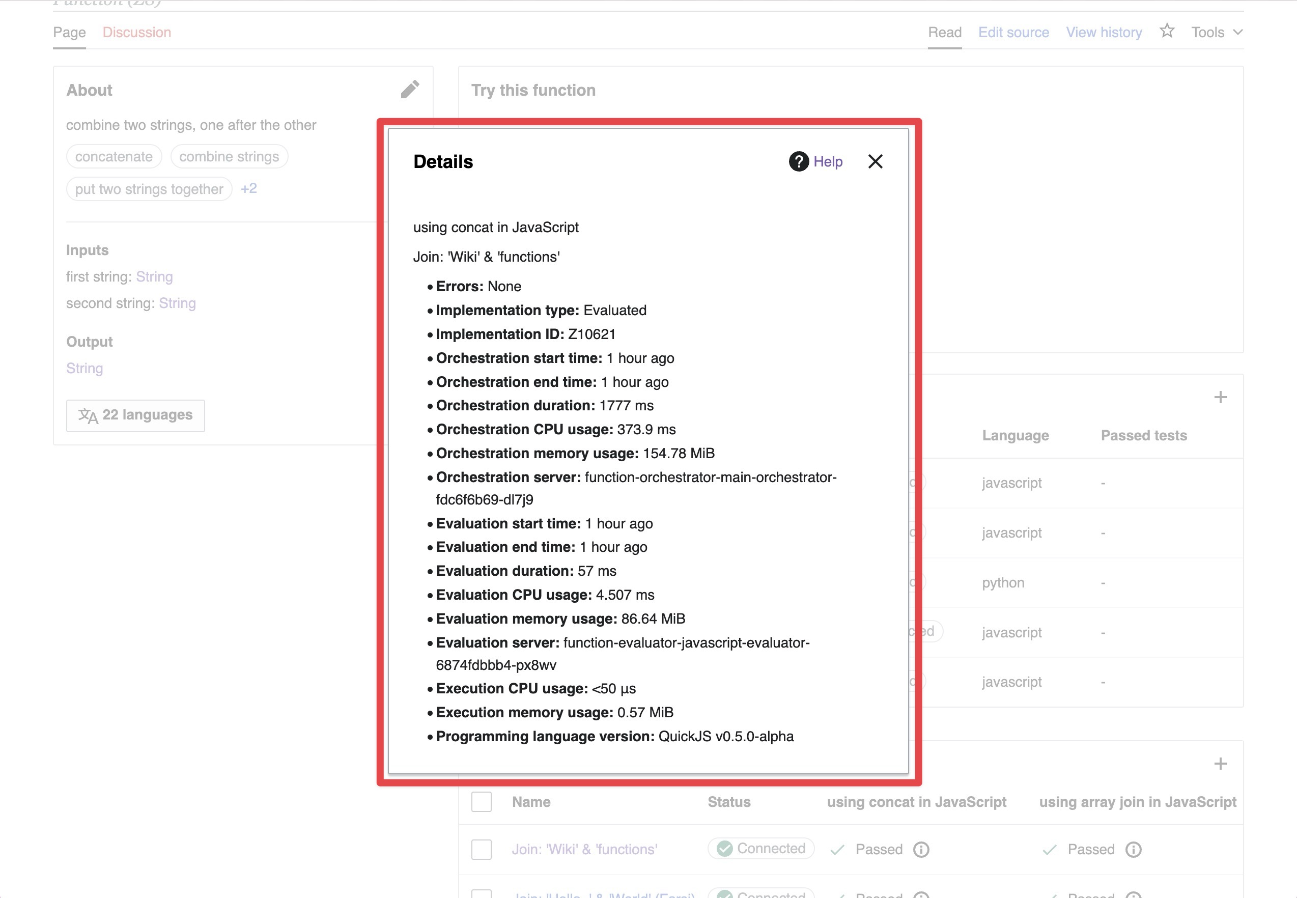
started to explore few ideas on how we might improve the content displayed in this dialog. i've been mostly focusing on the information architecture, and not questioning the current content, which is probably out of scope for this task.
Feb 5 2024
@gengh i would like to contribute to this task this week. could you give me more context on the design needs for this dialog? if i'm not mistaken, we're already using cdx-dialog. also, is this the dialog in question?
Hi and thank you for your interest! Please check thoroughly https://www.mediawiki.org/wiki/New_Developers (and all of its communication section!). The page covers how to get started, assigning tasks, task status, how to find a codebase, how to create patches, where to ask general development questions and where to get help with setup problems, and how to ask good questions. Thanks a lot! :)
Feb 2 2024
Feb 1 2024
Jan 31 2024
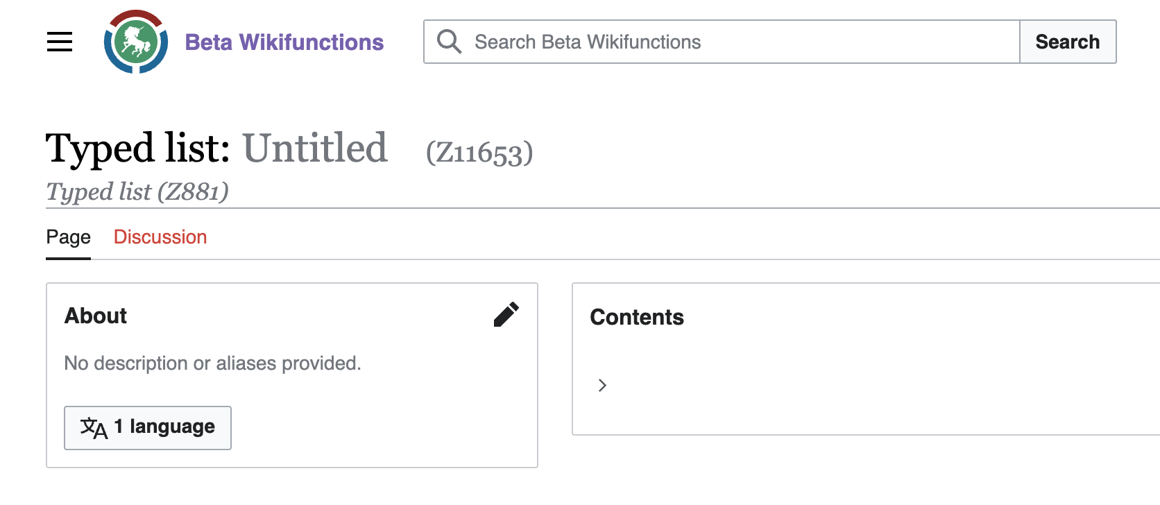
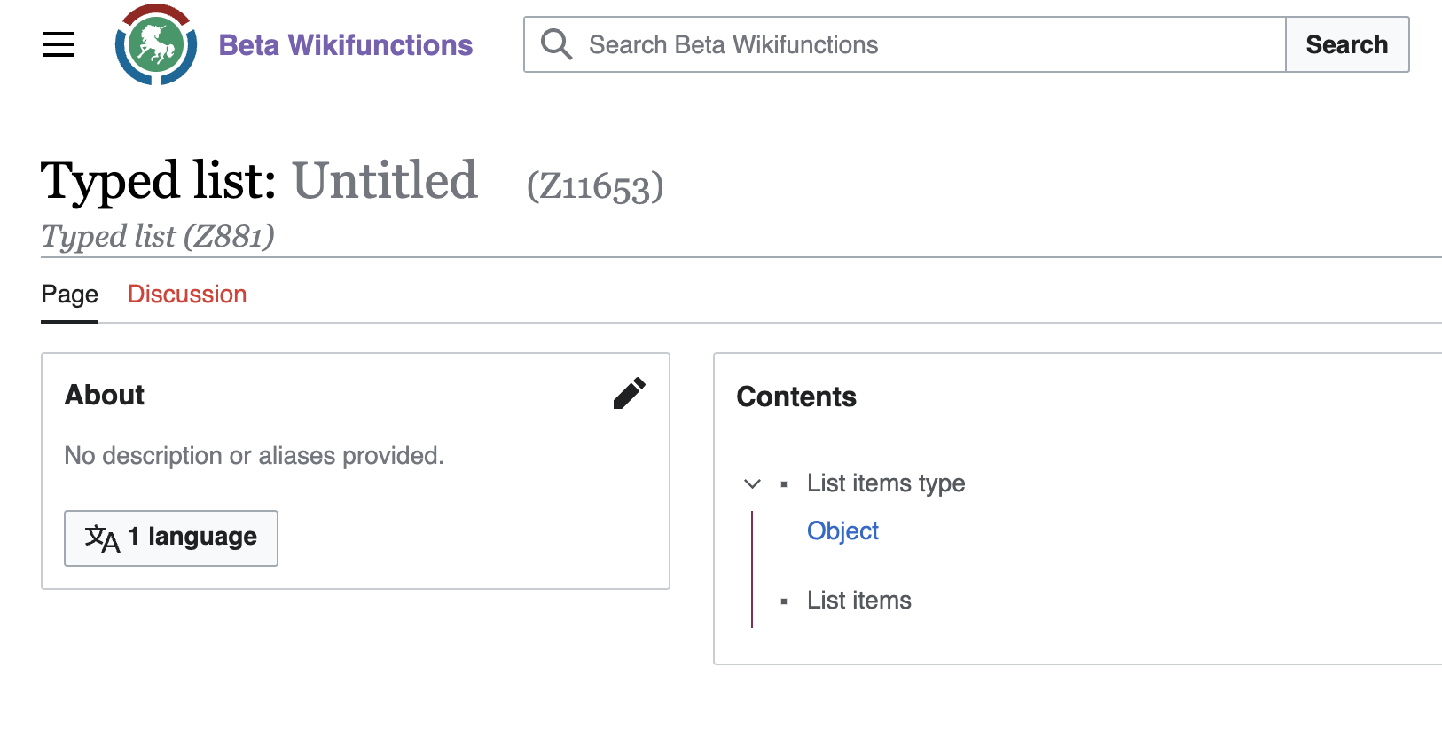
this task is also valid for read mode, in this example i published an empty list
Jan 30 2024
(3) the space between the lang icon and is rather tight.
Jan 26 2024
i've reviewed, edited, and updated the description of this task, and most of the noted issues have been addressed. the remaining (small) things have been filed as separate tasks. i'd suggest to verify and resolve this task.