User Details
- User Since
- Nov 19 2014, 9:05 AM (492 w, 1 d)
- Availability
- Available
- LDAP User
- Unknown
- MediaWiki User
- Snaterlicious [ Global Accounts ]
May 9 2016
Jan 15 2016
Dec 17 2015
Still, the formatting (apart from the colour) diverges a bit from the mock-ups and we could track that in this ticket.
Text format (font size, line height) should actually be the same (see mock-ups below).
If it is for the different colours, that is okay with me and complies to the mock-ups. The text is in the colour of the corresponding section (header section dark green, answer section white). The question mark icons are in different colours as well. In my opinion, that additionally underlines that the help text corresponds to either the question as a whole or a individual answer.
Dec 10 2015
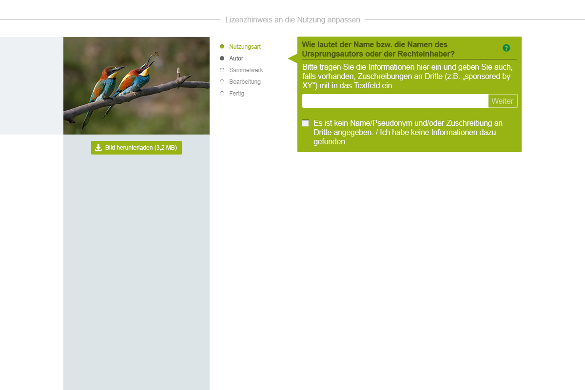
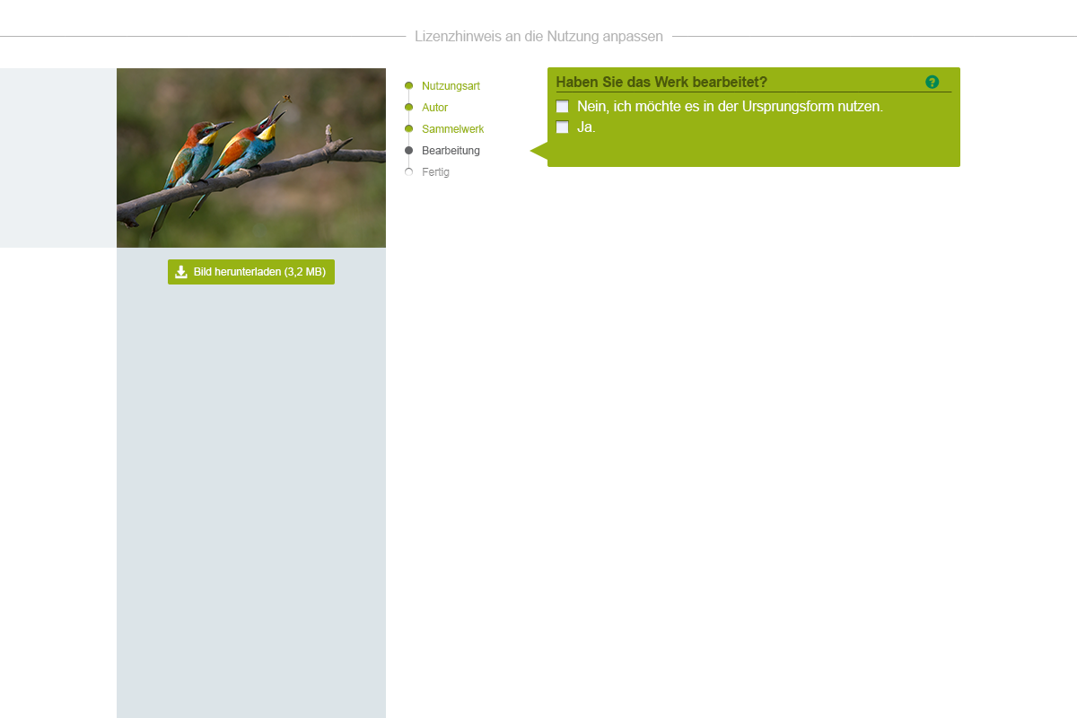
In general, it would also be nice to wrap text not around/below the checkboxes. I am not sure whether that is the case at the moment. See following mock-up ("Es ist kein Name/Pseudonym [...]"):
That sprite might be sufficient as there is need for a non-checked and hover state only since clicking advances to the next questionnaire step instantly.

Excuse me, that actually belongs to here:
Overlay of mock-up and implementation at the same viewport size:
The font-sizes in the implementation are larger. So are image and progress bar columns.
Nov 17 2015
Nov 16 2015
No problem.
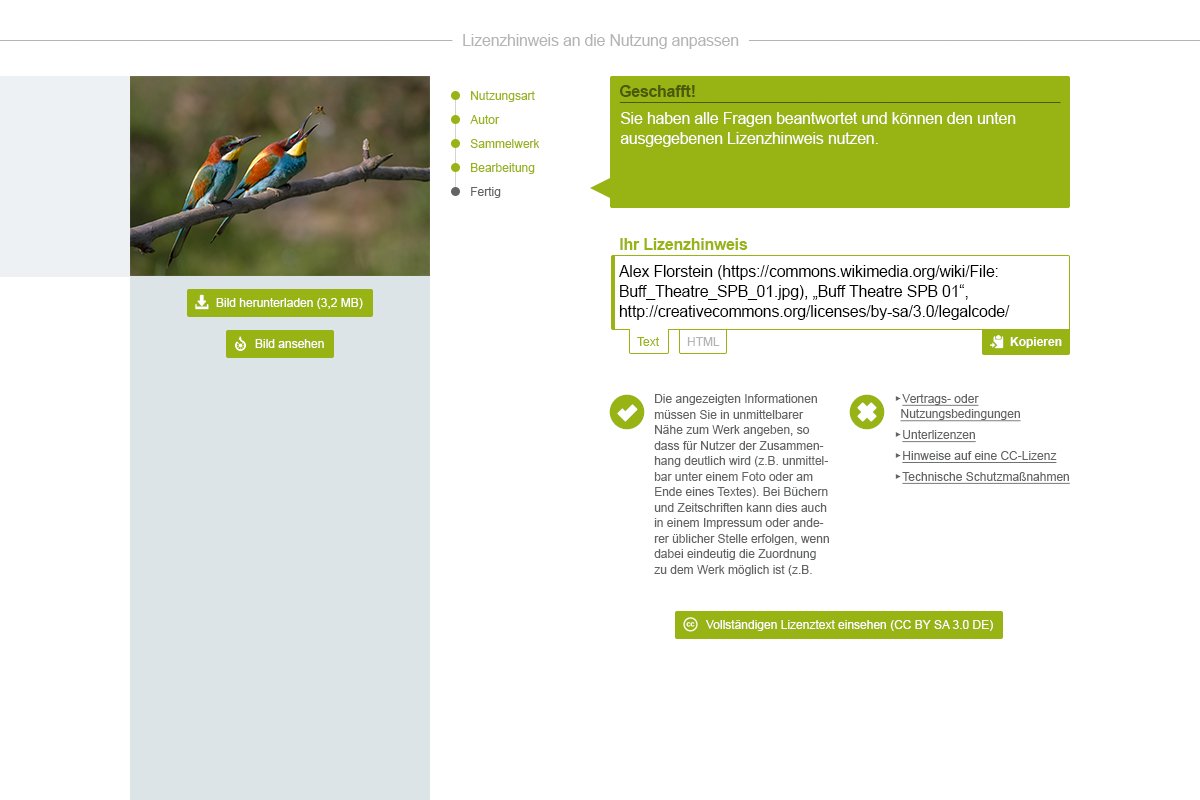
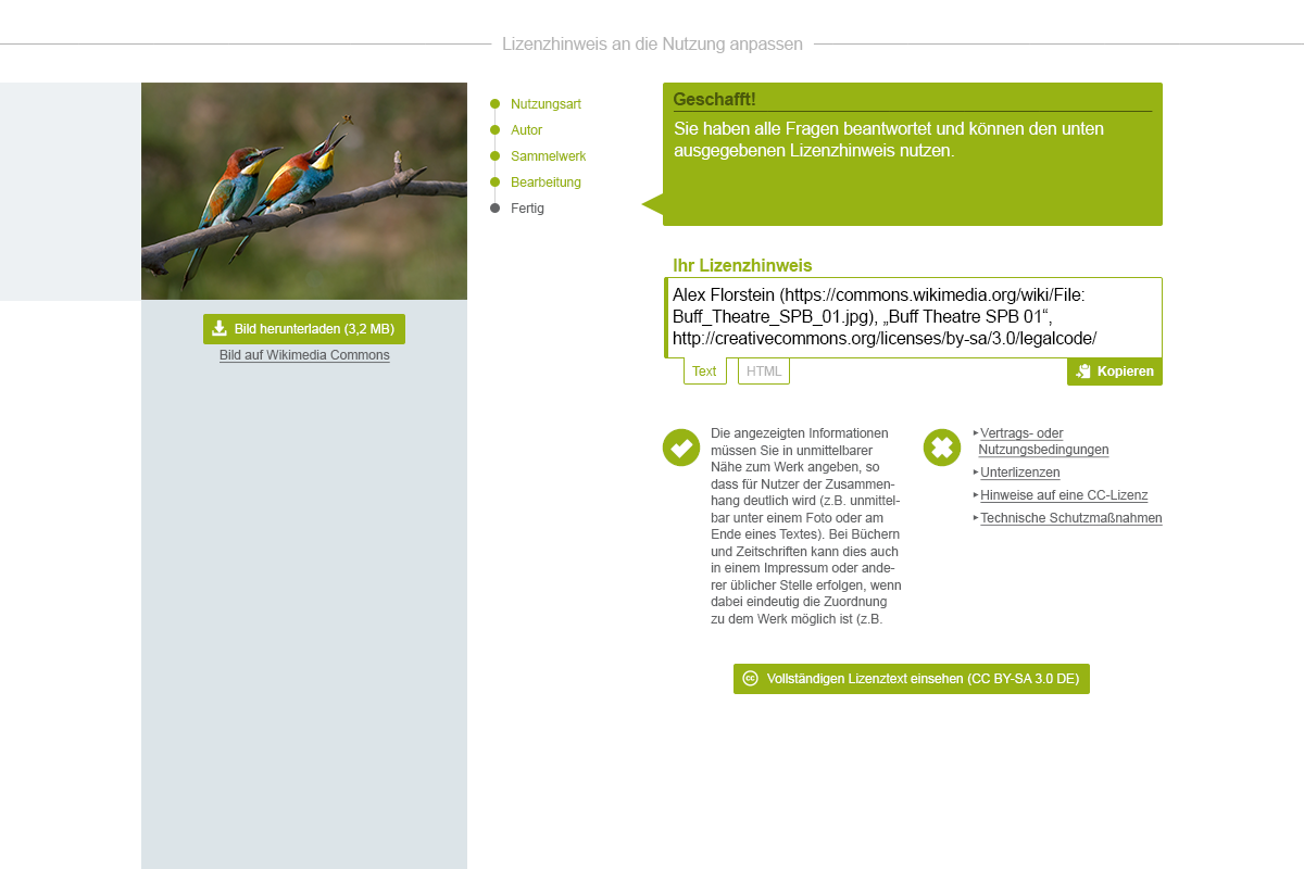
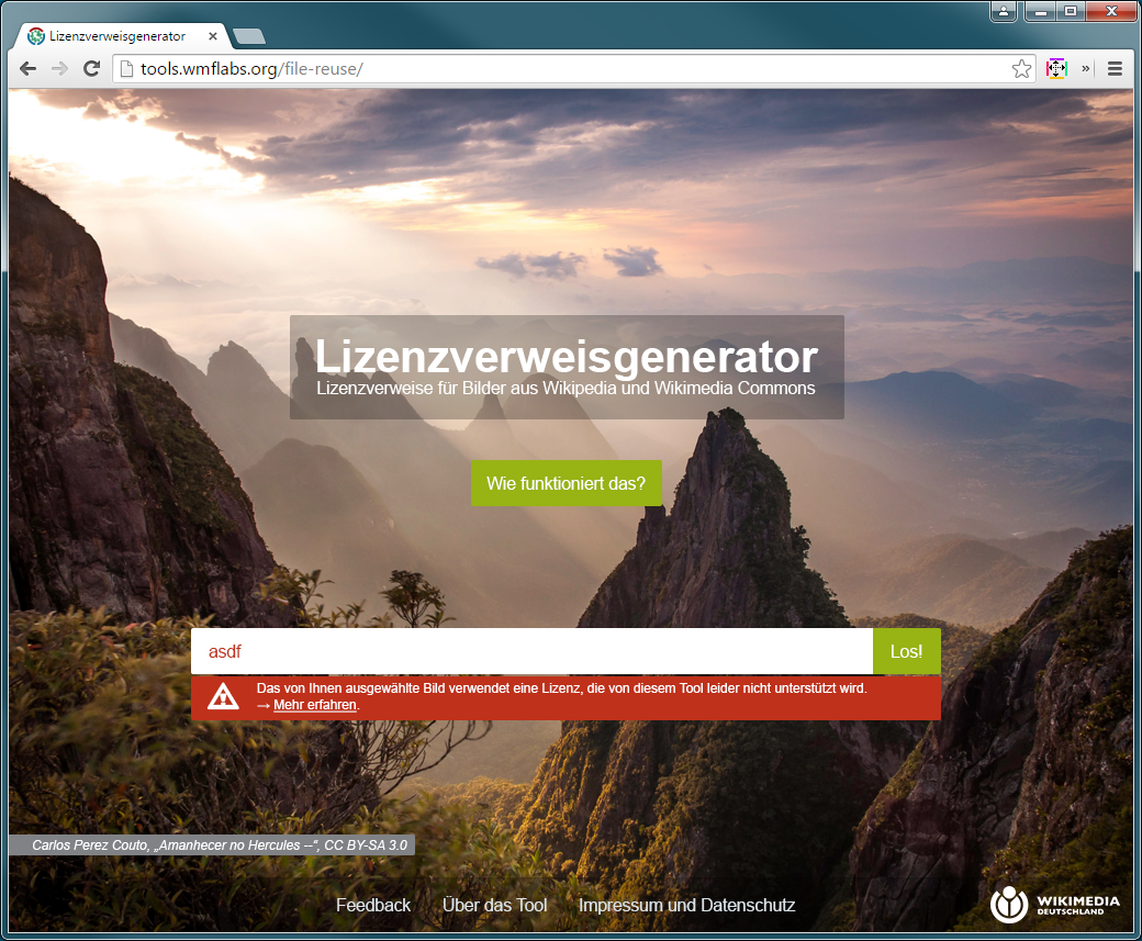
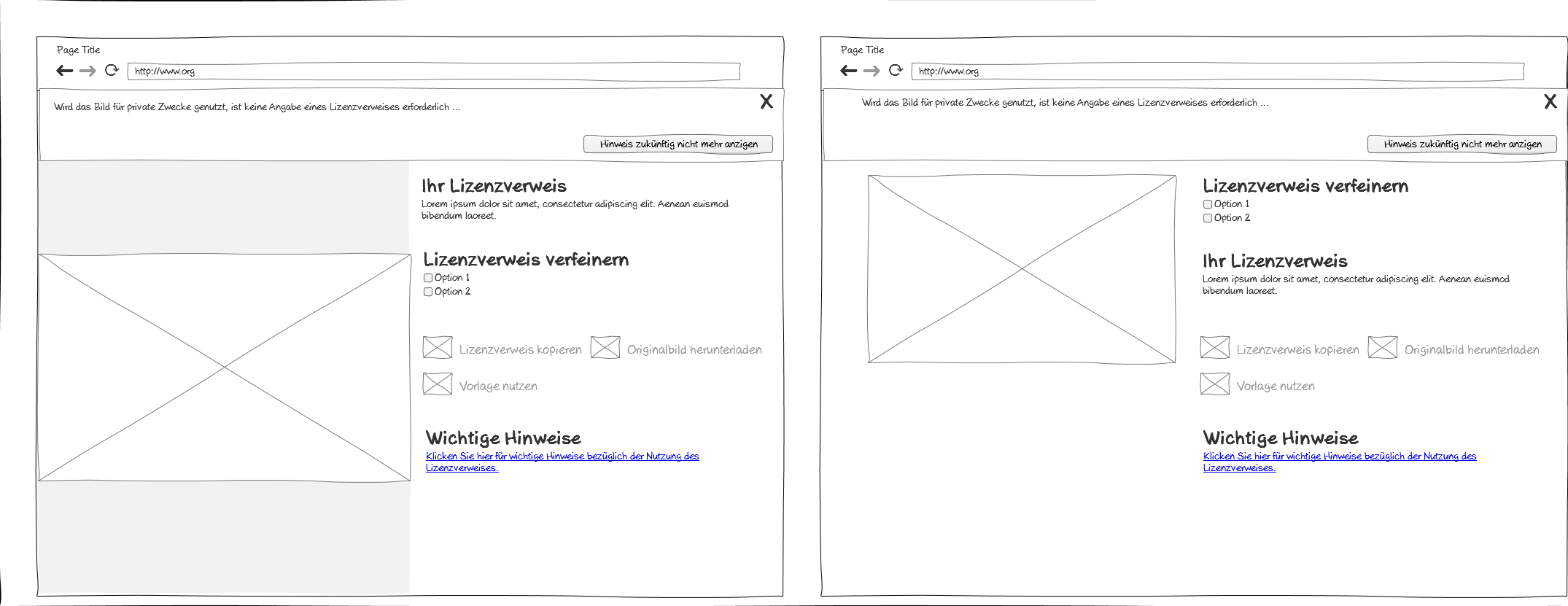
"Bild ansehen" is quite unspecific, although there is an icon in the button giving little hint. The licence name may appear quite cryptic and in my opinion the meaning of the characters become more obvious when dedicatedly stating that these represent the name of the licence.
Two screens for the updated final stage. In both screens, the licence name is included in the heading "Ihr Lizenztext" and below the button "Vollständigen Lizenztext einsehen". However, I think mentioning it once is sufficient and I would prefer to have it placed below the button as the one in the heading will most likely just be skimmed over.
Nov 2 2015
I have consolidated the visuals:

Oct 22 2015
first raw draft:

Oct 20 2015
Here is a screen with input box and checkbox:

Oct 19 2015

Oct 16 2015
OK, no problem. But do not feel urged to not combine progress bullet points not having shadows with checkboxes having shadows. I was just thinking that an overall "flat" look might be the one which is more desired/applicable as the input boxes do not have shadows as well (could, of course, apply some). And, all in all, the bullet points do not look that bad without shadows. Sorry, for making it complicated. ;) We can briefly talk about it on Monday.
Here are the updated screens (progress indicator inner shadows are removed in all screens):
Oct 15 2015
Oct 14 2015
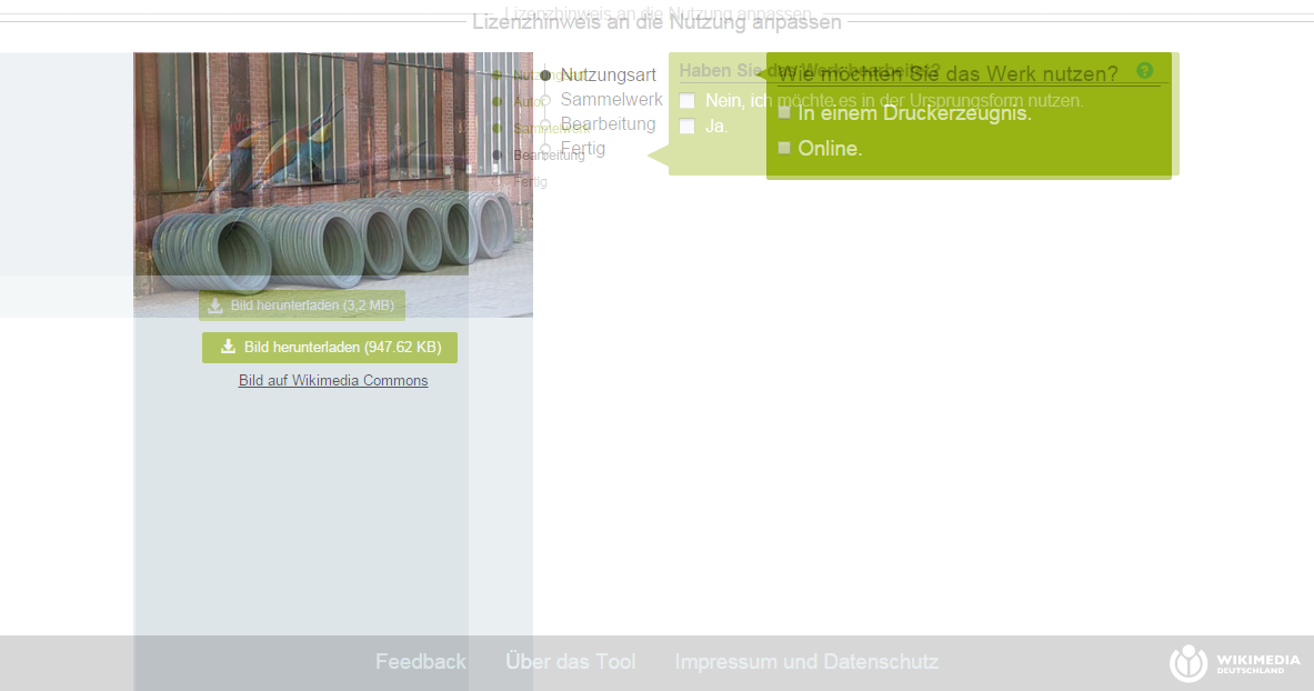
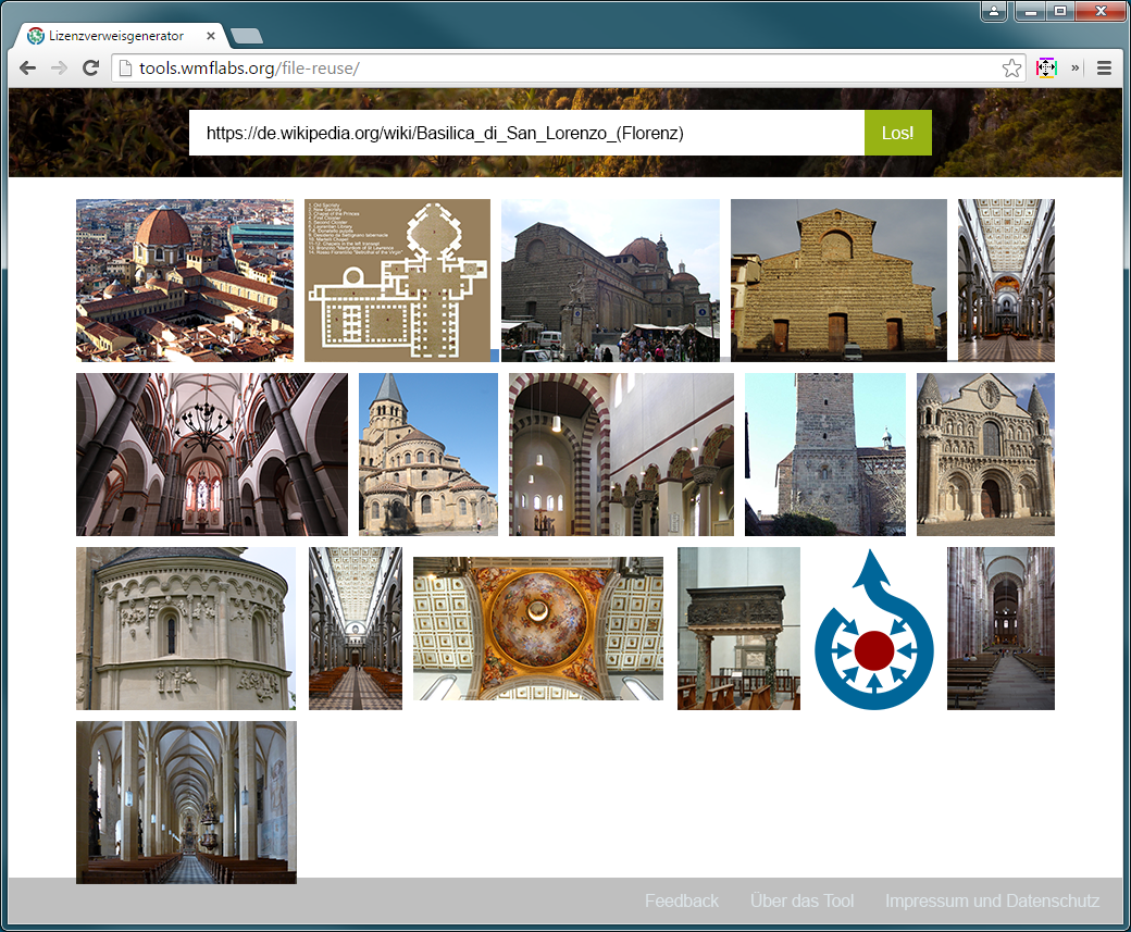
Handling of other image formats:
Oct 13 2015
Oct 8 2015
- "current final result"
Oct 1 2015
Larger main navigation bar:
Sep 30 2015
2nd iteration:
Sep 24 2015
The following designs are for consideration.
Since Bootstrap is used, these were made with a template for MD size. Numbers correspond to pages in the wire frame document of T103979. Menu bar left out by intention.
Exported results of https://docs.google.com/presentation/d/1g01fV_DQcbwBIxb84Rvu1kXisM1dhbFoVH3TDmO5fcs/edit#slide=id.gc6540e1d7_0_0 for future reference:
- edit = Edit
- save = Check
- remove = Remove
- cancel = Would prefer Close over Cancel
- add = Add (May also be a new icon of "Edit" with a "+" sign (compare to "EditLock"))
Sep 23 2015
We should not strive to invent icons different to the ones used in MediaWiki. Please have a look at those icons first:
- https://www.mediawiki.org/wiki/Design/WikiFont
- https://doc.wikimedia.org/oojs-ui/master/demos/#icons-mediawiki-vector-ltr
(I guess the latter one is "more current".)
I doubt it makes sense to design dedicated icons for "add [qualifier|reference|statement]". A generic "add" icon should be sufficient as long as it is ensured that the context can be identified by the user.
Sep 16 2015
As per @Lydia_Pintscher's request:
Sep 15 2015
Text entered into the text box should have the colour #636466. Might just want to add it to https://github.com/wmde/Lizenzverweisgenerator/pull/89. Thanks.
Sep 14 2015
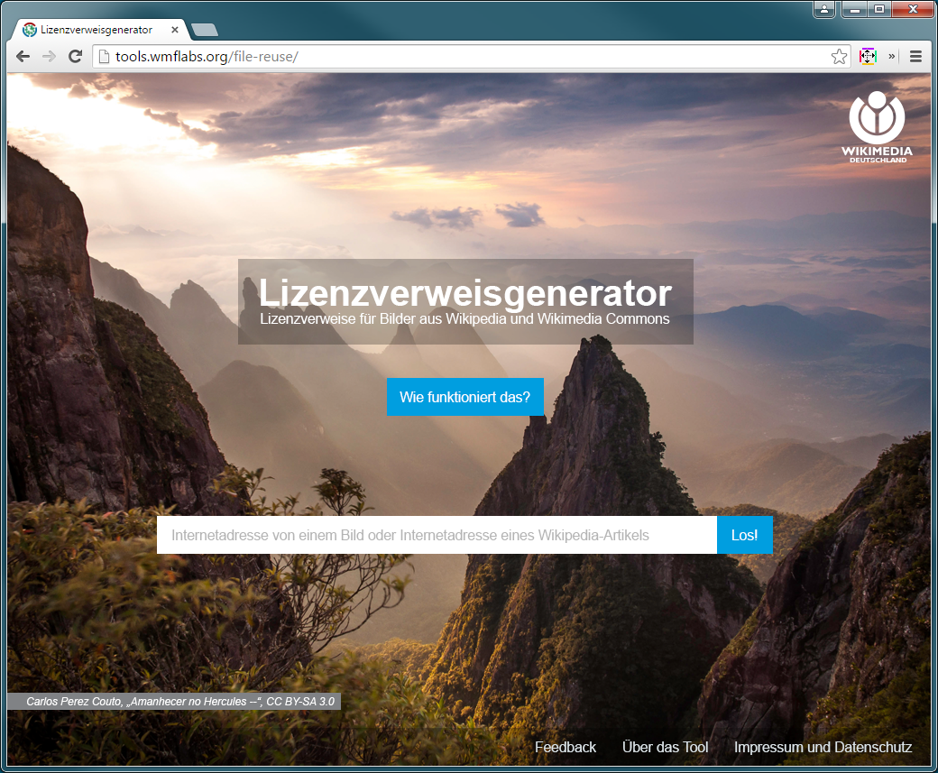
- Now that I know that the logo on Drive is different from that in the Wiki (where it is in square format): Please scale the logo to 80px height, making it a bit larger that it is right now.
- The text "Lizenzverweisgenerator" should be bold and the tagline's font size should be large enough to align in width with "Lizenzverweisgenerator".
- The attribution should be in italics.
- Please use German typographic quotation marks in attribution. The attribution text should be in German.
- The background image should be scaled that it always fills the viewport (like "background-size:cover;" does).
- The white space around the text box placeholder should have the same width/height (needs some more horizontal padding).
Aug 26 2015
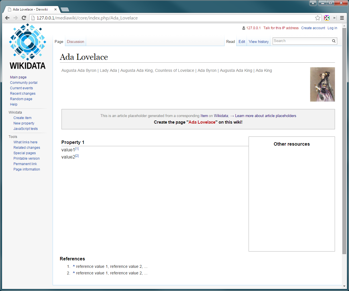
OK, now I get the picture! Although I wonder about the placeholders' use case if the information is not available instantly but after visiting a separate page first. The placeholder is basically mirroring the Wikidata page where it would be a good chance to make users directly aware of and get in touch with Wikidata which would be just one click away either. Of course Wikidata's major problem in that context is the UI but I wonder why not rather put some power into that.
Aug 25 2015
OK, as the amount of text will be not too large, we may want to use lightboxes. Since the content of the lightboxes is not finalized yet, this is only conceptual again.
Some attributes that may not change though: header bar height: 42px with 30pt font size; background overlay is #dce4e8 at .8 opacity.
As for the menu items. I would not recommend opening those in a lightbox like it is done at the moment as that additional layer might contain another scrollbar. Instead, the content could just be appended to the main layout container and the viewport can be scrolled down automatically. Some exemplary screenshot:
I wonder whether you can get along with that:
Aug 24 2015
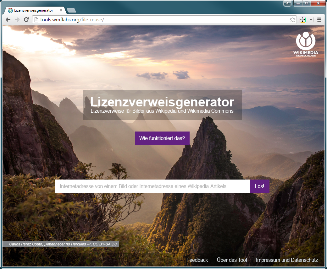
Decision was made to go with green.


Design will be documented (colours, spacing, behaviour etc.) after final approval.
Is that heading into the right direction:
Personally, I would refrain from using the description as its main purpose is to ease identification on Wikidata (the Wikibase instance) and, hence, may contain Wikidata specific content.
A few more / more detailed variations of the picture selection "page":
Aug 21 2015
I noticed that we actually moved on from wire-framing as to the ticket title. I guess this ticket is actually resolved by your mock-ups, @KasiaWMDE, at https://popapp.in/w/projects/55b5224613c497de0dc28973/mockups/55d35c5d01823bd659e259e8 and there should be a separate ticket for actual design...
@KasiaWMDE: What is the status of this ticket? Can it be set to resolved?
@KasiaWMDE: What is the status of this ticket?
Is any additional change required or can the ticket be set to "resolved"?
Front page with magenta colour as per request:


Aug 19 2015
We could just ask Google: https://cloud.google.com/translate/v2/using_rest?hl=en#detect-language
Well, no, but detecting a language is feasible. Just like for units, it is about making a proper "best guess" that is influenced by various parameters in addition to the actual input. Such a "best guess" could, of course, be altered (see T103835#1423985).
For clarification:
What information needs to be on the page except the data from Wikidata? / Is it that page that would basically be replaced: https://en.wikipedia.org/wiki/Page_that_does_not_exist? And there would be no redirection to full-text search anymore (https://en.wikipedia.org/w/index.php?search=Page+that+does+not+exist&title=Special%3ASearch&go=Go), provided a Wikidata item is found?
Reassessing that: As mentioned before regarding the basically wiped out unit selector discussion, still, the general idea should be to not require two input fields at all by having the software detect the unit from the combined string of value and unit. The (rest of the) procedure is described in T103835. The same would actually be possible for monolingual text by having the software detect the language.
Multilingual text is a value that very likely would require multiple inputs.
Aug 13 2015
Aug 11 2015